10 Award-Winning Websites With Kick-Ass Designs
by Matthew Bushery

January 31, 2014 at 8:00 AM
122
inShare
inShare
 Every once in a while I find a new website that makes me stop and stare. It's a modern-day masterpiece. The aesthetic and user experience are off the charts. It's new, innovative, and, frankly makes me wish I knew how to design web sites so I could create ones like it.
Until recently, I always wondered if there was some kind awards handed out to these sleek and chic sites. Turns out there is a respected group that doles out honors to the agencies behind these beautiful-looking sites. A jury of roughly 60 web designers, creative directors, and other big players in the world of marketing and design hands out Awwwards to the masterminds behind some of the most chic sites online today.
If you want to see some examples of the most gorgeous sites out there (and draw some inspiration for your site's design),
With that said, below are 10 world-class websites to win Awwwards in the last year.
10 Stunning Sites to Win Awwwards
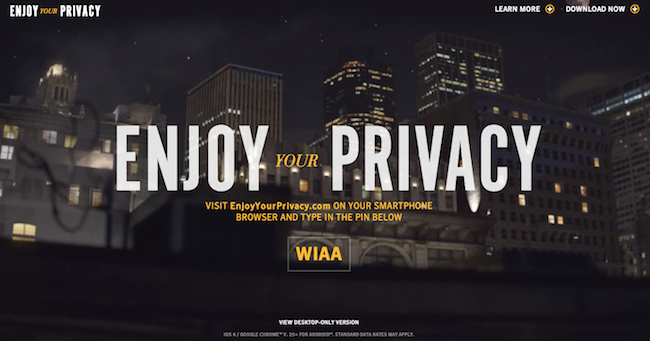
1) Norton: Enjoy Your Privacy
Norton's "Enjoy Your Privacy" site gives users the feel of how their private data can be easily accessed if they don't protect themselves properly. The site is both innovative and informative, earning the creators recognition from the Awwwards jury and online users alike. Norton knows that their audience cared about privacy and security, which is why this website is so powerful.
2) Warner Bros.: Gravity
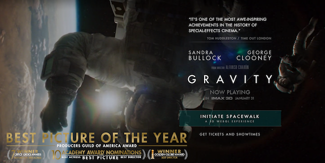
A top box-office hit in 2013, the movie Gravity also an equally exceptional website. The site let visitors partake in a unique spacewalk experience (one that must've taken a heckuva lot of man hours for the designers behind this beauty). What better way to market a movie than make you feel like you're a part of it?
3) Arcade Fire: Just a Reflektor
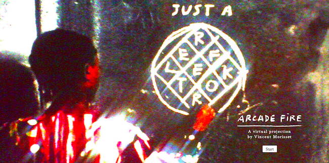
For Arcade Fire's latest album release, the marketing machine was in full force -- and included this intriguing website. The site allows you to control the focus and lighting of the video while listening to a Arcade Fire track, making for a terrific UX for passionate fans. Kudos to the alt-rockers for the experimental design -- it's honestly kind of trippy.
4) Google: Super Sync Sports
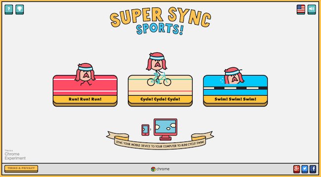
Google Creative Labs had a hand in creating this fun site. Super Sync Sports features three interactive games that users can control with their mobile device. Connect your phone and then you're ready to run, cycle, or swim. We love the cross-device use and we weren't alone -- this YouTube clip of the game has 1.8 million views and counting.
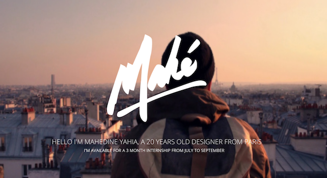
5) Mahedine Yahia
Who says marketers can't take design cues from personal websites? Case in point: This crazy-good site for Parisian designer Mahedine Yahia just blows me away. This site acts as a resume and portfolio for Yahia, who most likely will never be out of work again given the site's flawless design work and concerted focus on great imagery.
6) Rdio
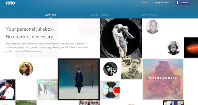
Back to some business-based sites. Here's one from the popular music tool Rdio: Its distinct and engaging homepage makes it easy for users to check out their favorite artists and share their playlists with friends through social media -- two crucial components of getting this website to grow. Because the site easy to use and share, Rdio will retain the visitors it gets and get those visitors to bring in new ones -- a superb growth strategy.
7) Iuqo
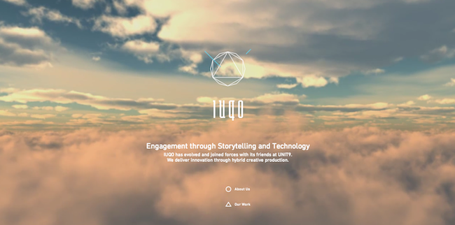
This website seems like it's simple and uninteresting at first glance -- Click on the "About Us" button and you get a quick and standard blurb detailing who the agency is. Not impressive. But then when you click on the "Our Work" button, the background of the page suddenly transforms to vibrantly tinted videos of their work. We love how the site balances minimalism with robust interactive content.
8) Bienville Capital
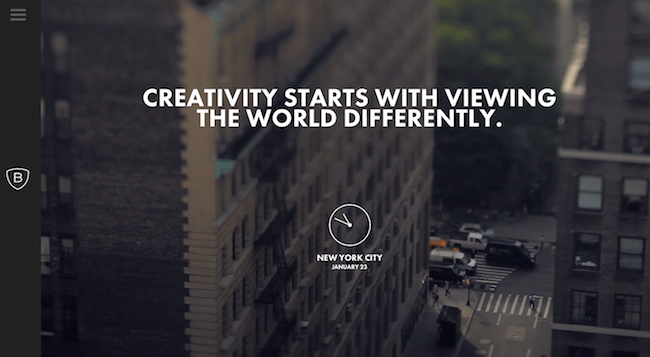
I'm sure you've caught on to the design themes of simplicity and minimalism in the sites mentioned thus far. This tactic tends to go over well with online users -- many of whom come across to sites daily that overstuff info, links, CTAs, images, etc. Especially for mobile users, that web experience is distracting and annoying. Bienville is a case study in how to sell in a subtle but effective manner.
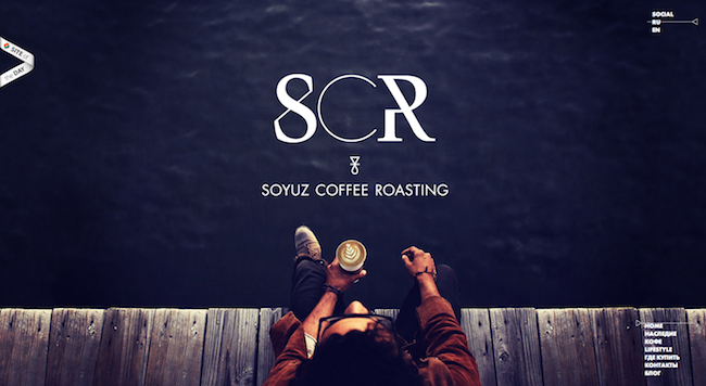
9) Soyuz Coffee Roasting
The Russian-based coffee roasting company does a wonderful job in not only showing off its great product (that coffee in the middle makes me start salivating), but also in telling its story. Consumers want to know the businesses they may decide to buy from. By sharing its background and mission with website visitors, Soyuz can build brand awareness, garner a loyal following, and ultimately boost sales.
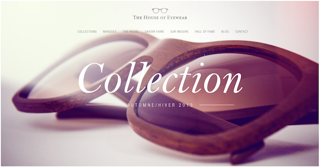
10) The House of Eyewear
The goal of your homepage should be to show off what you're selling in the most appealing way possible. The House of Eyewear does just this with its image heavy and minimal homepage design. Like we said before, this is an experience most web users love. And when you want to dive deeper into each section of the navigation bar, a neat little animation takes you to the next page. These design elements delight you in such a tiny way, but they tie the whole website experience together.
What are some of the most stylish websites you enjoy visiting regularly? Thinking of adding any elements to your site used in the ones above? Share your thoughts below!