Thursday, October 30, 2014

Instagram's Video Ads Are Finally Live, and Here Are 4 From Major Brands

Disney, Activision and Banana Republic among early buyers 
Disney is promoting Big Hero 6 with its Instagram video ad.
After six months of testing, Instagram's video ads are officially here.
Instagram, owned by Facebook, has deals to show 15-second autoplay spots from Disney, Activision, Lancome, Banana Republic and CW. The ads will start appearing today and roll out over the coming weeks. For instance, Disney is promoting its film, Big Hero 6, with a video showing animated characters posing as if they were taking selfies.
"We felt like we wanted to step up in big way for Big Hero 6," said Anthy Price, svp of media at Disney. "And we're excited about video."
Instagram has been unusually hands-on with brands in regards to its static image ads, which launched last year. And the same is true with video. The company reviews all clips to ensure that they contain mostly fresh content, fit the vibe of the platform and are not simply repurposed TV/Web commercials. 
Video has become an important part of mobile advertising, and Instagram rivals like Tumblr and Snapchat recently launched similar ad products. Snapchat, the mobile messaging app with a youthful audience, sold its first video ad this month to Universal Pictures, whichpromoted a trailer for the movie Ouija.
But it can be a delicate dance, introducing potentially intrusive ads to an app that had been commercial free. Some early Instagram advertisers that tried out the sponsored images heard negative comments from users who didn't enjoy the salesy activity in their feeds. Still, Instagram is sharing feedback that digs deeper than comment sentiment and looks at brand awareness and ad recall, which the company claims has been positive on all fronts. And the video advertisers going live this morning shared the opinion that it was best to be first, bolstering their brands' reputations as innovators.
"It wasn't a hard decision for us," said Brian Chang, assistant vp of media at Lancome USA. "We, as a brand, wanted to take advantage of being first to market."
Lancome is promoting a new fragrance and mascara. Its agency, DigitasLBi, was the go-between with Instagram, and Lancome's entry into the video ad deal wasn't finalized until this week. Therefore, the brand's team had to rush to complete video creative. Others, like Activision, which is promoting Call of Duty: Advanced Warfare, had months to prepare.
Omnicom-Instagram Deal Bears Fruit
For its Instagram ad, Activision is sharing a 15-second clip from a longer live-action video that will debut today on its Facebook page, which has 23 million fans.
"Our audience is becoming increasingly mobile-centric, and Instagram is a mobile-centric platform," said Jonathan Anastas, head of digital and social media at Activision. "So it's an important part of the marketing mix."
Anastas said he expects the ad to initially reach 2 million users, and after a lift from likes and shares, millions more will see it and drive traffic to the video on Facebook.
"One of the great advantages of working on the marketing team for Call of Duty is that gamers broadly—and our target audience specifically—just inhale content," Anastas said.
So, he's not worried about negative feedback from showing sponsored videos. Activision works with Omnicom Media Group, which inked an exclusive, $40 million deal with Instagram last spring that gives the media agency's clients first dibs on new ad products. 
Banana Republic's first video ad is a look behind the scenes at the company with sketches of holiday fashions. The video flips through the sketches in fast-motion, using a time-manipulation effect made popular by Hyperlapse, Instagram's first standalone app.
"We are targeting women because these are fashion illustrations and the focus is on women's products," said Marissa Webb, creative director and evp of design at Banana Republic.
The targeting of ads on Instagram is still rather basic, but it gives marketers the ability to reach people by age, gender and country.
Meanwhile, CW, also an Omnicom partner, is promoting its program The Flash, with a quick clip of passengers in a plane on the runway who see a burst of light out the window and then the hero of the show running by.
"We created it from scratch and were sort of wondering where to put it when the Instagram opportunity popped up, and it was like kismet," said Caty Burgess, head of digital marketing at CW. "We wanted to take full advantage of the Instagram opportunity and do something [memorable]."

What SEO beginners need to know: a basic skills guide

What SEO beginners need to know: a basic skills guide

mad scientist
SEO is now considered a basic skill, not the more technical aspects, but a good solid understanding should be a pre-requisite.
So says our brand new Skills of a Modern Marketer best practice guide. The report defines the soft skills needed to be successful in an organisation and the deep vertical knowledge areas that marketers see growing in importance in the coming years.
Search engine optimisation, as well as social media and the ability to write good copy, are considered fundamental skills and have grown increasingly important within the last few years. 
If you take for instance the importance of content marketing efforts within companies, it’s vital for everyone in that company to have an appreciation of all the different skillsets required to make it work. Companies are also much more likely to hire you if you have a broader knowledge, as less and less roles require just one specific skillset.
So let’s get you started.
I’ve talked a lot about SEO here on the blog, from creating a dictionary of SEO terms, navigatingblack and white hat SEO, to investigating the current SEO landscape.
This will be a collection of all the fundamental knowledge that I’ve collected over the last year, which should hopefully be helpful for any beginner in any organisational role.

What is SEO?

SEO is the acronym for search engine optimisation. Search engine optimisation is the process of optimising your website and its content so that it can easily be indexed by search engines. 
Using this indexed information about your website, search engines can provide searchers with the most relevant results based on their search terms. These listings are known as organic search results.
The results above these and to the right are paid-for ads. For this article we’ll be talking about your web page’s appearance in organic listings, however paid search is a fundamental part of search marketing and can be used in combination with SEO. For more info check out What is paid search (PPC) and why do you need it?

Making your web page more visible to search engines

The following on-page techniques can help make your web pages more accessible to search engines and rank higher in search engine results pages (SERPs). Further down we'll discuss off-page SEO, the content itself and improving click-through-rates.

On-page SEO

These are all the elements on your web page that you can control in order to make it visible to search engines. For instance: the use of a search engine friendly URL with relevancy to the content, good internal linking, fast loading pages, logical and clear navigation and the use of Sitemaps.
Here’s some basics for improving your website’s visibility using on-page SEO.

Internal linking

Linking to content within your own site is a great indicator to search engines that your site has value. 
Google sends out Googlebots (or Spiders) to fetch information on new and updated web pages. This is known as crawling and will lead to your website’s inclusion in search results. Internal linksare a great way to help Googlebots search and index your site. 
Internal links help you to rank for certain keywords and helps to distribute ‘link equity’ across your site. Some pages on your site may have more link equity than others, so it's important to pass some of that equity onto pages you'd like to improve rankings for, or pages that are more likely to convert visitors.  
Internal links help reduce bounce rates. If people arrive at an article and you give them some related content and somewhere else to go once they have read it, then it gives them a reason to stay on the site a little longer.
Try to avoid over-stuffing paragraphs with internal links, as readers will either consciously or subconsciously assume the piece is a mere ‘link-building exercise’ and trust the content less. Search engines will make a similar assumption.
Two or three good quality internal links to relevant content, using accurate anchor text, spread throughout the article is best.

Anchor text

Concise yet descriptive anchor text helps search engines better understand your content. This is also very useful for users. When you add a link to a piece of text, make sure the text is completely relevant to the link and avoid phrases like ‘click here’.
Some SEO experts also advise that anchor text should be varied as many pages linking to one page using the same anchor text may look suspicious to search engines.

Headlines, titles and title tags

Keep them as concise as possible sticking to the 65 character rule, although not to the point of making them too obscure or meaningless.
“A beginner’s guide to SEO best practice for bloggers” is descriptive and accurate. However, to benefit your readers and because search engines tend to give keywords at the beginning of a headline the most attention it might be best to rework it.
“SEO best practice: a beginner’s guide” may be better as the most important words are at the front.
Search engines regard metadata and meta keywords as less important than they used to, thanks to years of black hat misuse, however the title of your page and its relevancy to the content will always be a highly important factor in SEO.
Choose a title that accurately reflects the topic of the page's content. Create a unique tag for each page on your site. Avoid using extremely lengthy titles and stuffing irrelevant keywords in your title tags.

XML Sitemap

This is a document hosted on your website’s server that lists every page on your website. It’s a way for webmasters to inform search engines when new pages have been added or updated.
This is particularly useful if your site has pages that aren’t easily discoverable by Google, such as pages with few links or pages with dynamic content such as Flash.
If you have a WordPress site, you don’t need to do a thing as a Sitemap is automatically generated and regularly submitted to search engines for you. If you need to make your own, here are some formats and guidelines that will help you.

Navigation

Create a naturally flowing hierarchy. Make it easy for users to journey from general site information to more specific information. Provide breadcrumbs so users can easily navigate back and forth, and so users know where they are in the general layout of your website if they’ve arrived on page via other means.
Make sure you use text links to for navigation rather than animation or images. Search engine crawlers find text links easier to understand, as do users.

Comments

Prevent and remove spam from the comments sections of your site.
Ensure that ‘nofollow’ is implemented within your comments, so crawlers won’t assume that spam comments with links to erroneous or harmful websites are validated by your otherwise ethical site.
The controversy of how beneficial the practice of nofollow really is can be debated until your throat is sore or until Twitter has exceeded its capacity, however it’s what Google says is best practice and this section is all about playing by the rules.

Content

We can take it as read that the quality of your content is the most important ranking signal for all search engine algorithms
If you’re not producing good, relevant, entertaining, helpful content at a regular rate, then all of the SEO practices in the world won’t help you in the long run.
Google has an algorithm that’s complicated, ever-changing and impossible to second-guess. All you can guarantee is that no matter what Google and other search engines are looking for in terms of ranking, the value of your content will always be the top priority.
Write for human readers not search engines. That way your content is more likely to be read and shared, helping to drive more traffic to your site and your audience will grow.

Regularity

Producing content, regularly and as often as you can is also a must for appearing in SERPs. When it comes to my own personal blog, I have a policy of publishing at least one article a day during the week. 
Write as regularly as you can, and you’ll soon see that within a few months you’ll start to appear in SERPs and therefore pick up some organic traffic. If you don’t update regularly, search engines will view your site as irrelevant over time and rank you lower.

Length

Don’t be too concerned with the word-count. Whether you’ve been recommended that a post should be at least 300 words long, or 500-1,000 words if your blog is new, try to resist padding it out with waffle. 
Be as concise as possible. A reader would rather read a shorter article that gets to the point then a long-winded epic.
That being said, if you’ve written a 1,000 word masterpiece stuffed with fascinating, completely relevant and helpful content, where you’ve been as tightly controlled and clear with your prose as possible, search engines will prefer this to one that’s half the length on the same subject.
The likelihood of you being penalised for writing a 290 word post instead of keeping to the often recommended 300 word optimal length is very low.

Improving click-through rates

There are many ways to make your search result appear more appealing to searchers. Here are some of the key recommended ones.

Meta description

The meta description is the snippet of descriptive text that appears beneath the URL in SERPs and also when sharing the link on social media channels such as Facebook.
This is what searchers will read and their decision to click-through to your site will largely be determined by how relevant and readable this description us. You want this to be less than 150 characters long, with your keywords as near to the front as possible, but still make sense as a readable sentence.
Search engines will not raise you higher in the rankings because of the quality of the excerpt, but it will increase the likelihood that someone will click-through to your article based on how interesting, relevant or entertaining the excerpt is.

Authorship

Although there is no evidence to suggest that authorship helps your result rank higher, it certainly creates a more appealing and trustworthy listing that stands out from the other purely text based results, which can lead to higher CTR.
If you want your smiley little face to appear next to your content in search results like mine does…
All you need is a Google+ profile, a recognisable headshot and then follow these simple steps from Google.

Schema markup

Pages with Schema markup rank four positions higher in search results than pages without. 
Schema markup gives webmasters all kinds of options to make their site’s listing on a SERP look all snazzy and relevant to your business or service.
It’s the difference between this…
and this…
Schema is basically a type of ‘rich snippet’, a HTML markup that adds extra detail to the text underneath the URL in a search result. 
As you can see from above, if you’ve searched for ‘tiramisu recipe’ you are far more likely to click on the result that includes an image, a starred rating, a calorie count and various other bits of information that a webmaster can provide to make a result look more appealing.
Rich snippets are a way for you to tell search engines directly who you are, what you do and and to give precise information as to the product, service or content you’re providing
For more detail on how to implement Schema mark up, read What is Schema markup and why should you be using it.

Images

Image search is an important driver of traffic, but often images themselves are not optimised to their fullest potential.
Use brief but descriptive file names for your images, rather than ‘image0057’. 
Always fill in the ‘Alt’ attribute. Search engines can’t see your images, but they can read the ‘Alt’ text. It’s important to describe your image as accurately as possible as this may not only improve your ranking in image search but also improve the accessibility for those using ‘image reader’ software.
You need to complete the Title, Alt Tags and Description fields when uploading an image for full optimisation. This won’t ‘do’:

Off-page SEO

These are methods that you can use to raise the ranking of a website through off-site, promotional means beyond its code or design. For instance…

Natural link building

Google treats a link from another website to your site as a vote of confidence. Google will therefore rank you higher based on that vote. Therefore the more links the better. 
These links should be relevant though and of an organic quality. Not paid-for or gained through artificial, unrelated means. 

Social media

It’s vital that any content that you create is pushed out through your social media channels. For many companies, businesses and publishers it’s one of the key drivers of traffic to their sites.
As personalisation and relevancy play increasingly important roles in governing exactly what a searcher sees in their search results, it’s crucial that all of your social channels are optimised to include all of the relevant keywords, contact information and a clear description of what you do. 
In turn, all of your social channels should be clearly accessible from your website along with the ability to share your content with relevant share buttons.
Nearly every article we read is connected with an author, whose face, profile and social handles are visible for all. You can be sure that this personalisation facilitated by social will continue to factor highly in all current and future SEO activity. The importance of Google+ to Google SERPs can’t be underestimated. I’ll assume that you already have a Google+ Business page, right?

Further reading for beginners

During my first year at Econsultancy I’ve been making a point of writing beginner’s guides to any new terms or phrases I find particularly baffling, or that I might suspect other people may find baffling too. 
The following related articles should help clear up a few things… 

Real-Time Marketing Is Now Right-Time Marketing

Real-Time Marketing Is Now Right-Time Marketing

Something delivered at right time doesn't have to be created in real time

It’s time for the conversation about real-time marketing to move on. It’s not that the conversation is over. Rather, it’s that real-time marketing needs to evolve into something bigger and more important than simply sending out catchy posts timed to news events.

SHARE

That’s the upshot of a series of interviews we conducted with brand and agency executives for a new eMarketer report, “The Evolution of Real-Time Marketing: What Marketers Are Thinking—and Doing—Now.” Their viewpoints provide a snapshot of the current state of real-time marketing and how companies can expand their thinking about this important topic.
The definition of “real-time marketing” is changing. Many now refer to it as “right-time marketing.” The difference is subtle, but important: Something delivered at the right time doesn’t necessarily have to be created in real time. Even if it was developed days or weeks before, if it is delivered at the optimal moment, it feels real time.
“It’s about the right time. It feels real time because it’s the right thing to get in that moment. Now, that thing could have happened three months ago, but when you received it, it was the perfect thing for you to get at that time. The more data we have and the more companies that pop up with data about where you are and what you may be doing and what your past history has been, that’s going to inform what kind of content is served up to you. And mobile obviously is where this is going to happen.” —Anne-Marie Kline, DigitasLBi
We have adopted a similar but not totally identical moniker, which is right-time marketing. Right-time marketing is about the right message at the right time on the right platform.” —Matt Wurst, 360i and Expion
“I personally hate the term newsjacking because I think it sounds opportunistic. I think of what we’re doing as momentum marketing. We’re using data and insights to create the right content that hits the right people at the right time.” —Charlie Treadwell, Symantec
“Timeliness is the keyword. It’s not actually real time that we’re after. What we’re after is taking advantage of something that people are already talking about and participating in that conversation. If that’s created in real time, fantastic. If it’s not created in real time but it has the same effect, great.” —Marshall Manson, Social@Ogilvy at Ogilvy & Mather
- See more at: http://www.emarketer.com/Article/Real-Time-Marketing-Now-Right-Time-Marketing/1011421/3#sthash.zT0ZEKHP.dpuf

7 Current Design Trends Every Marketer Should Know

7 Current Design Trends Every Marketer Should Know

by Laura Kane

Date
October 30, 2014 at 6:00 AM
design_principlesTruthfully, not all of us have the best design chops -- but that doesn't mean we should be in the dark about the latest design trends. While it may not be part of your day-to-day activities, one day, you'll find yourself dragged into a project like a website redesign. Suddenly, it'll feel like you're in a foreign country and you can't understand or speak the language, but you somehow have to navigate it all. 
Luckily, it's easy to save yourself from feeling lost in the next design project you're collaborating on -- you've just got to do your homework.
This article is a great place to start your research. Compiled just for marketers, here are the top current graphic design trends you should know about. 

1) Flat Design 

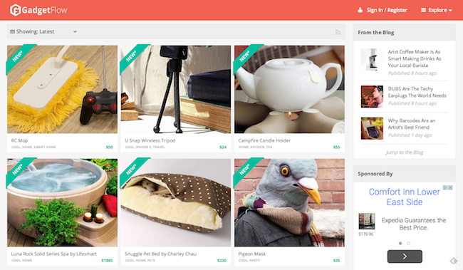
Flat design eliminates shadows and other design features that make graphics look three-dimensional. Skeuomorphic design is outdated -- the digital world no longer pines after a midway design featuring “real-world” details such as stiff computer folders or copied lines on a calendar app. Flat design requires less complex coding and images, instead including more white space, larger buttons, and clearer font.
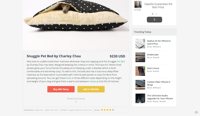
Gadget Flow is an example of a website that has flat design. Notice the consistently flat lines -- especially on the calls-to-action (CTAs) and image corners. 
gadget_flow1
gadget_flow_2

What are the benefits? 

Because of its reliance on white space and large, digital-based images, flat design makes websites faster to load and renders properly across all devices. This clean, modern, and organized design is also appealing to businesses looking to make their designs more "modern." 

2) Infinite Looping Videos 

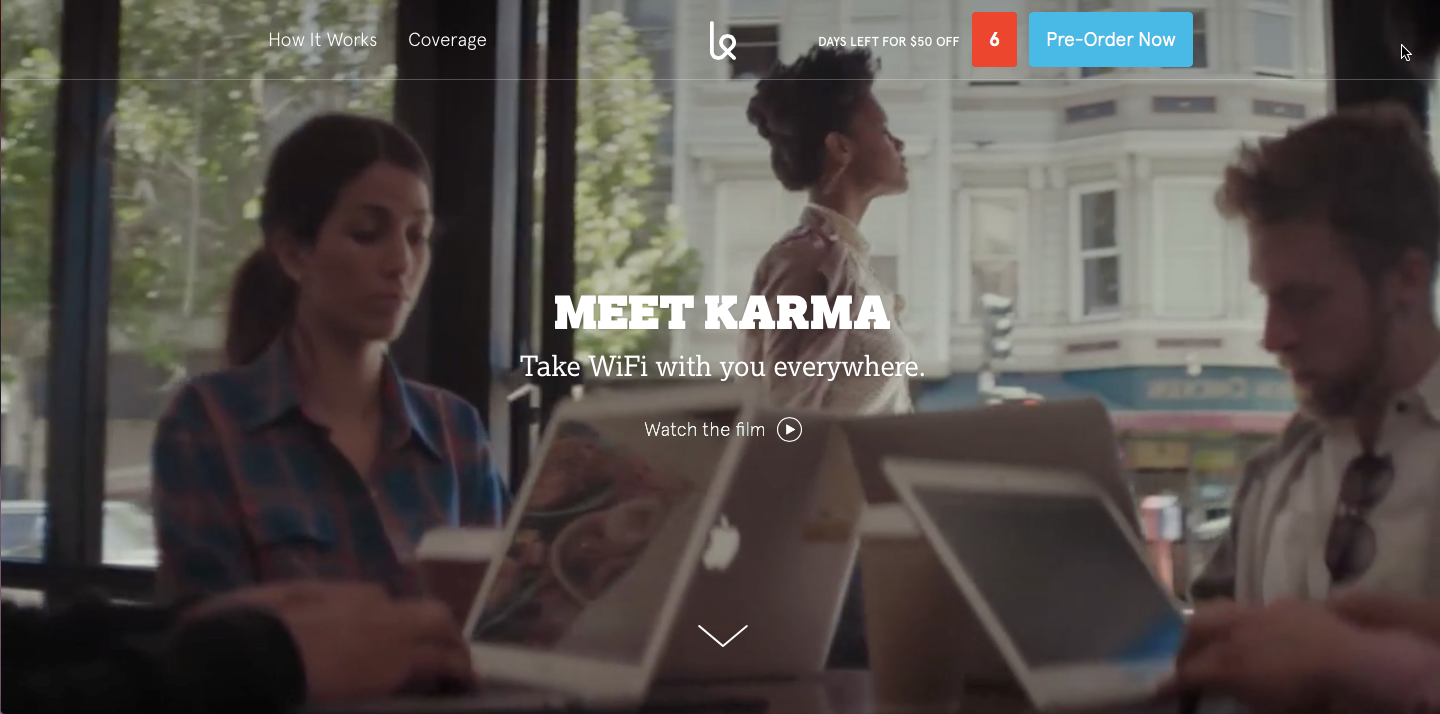
These videos are seamlessly weaved into the header of a webpage -- no play button or flash needed. These videos display various moving scenes, yet remain static on the page. 
Karma Wifi's website has an awesome looping video as the homepage header. Seen below, Karma's video creates a striking introduction to the brand and blends into the design of the entire website. 
karma_wifi

What are the benefits? 

Web graphics are now about creating emotional connections and telling a story through content -- this feature spearheads the beginning of a company’s “story." And because it's moving on the page, people will be more likely to notice it, and maybe even click on it to watch a longer video or visit a landing page.
Interested in creating this infinite looping videos on HubSpot's COS? Learn how on the Design Hub Blog

3) Detailed Cut-Out Images With Solid Light Background

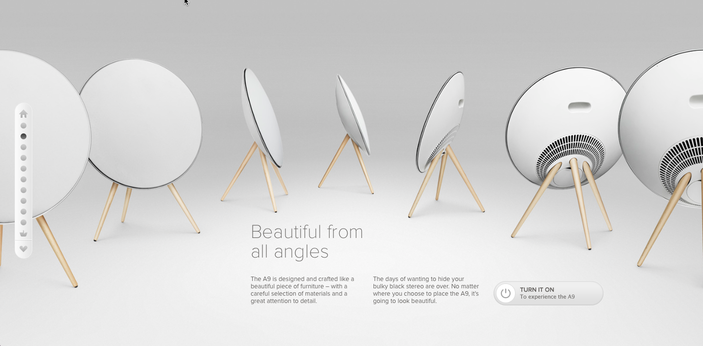
This web graphic is made up of a detailed cutout image laid on top of a nearly or completely solid color background. This style of graphic is continuously being featured on top rated design websites' product pages. Hint: You can find this trend on Apple's product pagesBeoPlay's A9 product page is another great example of this style of graphic. 
A9_picture

What are the benefits? 

Playing into the popular minimalistic design trend, this style of graphic calls attention to the product. Customers can really focus on a product's features. This style of graphic is especially great for parallax scrolling and one-page websites; with a light background, the image can easily transition into a different section of the page. 

4) Custom Illustrations and Icons 

Say goodbye to awkward stock photos and hello to custom animations as one of the latest design trends. Whether they are educational, product-orientated, or culture-based, custom illustrations are can be a central design tactic for some companies.
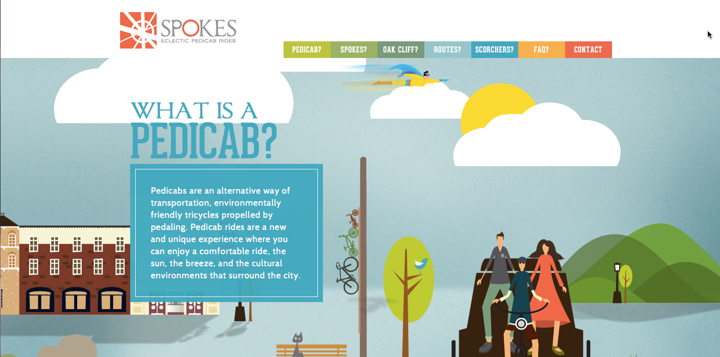
Some custom illustrations tell an interactive story such as Coke's building of memories asset, which allows visitors to use their mouse to climb up a urban skyscraper. Other websites such as Spokes website use these illustrations and parallax scrolling to explain the purpose behind the company's products. 
better_verison_of_the_pedicab

What are the benefits?

Illustrations are created to match the company’s mission statement and overall values. They allow the visitor to interact with the company in a fun, playful, yet informative way. 
It also helps users identify what content "belongs" to a company. In the words of HubSpot web designer, Anna Faber-Hammond, "An customized icon set that is consistent across a site helps create visual recognition for a company website and explains key messages to users beyond the typical type and copy." 

5) Grid Design 

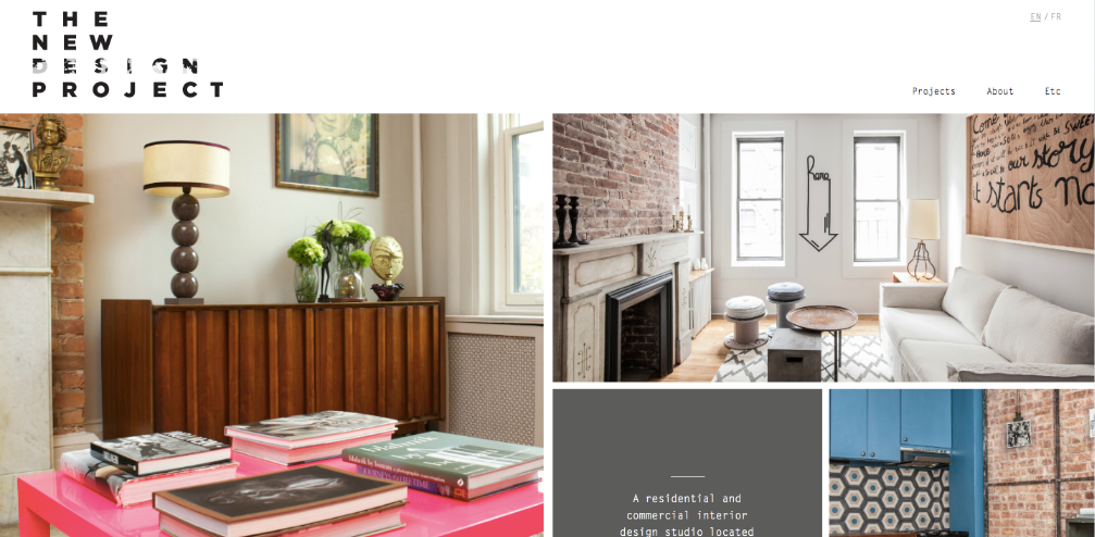
Whether it comes across as clean, sharp, stately, or quirky, grid design can be used for a variety of purposes. Giving visitors a glimpse into different facets of a website's content, grid design is kind of like a collage, emphasizing visuals and bold text. This design can be used for solely organizational purposes, like Curioo's elegant grid-style blocks, or for emphasizing the company's uniqueness, like Joost Huver's website does. 
The New Design Project does both. On their homepage, this interior design company uses large blocks to quickly show visitors samples of their work and have a link attached to lead visitors to more information about that specific project. 
The_New_Design_Project

What are the benefits? 

Grid design can turn cluttered content and an assortment of company case studies into an organized and sleek gallery that links to important parts of your website. It highlights a website’s key assets and navigates visitors to the next steps on the website that are most important to the company's overall goals, such as finding out more about a product or filling out a landing page form. 

6) Fixed Header Bar 

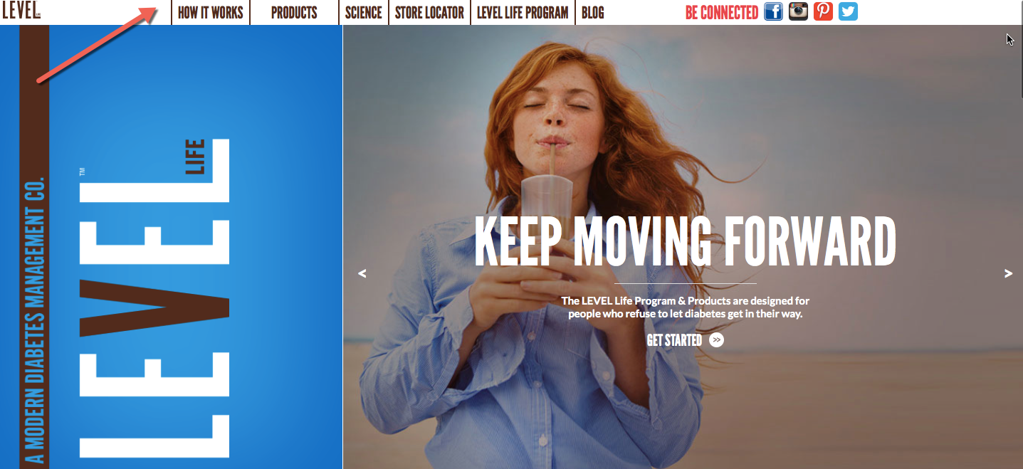
A fixed header bar lives on the top of a website -- and remains at the top of a page no matter how far down a visitor scrolls down on a page. Although this is a feature a developer will have to code, it also is a graphic design element because it ties together the entire look of a website.
For example, LevelFoods has a fixed header bar with colors and typography that match the rest of the website's design patterns.
levelfoods_fixed_header_bar-1

What are the benefits?

Fixed headers make it easy for visitors to navigate the website from any page they're on. Most visitors are not willing to spend time searching for a page on your website -- they want to find it the second they land on page. The fixed header helps guide visitors wherever they are on the site. The fixed header also allows marketers to highlight important pages, build branding across the website, and show vital CTAs in a prominent position across the website. 

7) Unique Geometric Shapes 

Web design is also moving toward incorporating unique geometric shapes -- not just typical squares and rectangle.
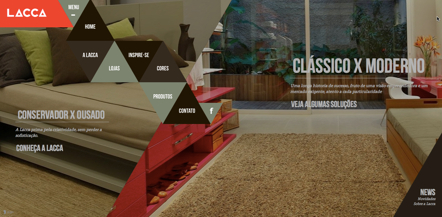
Lacca's website has created an origami triangle shape for it's navigational bar on its homepage to illustrate different paths throughout the website in a standout way. The two overlapping large background images also vary from the typical rectangular content containers.
Laccageometricshapessites

What are the benefits?

This web graphic design trend is typically bright and original, creating an opportunity for symbolic branding. Similar to block design's purpose, varying geometric shapes is a more standout design element. This graphic design also allows room to incorporate various other previous trends without overpowering the visitor. 
A pro tip from Faber-Hammond on using geometric shapes in your design: "Designing with unique shapes can be great. But it's important that if you get creative, you also make the web design clear. Use user testing to ensure that your visitors are interacting with it and can still find the correct information."