How To Design For Human Nature
Today, most of us would admit to being overwhelmed with the abundant options made available through technological advances. When it comes to determining which products to use for navigating our daily lives, we typically embrace the simpler digital platforms and products. Many small businesses, for example, choose Square to automatically link accounts and payments because of its simple UI. Similarly, Nest solved the complexities involved with operating and programing thermostats, a concept so popular that Google acquired the company.
These choices have a lot to do with the way humans are hardwired. Research on cognitive fluency--whether or not something is easy to think about--has shown that this ability to process things easily shapes what we believe, how we invest, and what we think is beautiful. Simply put, people gravitate toward ideas that are simple to understand.

Many aspects of design impact this ease of mental effort--or fluency--including font style and size, terminology, and branding. In fact, fluency can so dramatically increase a message’s acceptance that fluent design has been known to improve reception and increase sales. The SOMA water pitcher is a great example. The company not only designed a beautiful and sustainable water pitcher and filter, but its model ensures that the filters are on an auto-purchase subscription, which consumers can control via the brand website. One less thing to think about.

So, how can we design for today’s technological realities while keeping cognitive fluency in mind?
COMPLEX VERSUS SIMPLE
As designers, it is our responsibility to take complex information and whittle it down to something functional, easy to interact with, and aesthetically pleasing. Such efforts, if done correctly, can make a product or experience easier for consumers to digest and will ultimately contribute to a higher level of cognitive fluency. In other words, consumers will “get it” with relatively little effort.
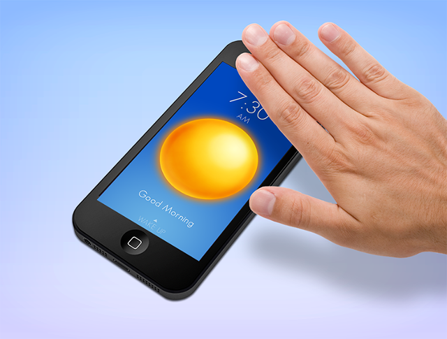
The Wake Alarm app is a great example. This was designed for the iPhone (a device that already has an alarm function) to be a beautiful and innovative alarm system. Users need only slap the device to snooze, flip the phone over to turn off alarms, or enable the device to shake to wake them up. The app has received 4.5 stars with almost 400 ratings in the app store-proving that simplicity sells.

DISPARATE VERSUS CONNECTED
Another consideration when thinking about cognitive fluency is whether things are scattered or connected--and how easy it might be for your audience to better adapt to a more connected experience.
Of course, Apple found this to be true with the iPhone; instead of carrying around a phone, camera, and MP3 player as separate devices, the brand was able to invent a smooth interface and technology that allowed consumers to enjoy all three functions through just one product. Millions of people around the world have adapted to new behaviors so that they can enjoy a simpler experience with the iPhone. For example, we now use a pinch movement with our fingers to zoom into photos, swipe to move through pages, and we’ve learned to tap a screen to change focus. These behaviors, formerly unknown, have come to be pretty standard multi-touch behaviors, even across non-Apple devices.

Amazon Mobile is another great example of a service designed for simplicity and connectivity. A new feature called Flow recognizes items users may want to buy via their shape, size, color, box text, and general appearance. It builds on previous features, which allowed users to enlist the app to not only compare prices and check availability on a plethora of products by scanning a barcode, but to also log into their Amazon account through the app to complete a secure purchase on the go.
These products illustrate the benefits of designing for connectivity, allowing users to harness many experiences through the simple understanding of just one very well designed product.
INTERRUPTION VERSUS ENGAGEMENT
Finally, designing something to be simple and connected can only work well if it is offered in a way that fits within some context of people’s current behaviors. It is better to engage an audience than to interrupt. If we do this well, the rewards will be profound.
Take for example Rent the Runway, a membership-based website that rents high-end designer apparel and accessories for a four- or eight-day time period. The entire experience is designed to tap into the existing behaviors of the brand’s clientele--women who want something fabulous to wear to special events without the not-so-fabulous price tag. The concept is a great example of category disruption: finding a better way to do things.
Through the brand’s online and social channels, Rent the Runway also designs its consumer engagement to reflect the realities of customers’ lives--encouraging them to pick favorite runway looks during New York fashion week or offering discounts and special selections during wedding season. This approach has turned out to be memorable for the brand’s primary audience, and has resulted in thousands of new and returning customers.
If we are to think about the experiences that touch us all on a deeper level, many times we’ll find that it has been the simple moments and ideas that have changed our lives in the most profound ways. As designers, it’s so important for us to remember the end goal of ultimately developing products and creating experiences that are easy for our audience to interact with and incorporate into their lives, knowing that, at our core, our job is to make things better for our community and hopefully change lives in the process.