5 Tips for Brands to Get the Most Out of Twitter's Latest Update
Posted April 12, 2014comments
0
 As you have likely already seen, Twitter began implementing a new design this week that has a major impact both on the interface and functionality of the site. The new look shares many similarities with Facebook and focuses more on improving the overall user experience while making it easier to navigate and filter through tweets.
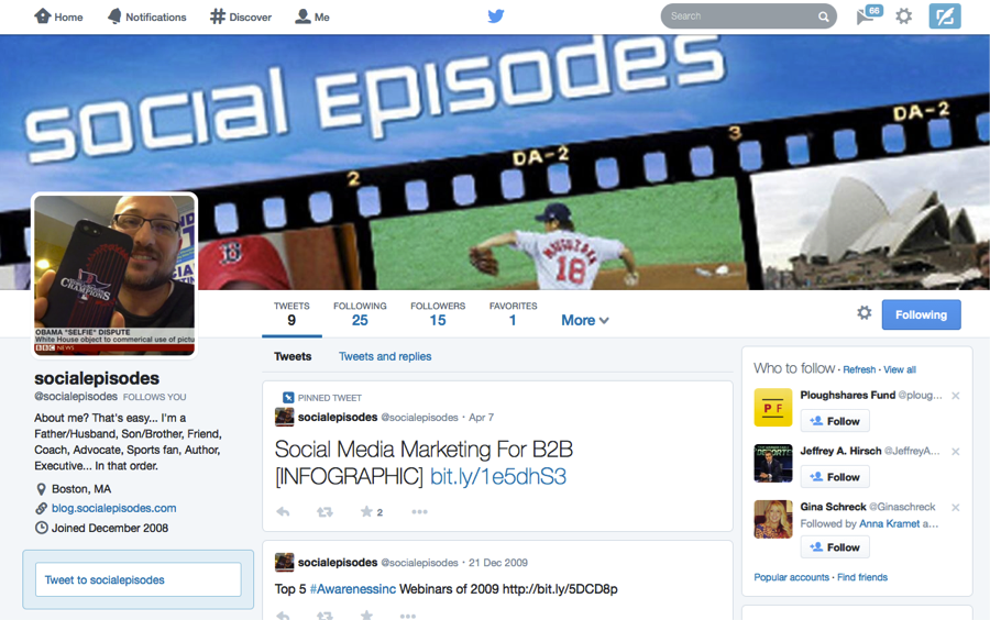
The most visible area of the latest Twitter upgrade are the changes to profile and cover images. The new cover photo spans the entire header of the profile page and replaces the background image used in the previous version of Twitter. The look is very clean and offers users the ability to focus on a single image for their profile page. In addition, users profile images are larger making it easier to see the individual.
From a functional perspective, Twitter has also introduced new functionality to improve the user experience by focusing on the most important content. The three areas with the biggest functional impact are:
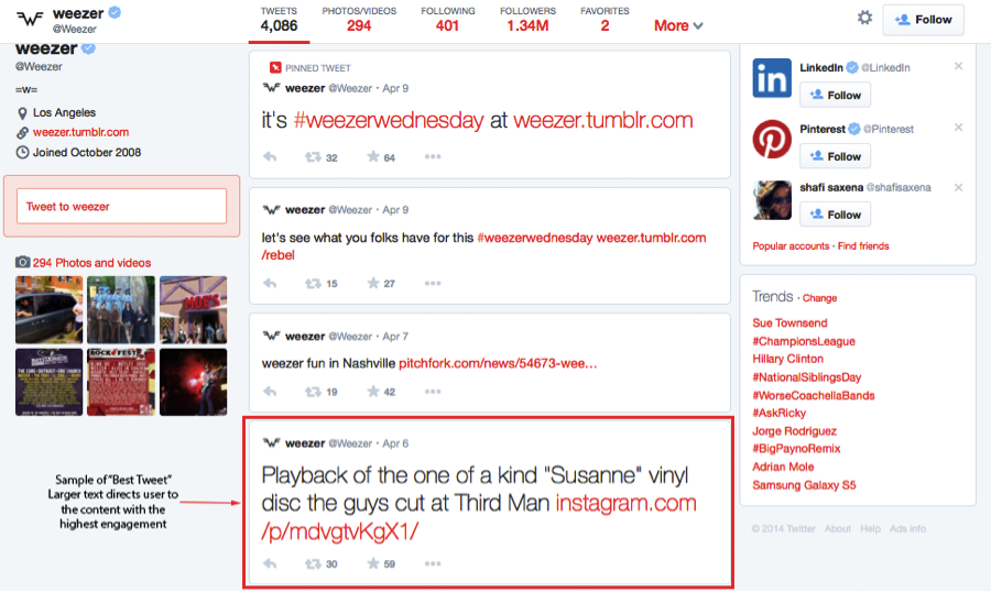
- "Best Tweets": This feature is interesting because it will help profile visitors sort through the noise of Twitter profiles by highlighting the tweets that have generated the most engagement. Content with the highest engagement will appear with larger text, making it easier for users to find and engage with.
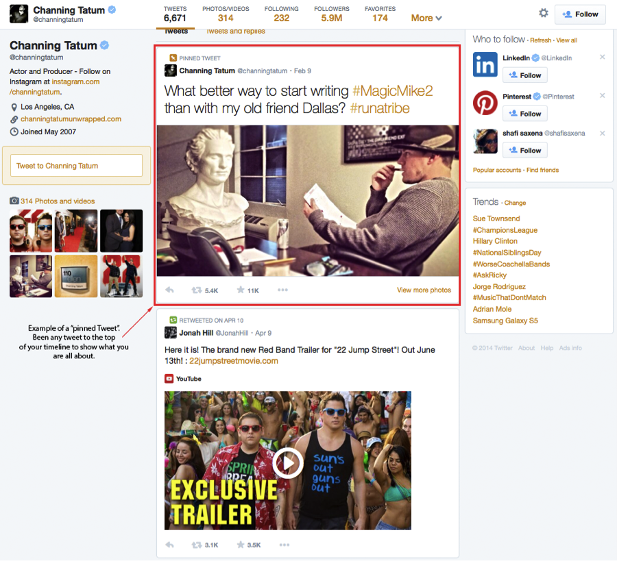
- "Pinned Tweets": I really like this feature because it offers a lot of potential for brands as well as individual users (more on this below in the tips section). This gives you the ability to "Pin" of feature one of your tweets at the top of your profile stream so visitors to your profile see it immediately.
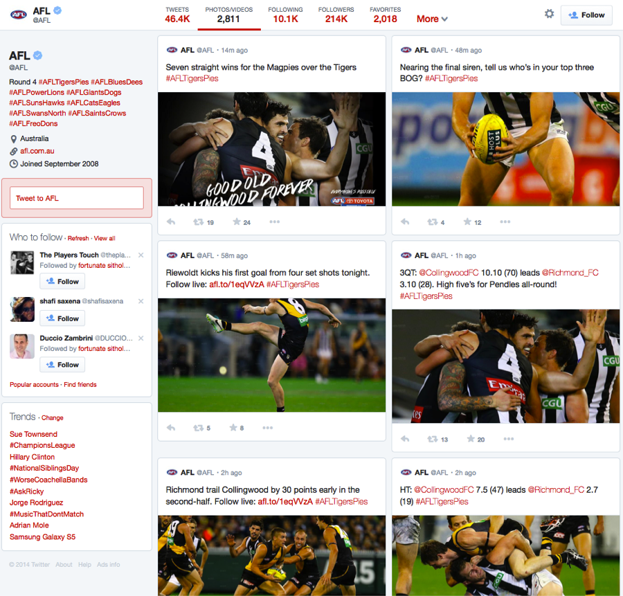
- Filtered Tweets: This is another cool feature that improves the overall user interface and makes it more user friendly. Twitter now gives visitors the option of choosing which timeline to view when checking out profiles. Users can select: a basic Twitter stream, a stream of only photos and videos, or tweets and replies.
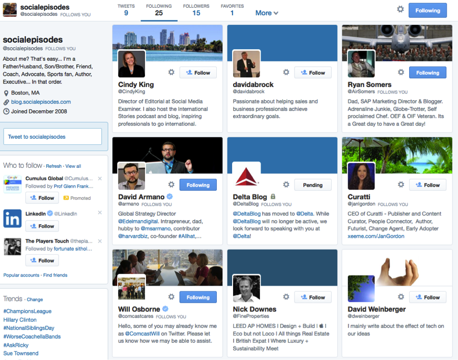
- Finally, the new follower & following list: Twitter has made the following/followers lists much more graphically orientated. You can now go visually see who is following a profile and who they are followers of through an easy to understand graphical interface.
Latest Mobile Functionality
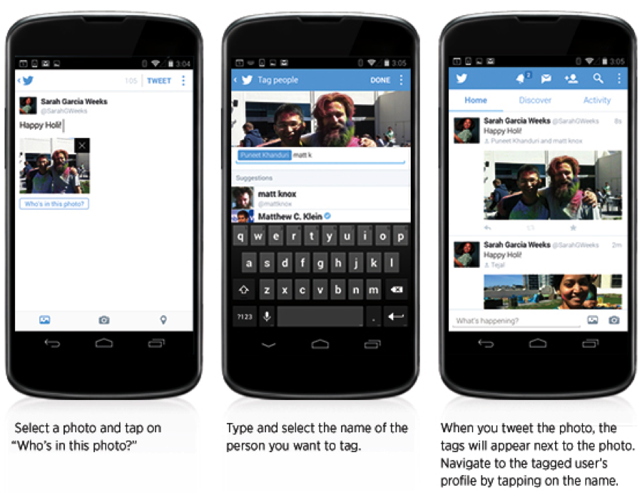
In addition to the upgrades made this week on Twitter.com, Twitter has also rolled out some significant upgrades to their mobile interface for photo sharing. The new functionality has made the Twitter mobile client more dynamic for photos and includes:
- Support for tagging up to 10 people in a photo – without impacting the 140 character limit Through the mobile interface you can now tag photos with up to 10 individuals and the best part is the number of individuals tagged in a photo does not impact the 140 character limit.Twitter's blog offers the instructions below:
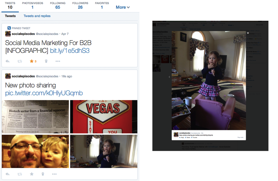
- Share Multiple Photos in a Single Tweet Twitter has implemented the ability to add multiple (up to four) photos to a single tweet. This features automatically creates a collage that visitor can scroll through as they view the tweet. Below is an example showing the four photos and the lightbox that appears for the gallery.
Tips for Brands Looking to Leverage the New Functionality
Twitter will begin rolling out the new change to Profile Pages to users over the next few weeks. In the meantime, it’s a good time for brands to begin thinking about how they will leverage this new functionality. Here are some tips to help get you started:
- Plan Your New Profile and Cover Images: There is no better time than now to begin designing and developing your new cover photo and profile image to meet the new Twitter requirements. Twitter recommends dimensions for header photo of 1500px in width × 500px in height.
- Offer Specials with Pinned Tweets: You now have the opportunity to feature a specific tweet a the top of your profile page to let new visitors get a better sense of who you are and what your profile is all about. One thing for brands to consider is featuring a tweet that offers an exclusive piece of content to visitors. For example, feature a tweet that offers a white paper, eBook or Infographic to help get visitors engaged.
- Use the Mobile Features for Photo Sharing: Tagging multiple people and posting multiple photos is a great way for brands to better engage with their audience. Consider posting multiple photos that illustrate a story or message to your audience and tag individuals that you think would appreciate the message.
- Larger Profile Image: The larger profile image on the new version of Twitter gives users more real estate to set the tone of their page. Consider changing profile photos on an ongoing basis to help keep users coming back.
- Make your Photos Count: This new version of Twitter places a deep emphasis on photos and video. Publish photos that are bold and catch peoples attention. This will help to increase engagement when visitors choose to filter your tweets using the photo/video filter.
Finally, brands can expect to see more changes from Twitter in the not-so-distant future. Just last week,Vivian Schiller, Twitter’s head of new partnerships shook the "twitterverse" by suggesting that hashtags and @replies are "arcane" and could possible be a thing of the past. When asked to clarify the remarks, Twitter representatives had this to say: "By bringing the content of Twitter forward and pushing the scaffolding of the language of Twitter to the background, we can increase high-quality interactions and make it more likely that new or casual users will find this service as indispensable as our existing core users do. And we took initial steps in that direction with the introduction of media forward timelines and in-line social actions in October, and we're already starting to see early signs that those initiatives are working well."
