7 Current Design Trends Every Marketer Should Know
by Laura Kane

October 30, 2014 at 6:00 AM
62
inShare
inShare
 Truthfully, not all of us have the best design chops -- but that doesn't mean we should be in the dark about the latest design trends. While it may not be part of your day-to-day activities, one day, you'll find yourself dragged into a project like a website redesign. Suddenly, it'll feel like you're in a foreign country and you can't understand or speak the language, but you somehow have to navigate it all.
Luckily, it's easy to save yourself from feeling lost in the next design project you're collaborating on -- you've just got to do your homework.
This article is a great place to start your research. Compiled just for marketers, here are the top current graphic design trends you should know about.
1) Flat Design
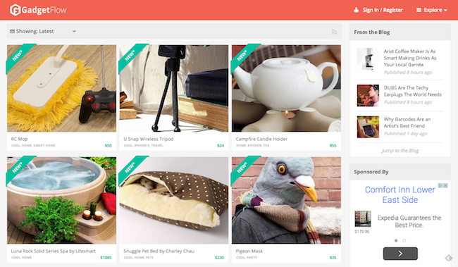
Flat design eliminates shadows and other design features that make graphics look three-dimensional. Skeuomorphic design is outdated -- the digital world no longer pines after a midway design featuring “real-world” details such as stiff computer folders or copied lines on a calendar app. Flat design requires less complex coding and images, instead including more white space, larger buttons, and clearer font.
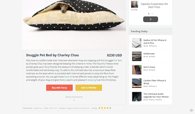
Gadget Flow is an example of a website that has flat design. Notice the consistently flat lines -- especially on the calls-to-action (CTAs) and image corners.
What are the benefits?
Because of its reliance on white space and large, digital-based images, flat design makes websites faster to load and renders properly across all devices. This clean, modern, and organized design is also appealing to businesses looking to make their designs more "modern."
2) Infinite Looping Videos
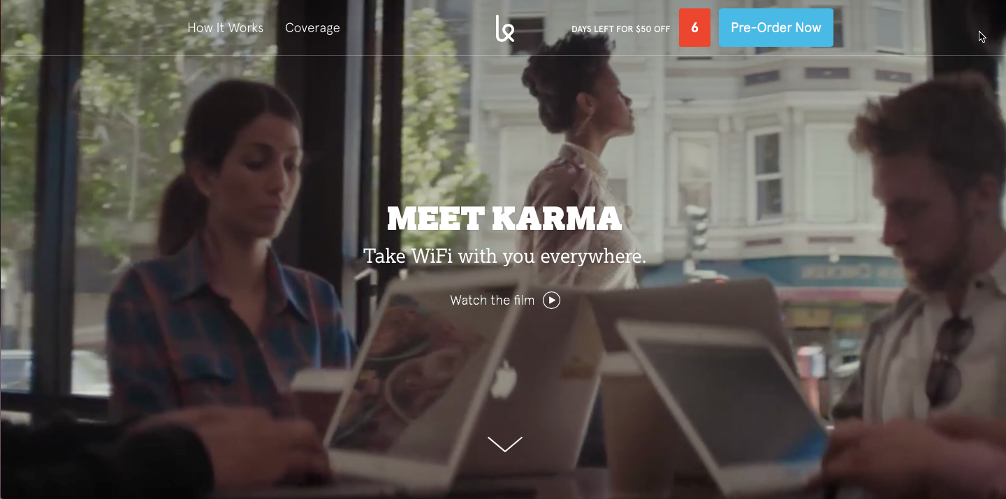
These videos are seamlessly weaved into the header of a webpage -- no play button or flash needed. These videos display various moving scenes, yet remain static on the page.
Karma Wifi's website has an awesome looping video as the homepage header. Seen below, Karma's video creates a striking introduction to the brand and blends into the design of the entire website.
What are the benefits?
Web graphics are now about creating emotional connections and telling a story through content -- this feature spearheads the beginning of a company’s “story." And because it's moving on the page, people will be more likely to notice it, and maybe even click on it to watch a longer video or visit a landing page.
Interested in creating this infinite looping videos on HubSpot's COS? Learn how on the Design Hub Blog.
3) Detailed Cut-Out Images With Solid Light Background
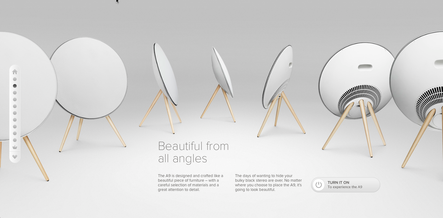
This web graphic is made up of a detailed cutout image laid on top of a nearly or completely solid color background. This style of graphic is continuously being featured on top rated design websites' product pages. Hint: You can find this trend on Apple's product pages. BeoPlay's A9 product page is another great example of this style of graphic.
What are the benefits?
Playing into the popular minimalistic design trend, this style of graphic calls attention to the product. Customers can really focus on a product's features. This style of graphic is especially great for parallax scrolling and one-page websites; with a light background, the image can easily transition into a different section of the page.
4) Custom Illustrations and Icons
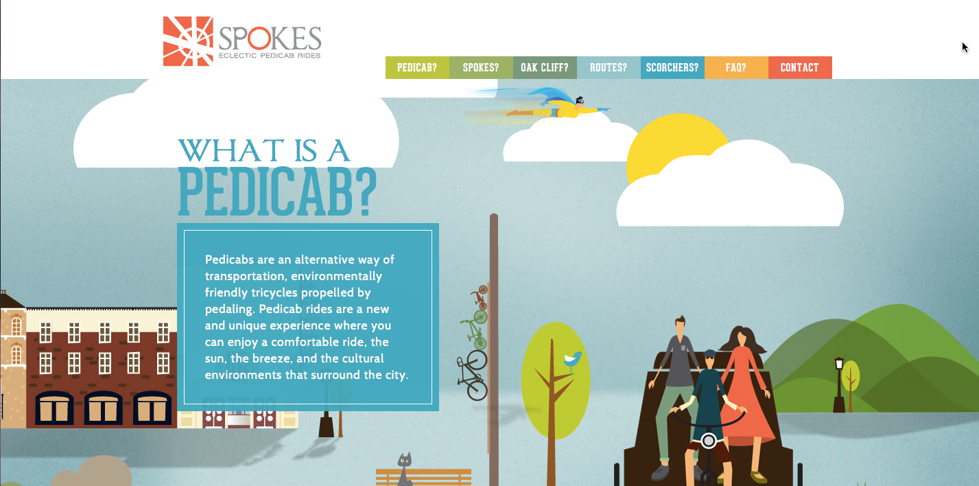
Say goodbye to awkward stock photos and hello to custom animations as one of the latest design trends. Whether they are educational, product-orientated, or culture-based, custom illustrations are can be a central design tactic for some companies.
Some custom illustrations tell an interactive story such as Coke's building of memories asset, which allows visitors to use their mouse to climb up a urban skyscraper. Other websites such as Spokes website use these illustrations and parallax scrolling to explain the purpose behind the company's products.
What are the benefits?
Illustrations are created to match the company’s mission statement and overall values. They allow the visitor to interact with the company in a fun, playful, yet informative way.
It also helps users identify what content "belongs" to a company. In the words of HubSpot web designer, Anna Faber-Hammond, "An customized icon set that is consistent across a site helps create visual recognition for a company website and explains key messages to users beyond the typical type and copy."
5) Grid Design
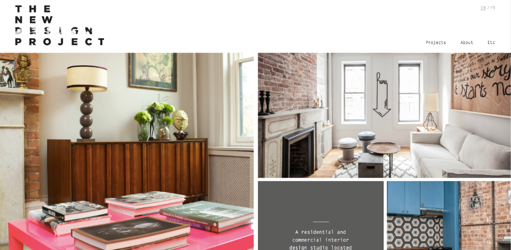
Whether it comes across as clean, sharp, stately, or quirky, grid design can be used for a variety of purposes. Giving visitors a glimpse into different facets of a website's content, grid design is kind of like a collage, emphasizing visuals and bold text. This design can be used for solely organizational purposes, like Curioo's elegant grid-style blocks, or for emphasizing the company's uniqueness, like Joost Huver's website does.
The New Design Project does both. On their homepage, this interior design company uses large blocks to quickly show visitors samples of their work and have a link attached to lead visitors to more information about that specific project.
What are the benefits?
Grid design can turn cluttered content and an assortment of company case studies into an organized and sleek gallery that links to important parts of your website. It highlights a website’s key assets and navigates visitors to the next steps on the website that are most important to the company's overall goals, such as finding out more about a product or filling out a landing page form.
6) Fixed Header Bar
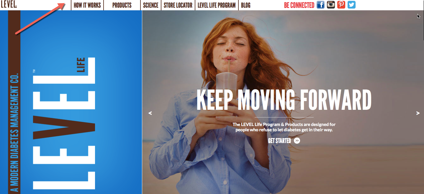
A fixed header bar lives on the top of a website -- and remains at the top of a page no matter how far down a visitor scrolls down on a page. Although this is a feature a developer will have to code, it also is a graphic design element because it ties together the entire look of a website.
For example, LevelFoods has a fixed header bar with colors and typography that match the rest of the website's design patterns.
What are the benefits?
Fixed headers make it easy for visitors to navigate the website from any page they're on. Most visitors are not willing to spend time searching for a page on your website -- they want to find it the second they land on page. The fixed header helps guide visitors wherever they are on the site. The fixed header also allows marketers to highlight important pages, build branding across the website, and show vital CTAs in a prominent position across the website.
7) Unique Geometric Shapes
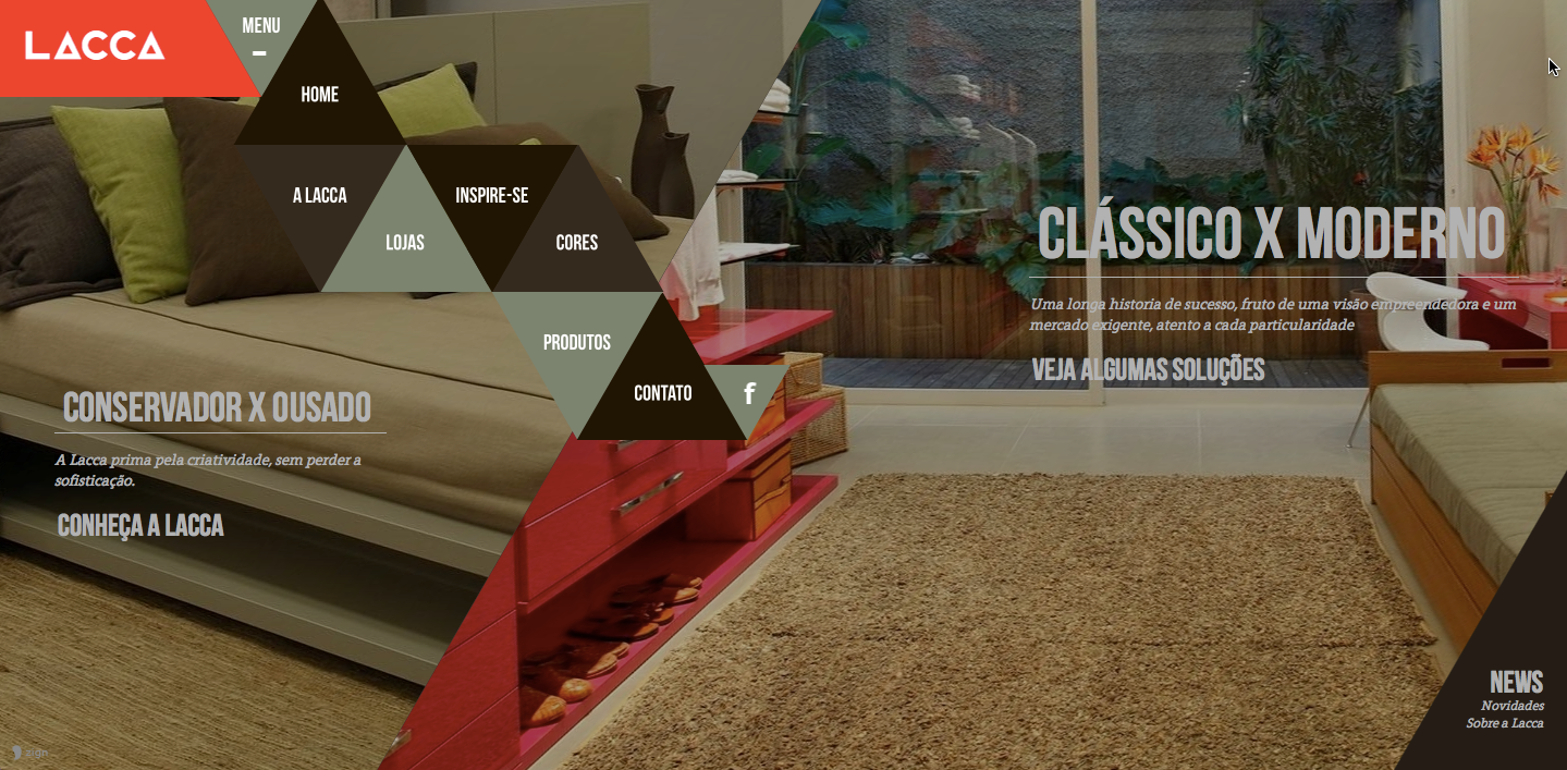
Web design is also moving toward incorporating unique geometric shapes -- not just typical squares and rectangle.
Lacca's website has created an origami triangle shape for it's navigational bar on its homepage to illustrate different paths throughout the website in a standout way. The two overlapping large background images also vary from the typical rectangular content containers.
What are the benefits?
This web graphic design trend is typically bright and original, creating an opportunity for symbolic branding. Similar to block design's purpose, varying geometric shapes is a more standout design element. This graphic design also allows room to incorporate various other previous trends without overpowering the visitor.
A pro tip from Faber-Hammond on using geometric shapes in your design: "Designing with unique shapes can be great. But it's important that if you get creative, you also make the web design clear. Use user testing to ensure that your visitors are interacting with it and can still find the correct information."
