Data can be very powerful. If you can actually understand what it's telling you, that is.
It's not easy to get clear takeaways by looking at a slew of numbers and stats. You've got to have the data presented in a logical, easy-to-understand way.
Enter data visualization. The human brain processes visual information better than it processes text -- so using charts, graphs, and design elements, data visualization can help you explain trends and stats much more easily.
But not all data visualization is created equal. (Just check out “Why Most People’s Charts and Graphs Look Like Crap” to see what I mean.)
So, how do organize data in a way that's both compelling and easy to digest? Get inspired by the following 16 examples of data visualization that communicate interesting information with both style and substance.
Click here to download our free guide to data visualization for more examples and tips.
What is Data Visualization?
Data visualization refers to representing data in a visual context, like a chart or a map, to help people understand the significance of that data.
Whereas data in text form can be really confusing (not to mention bland), data represented in a visual format helps people extract meaning from that data much more quickly and easily. You can expose patterns, trends, and correlations that may otherwise go undetected.
Data visualization can be static or interactive. For centuries, people have been using static data visualization like charts and maps. Interactive data visualization is a little bit newer: It lets people drill down into the dirty details of these charts and graphs using their computers and mobile devices, and then interactively change which data they see and how it's processed.
Ready to feel inspired? Let's take a look at some great examples of interactive and static data visualization.
Examples of Interactive Data Visualization
1) Why Buses Bunch
Here's a wonderful example of a complex data set boiled down into what that looks and feels like a game. In this visualization, the folks at Setosa are showing how "bus bunching" happens, i.e. when a bus gets delayed and later causes multiple buses to arrive at a single stop at the same time.
Telling this story in numbers alone would be pretty difficult, but instead, they turn it into an interactive game. While the buses rotate along a route, we can click and hold a button to delay a bus. Then, all we have to do is watch to see how even a short delay causes the buses to bunch together after a time.

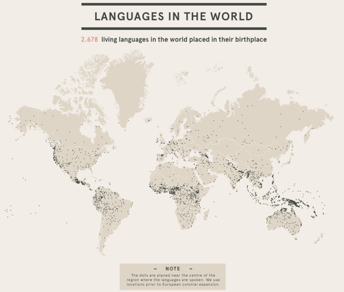
2) Languages in the World
This interactive by DensityDesign does an impressive job of introducing the non-linguist (aka most of us) to the many world languages. All 2,678 of them.
This piece allows you to explore common languages families, see which languages are most spoken, and view where languages are spoken around the world. This is great visual storytelling: taking an in-depth subject and breaking it down in an easy-to-understand way.

3) Percent of U.S. Population by Age Group
This is a strong example of how to present a single data set in a compelling way. Pew Research created this animated GIF composite to show shifts in population demographics over time. It’s a great way to tell a larger story in a neat package.
Plus, this type of micro-content is easy to share on social or embed in blogs, extending the content’s reach. If you want to make a GIF of your own using Photoshop, here's a step-by-step tutorial.
