It’s only a few months into 2017, but brands are already making their presences known – in a big way. Concepts and visuals are stronger than ever in this year’s content marketing efforts.
“We’re in a golden age of visuals, and content is king,” says Pam Grossman, Getty Images’ Director of Visual Trends. “2017 is all about images that are bold, impactful, and evocative.”
Each year, Getty releases an annual trends report on the types of images that most resonate with viewers and leave lasting impressions. Here’s a look at the 2017 list, inspiring examples from brands, plus tips on incorporating these new visual cues into your content marketing.
Virtuality

The digital realm has infiltrated just about every aspect of our daily lives, and more brands are experimenting with virtual reality (VR).
Virtuality is about the cutting edge technologies that make these new realities possible, but even more so about the changing definition of being human in an age that continues to elevate our existence.
Aesthetically, the trend expresses itself through first-person perspectives and images that evoke a shared experience. We’re no longer merely looking at visuals; we now have the capacity to step inside them.
According Alli Echelman, Content Marketing Specialist at Getty Images, it’s “about creating a deeper connection with your audience. Including VR and 360-degree imagery allows you to engage on an entirely new level and actually immerse your audience within your story.”
The enormous potential for virtual engagement spans industries, and falls perfectly into place with travel, in particular. One of the latest efforts comes from the Tourism Authority of Thailand, which unveiled four 360-videos giving viewers a taste of what it would be like to visit and explore the Southeast Asian country. The result? A incredibly immersive, interactive, and inspiring campaign that’s sure to ignite wanderlust in viewers and get people packing for a trip to the Land of a Thousand Smiles.
Tip: VR and 360-degree videos are still big investments for brands, but they’re becoming increasingly accessible. These days, it takes more to win and sustain your audience’s attention. A virtual experience can offer them a new way to see, interact with, and remember your brand. (See the end of this story if you’re considering getting into the space.)
Color Surge
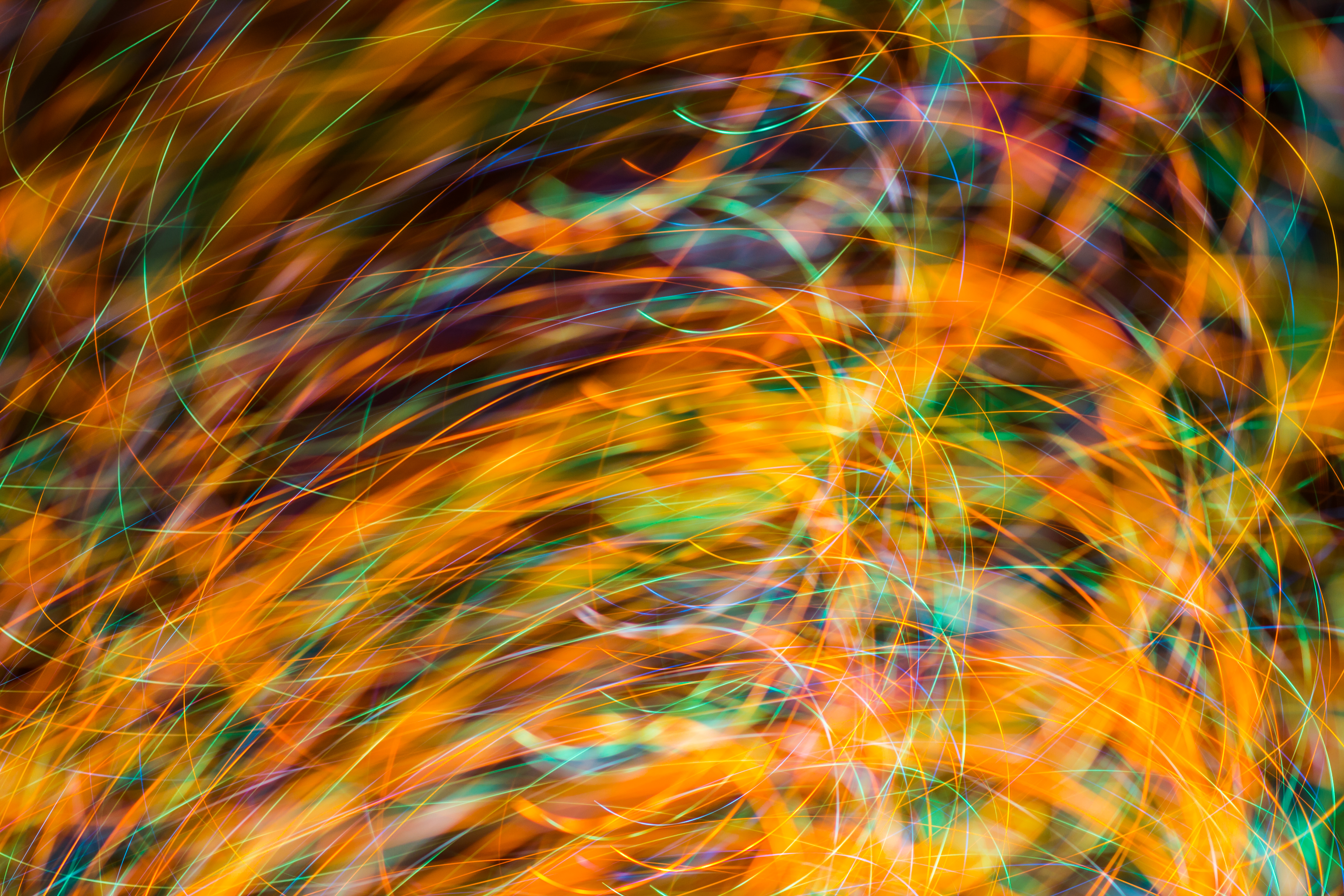
More rainbow-powered than tech-fueled, this trend is Getty’s answer to a recent resurgence in vivid color.
We’re seeing less of the 70s’ filter look and a rise in daring and sometimes strange color combinations, coming together in a new wave of visual sophistication.
The 2017 awards season was full of it: the bright blues, reds, and yellows of “La La Land,” the lush, shiny, greenish-blue hues of “Moonlight,” and the deep gem tones of “Nocturnal Animals” all worked to contribute a measure of magic to the films.
And speaking of cinema, thanks to the work of Roman Coppola, we’re seeing a surge of color in branding as well.
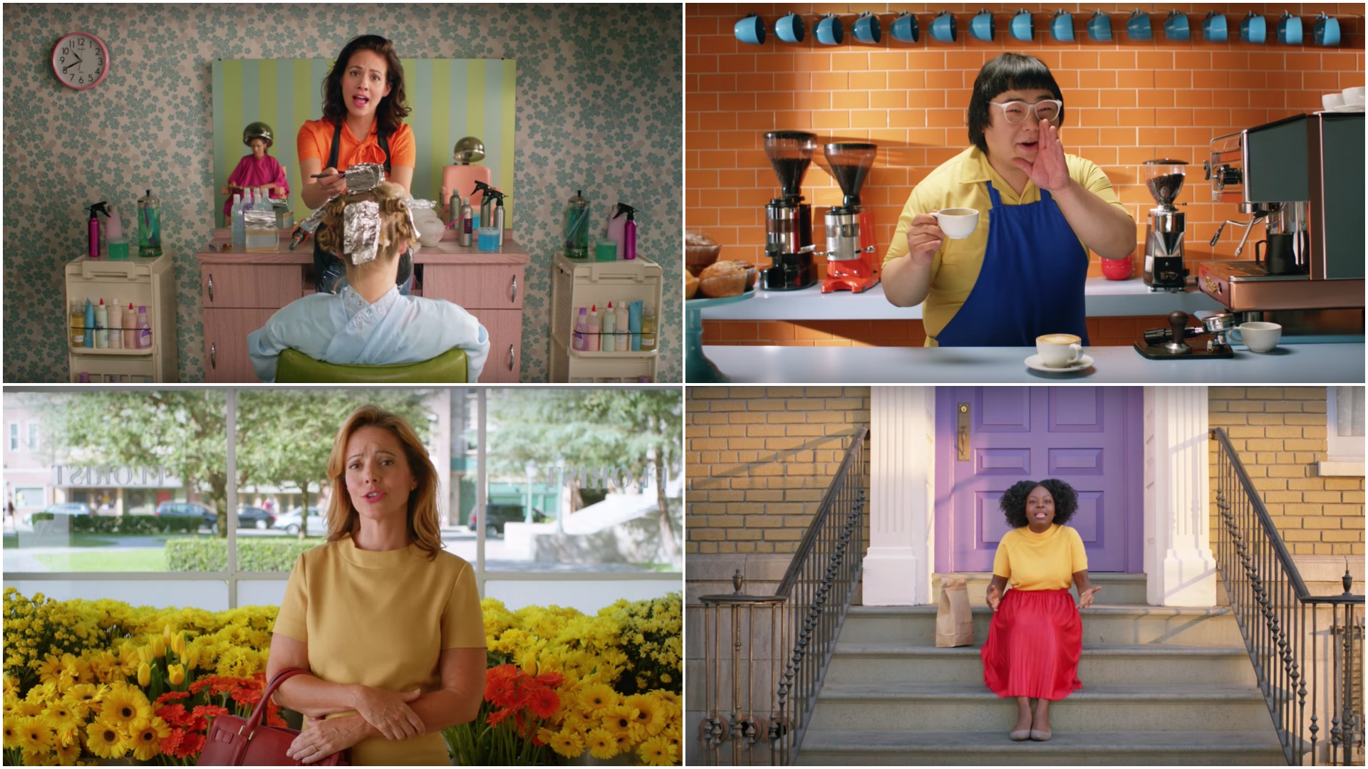
He’s the director behind real estate giant Re/Max’s recently released series of light-hearted ads that feature quite the colorful cast of characters. The campaign’s blend of bright backdrops and entertaining dialogue certainly leaves an impression, catching the eyes and ears of viewers just long enough to deliver the moral of the story (which also happens to be its title) – that “A Re/Max Agent Knows.”
Tip: Experiment and push the boundaries of your palette. Can your use of color tell a story all its own? Where in your content or brand strategy are you able to sneak some in? Think outside the box, do something unpredictable, and don’t be afraid to color past the lines.
Unfiltered

Unfiltered is the next iteration of what it means to be truly authentic.
It’s no secret that standing out in today’s endless flow of content is incredibly challenging. People see through preplanned poses and look straight past stylized shoots. The visual landscape is overly saturated, and in response, the new genuine is taking on more and more of a photojournalistic, documentary aesthetic – as true to life as can be.
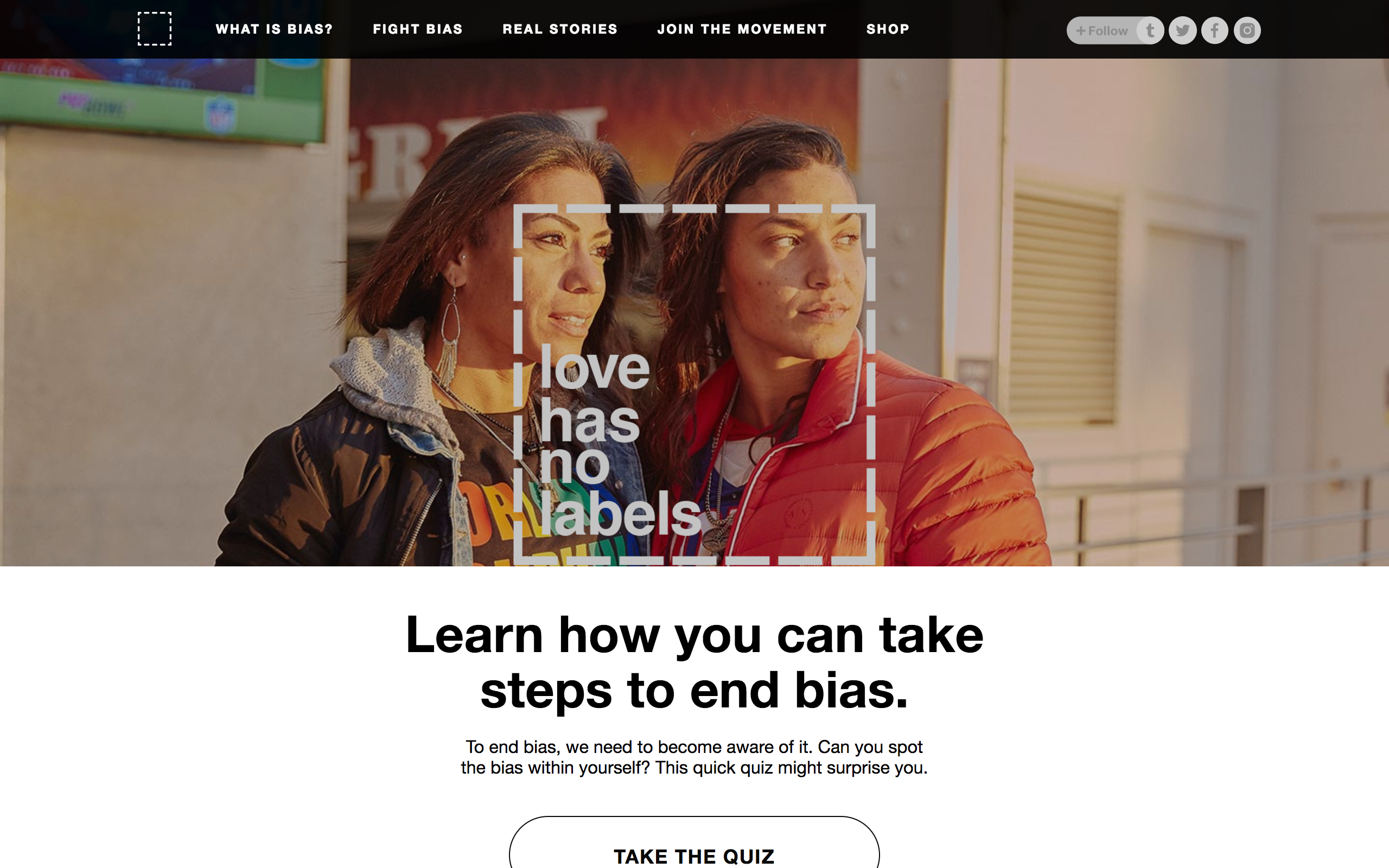
The Ad Council’s newest Love Has No Labels spot, “Fans of Love,” which was filmed at January’s NFL Pro Bowl in Orlando, follows this idea to a T.
The video, which was released on Valentine’s Day, follows a kiss cam celebrating a diverse and multicultural array of friends, families, and lovers – real people in real relationships who were at the game that day. The clip gained more than 3 million views on YouTube within days and is accompanied by a companion site that offers a quiz on bias, additional content on how to combat it, and a make-your-own statement photo function, adorned with the “love has no labels” message.
Tip: Show real people in your marketing efforts.
Whether it’s through curating a selection of candid images, or encouraging a spike in user-generated content (UGC), think: How can you capitalize on real life people and events? Is there a way to tie your brand values and mission to authentic imagery of what’s really happening around the globe and among your audience members?
Gritty Women
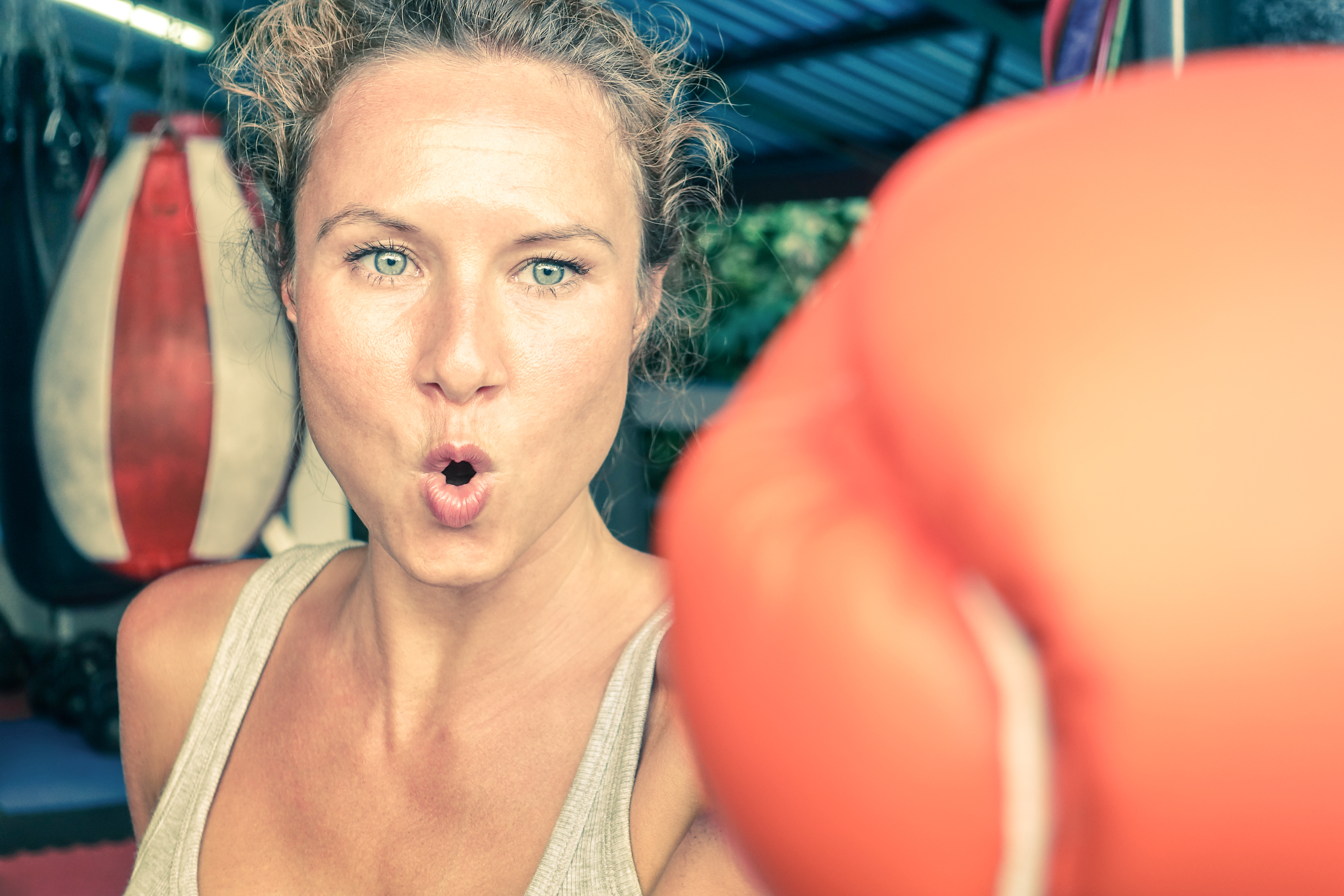
The world’s view of women is changing and brands that aren’t aligned with that shift will be left behind.
Long gone is the image of a pink-loving, salad-eating, heels-no-matter-what, made-up model mom, girlfriend, or lady-accessory. Today’s woman is the star of her own show, and she got there because she earned it. She’s ready to roll up her sleeves, put in the work, and get dirty if need be.
Brands like Reebok are doing their part to emphasize this point.
The company’s “Be More Human” campaign launched in 2015 and is still going strong, featuring fierce females throughout and promoting a newfound dedication to what the brand calls the tough fitness phenomenon.
“The more effort we put in, the richer our stories become,” reads the companion site. “Be More Human is a tale of constant progress. A movement of like-minded individuals who…[have] chosen to embrace the calluses that show our commitment.”
A lot of those calluses belong to women, and Reebok is sure to spotlight them throughout its content and across social media channels, elevating what it means to be a woman in 2017.
Tip: Forget the old stereotypes about the fairer sex, and forget that term, too. The future is female, and she’s every woman. Think feminism and the Lean In Movement. Think girl power. Think strong, diverse, intense, and independent. And then apply it to your visuals.
Global Neighborhood
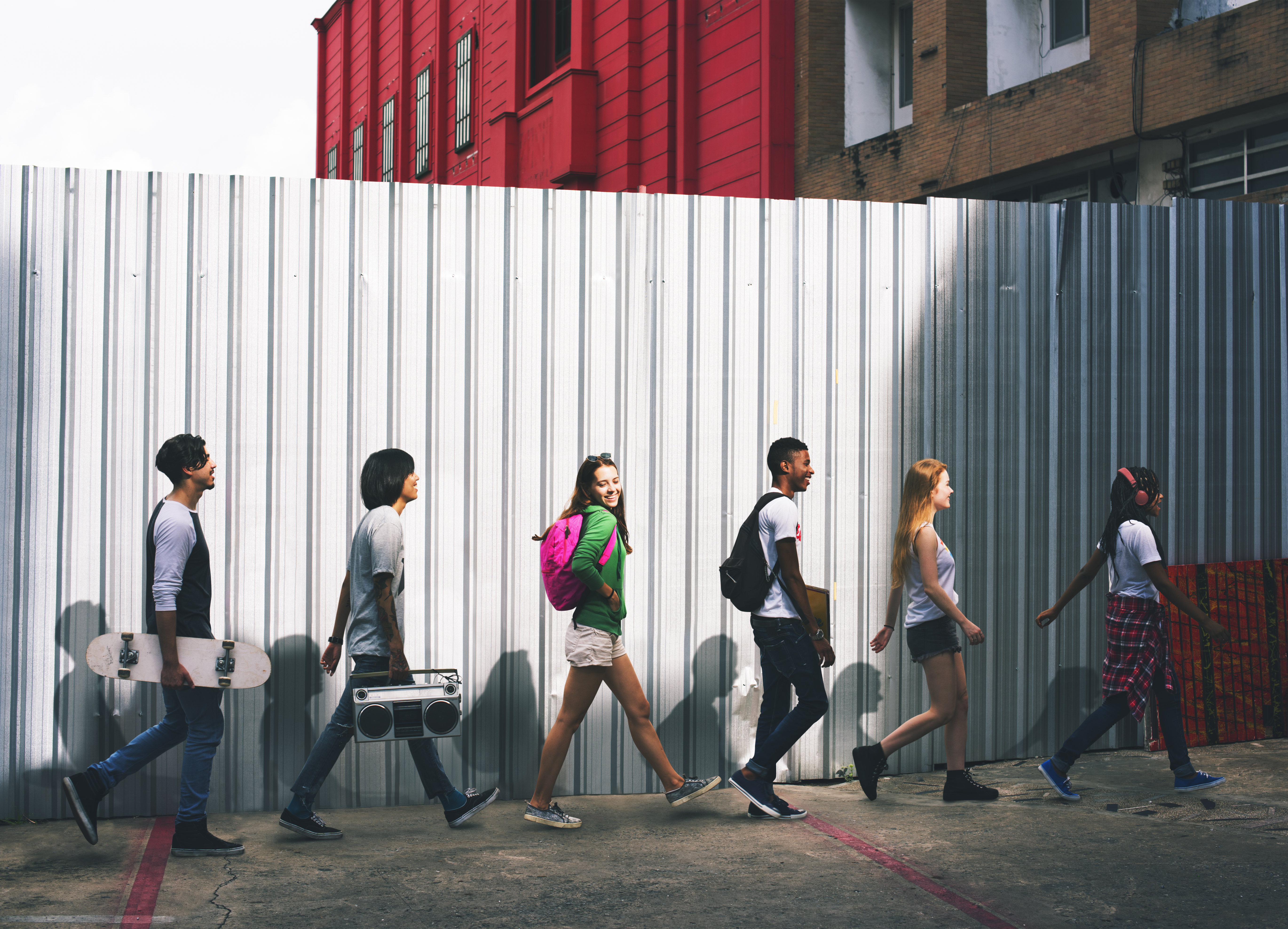
In this day and age, the world is getting smaller by the minute. People are traveling more than ever, frontiers are falling away, and cultures are clashing and coming together everywhere, every day.
Global Neighborhood “imagines a post-national world that transcends border and boundary,” says Grossman. “We’re starting to see several brands use regionally specific imagery on the world stage. Viewers are more interconnected and sophisticated than ever, so it’s a smart and timely tactic.”
Apple’s recent iPhone 7 Portrait Mode spots are a beautiful example of this kind of thinking.
In videos that show off the new phone’s stunning camera capabilities, viewers are exposed to everyday life and personalities of a Greek island village, as well as the amazing Brazilian tradition of Carnival. The concepts are simple – as per Apple’s style – but they send a powerful message of inclusion and equality.
“The fact that this ad is essentially a foreign language film aimed at the English-speaking market just goes to show that good stories are universal and unifying,” adds Grossman.
A girl, her grandmother, and the excitement of a shared experience? That’s something everyone can connect to, no matter where they’re from.
Tip: There’s so much beauty in our world. Find the corners that speak to your brand and share them with your audience. Display authentic examples of diversity. Shine a positive light on progress and celebrate the things that make us different and unique – and be sure to show that it’s something to praise, not put down.
“Brands are really starting to embrace concepts that connect us all as humans and bring awareness to people and stories that are often overlooked,” says Echelman. “It’s an opportunity to connect your customers to each other and to your brand.”
New Naivety
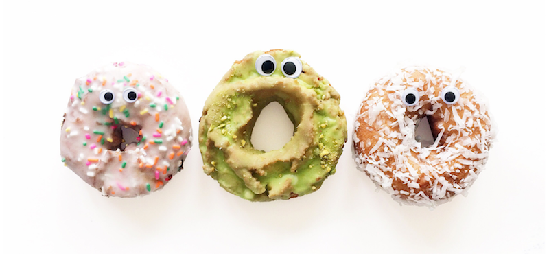
Scroll through almost any social media feed and you’ll start to notice something funny – literally.
GIFs, memes, and various digital gags abound, commanding our attention and tickling our senses of humor within the seconds they take to consume. If it’s spontaneous, playful, and kind of weird, it’s got the mark of New Naivety, Getty’s final trend, and one that delivers a much-needed dose of comedy.
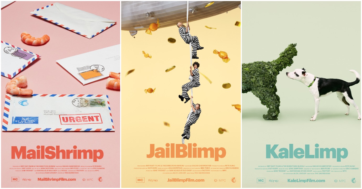
MailChimp’s first major advertising campaign, “Did You Mean…?” fits the bill perfectly. With a series of strange and surreal short films created by Droga5, the company riffs off its popular radio spot, in which a girl famously (thanks to the podcast “Serial”) mispronounces its name.
“They lead with color, using a delightfully jarring palette that feels a bit unnatural and otherworldly,” says Grossman. “And the whimsical visuals of the dogs made of kale paired with their silly wordplay tells us that this is a brand that is all about supporting creativity and free-spiritedness.”
The posters and companion clips make no attempt to correct or mention the actual brand; instead, the campaign is pure absurdity, from start to finish.
Tip: Dark moments call for happy reminders; gloomy times call for jokes. Make sure your content adds to the light. Whether it’s a silly still life, goofy illustration, or some bizarre juxtaposition, the world could use a little laughter right now. Why not be the one to bring it?