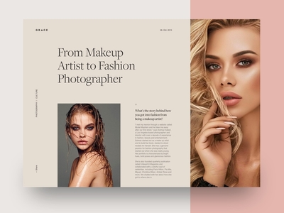
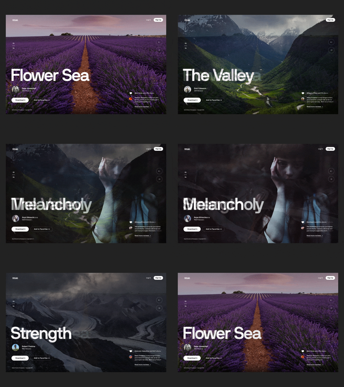
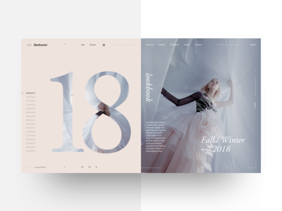
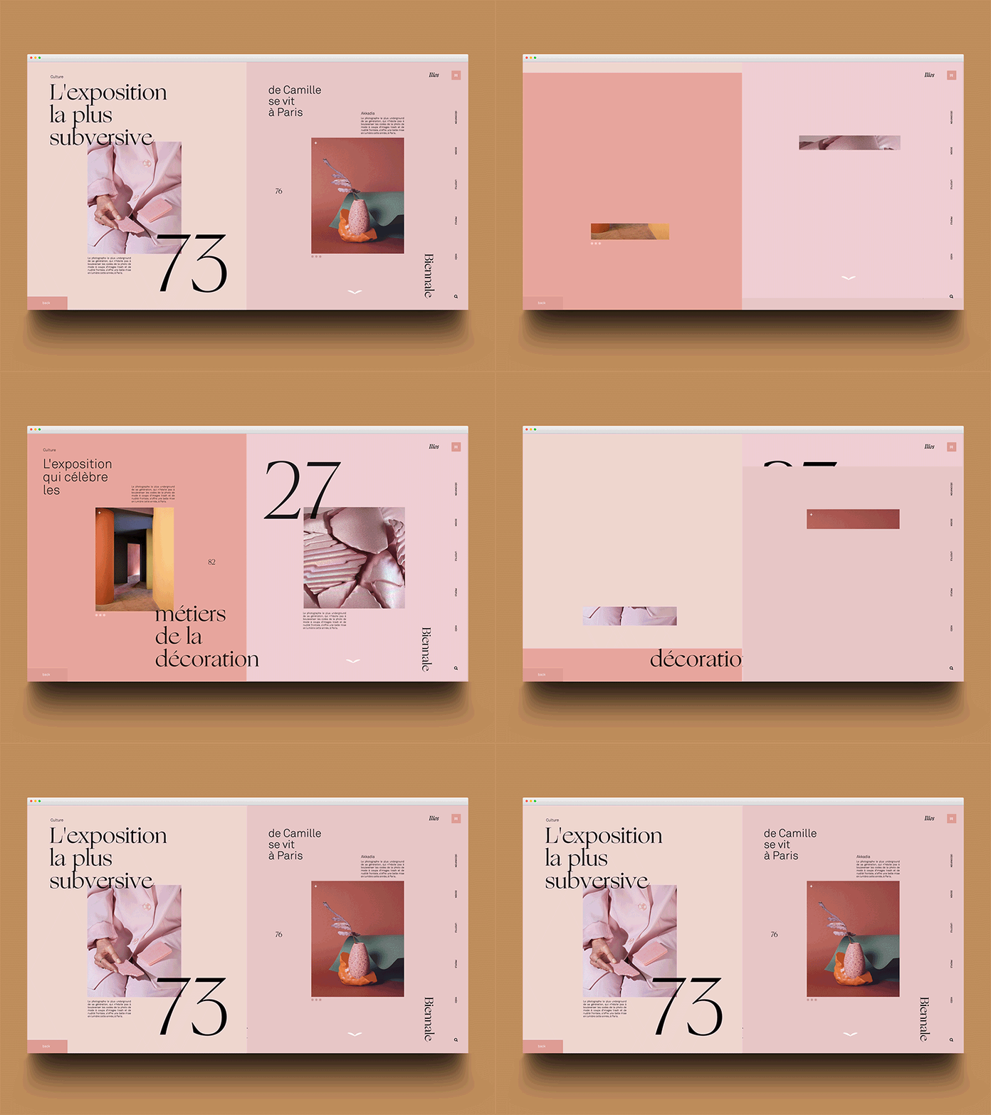
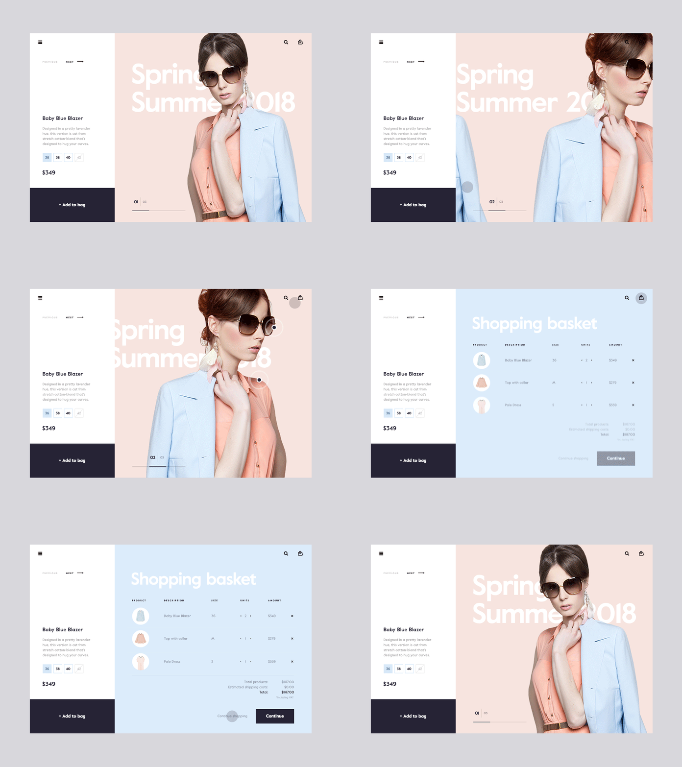
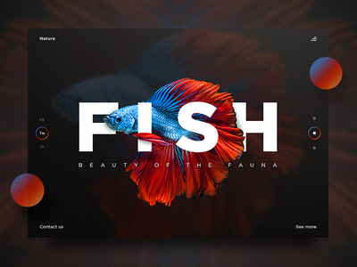
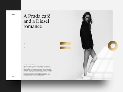
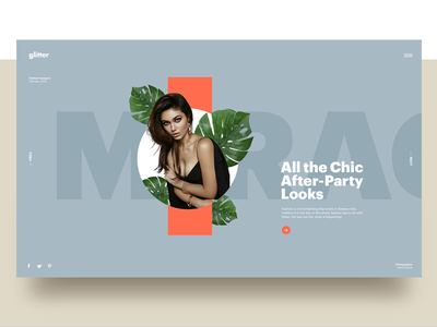
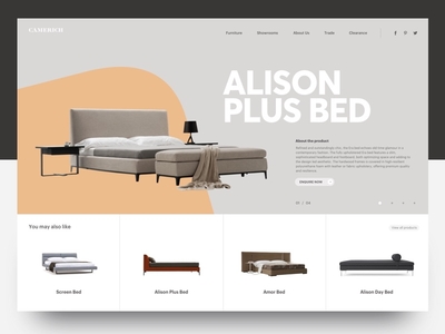
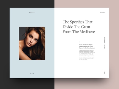
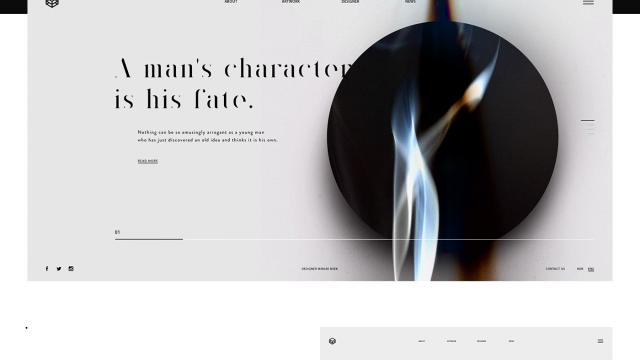
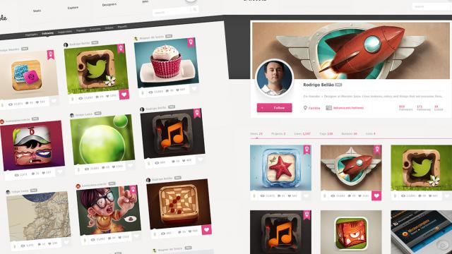
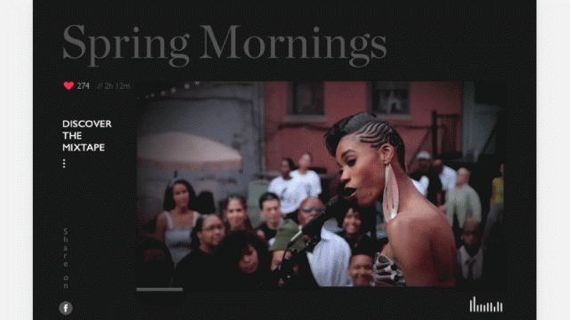
The cool thing about following websites like Dribbble and Behance, especially Dribbble, is that you can see the direction the visual design community is going. For the past 10 years we have seen photo-realistic icons being the main theme, then it evolved to lettering, vector illustration and for the past couple of years the site has definitely focused on UI/UX. Web design is part of that and I have been collecting images for posts to illustrate a new trend in web design. Below you can see what I am talking about. To summarize, it's highly editorial, simple and in my opinion looks amazing. The only question I have is how does that work with fully responsive websites. The more complex the layout is hight the number of edge cases you will have. At least from my short experience.
