StoryBrand Website Examples
But somewhere along the line, whether through busyness or the complicatedness of life, you start wondering, am I doing this right?
I have felt that feeling myself. I wondered if I described my customer’s problem in such a way they identify with it. I struggled with getting my language clean and concise. I wrestled with being too “cute” or too “artsy” in my language. I was too verbose.
And, I think the biggest issue I had (and seen others have) is that I knew my product so well I started talking with ‘insider’ language — this is where everyone inside the organization knows what you are talking about because it is familiar, but others really have no idea. This is extraordinarily easy to do and a bit tricky to overcome.
When we’re not clear in our marketing or on our website, we lose revenue.
Many people are in business to improve their customer’s lives and make our world a better place — even if only in a small way. They hear talk of revenue and check out. Revenue isn’t the point for these folks. Impact is.
However, without revenue, there is no capital to invest in the world. Your impact diminishes. Many nonprofits or businesses with a social mission are forced to close their doors because they didn’t see the necessity of prioritizing revenue.
Whether your goal is to make a bunch of money or to have a meaningful impact, your marketing matters. Your message matters.
When I am trying to learn a new way of doing things, I love to see examples of people who are masters of that skill.
Just like bikes in a peloton draft off of one another, gaining speed from each other’s draft, marketers gain momentum and clarity by looking at examples of how to do it right. How to be excessively clear.
Here are six StoryBrand website examples
In this article, our goal is to emphasize the first impression, the first three seconds, and demonstrate how StoryBrand can make your website immediately clear. Find a full walkthrough of how to StoryBrand your website here.
Or click here to download a StoryBrand website template you can use to upgrade your own website.
Viewers only give you 3 seconds to tell them what you do before they decide to check out. If you’re not clear, they leave. We use something we call the “Grunt Test” to see how clear a website is. We look at the site for 3 seconds and ask these 3 questions:
- What do you sell?
- How does it make my life better?
- How do I buy?
The companies in these StoryBrand website examples come from a diverse population of size and type. The common element is that they are incredibly CLEAR. In a quick scan of each website, it is immediately apparent what these businesses are selling and how to buy it.
Let’s look at some StoryBrand website examples to see if they pass the Grunt Test.
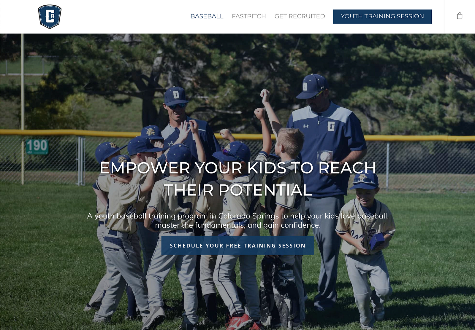
StoryBrand Website Example #1: CageRat Baseball
This certainly passes the test of clarity. Many websites don’t explicitly state what they’re selling. Users have to scroll all over the site and burn many mental calories to figure it out. CageRat clearly tells you what they offer. Let’s go through the Grunt Test.
- What do they do? It’s a youth baseball training program.
- How does it make your life better? It helps you empower your son to reach his potential. And, look at that picture! As a parent, I recognize what’s going on instantly. In fact, that’s exactly what I want for my son.
- How do you buy? There are two clearly labeled buttons.
Let’s look at another website.
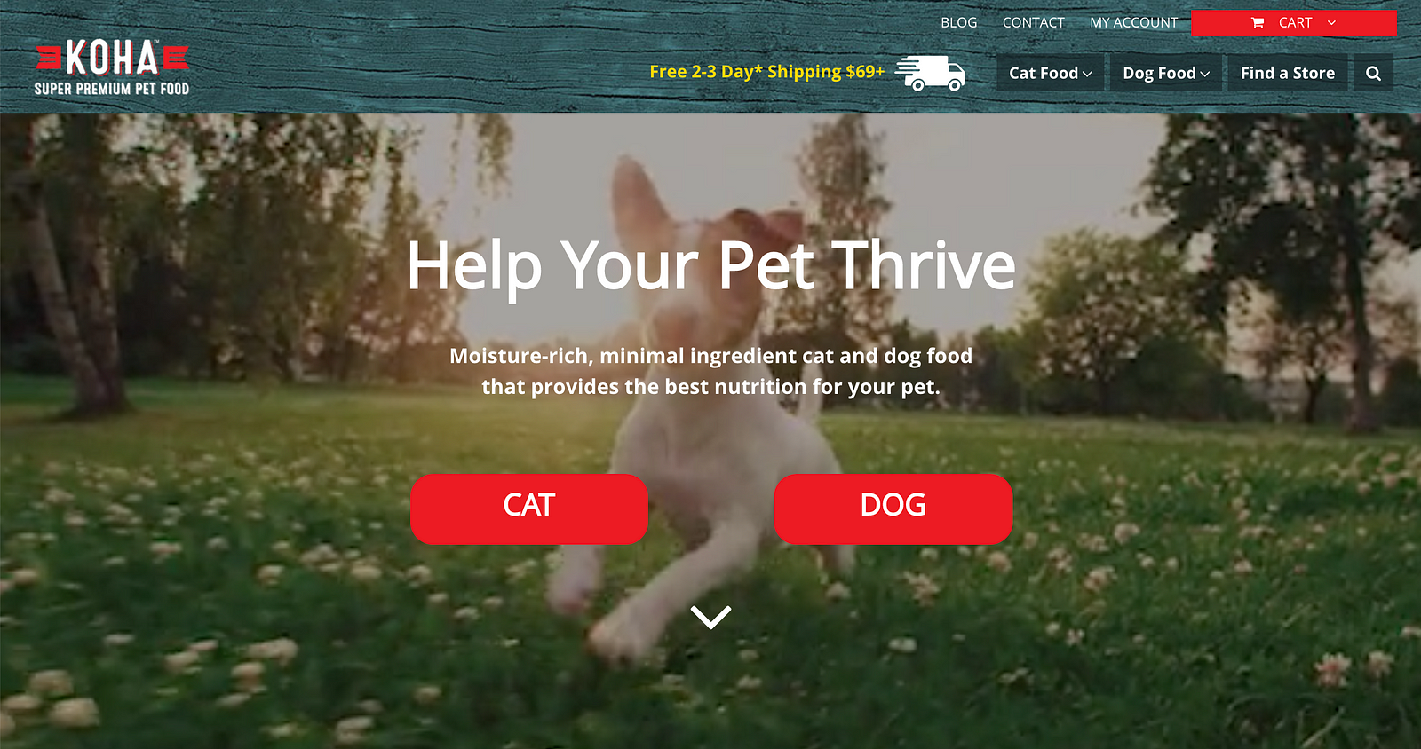
StoryBrand Website Example #2: Koha Pet Food
- What do they do? They help your pet thrive with food that provides the best nutrition for your pet. This is extraordinarily clear.
- How does it make your life better? Your pet is now thriving and healthy. And that picture helps me imagine how happy my dog will be when I start feeding him Koha!
- How do you buy? By clicking one of those big, red buttons! So good.
Their photo makes you smile as you imagine your own wonderful dog leaping and enjoying his or her life because s/he feels good. All because of good nutrition. Koha is a great example of a clear message.
In this next example, this company took clarity even further — they put it in their name.
StoryBrand Website Example #3: Perfect Venue
Notice the photo and the wording. We aren’t left guessing what these guys offer.
- What do they do? Help you find a venue for an event.
- How does it make your life better? They don’t help you find a mediocre venue, they help you find the perfect venue for your event!
- How do you buy? This one’s a little different, the main call to action is “Find a Venue.” There are two clear buttons for you to press to do that.
This next website example is a little different. It’s a person rather than a company.
StoryBrand Website Example #4: Judy Ingels
In this StoryBrand website example, it’s evident that even when a brand is a person all the same rules about clarity and message still apply.
- What does she do? She helps you get a home loan.
- How does it make your life better? You get to buy your dream home! And she also helps with the insecurity that comes with buying a house. If you have ever bought a home, then you know that it is a complicated process that can easily create tension and frustration.
Here is a great example of addressing both an internal and an external problem for the customer. Anxiety and frustration are strong emotions that motivate people. If your business can address my angst and also the “internal crazy”, then I am that much more willing to entertain your offer. And that makes you more money.
- How do you buy? Here is another example of making things very understandable to the website visitor. Notice how easy it is to find the call-to-action button. Nice job!
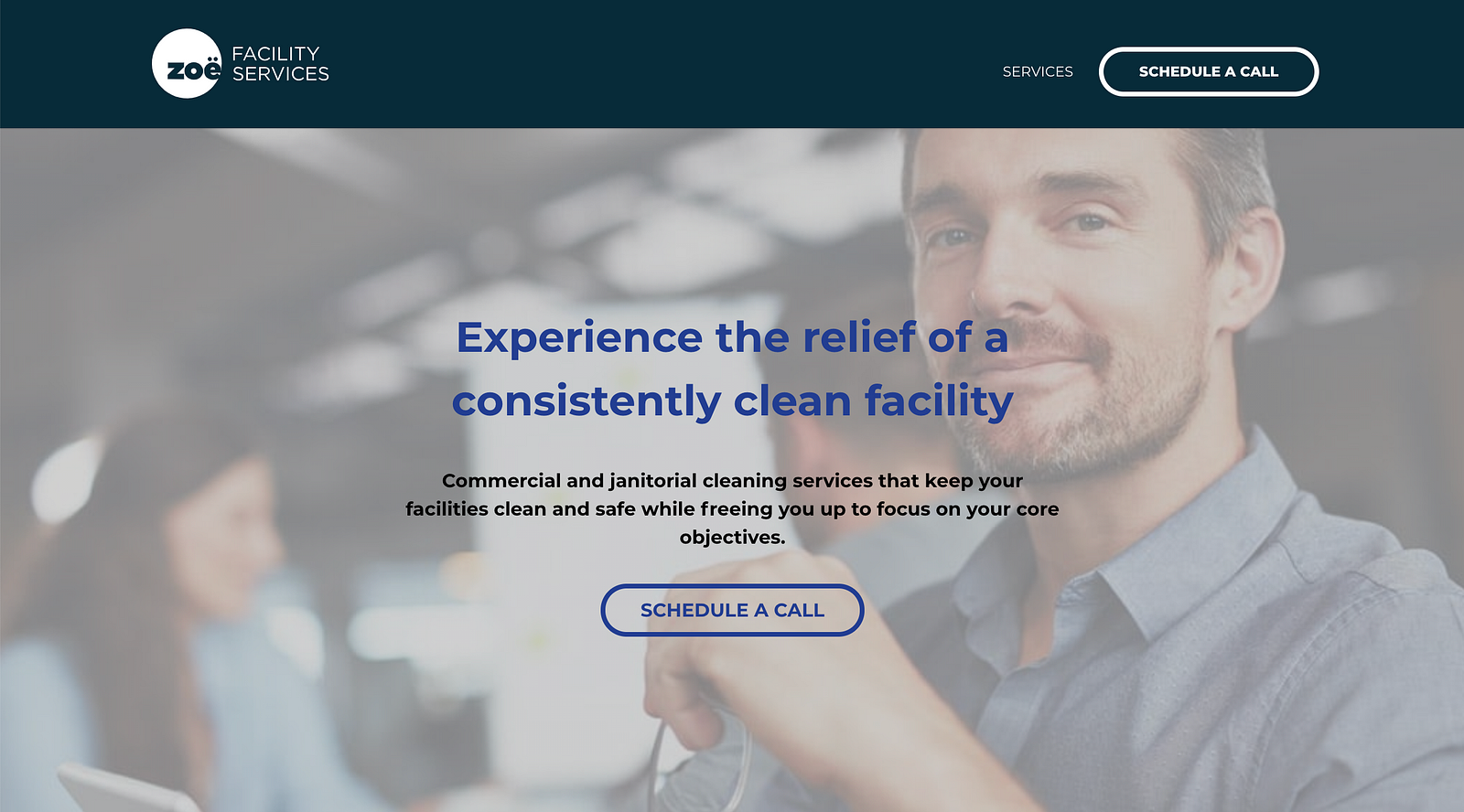
StoryBrand Website Example #5: Zoe Facility Services
You don’t necessarily know what this business does from the name, however, the copy immediately tells you what this business is all about.
- What do they do? They clean your facility.
- How do they make your life better? You experience relief. You are free to focus on your core objectives. And your building is clean. Consistently.
- How do you buy? Click the “Schedule a Call” button
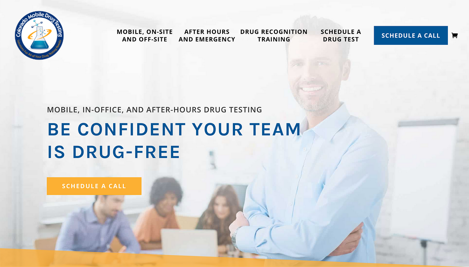
StoryBrand Website Example #6: Colorado Mobile Drug Testing
All of the pieces that we have been talking about show up on this StoryBrand website example.
- What do they do? Drug testing anywhere.
- How does it make your life better? Gain confidence your team isn’t on drugs.
- How do you buy? The easy to spot call-to-action button.
This company’s target client is someone who is not sure if their team is drug-free. Furthermore, it is difficult to get employees to go to some off-site location and get drug-tested. This would make me uneasy. Especially if the work involved any kind of precision that could harm other people if attention to detail was lacking.
Who comes to the rescue? You can, by utilizing Colorado Mobile Testing. They come to you and do the testing at a time that works for your people. The company is not the hero, the customer is. They save the day by bringing along someone who can really help, by helping you keep your team drug-free.
Now that you understand these concepts and have seen them implemented in several StoryBrand website examples, do you feel more confident as you try to change your own messaging? I hope these examples both inspired you and challenged you to change some of the messaging on your own website.
Click here to download a StoryBrand website template you can use to upgrade your own website.
Don’t continue missing out on future revenue and customers because your messaging is clunky and obtuse. Learn from these StoryBrand website examples.
When people understand what you sell and how it makes their life better, they buy more. Take some time and see if you can get your website as clear as the StoryBrand website examples we looked at here.


