Sunday, July 31, 2016

#SocialSkim: Why Social Media Satisfaction Is Falling

This week's 'Skim is all about reaching for ad dollars without compromising user experience. We'll dive into a recent survey that discusses falling user satisfaction on social platforms, and we'll explore Reddit's new plan to lure advertisers and shake off its users' anti-ad image.
We'll also touch on Twitter's big live-streaming news, fill you in on why Vine just paid a hacker $10,000, and give you some pointers on nine new and mostly secret Facebook targeting options designed to up your ad game. Skim to keep your fans engaged!
The state of social: More time on it, yet less satisfied
Though users are spending, on average, 10 minutes more per day on Facebook's platforms this year than last (now up to 50 minutes per day), their satisfaction has dropped nine percentage points—a marked year-over-year decrease that has some worried.
The new ACSI survey notes that Americans are generally pleased with their overall online experience, but social sites such as Facebook and Twitter are dragging the social category down.

Concerns about privacy and advertising appear to be the two biggest culprits: Users are not fully coming to terms with the idea that ads might be a necessary cost for the social services they've grown to expect for free.
In terms of rankings, Wikipedia ranked first with 78% satisfaction, with YouTube (77%), Google+ (76%), and Pinterest (76%) following closely. Instagram and Facebook pulled in 74% and 68% respectively, but Twitter and LinkedIn tied for last with 65% satisfaction.
1. Reddit will soon let brands sponsor user posts
Reddit can be a scary social platform for marketers, particularly because of its users' inclination to call out advertisers as big, bad, corporate machines. But that might all change, because the social network's CEO is taking a new approach to help coach brands through advertising on the platform.
Reddit will introduce a new offering called "Promoted User Posts" on August 4, which lets advertisers sponsor user-generated posts on the platform, as long as the user has given consent. If someone posts a giant tower of Oreos that reaches heights never before seen, for example, Oreo could sponsor that post, and it would then appear in different areas of the site and target specific users.
The idea is to help brands speak to users through user content itself, and hopefully in turn make their message resonate more greatly with Reddit's user base.
2. Twitter carves out niche with yet another deal for live sports streaming
The social network's been running after sports leagues and television networks in an effort to make it the go-to social platform for live sports updates and viewing. This time, the company inked a deal with Campus Insiders to broadcast over 300 college sporting events real-time.
The deal follows Twitter's professional deals with the NFL for Thursday games and the NBA pre-game show, and will give its users livestreaming access to an extensive lineup of football, lacrosse, basketball, volleyball, and other sports.
Oh, and it signed a deal to livestream weekly NHL and MLB games, too.
3. Facebook scraps Snapchat-like "Quick Updates"
Like some of its other experimental features that tried to attract the Snapchat generation, a Facebook rep announced the end of Quick Updates. The feature mimicked Snapchat Stories, and allowed its test users to bypass the News Feed and send content only to selected friends, with the sent content disappearing after 24 hours.
The test group of users were also able to overlay text on their Quick Update photos and videos, and had access to an activity tab that showed their friends' responses. Facebook said it has no plans to proceed with the feature, but it seems the social network will never be done trying to reimagine the magic of Snapchat.
4. The future of chat bots, and how your brand can prepare
The chat about chat bots has slowly dwindled since Facebook's introduction of the technology on its Messenger platform back in April. However, to see what the future holds and to best prepare your brand for it, we'll look to popular Asian messaging app WeChat to understand where the West's chatbots are likely to go.
Bots will likely be categorized as either service or subscription bots, with the former allowing users to transact with a business by doing things such as booking a taxi or ordering food, and the latter delivering pre-selected content to users like weather updates.
The key to preparing your brand is understanding which category you can be authentic in, and what content you can provide to be relevant. Go ahead, dive in!
5. Pokemon Go breathes new life into almost forgotten Foursquare
Foursquare, the location-based check-in social network once all but written off as a has-been in tech circles, is seeing 8 million daily check-ins—likely due in part to the wild success of Pokemon Go.
That's a record high for the social platform, and its founder thinks Pokemon's augmented reality game stands ready to drive new excitement to location-based apps and marketing.
Like McDonald's did by partnering with Pokemon to make its restaurants special game locations, he says, businesses will begin to realize they stand to profit by advertising within these types of applications. Have you used Pokemon Go to drive traffic to your business?
6. Facebook raking in lion's share of social media ad dollars
67.9%. That's the percentage of all—worldwide—social media ad dollars that will be spent on Facebook advertising this year, according to a new estimate from eMarketer.
Analysts say the social network is seeing momentum across its ad business as video ads become more popular and as features that let marketers upload their product catalogues and then deliver highly-relevant, targeted ads with ease progress. One can only assume the platform is thinking of ways to expand its ad business onto its 1-billion user=strong Messenger platform soon...
7. Vine just paid a hacker $10K for hacking it
Twitter's Vine fell victim to a hacker this week, and lucky for the company the hacker was an "ethical" one. "Avicoder" exposed a security flaw that allowed him to access the social network's entire source code, which contains confidential information and could have been exploited to cripple or even destroy the site.
The flaw allowed Avicoder to run Vine locally on his own machine, but the social network fixed the bug within five minutes of Avicoder's alerting it via Twitter. Oh, and Twitter paid him over $10,000for finding the security flaw as a part of their HackerOne bounty program. We're wondering how we can get involved...
8. Facebook just open-sourced its 360-degree camera for everyone
After all, the social network needs more video content to fill up users' News Feeds and Oculus Rift helmets! Facebook originally introduced Surround 360, its flying saucer-like, 360-degree video camera at its annual F8 developer event in April, and just this week posted the blueprints and instruction manual online for all to see.
The idea is not that your neighbor will build one (it'll cost a cool $30,000), but that Hollywood studios, media conglomerates, and gaming companies might make the investment to jump into what Facebook thinks will be the next, natural step toward wide adoption of virtual reality.
Until the cost comes down, it's likely large brands will be the only ones with the funds to take advantage, but it's time to start thinking about how your brand could adapt if 360-degree video becomes an expectation in the minds of consumers.
9. Six ways for your business to take advantage of Facebook Live
The social network prioritizes live video, meaning your reach can increase if your brand takes some of its social strategy live. You might think Live is reserved for the big-time publishers and news stations of the world, but here are six effective uses of the feature for each and every one of you.
Covered in detail: addressing blog comments, giving an inside look at your company, promoting your upcoming events, teasing new products, answering FAQs, and engaging with your Facebook group members.
10. Nine new and mostly secret Facebook targeting options
Now that we know 67.9% of all social ad dollars fly into Facebook's coffers, we need some new ways to improve ad performance and compete on the platform. Luckily, we've got just the article for you—one that will hopefully give you an edge above the rest. So, jump into the new audience targeting features on the platform and learn some lesser-known options that have serious ROI potential.
Covered in detail: defining audiences based on website visitors, users who've engaged with your content, internal company data, interests, third-party partner data, and much more!
11. We'll wrap with Instagram's tools meant to take on trolls
From everyday bullying to celebrity harassment, Internet trolls' actions can range from minor nuisances to serious offenders, and Instagram appears to be taking a first step at combating them.
The Facebook-owned social network is testing a tool that lets celebrities and other public figures more easily block trolls by automatically blocking comments that contain certain phrases, words, or emoji. The tool is being tested with starlets such as Taylor Swift.
Though the function might seem like an exclusive band aid given to celebrities to cover a massive wound that affects many around the globe, the implications of such technology could have far-reaching benefits if deployed to a greater number of users.

Instagram has confirmed the anti-abuse tool, saying it will use its "learnings to continue to improve the comment experience on Instagram." Here's to progress on the anti-bullying front.
Wednesday, July 27, 2016

The Four Dimensions of Tone of Voice


by KATE MEYER on July 17, 2016
Summary: A website’s tone of voice communicates how an organization feels about its message. The tone of any piece of content can be analyzed along 4 dimensions: humor, formality, respectfulness, and enthusiasm.

If we envision our website as a tool that enables us to have a conversation with our users, it’s clear that a carefully considered tone of voice is critical.
In literature, the tone of voice refers to the author’s feelings towards the subject, as expressed through the writing itself. Writing for the web is obviously different from writing prose (or at least it should be, since web users read very little.) Still, every scrap of writing on a page (from body copy to button labels and other UX copywriting) contributes to the tone of voice we’re using to speak to our users.
Tone is more than just the words we choose. It’s the way in which we communicate our personality. Tone of voice is the way we tell our users how we feel about our message, and it will influence how they’ll feel about our message, too.
Despite the importance of tone, advice about it tends to be vague: “Be consistent. Be authentic. Be unique.”
So, we wondered, what are the broader qualities that make up a tone? Here we describe a framework of 4 dimensions that can be used to analyze or plan a site’s  tone of voice. Then we conducted qualitative usability testing and online surveys, measuring the impact of those tone qualities on users (full details and findings to come in an upcoming article).

The Four Dimensions of Tone of Voice

A quick Google search for “tone-of-voice words” will surface lists of hundreds of words used to describe literary tones. (Most of them come from websites for undergraduate English courses). You’ll quickly notice that most of those words have very specific meanings and connotations (e.g., “vexed” or “cynical”), and couldn’t be used to describe the tones of many (if any) websites. You’ll also notice that many of these lists are huge, some with hundreds of words.
We decided to design a manageable web-specific tool that content strategists could use to create simple tone profiles for a company’s online presence. Our goal was to identify several tone-of-voice dimensions that could be used to describe the tone of voice of any website.
We began with a long list of literary tone words. We then eliminated any words that wouldn’t be realistic content goals for normal websites (like “guilty”). That process produced a list of 37 website-specific tone words.
We then iteratively refined that list, by:
  • clustering any words that were similar (e.g., “upbeat” and “cheerful”)
  • removing words that had no obvious antonyms, so wouldn’t work as dimensions (e.g., “nostalgic”)
  • removing words too specific to be widely applied to a variety of websites and topics (e.g., “romantic”)
At the end of this process, we identified 4 primary tone-of-voice dimensions.
  • Funny vs. serious: Is the writer trying to be humorous? Or is the subject approached in a serious way? (Note that for our purposes, this dimension was only the attempt at humor. We didn’t evaluate if the writers successfully landed their jokes.)
  • Formal vs. casual: Is the writing formal? Informal? Casual?  (Note that casual and conversational are not necessarily synonymous, but they do often appear together.)
  • Respectful vs. irreverent: Does the writer approach the subject in a respectful way? Or does she take an irreverent approach? (In practice, most irreverent tones are irreverent about the subject matter, in an effort to set the brand apart from competitors. They are not usually intentionally irreverent or offensive to the reader.)
  • Enthusiastic vs. matter-of-fact: Does the writer seem to be enthusiastic about the subject? Is the organization excited about the service or product, or the information it conveys? Or is the writing dry and matter-of-fact?
Tones could fall at either extreme of each dimension, or somewhere in between. Each website’s tone of voice could be expressed as a point in the 4-dimensional space described by these dimensions.

One Message, Many Possible Tones

To see how these 4 dimensions of tone can be varied to create different effects, let’s consider a small piece of copy that almost every content team has to consider at some point — an error message.
At the core of every piece of writing is the message — the information we’re trying to communicate to our user. In this case, our message is, “An error has occurred.” Our tone will be how we communicate that message.
First, let’s try a serious, formal, respectful, and matter-of-fact error message.
“We apologize, but we are experiencing a problem.”
We’re not trying to make users laugh, or using any strong emotion in the message. It’s a fairly traditional, straightforward message.
Now, what if we tweak one of the 4 dimensions? Let’s make this same message a little more casual.
“We’re sorry, but we’re experiencing a problem on our end.”
The message is still serious, respectful, and matter-of-fact. But the message becomes more casual with a few small changes:
  • “We are” becomes “we’re”
  • “Apologize” becomes “sorry”
  • The addition of the expression “on our end”
Let’s add a little more enthusiasm to the message. In this case, “enthusiasm” means emotion more than excitement, since the subject is a negative one for both the site and the user.
“Oops! We’re sorry, but we’re experiencing a problem on our end.”
Now we’ve taken the error message’s tone to casual and enthusiastic. If we add an attempt at humor and a little irreverence, we’ll have taken the same message to a totally different tone of voice. (Remember, the irreverence here is the speaker’s attitude towards the subject, not necessarily towards the audience.)
“What did you do!? You broke it! (Just kidding. We’re experiencing a problem on our end.)”
Which of these versions of the same message would work best? For your organization, that will depend on:
  • Your brand personality. For example, if you work in a large traditional financial institution, an enthusiastic and irreverent error message might be out of character for your brand. The formal error message could work, but maybe you’ll opt for a casual message if you’ve decided that a personal, conversational feel would be best for your content.

  • Your users. Consider the characteristics and preferences of your users, but also their emotions and information needs for each piece of content. If your users are frustrated when they arrive to this error message, or they see it frequently, a humorous tone might be irritating. The best way to know which tones will work with your users is to test.

Users Notice Variations in Tone-of-Voice Dimensions

We wanted to make sure changes in the 4 tone-of-voice dimensions would be noticeable to our users, and not just theoretical concepts. In preparation for an upcoming study, we used these 4 dimensions to create paired tone-of-voice samples for made-up websites from 4 industries (2 samples per industry). Both of the samples within in each pair were nearly identical in everything from visual design to message. The only variable we varied was the tone of voice: the two samples in a pair corresponded to different combinations of tone-of-voice dimensions. For example, in the security industry, one sample was funny, casual, irreverent, and enthusiastic; and the other one was serious, neutral on the casual scale, respectful, and matter-of-fact.
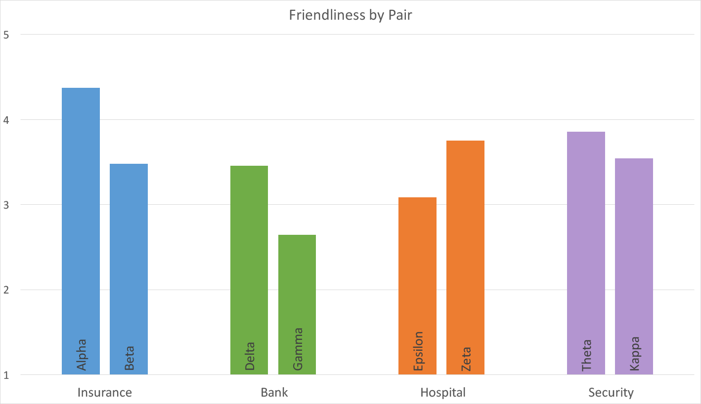
In an online survey of 50 American respondents, we asked users to rate the friendliness and formality of each sample on 5-point Likert scales.
The average friendliness ratings for each of the tone of voice samples
The average formality ratings for each of the tone of voice samples
The differences within each pair were statistically significant at p < 0.05. The differences were also consistent with what we would expect, based on each tone profile. For example, the funny, casual insurance company sample was found to be friendlier but less formal than the serious insurance company sample.
The actual differences in the ratings were rather small, around 0.5–1 point on a 5-point scale. Our samples used realistic tones that we could reasonably expect to find in real sites. For all but the most extreme and exaggerated tones, you should expect to find similar effect sizes in your own tone variations. It would be rare for a writing style to collect scores at the outermost limits of our tone scales and still be effective for business purposes: you want to emphasize your chosen tonal qualities without making them dominate your writing to the extent that the content becomes excessive and stops communicating the underlying meaning in favor of pure style.
These findings confirmed our hypothesis that variations along the 4 tone dimensions would produce measurable differences in users’ impressions of the sites. As we’ll show in the following article of this series, these variations in impressions influence important factors, like desirability.

Applying the Four Dimensions

Use these dimensions to identify your tone-profile goals.

Decide what combination of dimensions makes sense best for your company and think about strategies to implement this tone of voice.  When you’re defining your tone for a whole site or a specific piece of content, start with these four high-level dimensions first. For example, first decide if a funny, casual tone will work for your brand and your users. Then you can refine your tone strategy by choosing more specific tone target words like “playful,” “quirky,” or “sarcastic.”

Use these dimensions to evaluate your tone.

Test with your users to determine whether the tone of any new piece does conform to the chosen profile. You can do this by:
  • Using product-reaction testing to see if your users choose tone words that correspond to your target tone profile. For example, let’s say you want your users to view your brand as funny but respectful. If users choose “humorous” to describe your content, you could consider that it matches your goal. However, if many of your users choose “snarky” to describe your content, you might interpret that as being slightly off your goal, since “snarky” humor feels irreverent.
  • Ask your users to rate your content on one or more of the tone dimensions, by asking them to complete a 3-point or 5-point Likert scale with each extreme of the tone dimension at opposite ends of the scale (for example, “funny” vs. “serious”).

Remember that you can always vary your tone to fit the situation.

Keep your personality consistent, but vary the tone to fit the user’s emotional state and the topic. (For example, a company’s financial report will need to sound different than the same company’s careers page targeted at university students.) You might decide on a casual tone for your site-wide content strategy, but vary the amount of humor in your copy across the site.

Tone is about more than just content.

The visual design and interaction design contribute strongly to the overall ‘feel’ of a website, as well as to the construction of the brand personality. All members of the digital product team need to think about how their piece fits within the whole.

Tone applies to all channels and touchpoints.

As our example with an error message shows, tone of voice applies to all touchpoints, not just to your homepage copy. Your tone of voice should be part of your omnichannel strategy and be used when creating writing and other communications for all channels, including email (whether promotional, informative, or transactional), physical products, and the in-store experience.
(More on tone of voice in our courses on Content Strategy. For more detail, see also the complete tone samples studied in this research.)

Monday, July 25, 2016

28 of the Best Instagrams to Follow for Design Inspiration

28 of the Best Instagrams to Follow for Design Inspiration

instagram-best-designers.png
What if I told you you could visit an art gallery ... from the comfort of your own home? Or from a bus seat on your commute to work? Or while you're taking a break for lunch?
If you follow the right people, that's what Instagram can do for you. There are a lot of really talented artists and designers out there who use Instagram as a sort of mini art gallery -- a social portfolio, if you will.
And it's a jackpot for people who love browsing gorgeous design work. 

Download 195+ visual marketing design templates to use for social media posts, infographics, and more. 


To help you narrow your search, I've carefully curated some of the best Instagrams to follow for design inspiration. I did my best to place them in categories -- illustration, graphic design, pop art and installation, color palettes, street art, photography, typography, and calligraphy -- although you'll notice some of their work could fall into a number of different lists. 
Whether you're a designer looking for inspiration, or you simply harbor an appreciation for art and design, you'll want to check out (and follow) these accounts. 

28 Designers You Have to Follow on Instagram

Click on a category below to jump to that section:

Illustration

1) Steve Harrington: @s_harrington

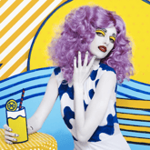
Steve Harrington is a Los Angeles-based designer who describes his own style as having a "psychedelic-pop aesthetic." His Instagram is full of his brightly colored, playful illustrations, many of which he's created for brands -- most notably Nike, for which he's designed sportswear, including shoes. 
 harrington-instagram-2.png harrington-instagram-4.png
harrington-instagram-1.png harrington-instagram-3-1.png

2) Rachel Ryle: @rachelryle 

Rachel Ryle is an illustrator, an animator, and a storyteller -- and she combines all three on her Instagram account. Most of her posts are beautiful, clever, and often super cute stop-motion videos like the one below. She told Mashable that each animation takes 15–20 hoursfrom the beginning concept to final editing, on average. If you like her work, Instagram is the place to follow her: It's her most dedicated channel for showcasing her work.
rachel-ryle-instagram-2.png rachel-ryle-instagram-1.png

3) Mikey Burton: @mikeyburton 

Mikey Burton, based out of Chicago, calls himself a "designy illustrator" -- his way of saying he works part time in both. Burton has done work for clients like Converse, ESPN, Target,The New York Times, TIME Magazine, and Esquire. He's been working on a lot of editorial pieces lately, which he posts proudly on his Instagram -- along with other, often-whimsical illustrations both as sketches and as final, published projects.
mikey-burton-instagram-3.png mikey-burton-instagram-2.png 
mikey-burton-instagram-4.png mikey-burton-instagram-1.png

4) Jamel Saliba: @melsysillustrations

Jamel Saliba, a.k.a. Melsy, is equal parts artist and entrepreneur, having quit her job in her mid-twenties to become a successful, full-time fashion illustrator. Her sketches are beautifully done and cover themes like fashion, friendship, and love -- all in the style of contemporary chic. Since her initial success on Etsy caught the eye of consumers and brands alike, Melsy's done client work for Hallmark, T.J.Maxx, and Home Goods.
On Instagram, she posts a combination of illustrations added to her portfolio, as well as those celebrating events or holidays, like the illustration she posted for Mother's Day (third image below).
melsys-illustrations-instagram-5.png melsys-illustrations-instagram-1.png
melsys-illustrations-instagram-2.png melsys-illustrations-instagram-4.png

Graphic Design

5) Neil A. Stevens: @neil_a_stevens 

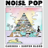
Neil A. Stevens specializes in poster design, and he's particularly good at creating sharp, dynamic pieces like the ones below. For example, the first image below is a map he designed for the Italian post office. He's created posters for many cities and countries around the globe, including a handful for the Tour de France. 
neil-stevens-instagram-2.png neil-stevens-instagram-3.png
neil-stevens-instagram-4.png neil-stevens-instagram-1.png 

6) Hey Studio: @heystudio

Hey Studio is made up of three designers: Ricardo Jorge, Veronica Fuerte, and Mikel Romero -- and is one of Spain's most popular graphic design studios. A lot of their work features stunning geometric shapes, which they post to their Instagram account in combination with pictures of their team during the creation process (and when they're just fooling around).
hey-studio-instagram-3.png hey-studio-instagram-1.png
hey-studio-instagram-2.png hey-studio-instagram-4.png

7) Luke Choice: @velvetspectrum

Luke Choice is an Australian living in New York whose work covers graphic design, illustration, and typography. His style is very colorful and very unique -- I especially love the 3D illustration work he does, some of which are crazy cool animations. Check out his Instagram feed to see his latest work, from his own personal projects to collaborations with brands like Nike.
velvet-spectrum-instagram-1.png velvet-spectrum-instagram-2.png

Pop Art & Installation

8) Jessica Walsh: @jessicawalsh 

I'm so inspired by Jessica Walsh, both as a designer and as an entrepreneur. She joined the design firm Sagmeister & Walsh, Inc. at age 23 -- back when it was just Sagmeister, Inc. Two years later, the firm's founder Stefan Sagmeister took her on as a partner when she was only 25, and the firm eventually became Sagmeister & Walsh. They've designed work for very high-profile clients, such as Levi's and HBO.
Walsh's Instagram account is a gorgeous display of her own work, the firm's, and design inspiration from others.
jessica-walsh-instagram-1.png jessica-walsh-instagram-4.png
jessica-walsh-instagram-3.png jessica-walsh-instagram-2.png

9) Daniel Aristizábal: @darias88

Colombian Digital Artist Daniel Aristizábal's talent is transforming regular, everyday objects into surreal, colorful renditions that are full of character. His work is "saturated with science references, retro hues, strange imagery, bold geometric patterns, and a playful sense of the absurd," reads his SkillShare bio.
Follow him on Instagram for a peek into how he sees the world, including the collaborations he's worked on with clients like Toy Nail Polish and Refinery29.
darias-instagram-2.png darias-instagram-3.png

10) Dschwen LLC: @dschwen

Dschwen LLC is a creative studio based in Minneapolis that employs collaborative designers throughout the United States. Their design projects are created mainly for brands -- including some big names like Amazon, Apple, Juicy Couture, General Electric, Uber, Twitter, and more.
They've won a plethora of awards, including a Design Gold at Cannes Creativity Festival for the second image below, "traffic cone in disguise," which they created for Twitter and Niche. Their Instagram page is chock full of creative, surprising, and clever designs -- including some sweet animations.
dschwen-instagram-1.png dschwen-instagram-2.png

11) Leta Obierajski: @letasobierajski 

Leta Obierajski is a New York-based art director and graphic designer with an eye for bright colors, angles, and curves. What I like about her Instagram account in particular is that she writes descriptive Instagram captions that give her followers a behind-the-scenes look at her thoughts and processes, making for an incredibly interesting read.
For example, in her caption for the last image below, she describes her collaboration with a fellow designer on this installation for local restaurant Le Turtle:
Taking notes from psychedelic symbology and visual occult, @wadejeffree and I sighted references such as The Holy Mountain by Alejandro Jodorowsky, the paintings of Victor Vasarely, the architectural notes of Carlo Scarpa, and Sol Lewitt in order to help us realize our vision for Le Turtle. We put a strong emphasis on raw materials as well as angles and curves to create a distinct brand language for the restaurant. We developed a bespoke typeface for Le Turtle to use on all printed materials as well as an iconography set for web and print.
leta-sobierajski-instagram-1.png leta-sobierajski-instagram-3-1.png
leta-sobierajski-instagram-4.png leta-sobierajski-instagram-2.png

Color Palettes

12) Design Seeds: @designseeds 

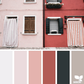
The folks behind Design Seeds' Instagram account do a wonderful job of showing their followers just how important color schemes are to beautiful design. They use Instagram to create color palettes inspired by images submitted to them on Instagram using the #SeedsColor hashtag. This is a fun way to share their passion for nature's beauty while encouraging engagement.
design-seeds-instagram-4.png design-seeds-instagram-1.png
design-seeds-instagram-3.png design-seeds-instagram-2.png

13) Canva: @Canva 

As a design tool, it makes sense that Canva's Instagram account would be centered around design. Not only do they post gorgeous photos and design work, but I especially love their color palette series, where they create color palettes based on photos, much like Design Seeds.
As an added bonus, they include the names and hex codes of each color and prompt their followers to punch the hex codes into their Canva color wheel to use them in their own designs.
canva-instagram-5.png canva-instagram-1.png
canva-instagram-3.png canva-instagram-4.png

Street Art

14) Jaime Rojo: @bkstreetart

Jaime Rojo isn't a street artist; he's a photographer of street art. One of his goals, which he articulates on his website, is to photograph new public art, street art, graffiti, and urban art as they're created, not just in Brooklyn, but all over the world (thanks to a partnership with Urban Nation Berlin). He keeps an eye on developing trends and strives to lead a worldwide conversation about how these trends affect popular and art culture. His Instagram is a live collection of his photographs, in which he credits and tags the artist when known.
brooklyn-street-art-instagram-2.png brooklyn-street-art-instagram-3.png
brooklyn-street-art-instagram-4.png brooklyn-street-art-instagram-1.png

15) Biafra Inc.: @biafrainc

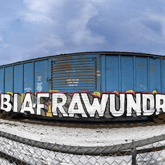
Biafra Inc. is an anonymous Minneapolis-based street artist who creates his work via spray paint, screen printing, stencils, stickers, and posters. As he tells it, his work is often "a visual retelling of stories that are apart of his life." As a self-proclaimed news junkie, he also incorporates socio-political themes in his work from time to time. His Instagram account is an inspirational showcase of his work in a variety of urban environments all over the Midwest.
biafrainc-instagram-1.png biafrainc-instagram-2.png
biafrainc-instagram-4.png biafrainc-instagram-3.png

16) Fumeroism: @fumeroism

"My art is an extension of my character, bold and uninhibited, assertive and unorthodox." That's how anonymous street artist Fumeroism describes his colorful, expressive, contemporary street art. His designs are often caricatures of real subjects, like his portrait of fellow street artist Sebastien Waknine in Barcelona in the third image below. Follow Fumeroism on Instagram for colorful, bold, and energetic street art in locations all over the world.
fumeroism-instagram-3.png fumeroism-instagram-4.png
fumeroism-instagram-2.png fumeroism-instagram-1.png

17) Banksy: @banksy 

Unsurprisingly, the famous British street artist Banksy doesn't post to his Instagram account very often. (Yes, it is his official account -- Banksy's publicist Jo Brooks confirmed it in a tweet.) But when he does, it's not something you'll want to miss.
For example, in February 2015, after almost a year and a half of nothing new on Instagram, Banksy posted a caption-less photo to his Instagram account of a brand new, never-before-seen piece of street art that Paste Magazine theorized appeared to be "done over a door. The location has not been discovered or revealed as of yet." Follow his account to scroll through some of his great work and to stay in the loop in case a new piece appears.
banksy-instagram-2.png banksy-instagram-1.png
banksy-instagram-3.png banksy-instagram-4.png

Photography

18) VuThéara Kham: @vutheara

When it comes to beautiful photography, there are a whole lot of Instagrammers to choose from. One of my favorites is Paris-based photographer VuThéara Kham, who actually started his career on Instagram and became quite popular in the Instagram community. Follow his Instagram account for gorgeously framed photos of Paris' landscapes and people.
VuTheara-instagram-1.png vutheara-instagram-2.png
vutheara-instagram-3.png vutheara-instagram-4.png

19) Hiroaki Fukuda: @hirozzzz

Instagram is actually the basis of Hiroaki Fukuda's photography career, which is why his posts on there are so darn good. Like Kham, Fukuda started as an Instagram hobbyist in Tokyo and ended up gaining a huge following.
When big brands caught wind of his talent and began hiring him for different projects, he became a full-time Instagrammer (yes, these do exist). Now, he travels all over the world taking photos for companies like Nike and Christian Dior. Side note: He told CNN in an interview that he likes when people comment on his photos ... so comment away!
hirozzzz-instagram-4.png hirozzzz-instagram-5.png
hirozzzz-instagram-2.png hirozzzz-instagram-1.png

20) Dirk Bakker: @macenzo

Although Dirk Bakker is an Amsterdam-based graphic designer, he likes to take photographs of art, design, and architecture -- and post it to his Instagram account. He has a keen eye for taking something "normal" -- like cranes or a staircase -- and transforming it into a stunning image with a great sense of depth. He's especially talented at capturing repetitive patterns like lines, geometric shapes, forms, and colors, making for striking images with strong visual impacts.
macenzo-instagram-2.png macenzo-instagram-3.png
macenzo-instagram-4.png macenzo-instagram-1.png

21) Max Wanger: @maxwanger

Max Wanger is a Los Angeles-based photographer who specializes in portraits, including wedding photos. His Instagram posts are a combination of his personal photography and the work he's done for clients. What I love about his photos is that they have a romantic, personal touch, and often make beautiful use of negative space.
max-wanger-instagram-1.png max-wanger-instagram-2.png
max-wanger-instagram-4.png max-wanger-instagram-3.png

Typography

22) Erik Marinovich: @erikmarinovich

Erik Marinovich is a lettering artist and designer and an entrepreneur. In addition to drawing letters, logos, and type for big brands like Nike, Target, Google, Facebook, Sonos, and Sharpie, Marinovich has also co-founded Friends of Type, a collaborative blog and shop, and Title Case, a creative work space that runs workshops and lectures. His Instagram account is a great showcase of his impressive lettering work, from branded design work to impressively cool doodles.
erik-marinovich-instagram-2.png erik-marinovich-instagram-4.png
erik-marinovich-instagram-1.png erik-marinovich-instagram-3.png

23) Ahda: @misterdoodle 

Ahda, the man behind the Mister Doodle pseudonym, is a hand letterer who's done design work for big brands like Element Skateboards, The Sunday Times U.K., Citizen Apparel, and more. His specialty is incorporating his beautiful, curvy hand lettering into shapes and illustrations. Check out his Instagram for photographs of his lettering work, including t-shirt designs and creative showcases of his projects alongside relevant props.
mister-doodle-instagram-1.png mister-doodle-instagram-3.png
mister-doodle-instagram-4.png mister-doodle-instagram-2.png

24) Cyril Vouilloz: @rylsee 

Cyril Vouilloz, a.k.a. Rylsee, is a Berlin-based designer with a fun and experimental take on typography. His unique hand-drawn lettering work plays with lines and dimensions -- and what makes his Instagram posts so cool is that many of them show his fingers "interacting" with his illustrations, enhancing the optical illusions in a way that'll blow your mind a little bit. Browse through his crazy cool work on Instagram, and follow him to see what original artwork and distortions he comes up with next.
rylsee-instagram-1.png rylsee-instagram-2.png
rylsee-instagram-4.png rylsee-instagram-3.png

25) Arabic Typography: @arabictypography

Beautiful typography doesn't just mean Latin letters. In fact, some of the most beautiful typography in the world comes from Arabic script. There are many features that make Arabic lettering so aesthetic: It's written from right to left, it can include accents and dots or lines, and its letters can vary in shape depending on their position in a word.
The Arabic Typography Instagram account, run by Egypt-based Noha Zayed, is a collection of beautiful Arabic typography -- from signage to street art to tattoos -- that's crowdsourced from all over the world.
arabic-typography-instagram-1.png arabic-typography-instagram-4.png
arabic-typography-instagram-3.png arabic-typography-instagram-2.png

Calligraphy

26) Seb Lester: @seblester 

Artist and Designer Seb Lester is one of the most famous calligraphy artists on Instagram, with over one million followers (as of this posting). The vast majority of his posts are actually videos -- and for good reason.
"So much of calligraphy is about movement and rhythm, and a short video can capture the beauty and the magic of calligraphy in a very Internet-friendly format," he told The New Yorker. "Recurring words in people’s comments are 'mesmerizing,' 'hypnotic,' and 'satisfying.' For reasons I don’t fully understand, people clearly enjoy watching the process of something perceived as 'perfect' being made from start to finish.”
Here's another cool video from his Instagram feed: 

27) Lindsay Oshida: @lindsayoshida

Lindsay Oshida is a Los Angeles-based graphic designer who posts beautiful calligraphy work to her Instagram account. She gained a lot of attention on Instagram for her "Game of Thrones" quotes, which she posted once per day during the ten days leading up to the 2015 season premiere.
For example, she did her piece "Kill the crows" (the first image below) in black letter with walnut ink, according to The New Yorker, and the black crows were sketched using a crow-quill nib -- "a calligrapher in-joke." She's since posted quotes both from "Game of Thrones" and other popular TV shows, and claims other calligraphers have followed her lead.
 lindsay-oshida-instagram-5.png lindsay-oshida-instagram-3.png
lindsay-oshida-instagram-1.png lindsay-oshida-instagram-2.png 

28) Calligraphy Videos: @calligraphyvideos

If you can't get enough of those mesmerizing calligraphy videos, here's another account that makes great use of video on Instagram. It's a collection of crowdsourced videos of people creating beautiful calligraphy in all different styles -- and the artists are cited in the captions in case you're looking for more calligraphers to follow. Prepare to be hypnotized.
Here's another video from their collection:
We hope this list helped you find some new designers to follow. May your Instagram feed be much more beautiful for it!