
Showing posts with label blog. Show all posts

Wednesday, October 5, 2016

16 of the Best Examples of Beautiful Blog Design


Written by | @
beautiful_blog_design-1.png
According to a recent U.K. survey, bloggers have ranked as the third most trustworthy source of information, following only friends and family. That's right -- bloggers are trusted more than celebrities, journalists, brands, and politicians.
But how do you get people to fall in love with your blog in the first place? (Aside from remarkable content, of course.)
Well, just as your website homepage is like the front door to your business, your blog's design -- much like a welcome mat -- is the front door to your business blog. New Call-to-action
If you're not attracting people visually, how will you get them to take the next steps to actually read (and, hopefully, subscribe to) your content? Once you're done creating the quality content, you still have the challenge of presenting it that clearly dictates what your blog is about. Images, text, and links need to be shown off just right -- otherwise, readers might abandon your content, if it's not aesthetically showcased in a way that's both appealing and easy to follow.
That's why we've compiled some examples of blog homepages to get you on the right track to designing the perfect blog for your readers. Check 'em out.

16 Inspiring Examples of Beautiful Blog Homepage Design

1) Help Scout

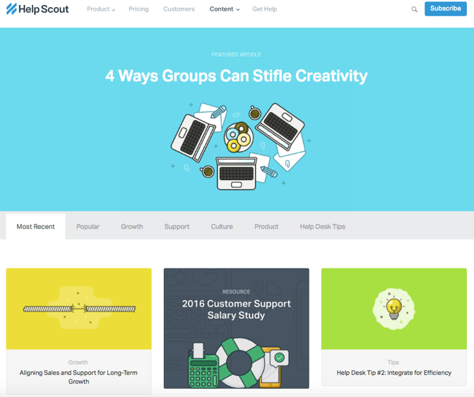
Sometimes, the best blog designs are also the simplest. Help Scout, makers of customer service software, uses a unique but minimalist design on its blog that we love -- it limits the use of copy and visuals and embraces negative space.
What we particularly like about this blog is its use of featured images for all posts, including a banner one at the top that highlights a recent or particularly popular entry. These icons are set in front of bright, block colors that catch the readers' eye and signal what the post is about. And it works -- everything about this blog's design says "clean" and "readable."
Help_Scout_Blog-2.png

2) Microsoft Stories

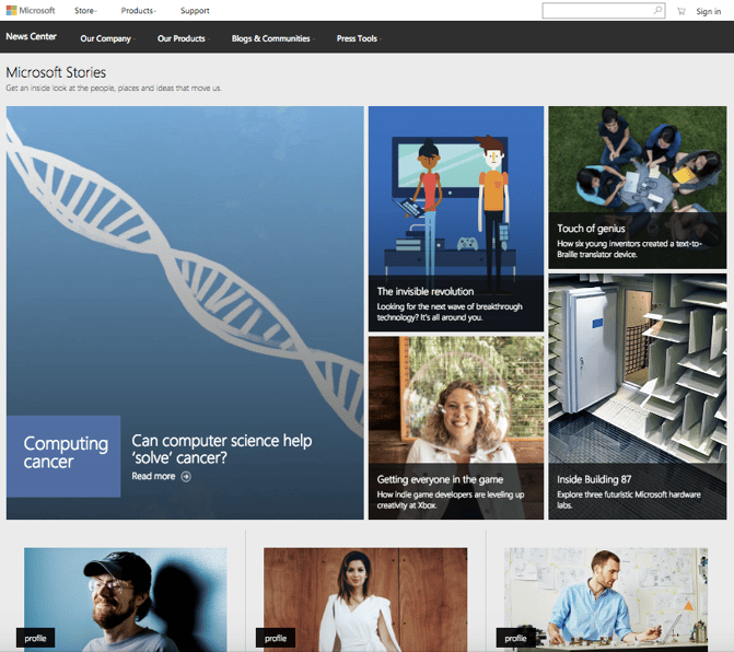
Full disclosure: We've totally gushed over Microsoft's "Stories" microsite before. We can't help it -- what better way to revitalize an old-school brand than with a blog that boasts beautiful, interactive, and inspiring branded content? Plus, the square layout of these stories is reminiscent of the Microsoft logo, which achieves a valuable brand consistency.
Microsoft Stories is also a prime example of how a business blog can be a major asset for an overall rebrand. In recent years, Microsoft has worked to humanize its brand, largely in response to a rivalry with Apple. The "Stories" microsite has a simple tagline -- "Get an inside look at the people, places and ideas that move us." It's the softer side of Microsoft, so to speak. 
When you're trying to convey a certain brand message, your blog can be used to communicate it -- both aesthetically, and content-wise.
Microsoft_Stories_Blog.png

3) Pando

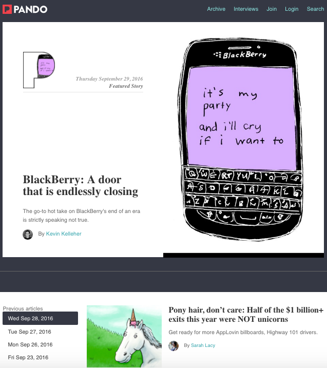
An important aspect of a well-designed blog is a consistent color scheme and style -- after all, 80% of consumers say that color boosts their recognition of a brand.
It's interesting to see how color consistency can unify the more diversified elements of design. Pando, a blog that explores the startup cycle, incorporates blue tones in several sections of its site -- the background, highlight bars, and certain areas of text. But it also uses several different fonts -- all of which manage to look seamless together, when tied together by a cohesive color scheme.
Pando_Blog.png

4) Design Milk

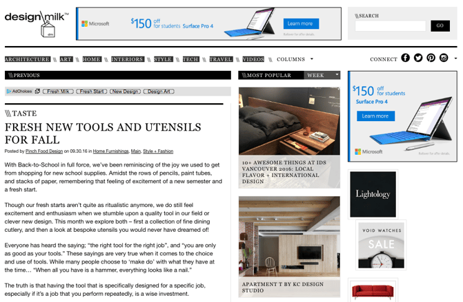
Design Milk, an online contemporary design outlet, uses a very simple layout to highlight its posts. The sidebar to the right -- which remains visible when a blog post is opened to read -- is perfect for showcasing thumbnail images for new articles. That's an internal link strategy, which helps to encourage readers to remain on the site longer.
The social icons at the top are a pleasant addition to the overall look and feel of the site -- they're easy to spot, and make it easy to share Design Milk's content. (And to learn more about adding social buttons to your blog, check out this post.)
Design Milk Blog.png

5) Fubiz

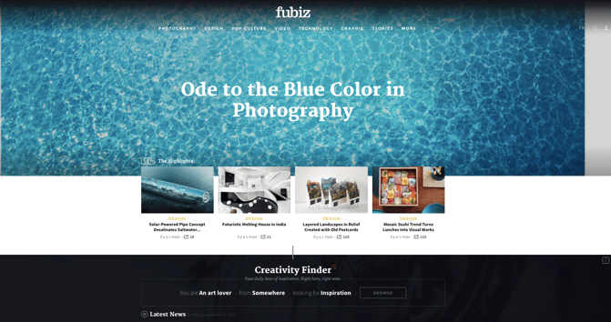
Fubiz, an art and design blog, is an example of a really sleek design that also includes some cool personalization.
Near the top of the blog's homepage, readers can side-scroll through "highlighted" posts. Below that is the Creativity Finder, where visitors can select their chosen personas -- from "Art Lover" to "Freelance" -- location, and the type of content they're looking for. From there, readers can browse content specifically catered to them. 
We can't help but love the header image, too. It uses something called "blue mind"psychology, which has found that the sight of open water can naturally draw us in. By using it in a design scheme, Fubiz is able to visually attract visitors to its content.
Fubiz blog.png

6) Webdesigner Depot

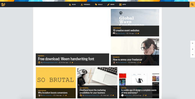
With a name like "Webdesigner Depot," it's no wonder that this design news site is visually appealing.
One thing that we particularly like is the way Webdesigner Depot has incorporated social sharing icons on each individual post. While we of course suggest actually reading each piece, having those links readily available helps visitors immediately share a headline they find interesting. And check out those navigation arrows on the right -- never before has it been so easy to scroll to the top or bottom of a page.
What's more, the color scheme, background, and fonts are all consistent -- which keeps this blog looking professional, but still distinct from the basic blog templates we might be used to seeing.
Webdesigner Depot Blog.png

7) Mashable

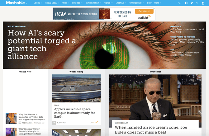
I mean, just look at that header image. The bold colors, the wiring overlay, the gripping pupil and the contrasting text. It absolutely catches the reader's eye -- no pun intended.
Mashable breaks its content into three noticeable sections on the homepage: New posts are listed on the left in the smallest sized thumbnails. "What's Rising" posts are displayed in the center column as large thumbnails, and the "What's Hot" posts are shown to the right, also as large thumbnails. This three-pronged approach to displaying content can help readers decide which kind of news matters to them the most -- the attention-grabbing top story, or other posts that are currently trending.
Plus, we like that the number of shares is displayed in each post preview -- that's a great form of social proof.
Mashable Homepage.png

8) Brit + Co

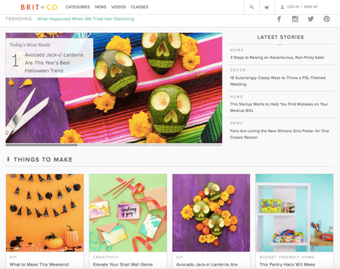
Everything about the Brit + Co homepage says "clean," "warm," and "welcoming." It's free of clutter, making the content more digestible, and the layout is extremely organized.
We dig the seasonality of the site, too. I mean, avocado jack-o'-lanterns on the dawn of October? Adorable, and replete with a colorful, fun photo to illustrate the story's content.
The subtle "trending" header also serves as a nice way to promote popular content, without being too in-you-face about it. Plus, with such great visuals, we took note of the nod to Pinterest -- that icon is important to include when your blog incorporates attractive imagery.
Brit+Co Blog.png

9) Tesco Living

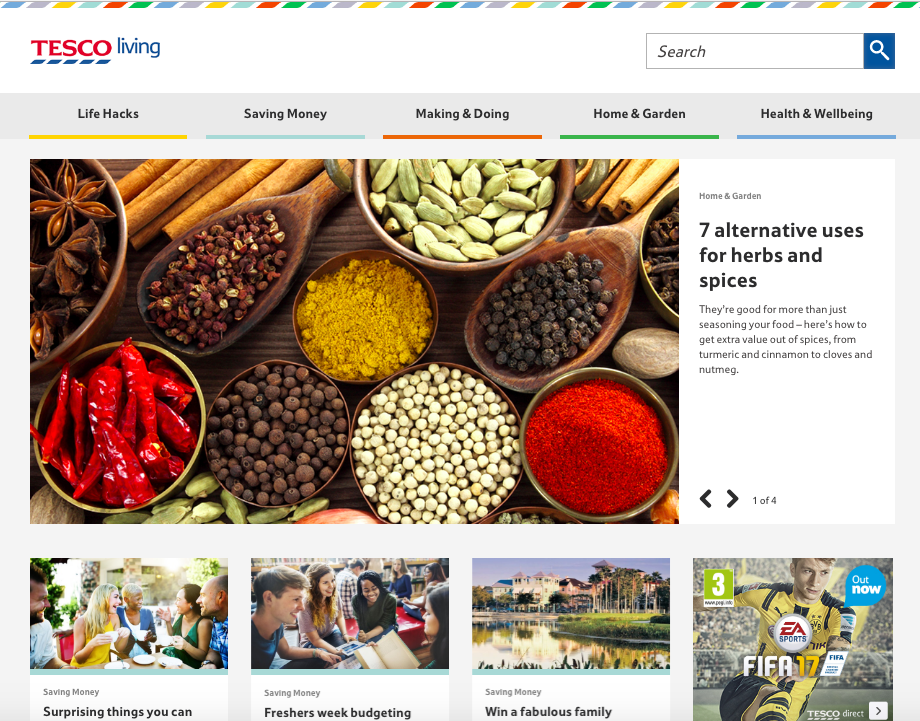
We love the colorful, consistent design of Tesco Living, the blog site of British grocery chain Tesco. 
Remember how we keep harping away at brand consistency? Check out the rhombus-like designs in the top banner -- that reflects the same ones that appear in Tesco's logo.
What Tesco Living has achieved is a great balance of simplicity and boldness. The layout is extremely minimal, but it isn't dull. Warm and welcoming shades underscore each content category, and the photos add dashes of colors throughout the site. It's a great example of how the right imagery can achieve an appealing "less-is-more" appearance, especially if that fits in with your overall brand concept.
TescoBlog.png

10) Crew

Crew Backstage, the blog of the Crew platform for designers and developers, has a fabulously minimalist blog design, but quiet a unique one.
Notice that, above the fold, it features one blog post with a large title, subtitle, and call-to-action to read more.
To the left, there's an equally minimalist call-to-action that makes it easy for readers to connect with Crew, or learn more. Plus, there's that consistency again -- everything above the fold is the same shade of blue, which has been shown to invoke brand trust.

Crew Backstage Blog.png

11) Innocent Drinks

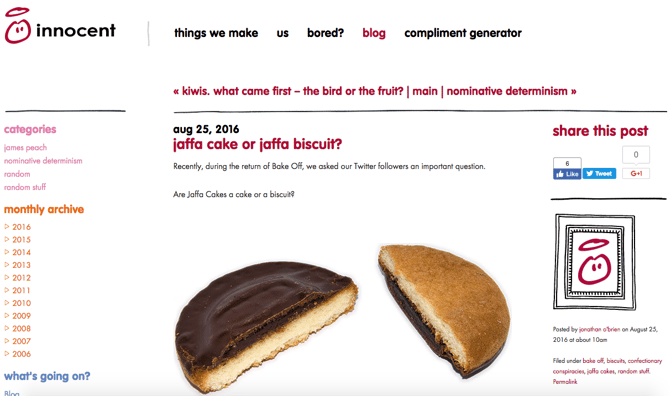
Not only are the folks at Innocent Drinks great copywriters, but the design of its blog is also a great reminder that blog designs don't have to get super fancy.
Notice how the logo -- displayed in the upper left -- is simple, cartoonish, and almost delightfully child-like. It works for Innocent Drinks (hint: childhood innocence), and that brand presence is maintained throughout the company's blog.
The colorful fonts, for example, match the logo and stay in line with the brand's casual, playful voice. We also like the easily-navigable archive links on the left, which are complemented by the geometric social sharing buttons on the right.
Innocent Drinks Blog.png

12) 500px

Much like Crew, the photography blog, 500px, leads with one featured article and a big, bold, high-definition photo to draw the reader in. That makes is pretty clear what the blog is about -- it boasts valuable content on photography with gripping photography.
Plus, how cool is it that the social links are right there, obviously displayed above the fold? They keep readers engaged with the content, and make it easy to share the photography -- and, content with images is up to three times as likely to be shared on social media.

500px Blog.png

13) BarkPost

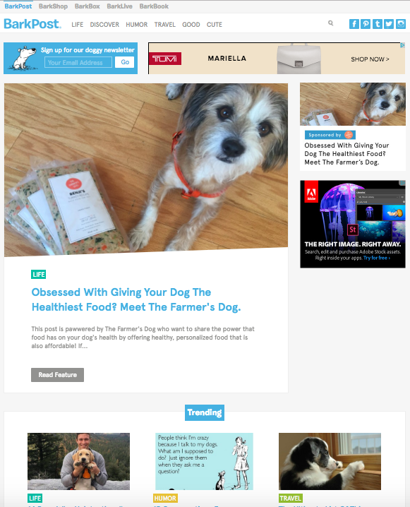
It's no secret that we kind of like dogs here at HubSpot. So when a blog dedicated to life as a dog owner came across our radar, it got our attention.
BarkPost, the blog of canine subscription box company BarkBox, is a great example of design for a number of reasons. First, look how easy it is to subscribe -- the call to action is right there, above the featured content. The social share icons are easily noticeable, too -- and, of course, all in the brand-matching, trustworthy blue.
We also like that BarkPost draws attention to its sister companies, all of which are owned under the Bark & Co portfolio of brands. But at the same time, the blog doesn't hock its own products -- rather, it serves as an informational resource to dog parents and lovers alike.
BarkPost Blog.png

14) Goodwill Industries International

Who says nonprofit organizations can't blog? Nay, they should -- and Goodwill's clean, colorful navigation (again -- the trustworthy blue) draw the reader to the important elements of this blog.
The posts are also neatly positioned and easily accessible to readers. And, visitors can pick the type of information that matters to them the most by choosing a topic from the drop-down menu on the top right.
Finally, we love that there's a collaborative call to action in the introductory text that invites readers to contribute content to the Goodwill blog. After all, the organizations services have reached 37 million people -- here's a way for them to share their stories, or invite donors to write about why they chose to support Goodwill.

Goodwill Blog.png

15) charity: water

Keeping the nonprofit blogging train going is charity: water, which makes excellent use of high-quality photography.
Recently, the organization redesigned its blog with a lengthy post dedicated to its 10-year anniversary. Using that opportunity to share its impact over the past decade, chartiy: water maintained a simplistic design with concise text and bright images from the anniversary event.
Plus, there's a clear CTA to donate at the top of the page. Placing that above a story about charity: water's impact is a double-edged sword, by both inspiring people to contribute to the cause while making it easy to do so.

charity water blog-1.png
charity: water blog 2.png

16Johnny Cupcakes

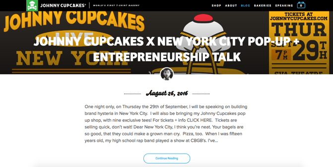
To clear up any confusion, Johnny Cupcakes doesn't actually make cupcakes. It makes clothing. But the company has done a great job of playing up its brand's association with baked goods -- its blog uses the subdomain "kitchen."
Plus, the folks at Johnny Cupcakes know a thing or two about brand consistency across channels. Its blog's simple color scheme and matching fonts help to create a unified user experience from the shop to general content, all the while throwing in bold, colorful images to catch readers' attention.
Also, visit the website and have a scroll -- we think it's pretty cool how the background images vary, but stay positionally static for each entry.
Johnny Cupcakes Blog.png
Which other blogs have excellent homepage d

Monday, January 13, 2014

15 Blog KPIs You Should Already Be Tracking

15 Blog KPIs You Should Already Be Tracking

by Pamela Vaughan

Date
January 13, 2014 at 8:00 AM
baby-metrics-measurementAnyone who manages a business blog knows all too well that the darn things require quite a bit of commitment.
The bright side is, they can also be extremely rewarding from a return-on-investment perspective. But how do you know if all that commitment is actually leading to a positive ROI? Analytics, my friends. Analytics. 
As someone who pulls together the monthly report for this very blog, I thought I'd share the metrics I track on a monthly basis (and for certain metrics, much more frequently) to report on the progress and success of our blogging efforts.

15 Blogging KPIs You Should Be Tracking

1) Overall Blog Visits

In other words, how many visits does your blog rake in in a given period of time? Tracking this on a monthly basis will give you a good sense of whether you're growing traffic to your blog over time and insight into monthly trends. For example, is January typically a strong month for your blog? Are there certain months in which your blog's performance is particularly sub-par? Picking up on these trends allows you to plan your strategy differently for months you know are known to be challenging.
HubSpot customers can easily track this metric using the Sources tool (pictured below). Google Analytics is another option for non-HubSpot users.
sources-screenshot

2) Traffic Source Breakdown

Where is the traffic to your blog coming from? Social media? Organic search? Referrals? Of those sources, which social networks, keywords, and websites are sending visitors your way? Knowing how your blog visits break down can give you insight into your high-performing channels as well as under-utilized ones. Where is your biggest opportunity for growth? Could your blog subscriber emails use some optimization to drive more traffic to your blog? Are you neglecting your blog's SEO?
This information is also accessible via the HubSpot Sources report or Google Analytics.
sources-breakdown

3) Blog Homepage Visits 

Of your overall blog visits, how many can be attributed to the homepage of your blog? Knowing this will give you a sense of whether your visitors use your blog as a destination site (i.e. direct traffic is a big driver of your visits, and visitors typically enter your blog's URL into their browser to get to you) vs. one that gets found through indirect sources. This will also give you a sense of the type of visitors you typically attract. For example, a lot of direct traffic is an indication of repeat visitors, whereas more traffic from indirect sources usually indicates a higher proportion of new visitors. Furthermore, if you notice that your homepage is generating a lot of your traffic, you might want to diagnose the efficiency of that homepage. Is it optimized for lead gen? What pieces of low-hanging marketing fruit is it missing? 
In HubSpot, customers can track this metric via the Page Performance tool (see below). Google Analytics is again an option for non-HubSpot users.
page-performance

4) Number of Posts Published 

Tracking the sheer number of blog posts published in a given time period is easy -- and great for identifying correlations between blogging volume/frequency and other results like traffic and leads. Our benchmarking data shows that blogging more leads to more traffic and leads, but what about for your blog in particular?
This metric is easy to count manually, but an export of HubSpot's Page Performance reportcan provide this data (along with the next four metrics) easily, too.

5) Top Viewed Posts 

Which posts are you real traffic drivers? Identifying these posts can help you analyze the topics, types, and formats of blog posts that are your bread and butter for raw visits. Having a traffic problem? Now you'll know which types of posts to create to solve it! 
HubSpot's Page Performance tool is your go-to for this metric. Just sort by views in the user interface or in the Excel export. Google Analytics can also help here as well.

6) Average Views per Post

This metric is good for understanding how each individual blog post contributes to overall traffic. It's also a great metric for understanding the correlation between volume/frequency and results. If you're publishing more, but your posts' average views go down, this means each individual post you publish is getting fewer views. This could be an indication that you're sacrificing quality for the sake of quantity -- and generating the same results. Could you generate the same results with fewer, but higher quality posts that lead to a higher quality blog overall? A similar metric to look at here is median views -- which is great when you have one or two over- or under-performing posts that might skew your averages. 
Again, the Page Performance tool, exported and analyzed is your best friend for this one if you're a HubSpot customer. Non-HubSpot users can fall back on Google Analytics.

7) Average Inbound Links per Post

Are you creating content worth linking to? Inbound links are extremely valuable currency in the land of search engines. It indicates to search engines that your content is valuable to others and worth ranking well in search results. Keep track of your average inbound links so you can keep tabs on the quality of your content (more important than ever in the eyes of Google) and thus, your inbound links' impact on your search authority.
And the winner is ... HubSpot's Page Performance! Not a customer? Google can help you out in your Google Webmaster account.

8) Average Comments per Post 

Although many consider the number of comments to be mainly a vanity metric, tracking engagement and sentiment among your readers definitely has its place. Use this to gauge your audience's reaction to your content and how involved your community is. If engagement is low, experiment with ways to encourage it: Pose questions in your content, try new types of content that might elicit a response, and get involved in the discussion in the comments of your posts as well. When your readers feel more engaged with your content, they'll be more likely to come back in the future, share your posts with others, and help you expand your reach.
HubSpot customers can get this from, you guessed it -- Page Performance! Otherwise, you'll need to rely on your individual blogging platform's analytics for this data.

9) Social Shares per Post 

While also somewhat of a vanity metric, number of social shares per post will give you a good sense of which types of content perform well in social media -- and in which social networks in particular. This can inform decisions about which types of content to promote in social (and on what networks specifically) for the best ROI. You might find that content that performs well on Twitter, for instance, does very poorly in a social network like LinkedIn. Use these insights to improve your social media marketing strategy as it relates to blog promotion.
Track your posts' overall social shares -- as well as a breakdown of the top four social networks -- using LinkTally.com, a free tool created by HubSpot's social media scientist, Dan Zarrella.

10) New Blog Leads (and Customers!)

Traffic is all well and good, but leads (and customers!) are a much better indicator of your blog's impact on your business' bottom line. Track how well your blog is contributing to lead and customer generation over time. In doing so, you'll be able to identify correlations between variables such as content volume, frequency, etc. and lead/customer generation effectiveness. You'll also be able to diagnose inefficiencies in your lead gen strategy. Is your truly blog optimized for lead gen?
To measure leads and customers from your blog, you'll need software with closed-loop reportingcapabilities.
HubSpot users, for example, can measure new contacts and customers generated by their blog via the Sources report for their landing pages (look at referrals, then your blog's subdomain), or, for Enterprise customers, by creating a custom Contacts report (see below) to track this data.
custom-contacts-report

11) Lead Source Breakdown 

Take it one step further by identifying the sources your blog leads are coming from. Do you generate more blog leads from email than social media? Pair this with your traffic source data for even meatier insight: For instance, if you notice social media isn't a great source of blog leads but is one of the top traffic sources for your blog, you might want to focus on finding ways to fix that discrepancy so you can generate more leads from all that social media traffic. 
In HubSpot, Enterprise users can see this lead source breakdown via a custom Contacts report.
leads-source-breakdown

12) Top Lead/Customer Gen Posts 

And if you really want to improve your blog's lead (or customer) gen potential, you need to dig into the data even deeper. One great way to do this is by analyzing your individual posts' lead gen effectiveness. A report that breaks down your blog's lead gen by post will give you a sense of the types of content that are great for generating leads. Does the topic matter? What about the format? This way, you can learn which types of posts are your true lead drivers and have that insight handy whenever you're behind on your leads goals. Same goes for generating customers! 
Again, HubSpot customers can use the Sources report for their landing pages and dig one level deeper to see new contacts/customer counts for each individual post. Furthermore, Enterprise customers can create a custom Contacts report broken for blog leads broken down by first page seen to gather this data. 
leads-by-post

13) Conversion Rate

Calculate your conversion rates (visit-to-lead and lead-to-customer) to understand the relationship between traffic, leads, and customers. This can help you pinpoint what you should be focusing on when making improvements to your blog. If you improve your visit-to-lead conversion rate for example, you can generate even more leads from the same amount of traffic. On the other hand, you could also increase lead/customer generation by increasing traffic and keeping your conversion rates steady. Track this over time to understand how changes to your blogging strategy and tactics are affecting your ability to convert visitors and leads.
Here's a handy online calculator for calculating conversion rates. If you're a HubSpot customer, we'll do you one better -- the Sources tool calculates conversion rates for youautomatically!
conversion-rate

14) Active RSS Subscribers

How many people are subscribed to your blog via RSS? More importantly, how many of those subscribers actively check your feed? The number of active subscribers you have is a great metric for evaluating how many loyal, dedicated readers you've attracted and retained. It's also a great indicator of your blog's stickiness. Do people just visit your blog once, never to return? Or do they love your content so much they want to keep coming back for more? Generating more and more of the latter type of visitor means you're growing a group of content evangelists who are more likely to share your content, sing your praises, and expand your reach to more potential readers.
For HubSpot customers, RSS subscribers can be accessed via Page Performance. Keep in mind that HubSpot's reporting gives you the number of active subscribers who have accessed your blog's feed in the last day -- weeding out inactive subscribers who may have added your feed to their RSS reader once but never checked it later and giving you a more accurate report on your RSS subscribers. It also provides a quick look at how this number has changed over time. If you're not a HubSpot customer, check your RSS feed account for more information about how your subscriber count is calculated.
subscribers-1

15) Email Subscribers 

Last, but definitely not least, we have another breed of subscribers -- your email subscribers. Email subscribers have all of the same benefits of RSS subscribers and more, since these subscribers have given you access to their precious inboxes. As a result, there's a direct correlation between the number of email subscribers you have and the amount of email traffic you generate to your blog. If you haven't put a lot of effort into generating email subscribers, you're sitting on a gold mine of opportunity, my friends. Get started with these tips for converting casual visitors into dedicated subscribers. Then beef up your blog subscriber emails so you're getting the most out of them with these best practices.