Showing posts with label Website Redesign. Show all posts

Thursday, May 23, 2019

StoryBrand Website Examples

StoryBrand Website Examples

But somewhere along the line, whether through busyness or the complicatedness of life, you start wondering, am I doing this right?
I have felt that feeling myself. I wondered if I described my customer’s problem in such a way they identify with it. I struggled with getting my language clean and concise. I wrestled with being too “cute” or too “artsy” in my language. I was too verbose.
And, I think the biggest issue I had (and seen others have) is that I knew my product so well I started talking with ‘insider’ language — this is where everyone inside the organization knows what you are talking about because it is familiar, but others really have no idea. This is extraordinarily easy to do and a bit tricky to overcome.

When we’re not clear in our marketing or on our website, we lose revenue.

Many people are in business to improve their customer’s lives and make our world a better place — even if only in a small way. They hear talk of revenue and check out. Revenue isn’t the point for these folks. Impact is.
However, without revenue, there is no capital to invest in the world. Your impact diminishes. Many nonprofits or businesses with a social mission are forced to close their doors because they didn’t see the necessity of prioritizing revenue.
Whether your goal is to make a bunch of money or to have a meaningful impact, your marketing matters. Your message matters.
When I am trying to learn a new way of doing things, I love to see examples of people who are masters of that skill.
Just like bikes in a peloton draft off of one another, gaining speed from each other’s draft, marketers gain momentum and clarity by looking at examples of how to do it right. How to be excessively clear.

Here are six StoryBrand website examples

In this article, our goal is to emphasize the first impression, the first three seconds, and demonstrate how StoryBrand can make your website immediately clear. Find a full walkthrough of how to StoryBrand your website here.
Or click here to download a StoryBrand website template you can use to upgrade your own website.
Viewers only give you 3 seconds to tell them what you do before they decide to check out. If you’re not clear, they leave. We use something we call the “Grunt Test” to see how clear a website is. We look at the site for 3 seconds and ask these 3 questions:
  1. What do you sell?
  2. How does it make my life better?
  3. How do I buy?
The companies in these StoryBrand website examples come from a diverse population of size and type. The common element is that they are incredibly CLEAR. In a quick scan of each website, it is immediately apparent what these businesses are selling and how to buy it.
Let’s look at some StoryBrand website examples to see if they pass the Grunt Test.

StoryBrand Website Example #1: CageRat Baseball

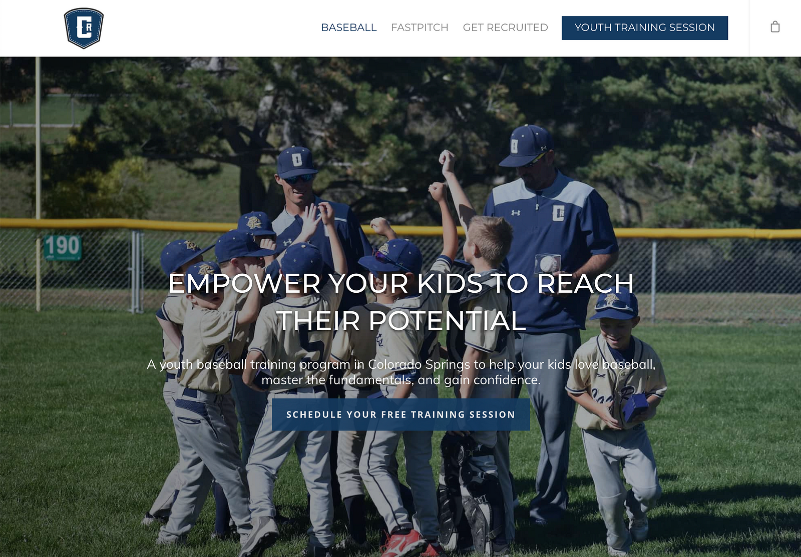
This certainly passes the test of clarity. Many websites don’t explicitly state what they’re selling. Users have to scroll all over the site and burn many mental calories to figure it out. CageRat clearly tells you what they offer. Let’s go through the Grunt Test.
  1. What do they do? It’s a youth baseball training program.
  2. How does it make your life better? It helps you empower your son to reach his potential. And, look at that picture! As a parent, I recognize what’s going on instantly. In fact, that’s exactly what I want for my son.
  3. How do you buy? There are two clearly labeled buttons.
Let’s look at another website.

StoryBrand Website Example #2: Koha Pet Food

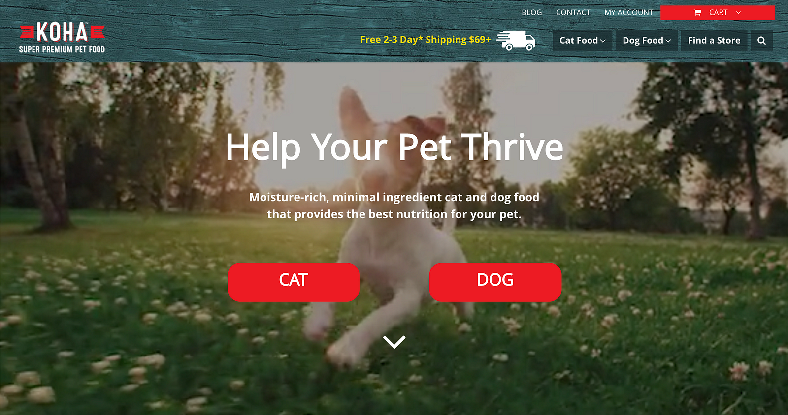
  1. What do they do? They help your pet thrive with food that provides the best nutrition for your pet. This is extraordinarily clear.
  2. How does it make your life better? Your pet is now thriving and healthy. And that picture helps me imagine how happy my dog will be when I start feeding him Koha!
  3. How do you buy? By clicking one of those big, red buttons! So good.
Their photo makes you smile as you imagine your own wonderful dog leaping and enjoying his or her life because s/he feels good. All because of good nutrition. Koha is a great example of a clear message.
In this next example, this company took clarity even further — they put it in their name.

StoryBrand Website Example #3: Perfect Venue

Notice the photo and the wording. We aren’t left guessing what these guys offer.
  1. What do they do? Help you find a venue for an event.
  2. How does it make your life better? They don’t help you find a mediocre venue, they help you find the perfect venue for your event!
  3. How do you buy? This one’s a little different, the main call to action is “Find a Venue.” There are two clear buttons for you to press to do that.
This next website example is a little different. It’s a person rather than a company.

StoryBrand Website Example #4: Judy Ingels

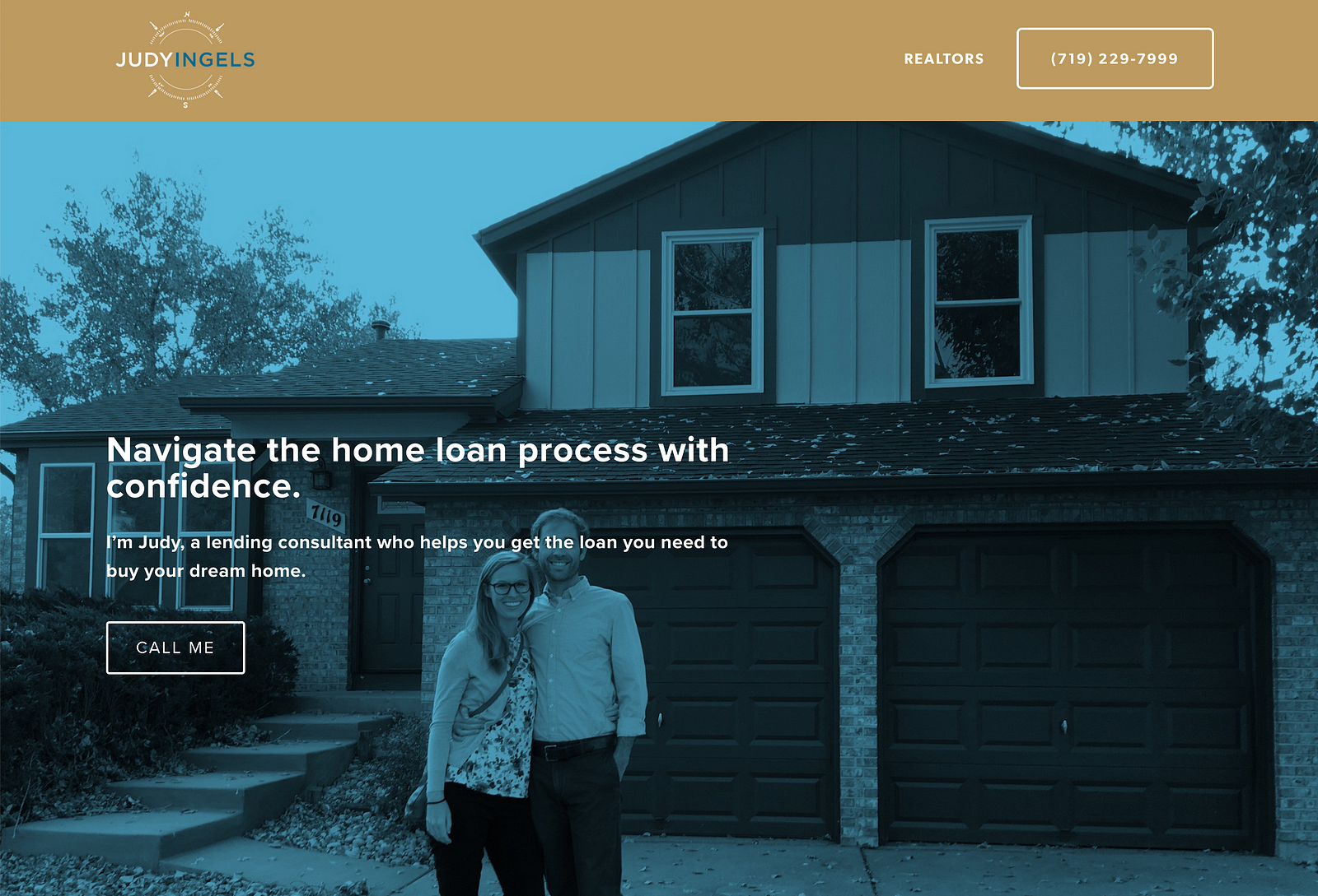
In this StoryBrand website example, it’s evident that even when a brand is a person all the same rules about clarity and message still apply.
  1. What does she do? She helps you get a home loan.
  2. How does it make your life better? You get to buy your dream home! And she also helps with the insecurity that comes with buying a house. If you have ever bought a home, then you know that it is a complicated process that can easily create tension and frustration.
Here is a great example of addressing both an internal and an external problem for the customer. Anxiety and frustration are strong emotions that motivate people. If your business can address my angst and also the “internal crazy”, then I am that much more willing to entertain your offer. And that makes you more money.
  1. How do you buy? Here is another example of making things very understandable to the website visitor. Notice how easy it is to find the call-to-action button. Nice job!

StoryBrand Website Example #5: Zoe Facility Services

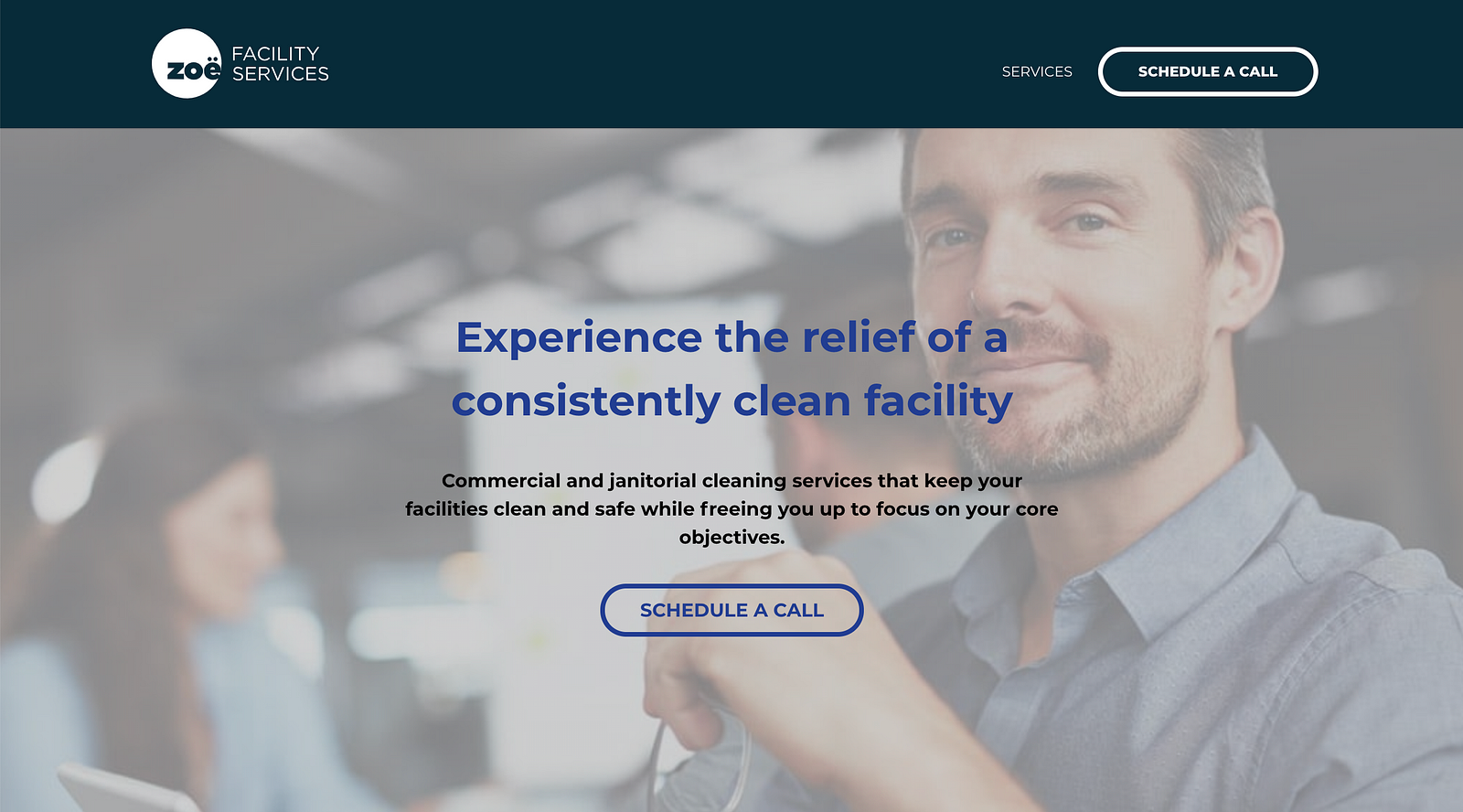
You don’t necessarily know what this business does from the name, however, the copy immediately tells you what this business is all about.
  1. What do they do? They clean your facility.
  2. How do they make your life better? You experience relief. You are free to focus on your core objectives. And your building is clean. Consistently.
  3. How do you buy? Click the “Schedule a Call” button

StoryBrand Website Example #6: Colorado Mobile Drug Testing

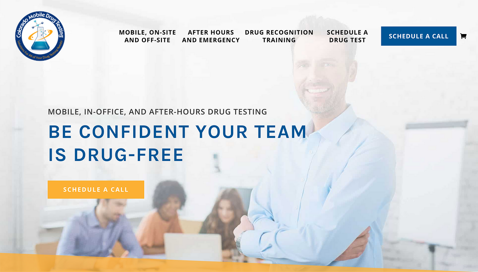
All of the pieces that we have been talking about show up on this StoryBrand website example.
  1. What do they do? Drug testing anywhere.
  2. How does it make your life better? Gain confidence your team isn’t on drugs.
  3. How do you buy? The easy to spot call-to-action button.
This company’s target client is someone who is not sure if their team is drug-free. Furthermore, it is difficult to get employees to go to some off-site location and get drug-tested. This would make me uneasy. Especially if the work involved any kind of precision that could harm other people if attention to detail was lacking.
Who comes to the rescue? You can, by utilizing Colorado Mobile Testing. They come to you and do the testing at a time that works for your people. The company is not the hero, the customer is. They save the day by bringing along someone who can really help, by helping you keep your team drug-free.
Now that you understand these concepts and have seen them implemented in several StoryBrand website examples, do you feel more confident as you try to change your own messaging? I hope these examples both inspired you and challenged you to change some of the messaging on your own website.
Click here to download a StoryBrand website template you can use to upgrade your own website.
Don’t continue missing out on future revenue and customers because your messaging is clunky and obtuse. Learn from these StoryBrand website examples.
When people understand what you sell and how it makes their life better, they buy more. Take some time and see if you can get your website as clear as the StoryBrand website examples we looked at here.

Monday, June 20, 2016

18 of the Best Examples of Mobile Website Design

Now more than ever, businesses are focusing on creating delightful mobile website experiences.
After all, Google has been heavily favoring mobile-friendly websites since they updated their algorithm in April 2015 and again in March 2016. And that's crucial, seeing as there have been more Google search queries on smartphones than on desktop computers and tablets for over a year now.
Going forward, Google will only continue to raise the bar for what it considers to be mobile-friendly (including page load time) and reflect that in its algorithm updates. So if you haven't been focusing on improving your mobile experience, you'd better prioritize it now, or your search ranking could really suffer. New Call-to-action
To help inspire any mobile website design changes you'll be making, here's a list of 18 companies who really nailed their mobile web experience.

18 of the Best Mobile Website Design Examples

1) Shutterfly

Shutterfly is an online service that allows users to create photo books, personalized cards and stationary, and more. Because more and more people are taking photos and then accessing them using their smartphones, Shutterfly recognized the need to create a great mobile experience for their customers -- and they delivered.
Shutterfly accomplishes two key goals on their mobile website:
  • It's easy for users to find out information about their offerings.
  • They're selling that information by way of beautiful imagery.
When you arrive on their mobile site, you'll see the menu items have been enhanced into large buttons at the bottom half of the screen. This makes it easy for users to quickly select which option they're interested in learning more about.
shutterfly-mobile-site-1.png
Once users click through to one of those options, they're greeted with large photos showcasing what Shutterfly is capable of for easy browsing.
shutterfly-mobile-site-2.png

2) Google Maps

Everyone has their favorite map or directions application. Mine is Google Maps, which I use whether I'm walking, driving, biking, or taking public transportation. What's special about their mobile website is that it's virtually indistinguishable from their downloadable mobile app.
The screenshots below are taken of their mobile website, but if you're familiar at all with the app, you'll notice they look exactly the same. Not only is the appearance identical, but the mobile website has the speed and functionality of the app.
google-maps-mobile-site-1.png
google-maps-mobile-site-2.png

3) Typeform

Typeform is a Barcelona-based tech company with one, simple mission: to "make forms awesome." Their desktop website is really beautifully designed, greeting visitors with succinct copy, high-definition videos, relevant animations, and other, more complex design components.
But for mobile users, they recognized that complex design components like video and animations could significantly affect page load time, among other difficulties. That's why they actually removed many of them -- which decluttered the site and simplified the overall mobile experience. The mobile website is a simpler version of their desktop website, and it's still beautifully designed.
typeform-mobile-site-1.png
Take note of the large buttons in their menus -- perfect for tapping with your finger on a mobile screen.
typeform-mobile-site-2.png

4) Etsy

Etsy is an ecommerce website where people can buy and sell vintage or handmade items. Most buyers who visit Etsy's website are there to do one of two things: Either they're searching for a specific item, or they're browsing items in categories that interest them.
The mobile website caters to both types of visitors from the very beginning. When you first go to their mobile website, you're greeted with an option to search for specific items, shops, or categories.
etsy-mobile-site-1.png
Immediately below the search bar are thumbnail images of trending items that showcase some of the most popular things you can buy on Etsy. Mobile users can view these trending items in a collage format, and the images are big enough for them to easily tap with their finger.
etsy-mobile-site-2.png

5) Adrian Zumbrunnen

This is the personal website of Adrian Zumbrunnen, a UX designer, writer, and speaker. When you visit his website, you'll notice right away there's something very unique about it: It's a conversational website.
It almost looks like a text message conversation you'd normally have on your phone -- including the ellipsis to show he's "typing." Users are given two response options at the end of every exchange, so it's kind of like a "choose-your-own-adventure" experience.
While the mobile and desktop experience are very similar, the desktop website feels like it was made primarily for mobile -- which could be the direction sites will go in the future.
adrian-zumbrunnen.gif
And if you'd prefer not to engage in the conversation-like exchange, you can simply scroll down for details.
zumbrunnen-mobile-site.jpg

6) Elf on the Shelf

Elf on the Shelf is, relatively speaking, a fairly new Christmas tradition based on a children's book. If you're unfamiliar, the basic premise is this: The book tells the story of Santa's scout elves, who are sent by Santa to watch over children in their homes all over the world and report back to Santa.
Along with the book, parents can purchase an elf figurine, which they'll subtly place somewhere in their house where their kids can see it. Every night leading up to Christmas, parents move the elf to a different location around their house to "prove" to their kids that the scout elves are real and always looking over them.
When you first arrive on Elf on the Shelf's website, you'll see that there are actually numerous types of Elf on the Shelf products you can purchase. But instead of forcing users to scroll through a long, text-based list, the web designers made it easy for users to simply swipe from left to right to look through all the different options -- ideal for visitors browsing products on the website.
elf-on-shelf-mobile-site.png

7) BuzzFeed

BuzzFeed is a news company known for it's viral content and popular quizzes. It also happens to be one of my favorite sources of entertainment during my commute to and from work.
And where do you think I'm checking BuzzFeed during my commute? You guessed it: on my phone. BuzzFeed knows that a lot of their visitors are visiting their site on mobile, so they've taken great care to create a smooth experience for their on-the-go readers.
When you arrive at BuzzFeed's mobile website, the first thing you'll see is some of their most popular pieces of content displayed in a simple, collage-like format using large images that are easy to tap with your finger.
buzzfeed-mobile-site-1.png
For users interested in specific categories, there's a clickable menu in the top left-hand corner of the screen that lists out all the post categories.
buzzfeed-mobile-site-2.png

8) Evernote

Evernote is an application that allows you to store notes, images, and web articles and then access them across all your devices. Because users tend to download the app or access the website on multiple devices including desktop computer, smartphone, and tablets, it's essential that Evernote get the mobile experience right.
If you look at Evernote's homepage on your desktop computer, you'll notice how clean the design is. The value statements are short and to-the-point, and the images add to the positioning but don't clutter the page. When you look at their mobile website, they've kept this design and style entirely intact. Their mobile website is clean, simple, and doesn't detract at all from the value of the app.
evernote-mobile-site-1.png
Plus, there are those large call-to-action buttons again, which are great for mobile users.
evernote-mobile-site-2.png

9) Huffington Post

The Huffington Post is a well-known news outlet that reports from everything from politics and current events to entertainment and technology. What makes their mobile website unique is that they actually alter their headlines slightly for mobile users so their content is more easily scannable.
If you compare the desktop versus mobile websites, you'll notice that the mobile website has fewer words on the homepage. The headlines are shorter and much more digestible -- perfect for someone skimming or reading on a small screen.
huffington-post-mobile-site-1.png
As with BuzzFeed, you'll find a clickable menu in the top left-hand corner of the screen listing out all the post categories.
huffington-post-mobile-site-2.png

10) Express

Express is a clothing store that caters to young men and women. Because their audience often comes to their website to browse clothing, it's important for their website to include big, clear images of their clothing -- especially on mobile devices, when users will need to tap items on the screen with their fingers to click through for purchase information.
Express takes their mobile experience a step further than most online retail sites. If you slide your finger from left to right across an image showing a piece of clothing, the image will change so you can see the clothing in a different view. In other words, users don't have to load another page to see multiple pictures of the same article of clothing.
Look at the image on the top right in the following two images to see how it changes when you swipe to one side:
express-mobile-site-1.png
express-mobile-site-2.png

11) Nationwide Insurance

Nationwide Insurance provides insurance and financial services. You might think a financial company would have a really complicated website, but on mobile, Nationwide Insurance nails down the simple user experience.
When you arrive on their mobile site, you can get an auto insurance quote right away by entering your zip code -- or, alternatively, you can "Find an Agent" to learn more information about their services. Other than logging in or signing up for an account, that's all the homepage offers.
Although this gives users limited options, it makes for a much easier experience for visitors using small screens. This is a great technique to lead potential customers in the right direction.
nationwide-mobile-site.png

12) Squaredot

Squaredot is a HubSpot partner agency that helps marketers build out their inbound marketing strategies. Their mobile website is colorful, simple, and makes for easy navigating. But what sticks out to me most is how they've adapted their blog for mobile users. Check out the screenshot below, which shows one article in a list of many. Each article takes up the entire width of the screen, making for large, eye-catching images and text that's big enough to skim
squaredot-mobile-site-1.png
We like how they've optimized their online forms for mobile, too. Check out how large the text and the form fields are in the subscription CTA below, making it easier for folks to fill it out on their mobile devices instead of pinching and zooming.
squaredot-mobile-site-2.png

13) Zappos

Zappos is an online vendor for shoes and clothing known for their stellar customer service. Their top priority on mobile is to help users search easily for the items they're looking for on their website, so they've put a large search bar at both the top and bottom of their mobile website to make it super easy for them.
This is what the top of their mobile site looks like:
zappos-mobile-site-1.png
And here's the bottom of the page (equipped with a delightful signoff):
zappos-mobile-site-2-1.png

14) ABC

ABC is a television broadcasting company known for popular shows like "The Bachelorette," "Battle Bots," and "General Hospital." Users visiting ABC's desktop website are greeted with a ton of options: view their television schedule, check out the Oscar winners, watch some of your favorite television shows, or even look at entertainment news relating to those shows.
But ABC knows that the experience on a mobile device should be simplified. When you visit the ABC website on a mobile device, you aren't offered nearly as many choices from the get-go. Instead, you're given one option: to scroll through large, clickable images representing all their television shows. Users can scan through these options and click into any show they want.
abc-mobile-site.jpg

15) Lean Labs

Lean Labs is a HubSpot partner agency that creates engaging, responsive, and high conversion web solutions. (They were also featured on ABC's hit TV series Shark Tank.) The folks over there do a great job of providing a smooth experience for their mobile users, especially with regard to their design techniques and the emphasis they place on their core values, which are apparent to visitors within seconds of landing on their mobile site.
Notice how their mobile website uses scale and color to distinguish certain elements of their page:
lean-labs-mobile-site-1.png
And, like I said before, their core values -- growth strategies, responsive web design, and inbound marketing -- are clearly visible to mobile users scrolling through the homepage, with relevant icons to match.
lean-labs-mobile-site-2.png

16) SAP

SAP is an enterprise software company that manages business operations and customer relations. They enhance the mobile experience by condensing information.
More specifically, they combine some of their calls-to-action into sliders, whereas their desktop website has these CTAs laid out horizontally. This helps keep things simple so mobile users aren't overwhelmed with a lot of information at once, and it also ensures none of the CTAs are too small to read.
SAP-mobile-site.jpg

17) KISSmetrics

KISSmetrics provides analytics software for businesses. On their homepage, there's a lot of information explaining what the software does along with a testimonial.
But their mobile site is displayed a little differently: On a mobile device, the information on their site is shown in a list with alternative dark and light modules. This makes it easy for users to skim the page without getting lost in text.
kissmetrics-mobile-site-2.png
They've also made the text and fields on their forms large and easy to read:
kissmetrics

18) idig Marketing

idig Marketing is a development and communications provider. Their mobile website is laid out similarly to their desktop website, but I especially liked how they incorporated the interactive heart icons into their blog posts so users can "Like" their posts.
This mimics the "Like" heart icon in Instagram and Twitter, which is easily recognizable for mobile users familiar with those platforms.
idig-marketing-mobile-site-2.jpg
These were some of our favorites. Which other mobile websites have caught your fancy? Share with us in the comments!