Friday, October 21, 2016

SocialSkim: Twitter Takeover Hopes Crushed; Pinterest Hits New Milestone

This week in social news: Twitter's hopes are dashed as all big players bow out of a potential takeover; Facebook updates Facebook Live with sought-after scheduling feature, releases push notifications feature for apps; an introduction to Busker, the livestreaming app blending content and ecommerce; four ways B2Bs should be using Snapchat and Instagram; and much more...
Skim to stay up to speed!
1. Twitter takeover speculation ends for now
A few weeks ago, we filled you in on three or four big-name companies reportedly mulling over the purchase of Twitter, but this week brings (much) less hope for the struggling social network, with Salesforce publicly breaking up with Twitter and walking away from a bid.
Google, Disney, Apple, and Verizon were other companies rumored to be interested in Twitter, and all of them have declined or dismissed speculation on the matter. Even Facebook is uninterested in an acquisition of what used to be seen as its top rival. Investor hopes were shattered, and growth-stunted Twitter now needs to find new ways to jump-start user growth and revenue... ideally before it updates investors on its earnings next week.

2. Facebook brings scheduling, waiting rooms to Facebook Live...
...for verified pages, at least. Those pages with the blue checkmark, and all other pages in the coming weeks, will soon be able to create a link to a livestream event up to a week in advance in order to help them recruit audiences and promote their broadcasts. The link will appear as a News Feed reminder post that lets users opt in for a one-time notification when the livestream event begins.
The new capability can help brands promote their broadcasts and avoid rushing to share updates on other social platforms during a livestream, and it also allows broadcasters to let viewers into a "lobby," or waiting room of sorts, up to three minutes before a stream begins, so avoiding the awkward lag-time when broadcasters wait for enough people to join a stream to start the show.
Will these new changes make you consider including Facebook Live in your social strategy?
3. Pinterest hits 150 million monthly users
The digital bulletin board platform announced that it grew 50% over the course of the past year andnow boasts 150 million monthly active users—with 80 million of them coming from outside the US. Those are impressive numbers for what the co-founder describes as more of a personal tool than a social network.
The company sees itself at the crossroads of social networking and online search, and in the same announcement boasted that the platform serves as an online venue for more than a million businesses, hosts tens of thousands of advertisers, and serves up 10 billion recommendations to its users daily. Has your company had success with Pinterest? Sound off in the comments below!
4. Facebook gives app developers the power of push notifications
Facebook announced the introduction of push campaigns for app developers at this year's F8 event, but only now is it moving the capability past the beta stage and into the hands of everyone. The feature is designed to help brands keep those who've downloaded their apps coming back for more by targeting specific users based on the actions they take while using the apps.
The new tool is part of Facebook's Analytics for Apps mobile analytics solution, which also allows companies to track app engagement and conversion rates, as well as specific demographics. The social network claims apps are registering up to 180% more retention when users opt into push notifications, and with 800,000 developers already using the analytics suite, it appears poised to take off.
5. B2B CMOs need to show social media savvy, and here's why
Building credibility, even in B2B circles, is becoming increasingly difficult to do without social media, which some in the industry have shunned despite the opportunity it provides to connect at scale. A recent interview with head of business development and CMO at global brand strategy and design firm Siegel+Gale dives into why social media is crucial for CMO's—and B2B brands in general—to establish credibility.
But social media savvy isn't something employees are born with, and the race to become fluent in mechanics and authentic in content often requires significant homework on the different platforms. Not doing so means you're missing an important opportunity, so check out these insights if you're not already convinced.
6. New livestreaming app aims to merge e-commerce and content
Busker, a new app named after the chiefly British term for street performer, seeks to blend commerce and content in a livestreaming app that incorporates real-time merchandising capabilities and tip collection.
Creators can sell shirts, bags, e-books, courses, music, and much more within the app, and Busker takes only 15% off the top because it doesn't owe the app stores the 30% required for apps that depend on in-app purchases. Tips let users support creators with real money, not virtual currency, and Busker functions like most other livestreaming platforms, with users able to launch or schedule a broadcast and interact with viewers with chat and likes.
With its live, interactive e-commerce and plans to open the door to retailers and brands who wish to monetize on the platform, we're thinking this could go a long way, so long as the frontrunners (cough, Facebook Live, cough) don't jump at the opportunity first.
7. Four ways B2Bs should use Snapchat and Instagram
Limiting your B2B company to generating leads and spreading your message on LinkedIn and Twitter can be costly, particularly when Millennials make up the largest portion of the US labor force, and Snapchat surpasses Twitter in daily active users.
Luckily, the two social networks boast numerous ways to benefit B2B brands, and The Social Media Examiner rounds them up with all the details you need for a jump start. Covered in detail: attracting new talent, creating visibility for events, boosting brand awareness, and showcasing customer success stories.
8. The best days and times to post on five major social networks
A thorough TrackMaven report that spans over 17.5 million social media posts from over 17,000 brands reveals that optimal posting times vary substantially across five major social networks—Facebook, Twitter, Instagram, LinkedIn, and Pinterest. Differences among industry are no exception, meaning aviation industry brands' sweet spot for social doesn't match that of marketing and advertising firms, for example.
Dig into the full TrackMaven report to find out when your LinkedIn leads might be most open to your pitches, what day of the week is best to show off on Instagram, and much more!
9. Four steps to generating quality leads on social media
Although many often consider it solely a tool for branding, social media offers businesses the opportunity to generate real leads if strategic in cross -promotion and thoughtful in content.
To help you boost your chances of generating worthwhile leads, Marketing Land's got four surefire ways to get your brand on track to greater lead generation based on real campaigns with real payoffs. Covered in detail: making your landing pages social, directing social media followers to your blog, creating separate social media accounts on one platform, and running competitions.
10. We'll wrap with Facebook's new push for users to get even more political
As if presidential elections weren't polarizing enough, one social network wants to make your political views even more evident. Facebook rolled out the ability for users to publicly "endorse" candidates by clicking the endorsement tabs on their pages, which results in the users' being able to share their declaration via a News Feed update—publicly or to select audiences.

The social network also rolled out issues tabs to political figures' pages, which lets them showcase their positions on specific topics with videos and quotes on those issues. Could Facebook actually become a place for civil discourse on political matters? Our hopes are... not the highest they've ever been.

Monday, October 17, 2016

The Rise of Mid-Roll Video Ads

The use of mid-roll digital video advertisements increased 24% between February 2015 and April 2016, according torecent research from Ooyala.
The report was based on data from 50 global premium online publishers and broadcasters collected between February 2015 and April 2016.
Some 33% of video ads served on the sites examined were mid-rolls in April 2016, up from 19% in February 2015.
Pre-roll remains the most popular video ad format, though its share dropped from 75% of all video ads served in March 2015 to 60% in April 2016.
Post-roll accounted for 7% of all video ads served in April 2016.


About the researchThe report was based on data from 50 global premium online publishers and broadcasters collected between February 2015 and April 2016.

#SocialSkim: Facebook Launches 'Workplace' Social Network;

What to know this week: Facebook officially introduces Workplace, launches standalone event app; Snapchat introduces post-roll ads, plans for $25 billion IPO; American Express gets social for Small Business Saturday; five tips for building qualified leads on LinkedIn; and much more... Skim for your weekly dose of need-to-know social!
1. Facebook officially launches 'Facebook at Work' under a new name
The social network officially announced the global launch of its enterprise social network—formerly known as Facebook at Work—at an event in London on Monday. The long-awaited and long-tested product is dubbed Workplace and offers a unique mix of Facebook's News Feed, groups, Facebook Live, messaging, search, and trends for company networks that remain separate from users' personal profiles.
Workplace offers companies exclusive features as well, including analytics dashboards, identity providers that let organizations integrate the product with their existing information technology systems, and multi-company groups that allow workers from separate organizations to collaborate securely.
Free for educational and nonprofit organizations, and with a cost-per-user pricing structure for others, it could be a smooth transition into enterprise software for your brand.

2. Snapchat introduces post-roll ads, new features to compete with Instagram Stories
To fight back against Instagram Stories, which quickly reached 100 million daily users after its introduction, Snapchat brought a suite of updates to put users' friends first.
The social network not only placed friends' Stories back up above its Discover section on the app but also replaced auto-advance Stories with what it calls the Story Playlist, which gives users the opportunity to select the Stories they wish to watch consecutively.
However, now that users can decide to watch a single Story at a time, or a Playlist of hand-picked ones, Snapchat also offers a new, post-roll ad-type to make sure the company can still stick ads at the end of a single Story should users opt to view just one.
3. Facebook launches standalone 'Events' and calendar app
Unlike Messenger, users won't be obliged to download the new Events app because a dedicated events section will remain in the social network's flagship app, but the launch gives the 100 million people who consult events on Facebook everyday a new way to explore, organize, and plan with ease.
Facebook Events, launched on iOS last Friday, compiles users' existing RSVPs, and provides a feed of what the social titan thinks would interest users, based on their friends' activity, their location, interests, Pages liked, and more.
The standalone app serves a reminder not only that 650 million people use Facebook Events in general but also that your brand might very well consider it in the future for event planning, if it hasn't already.
4. How to get social for American Express's Small Business Saturday
Ever feel let down on social because your small business can't afford to spend thousands on boosted posts? If you're not familiar with Small Business Saturday, here's the lowdown: Launched by American Express, it's a yearly event created to ignite awareness, show appreciation for, and stimulate commerce for US small businesses, from both a B2B and B2C perspective.
This year's Small Business Saturday falls on November 26, and even the smallest businesses have an arsenal of traditional and digital/social marketing assets courtesy of American Express to join the nationwide event.
Check out how Small Business Saturday, mixed with effective social media marketing, could give your company a boost!
5. Facebook eyes US for Free Basics Internet app
After its costly failure in India where regulators shut down the project because of fears it would disadvantage businesses that didn't have the money or notoriety to be included in the social network's free offering, rumors are swirling that Facebook is set to introduce a similar app to low-income and rural American communities.
The Free Basics app gives users free Internet access for resources like job boards, news, and health information, thanks to deals with wireless carriers that would allow the users to "stretch" their existing data plans. The service could provide new ways for businesses to reach currently unreachable customers, but also make Facebook those businesses' only recourse for doing so.
6. Snap Inc. working on $25 billion IPO
The parent company of Snapchat is eyeing March for a public debut, and it's envisioning an initial public offering that could value the company at $25 billion... or more. It's quite a feat for a social network that, fewer than two years ago, was sometimes treated as little more than a sexting app by major media.
To put such an IPO in perspective, it would be the largest since Chinese e-commerce giant Alibaba went public in 2014. Snapchat's integration of advertising and sponsored content has helped its valuation grow, and the app is set to hit 66.6 million users in the United States alone by 2017!
7. Five steps to generate more LinkedIn sales leads
Turning connections into leads on LinkedIn can prove a challenge, particularly for those B2B companies just starting out on the platform. Luckily, with the right guidebook and nifty hints, anyone can generate qualified leads through five thoughtful steps. Covered in detail: building your network strategically, shifting the focus away from yourself, sharing your secrets to build trust, staying top of mind, and making the ask.
8. What social platforms your brand should learn first
Different social media reach different demographics, and different types of content achieve varying levels of engagement depending on where they're posted. So, where does a B2B brand focus if just starting off? Embark on a social strategy that fits your brand goals, and provides the benefits and ROIs your company seeks.
LinkedIn is arguably the best platform for B2B leads, but Twitter, positioned more so now as a source of news, is also used with equal measure to raise brand awareness and share information.
While Tumblr is often left out of mainstream social media conversations, recent research from Pew shows that 10% of Internet users frequent it, so it might also be worth looking into a strategy for your brand if your business strengths are best represented by vibrant images and blog posts.
Check out the full insights for a solid start to social.
9. Meet Snapchat and Twitter: The tale of two diverging social networks
Snapchat and Twitter are headed in opposite directions, with the former being the darling of investors ahead of its high-value IPO, and the latter losing steam after bids for takeovers as monetization of the platform has faltered.
Twitter's been generating revenue far longer than Snapchat, so what are some reasons for the divergence? For one, Snapchat is poised to reach similar revenue levels of Twitter by 2018, and its user growth is projected to grow significantly faster than Twitter's.
Snapchat also boasts a higher average user time spent on the platform, and plays host the elusive Millennial audience brands so desperately seek. If your brand has been holding out on creating that Snapchat account, you may want to reconsider; it could very well be the future.
10. We'll wrap with how Adidas's 'dark social' experiment just got darker
Most of us might not be clear on the concept of dark social, but Adidas tried to tackle it head-on in an effort to build hyper-local communities that stretch beyond your typical brand ambassador by offering unique access to events, people, and experiences. But the brand is running into trouble for the same reasons that make dark social, well, dark.
Dark social refers to the tracking of communications that are shared privately on platforms like WhatsApp and other social networks, with little or no analytics readily available. Adidas used WhatsApp to slyly build groups of super brand ambassadors across the globe by providing them with access to cool things like a group conversation with one of their sponsored athletes. The goal was to encourage and harness the power of private recommendations to build relationships in a way that will serve the brand down the road.
But measuring engagement is proving more difficult than thought for the brand, and the senior director of global communications has some insights to share with brands considering dark social in their approach.

What do you think of the technique? Will infiltrating dark social lose its edge as messaging apps become filled with brand-built chatbots?

Wednesday, October 5, 2016

16 of the Best Examples of Beautiful Blog Design


Written by | @
beautiful_blog_design-1.png
According to a recent U.K. survey, bloggers have ranked as the third most trustworthy source of information, following only friends and family. That's right -- bloggers are trusted more than celebrities, journalists, brands, and politicians.
But how do you get people to fall in love with your blog in the first place? (Aside from remarkable content, of course.)
Well, just as your website homepage is like the front door to your business, your blog's design -- much like a welcome mat -- is the front door to your business blog. New Call-to-action
If you're not attracting people visually, how will you get them to take the next steps to actually read (and, hopefully, subscribe to) your content? Once you're done creating the quality content, you still have the challenge of presenting it that clearly dictates what your blog is about. Images, text, and links need to be shown off just right -- otherwise, readers might abandon your content, if it's not aesthetically showcased in a way that's both appealing and easy to follow.
That's why we've compiled some examples of blog homepages to get you on the right track to designing the perfect blog for your readers. Check 'em out.

16 Inspiring Examples of Beautiful Blog Homepage Design

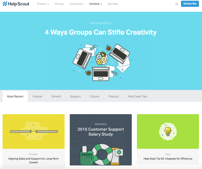
1) Help Scout

Sometimes, the best blog designs are also the simplest. Help Scout, makers of customer service software, uses a unique but minimalist design on its blog that we love -- it limits the use of copy and visuals and embraces negative space.
What we particularly like about this blog is its use of featured images for all posts, including a banner one at the top that highlights a recent or particularly popular entry. These icons are set in front of bright, block colors that catch the readers' eye and signal what the post is about. And it works -- everything about this blog's design says "clean" and "readable."
Help_Scout_Blog-2.png

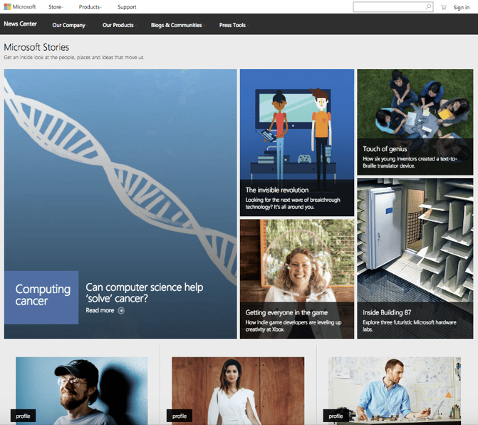
2) Microsoft Stories

Full disclosure: We've totally gushed over Microsoft's "Stories" microsite before. We can't help it -- what better way to revitalize an old-school brand than with a blog that boasts beautiful, interactive, and inspiring branded content? Plus, the square layout of these stories is reminiscent of the Microsoft logo, which achieves a valuable brand consistency.
Microsoft Stories is also a prime example of how a business blog can be a major asset for an overall rebrand. In recent years, Microsoft has worked to humanize its brand, largely in response to a rivalry with Apple. The "Stories" microsite has a simple tagline -- "Get an inside look at the people, places and ideas that move us." It's the softer side of Microsoft, so to speak. 
When you're trying to convey a certain brand message, your blog can be used to communicate it -- both aesthetically, and content-wise.
Microsoft_Stories_Blog.png

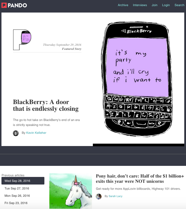
3) Pando

An important aspect of a well-designed blog is a consistent color scheme and style -- after all, 80% of consumers say that color boosts their recognition of a brand.
It's interesting to see how color consistency can unify the more diversified elements of design. Pando, a blog that explores the startup cycle, incorporates blue tones in several sections of its site -- the background, highlight bars, and certain areas of text. But it also uses several different fonts -- all of which manage to look seamless together, when tied together by a cohesive color scheme.
Pando_Blog.png

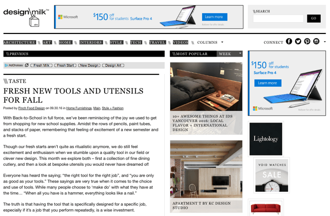
4) Design Milk

Design Milk, an online contemporary design outlet, uses a very simple layout to highlight its posts. The sidebar to the right -- which remains visible when a blog post is opened to read -- is perfect for showcasing thumbnail images for new articles. That's an internal link strategy, which helps to encourage readers to remain on the site longer.
The social icons at the top are a pleasant addition to the overall look and feel of the site -- they're easy to spot, and make it easy to share Design Milk's content. (And to learn more about adding social buttons to your blog, check out this post.)

Design Milk Blog.png

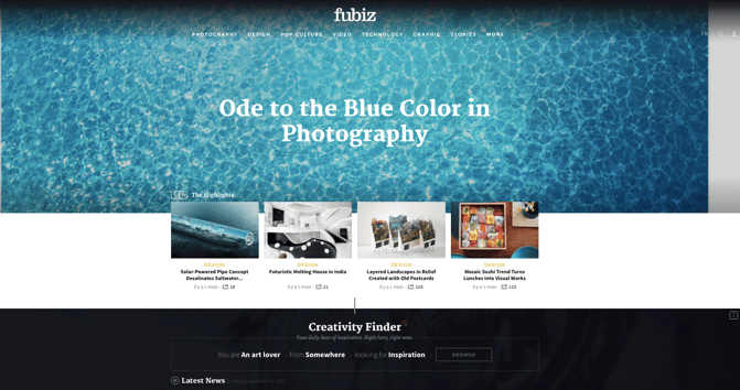
5) Fubiz

Fubiz, an art and design blog, is an example of a really sleek design that also includes some cool personalization.
Near the top of the blog's homepage, readers can side-scroll through "highlighted" posts. Below that is the Creativity Finder, where visitors can select their chosen personas -- from "Art Lover" to "Freelance" -- location, and the type of content they're looking for. From there, readers can browse content specifically catered to them. 
We can't help but love the header image, too. It uses something called "blue mind"psychology, which has found that the sight of open water can naturally draw us in. By using it in a design scheme, Fubiz is able to visually attract visitors to its content.
Fubiz blog.png

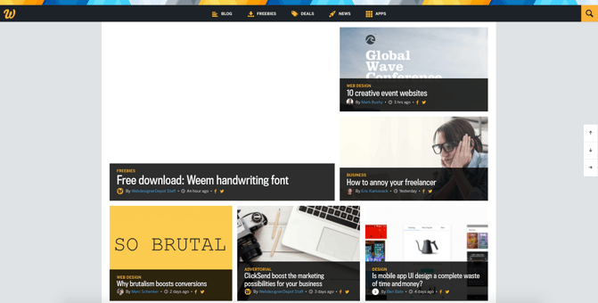
6) Webdesigner Depot

With a name like "Webdesigner Depot," it's no wonder that this design news site is visually appealing.
One thing that we particularly like is the way Webdesigner Depot has incorporated social sharing icons on each individual post. While we of course suggest actually reading each piece, having those links readily available helps visitors immediately share a headline they find interesting. And check out those navigation arrows on the right -- never before has it been so easy to scroll to the top or bottom of a page.
What's more, the color scheme, background, and fonts are all consistent -- which keeps this blog looking professional, but still distinct from the basic blog templates we might be used to seeing.
Webdesigner Depot Blog.png

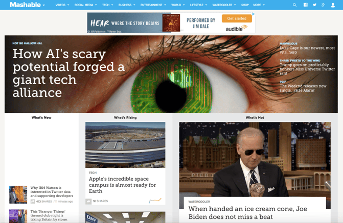
7) Mashable

I mean, just look at that header image. The bold colors, the wiring overlay, the gripping pupil and the contrasting text. It absolutely catches the reader's eye -- no pun intended.
Mashable breaks its content into three noticeable sections on the homepage: New posts are listed on the left in the smallest sized thumbnails. "What's Rising" posts are displayed in the center column as large thumbnails, and the "What's Hot" posts are shown to the right, also as large thumbnails. This three-pronged approach to displaying content can help readers decide which kind of news matters to them the most -- the attention-grabbing top story, or other posts that are currently trending.
Plus, we like that the number of shares is displayed in each post preview -- that's a great form of social proof.
Mashable Homepage.png

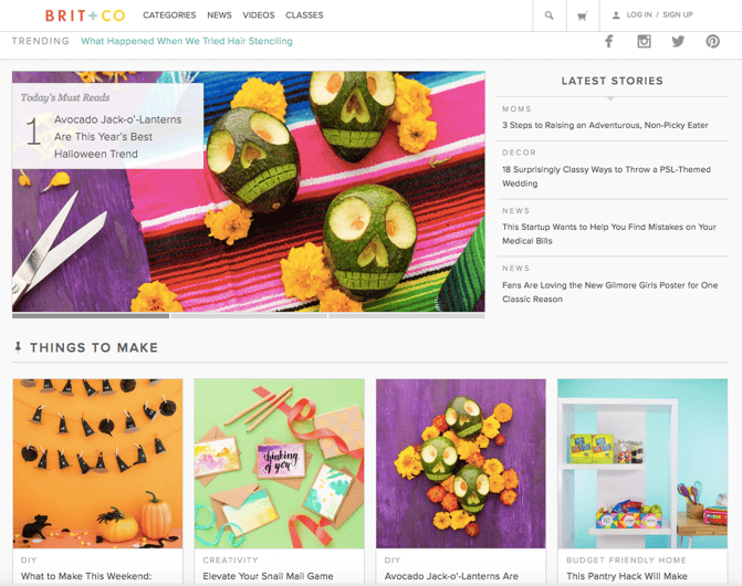
8) Brit + Co

Everything about the Brit + Co homepage says "clean," "warm," and "welcoming." It's free of clutter, making the content more digestible, and the layout is extremely organized.
We dig the seasonality of the site, too. I mean, avocado jack-o'-lanterns on the dawn of October? Adorable, and replete with a colorful, fun photo to illustrate the story's content.
The subtle "trending" header also serves as a nice way to promote popular content, without being too in-you-face about it. Plus, with such great visuals, we took note of the nod to Pinterest -- that icon is important to include when your blog incorporates attractive imagery.
Brit+Co Blog.png

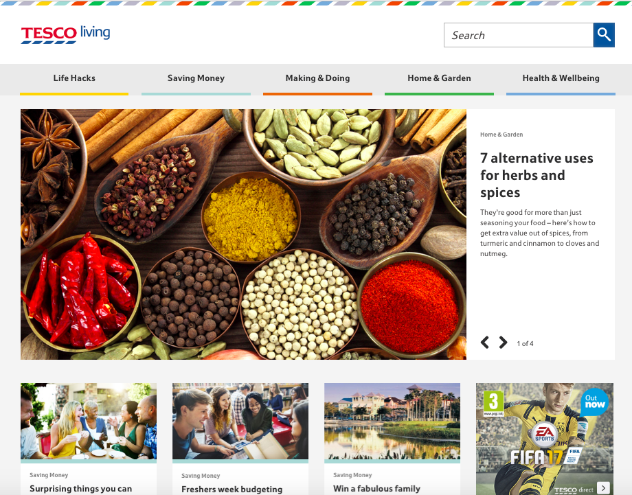
9) Tesco Living

We love the colorful, consistent design of Tesco Living, the blog site of British grocery chain Tesco. 
Remember how we keep harping away at brand consistency? Check out the rhombus-like designs in the top banner -- that reflects the same ones that appear in Tesco's logo.
What Tesco Living has achieved is a great balance of simplicity and boldness. The layout is extremely minimal, but it isn't dull. Warm and welcoming shades underscore each content category, and the photos add dashes of colors throughout the site. It's a great example of how the right imagery can achieve an appealing "less-is-more" appearance, especially if that fits in with your overall brand concept.
TescoBlog.png

10) Crew

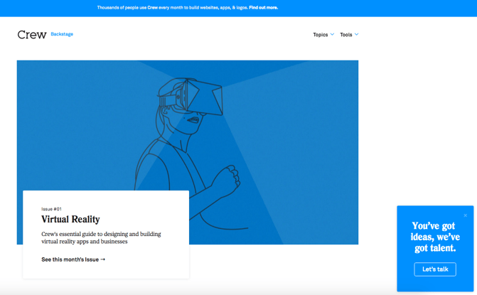
Crew Backstage, the blog of the Crew platform for designers and developers, has a fabulously minimalist blog design, but quiet a unique one.
Notice that, above the fold, it features one blog post with a large title, subtitle, and call-to-action to read more.
To the left, there's an equally minimalist call-to-action that makes it easy for readers to connect with Crew, or learn more. Plus, there's that consistency again -- everything above the fold is the same shade of blue, which has been shown to invoke brand trust.
Crew Backstage Blog.png

11) Innocent Drinks

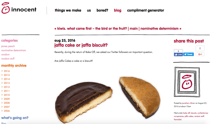
Not only are the folks at Innocent Drinks great copywriters, but the design of its blog is also a great reminder that blog designs don't have to get super fancy.
Notice how the logo -- displayed in the upper left -- is simple, cartoonish, and almost delightfully child-like. It works for Innocent Drinks (hint: childhood innocence), and that brand presence is maintained throughout the company's blog.
The colorful fonts, for example, match the logo and stay in line with the brand's casual, playful voice. We also like the easily-navigable archive links on the left, which are complemented by the geometric social sharing buttons on the right.
Innocent Drinks Blog.png

12) 500px

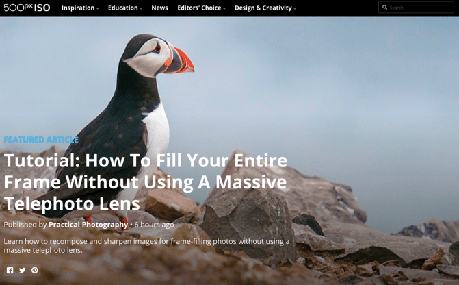
Much like Crew, the photography blog, 500px, leads with one featured article and a big, bold, high-definition photo to draw the reader in. That makes is pretty clear what the blog is about -- it boasts valuable content on photography with gripping photography.
Plus, how cool is it that the social links are right there, obviously displayed above the fold? They keep readers engaged with the content, and make it easy to share the photography -- and, content with images is up to three times as likely to be shared on social media.
500px Blog.png

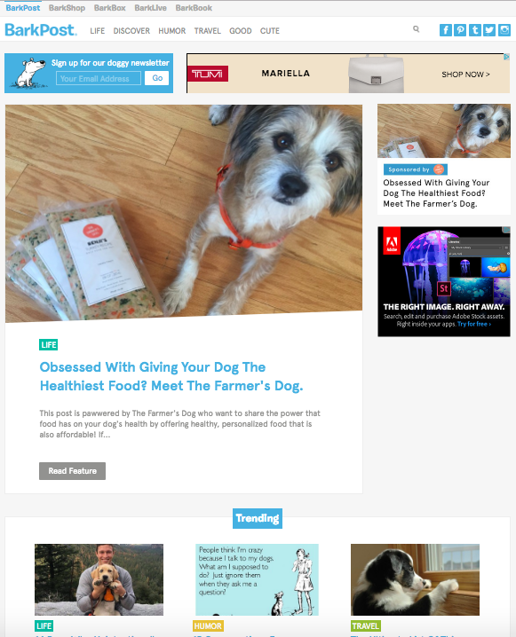
13) BarkPost

It's no secret that we kind of like dogs here at HubSpot. So when a blog dedicated to life as a dog owner came across our radar, it got our attention.
BarkPost, the blog of canine subscription box company BarkBox, is a great example of design for a number of reasons. First, look how easy it is to subscribe -- the call to action is right there, above the featured content. The social share icons are easily noticeable, too -- and, of course, all in the brand-matching, trustworthy blue.
We also like that BarkPost draws attention to its sister companies, all of which are owned under the Bark & Co portfolio of brands. But at the same time, the blog doesn't hock its own products -- rather, it serves as an informational resource to dog parents and lovers alike.
BarkPost Blog.png

14) Goodwill Industries International

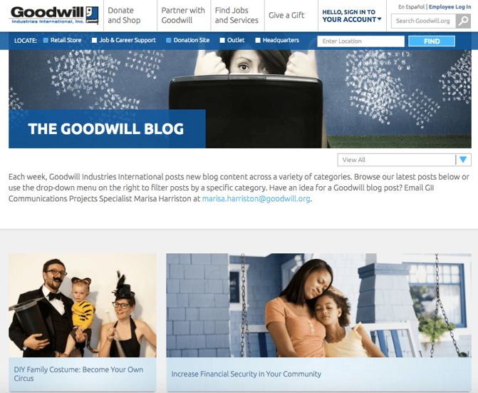
Who says nonprofit organizations can't blog? Nay, they should -- and Goodwill's clean, colorful navigation (again -- the trustworthy blue) draw the reader to the important elements of this blog.
The posts are also neatly positioned and easily accessible to readers. And, visitors can pick the type of information that matters to them the most by choosing a topic from the drop-down menu on the top right.
Finally, we love that there's a collaborative call to action in the introductory text that invites readers to contribute content to the Goodwill blog. After all, the organizations services have reached 37 million people -- here's a way for them to share their stories, or invite donors to write about why they chose to support Goodwill.
Goodwill Blog.png

15) charity: water

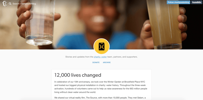
Keeping the nonprofit blogging train going is charity: water, which makes excellent use of high-quality photography.
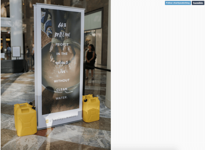
Recently, the organization redesigned its blog with a lengthy post dedicated to its 10-year anniversary. Using that opportunity to share its impact over the past decade, chartiy: water maintained a simplistic design with concise text and bright images from the anniversary event.
Plus, there's a clear CTA to donate at the top of the page. Placing that above a story about charity: water's impact is a double-edged sword, by both inspiring people to contribute to the cause while making it easy to do so.
charity water blog-1.png
charity: water blog 2.png

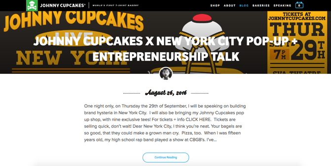
16Johnny Cupcakes

To clear up any confusion, Johnny Cupcakes doesn't actually make cupcakes. It makes clothing. But the company has done a great job of playing up its brand's association with baked goods -- its blog uses the subdomain "kitchen."
Plus, the folks at Johnny Cupcakes know a thing or two about brand consistency across channels. Its blog's simple color scheme and matching fonts help to create a unified user experience from the shop to general content, all the while throwing in bold, colorful images to catch readers' attention.
Also, visit the website and have a scroll -- we think it's pretty cool how the background images vary, but stay positionally static for each entry.
Johnny Cupcakes Blog.png
Which other blogs have excellent homepage d