Apr 22, 2013 at 10:15am ET by Mona Elesseily
For many years, I’ve been participating in sessions/panels in which I critique PPC landing pages volunteered by audience members. As crowds go wild for this type of session, I’ve decided to use this space to focus on effective landing page elements and provide several examples thereof.
#1 Use Credibility Indicators
Include credibility indicators on your landing page such as testimonials, reviews, awards, social media information (Facebook likes, number of tweets, etc.), and seller ratings (on Google, this info is pulled from Bizrate and other rating sites).
Here are some specific ideas related to testimonials:
- Use testimonials to reiterate your company’s core value propositions. For example, consider prominently featuring one extremely compelling testimonial, in larger or selectively bolded print, above a few smaller-print ones further down the page. Whether this featured testimonial is from CNN, NYT, or a particularly eloquent customer depends, of course, on your track record, business, etc.
- In general, testimonials work better for emotional/personal/edible/retail items. Using citations in publications and expert opinions are better options for products like art, theater and software solutions.
#2 Incorporate Product Badging
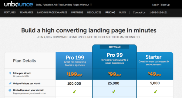
In 3 Neuromarketing Considerations for Landing Page Optimization, I covered neuromarketing and how the reptilian brain prefers fewer options. A great way to reduce the number of options and highlight a single or only a few options is to use product badging. Below is an example from unbounce.com and they highlight the Pro plan with a “best value”:

Here are some other badging options:
- Top Rated
- Best Seller
- New Arrival
- Top Pick, Top Seller or Hot Seller
- New
- Great Gift
- Etc.
#3 Remove Page Elements
Try removing page elements. While it is important to test various elements on a PPC landing page, testers must also make a concerted effort to remove elements that distract visitors. In general, cleaner pages tend to convert better than cluttered ones. Here are some suggestions for minimizing the clutter:
- Remove elements that don’t add value to the #1 conversion goal of your page. For example, remove newsletter sign up options, links to other content, navigation on a page, etc.
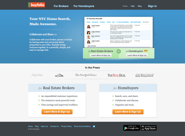
- Chop down ad copy and try incorporating bullet points on your page. Less content is easier to read, and copy pops against the white of a page. Take a look at this example from buyfolio:

#4 Test Your Copy
Vary your writing style, using tone and word choice to see what resonates with your audience. When testing copy, I’ll generally use the same overall paragraph components, but change a few sentences and talk about how the product might make different users/visitors feel. Remember, customers buy emotionally and defend their purchases rationally. Make it a goal to get visitors excited about your product or service and see what that does for conversion rates. There are plenty of clues in review information, or you can directly investigate what jazzes your clients (past or current).
#5 Take It Slow
Think about it: it’s not always the best strategy to go for the sale. It might make sense to break down your sales process into a couple of steps — perhaps get a little information at the beginning (like name and phone number or email address) then continue the conversation and building the relationship via phone or email. Taking time to build rapport can really help boost conversion rates and is particularly valuable in a B2B or high-ticket sales situation where sales cycles are longer. In the context of dating, asking for the sale too fast is tantamount to asking someone to marry you after one date. Oy vey.
#6 Test Your Messaging
Evaluate your site by asking someone (preferably someone who doesn’t know anything about your company) the following questions:
- What specific services does your company offer?
- Why should they do business with you?
Go back and rework your landing page copy if users cannot figure out what your company is about in less than 4 seconds (the amount of time before people tend to bail on a page). Revised copy doesn’t need to be long copy, and bullet points are a great option to communicate marketing messages (as per #3).
#7 Use Banners
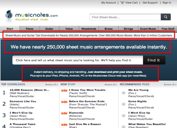
A great way to incorporate messaging into a page is to use banners and/or ribbons — not hard to do. Figure out why people should buy from you (you should have at least one USP) and put it on your page. Don’t be afraid to repeat it. Look at the example below from musicnotes.com — they have 250K sheet music arrangements (this is their USP), all of which are available instantly. Notice they repeat this over and over in different ways.

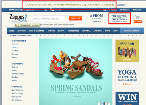
Don’t assume people know what you’re all about. Even Zappos, which is very well known for free shipping and returns, repeats this value proposition a couple times on their page. Take a look:

The above represent a few of the many tactics you can use for improving PPC landing page optimization. What strategies do you use? Sound off in the comments!