LinkedIn Company Pages You Should Copy
They say imitation is the sincerest form of flattery, and
unless it's a very sarcastic impression of your company's CEO, that's
probably accurate.
It's very hard to have an interesting LinkedIn company page because the social media network is so business-oriented. Everyone on LinkedIn is there for a reason, which usually involves networking, looking for a job, or learning something new.
What does your LinkedIn company page look like? A great LinkedIn company page does three things: it knows its audience, it serves an important function for them, and it accurately reflects the organization's brand.
Check out these examples of amazing LinkedIn pages and feel inspired.
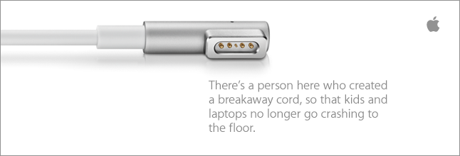
Everyone knows Apple. They know what they make. They know what they represent. And their LinkedIn page is a reflection of that.
Their banner is so, so simple. Lots of white space, the brand messaging isn't a primary tagline, and the logo is almost an afterthought. Look at this atrocity and see why one is a luxury brand that everyone loves and one is...not.
What's amazing about Apple is that their product is so well-known that even the tip of the charging plug is instantly recognizable to most people. No one's ever heard of this major brand's primary product despite funneling millions of dollars into marketing.
Apple just gets it. This message works because it's not primary. It honors an achievement most would overlook, an achievement by someone that probably was in charge of nothing but had a great idea.
And that's what Apple is all about. They were underdogs. They failed. But by inspiring and learning and growing, they rose to the top and created a product that was not just iconic but that transformed the tech industry. And they they did it again. And again. And again.

I have to confess that part of the reason why I included Kellogg's was because they were recognized by LinkedIn as one of the best company pages. And honestly, there aren't that many great pages - most brands are safe and boring or use generic stock photography.
I love this page for two reasons: the first is because they post primarily information about open positions, which, let's face it, is way more useful than posting information about their products.
But the reason why I really love this page is the photography. The dad could really be a dad. He's not a model, he's just a normal guy. He's wearing a stretched out white undershirt and he looks like he just woke up.
And his son is looking through the cereal box at him. Who knows what he's imagining? People buy Kellogg's cereal because it tastes good and because it's inexpensive. But Kellogg's is really about the little family experiences that don't seem special at the time but become cherished memories long after. When his kid's all grown up, he's going to miss these moments. Kellogg's is about family and it's about imagination and it's about the simple things in life. This photographer nailed it.
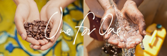
We've written about them before - they're a brand we admire because they offer a great product and make a difference in society.
And that's a part of their brand and a part of their identity. So why not lead with that? Expecting to see a smiling model wearing a pair of shoes? NOPE! Because that's not what TOMS is about. At this point, their product, as great as it is, is almost secondary. Lots of companies sell inexpensive, comfortable shoes. But there's only one TOMS.

Virgin Media's page is perhaps the most flawed among those I've included. While the page description tells a compelling story, it's very long, and perhaps unclear to someone unfamiliar with the many divisions of the Virgin Group may not be able to tell right away what they do.
That being said, the Virgin brand is best known for being unconventional and not adhering to the standards of conformity. Pictured is endorser Usain Bolt and his family (who you can see in their television spot, as well). LinkedIn is typically a very serious place with no room for joking around. But Virgin has never been a company that accepts the status quo.

Warby Parker is one of my favorite brands, and their site is often used as a source of inspiration for our creative team for their ability to create a great brand experience that creates brand advocates. They offer a great product, great customer service, their site is well-designed, and their copy tells a story. And, like TOMS, philanthropy is part of their mission: for every pair of eyeglasses they sell, they donate a pair to someone in need.
What really sets them apart is that you just get them right away. Their LinkedIn page banner simulaneously communicates style, creativity, and European-style class, while their description explains in one sentence what they're all about: Warby Parker is a transformative lifestyle brand with a lofty goal: to offer designer eyewear at a revolutionary price while leading the way for socially-conscious businesses.
It's very hard to have an interesting LinkedIn company page because the social media network is so business-oriented. Everyone on LinkedIn is there for a reason, which usually involves networking, looking for a job, or learning something new.
What does your LinkedIn company page look like? A great LinkedIn company page does three things: it knows its audience, it serves an important function for them, and it accurately reflects the organization's brand.
Check out these examples of amazing LinkedIn pages and feel inspired.
1. Apple

Everyone knows Apple. They know what they make. They know what they represent. And their LinkedIn page is a reflection of that.
Their banner is so, so simple. Lots of white space, the brand messaging isn't a primary tagline, and the logo is almost an afterthought. Look at this atrocity and see why one is a luxury brand that everyone loves and one is...not.
What's amazing about Apple is that their product is so well-known that even the tip of the charging plug is instantly recognizable to most people. No one's ever heard of this major brand's primary product despite funneling millions of dollars into marketing.
Apple just gets it. This message works because it's not primary. It honors an achievement most would overlook, an achievement by someone that probably was in charge of nothing but had a great idea.
And that's what Apple is all about. They were underdogs. They failed. But by inspiring and learning and growing, they rose to the top and created a product that was not just iconic but that transformed the tech industry. And they they did it again. And again. And again.
2. Kellogg's

I have to confess that part of the reason why I included Kellogg's was because they were recognized by LinkedIn as one of the best company pages. And honestly, there aren't that many great pages - most brands are safe and boring or use generic stock photography.
I love this page for two reasons: the first is because they post primarily information about open positions, which, let's face it, is way more useful than posting information about their products.
But the reason why I really love this page is the photography. The dad could really be a dad. He's not a model, he's just a normal guy. He's wearing a stretched out white undershirt and he looks like he just woke up.
And his son is looking through the cereal box at him. Who knows what he's imagining? People buy Kellogg's cereal because it tastes good and because it's inexpensive. But Kellogg's is really about the little family experiences that don't seem special at the time but become cherished memories long after. When his kid's all grown up, he's going to miss these moments. Kellogg's is about family and it's about imagination and it's about the simple things in life. This photographer nailed it.
3. TOMS

We've written about them before - they're a brand we admire because they offer a great product and make a difference in society.
And that's a part of their brand and a part of their identity. So why not lead with that? Expecting to see a smiling model wearing a pair of shoes? NOPE! Because that's not what TOMS is about. At this point, their product, as great as it is, is almost secondary. Lots of companies sell inexpensive, comfortable shoes. But there's only one TOMS.
4. Virgin Media

Virgin Media's page is perhaps the most flawed among those I've included. While the page description tells a compelling story, it's very long, and perhaps unclear to someone unfamiliar with the many divisions of the Virgin Group may not be able to tell right away what they do.
That being said, the Virgin brand is best known for being unconventional and not adhering to the standards of conformity. Pictured is endorser Usain Bolt and his family (who you can see in their television spot, as well). LinkedIn is typically a very serious place with no room for joking around. But Virgin has never been a company that accepts the status quo.
5. Warby Parker

Warby Parker is one of my favorite brands, and their site is often used as a source of inspiration for our creative team for their ability to create a great brand experience that creates brand advocates. They offer a great product, great customer service, their site is well-designed, and their copy tells a story. And, like TOMS, philanthropy is part of their mission: for every pair of eyeglasses they sell, they donate a pair to someone in need.
What really sets them apart is that you just get them right away. Their LinkedIn page banner simulaneously communicates style, creativity, and European-style class, while their description explains in one sentence what they're all about: Warby Parker is a transformative lifestyle brand with a lofty goal: to offer designer eyewear at a revolutionary price while leading the way for socially-conscious businesses.