10 Brands That Brilliantly Differentiated Themselves From the Competition
by Bethany Shepard

June 30, 2014 at 12:00 PM
 This post originally appeared on the Insiders section of Inbound Hub. To read more content like this, subscribe to Insiders.
Today’s winning brands aren’t playing it safe. They never say “that’s how we’ve always done it,” and they know their brands are more than just a sleek logo or a cool website.
The brands that crush their competition are those who understanding that strategic branding goes much deeper than pretty visuals and responsive code. Branding is layered, sculpted, and tested.
To create a layered, brilliant, and competition-killing brand, three things must align.
- Understanding of your brand (internal beliefs and communications)
- Understanding of your best potential audience(s)
- Understanding and differentiating from your competition
Combined, these elements create brand magic. To see these three things in action, keep on reading. Below I’ve curated some brilliant companies that are great at differentiating themselves from their competition.
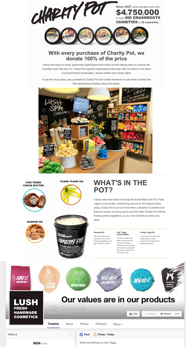
1) Lush
Why They’re Brilliant
- They're unlike any other makeup brand on the marketplace.
- They have international reach with a local "warm and fuzzy" approach.
- They are advocates of ethical buying and the purity of handmade things. They value social and corporate responsibility over a luxurious and out-of-reach image.
- Their branding is simple and genuine.
- They have a massive cult brand following.
How They're Doing It
- They understand their customers. They appeal to the girl who’s "had enough" of standard beauty products and has strong beliefs.
- They're selfless with their products -- they offer free samples and in-store trials on nearly everything.
- They aren’t selling a product -- they’re selling a viewpoint on how they define beauty.
- They offer a one-of-a-kind retail experience that feels like you’re walking into an Etsy store in real life.
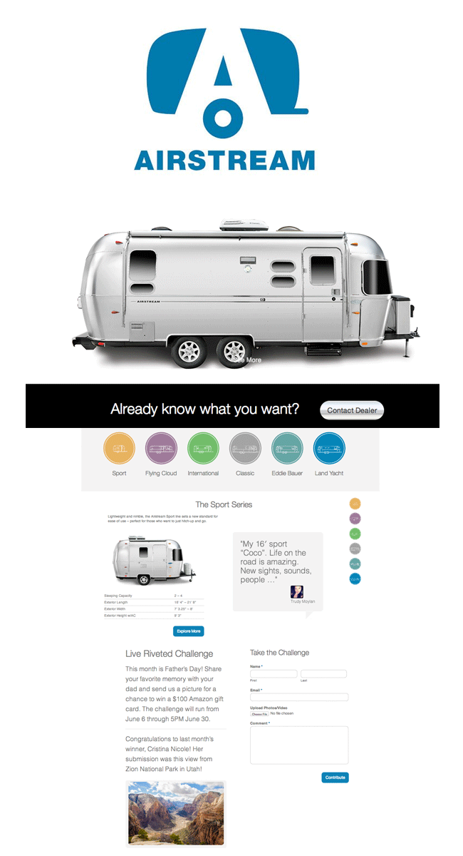
2) Airstream
Why They’re Brilliant
- Airstream has been a cult classic since 1929.
- They're one of the most recognized RVs on the road. The image is iconic.
- They have a massive audience following that embraces the "retro" side of life.
- Their product has a great blend of the past meets the future -- classic exterior, modern interior.
- They offer a "silent" luxury -- it doesn’t scream "I’m rich" until you get inside.
How They're Doing It
- They focus on quality, image, and community -- the product is expensive, but rarely loses value since it's built to last.
- They relaunched a new website and digital experience in 2014.
- They offer endless community and dealership events where you can sit in an Airstream to experience it yourself.
- Their campaigns focus on their following using the tagline "Live Riveted."
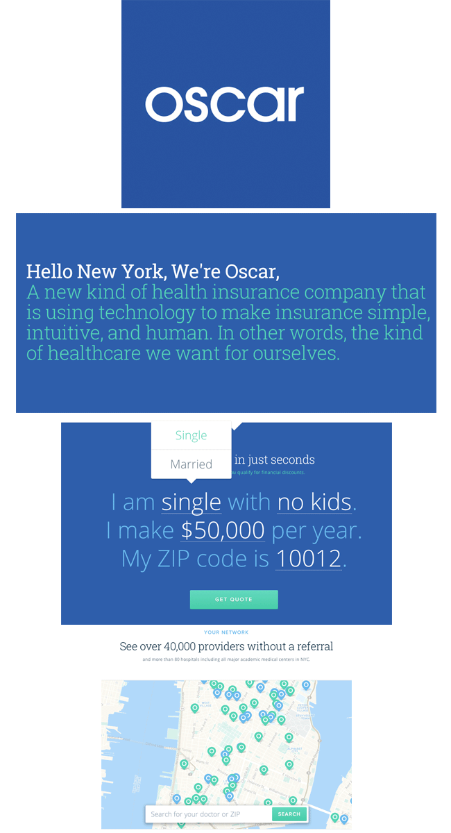
3) Oscar Health Insurance
Why They’re Brilliant
- They make health insurance feel friendly, personable, and easy-to-understand.
- They consider the UX behind buying and understanding health insurance.
How They're Doing It
- They use bright visuals, large concise copy, and a parallax scrolling site to make digesting information easy on desktop, mobile, and tablet.
- They focus on a small, niche network just in New York.
- They're transparent -- they partner with doctors and allow you to customize your quote immediately.
- They make customer-benefit promises like “Talk with our doctors for free, one will call you within the hour.”
4) T-Mobile
Why They’re Brilliant
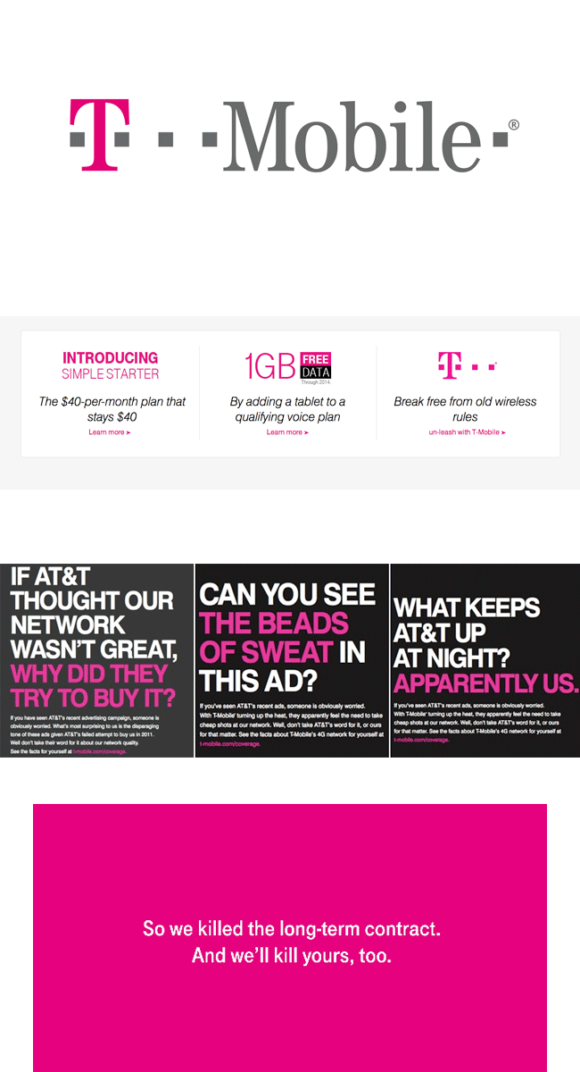
- They're a cellular company that is changing what it means to be a cellular company.
- They're catering to a smaller, niche audience that is young and urban -- those who don’t want to be tied down and "owned" by their cellular company.
- They listen and follow the behaviors of their core customer.
How They're Doing It
- They create messaging that aims directly at customers' biggest pain points (being tied down to a carrier) and away from their biggest flaw (the size of their network).
- They have a strong and unique color palette -- think pink!
- They pay ETF’s -- the biggest hurdle in switching carriers.
- They allow customers to bring in unlocked phones to switch to T-Mobile.
5) Whole Foods
Why They’re Brilliant
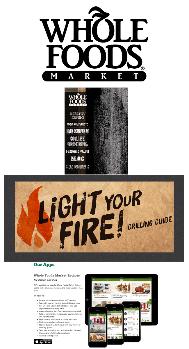
- They go beyond being a grocery store -- they're also content generators and thought leaders.
- They use their site to offer a whole new experience for customers offline and online.
- They understand why people shop at Whole Foods in the first place -- because it's a wholesome food source.
How They're Doing It
- They're sharing ideas and generating meaningful content that isn’t boastful -- they understand what their customer is looking for.
- They're promoting a "greener" lifestyle -- they got rid of plastic bags in 2008.
- They focus on local stores, taking away that feeling of the big chain.
- They use bright, unique, and cheerful design that is easy to understand.
- They partner with shows like Top Chef to promote their food.
- They hosts events, run multiple blogs, and have an app -- showing they're way ahead of their competition.
6) Zendesk
Why They’re Brilliant
- No longer is customer service some person in the back of the building like Kelly from The Office -- it’s immediate, digital, and genuine with Zendesk.
- They're a one-stop shop customer service platform that empowers the whole organization.
- They help customer service agents prioritize. Companies no longer give off a “take a ticket" message.
- They're destroying the stereotype that customer service is something that’ll take forever.
How They're Doing It
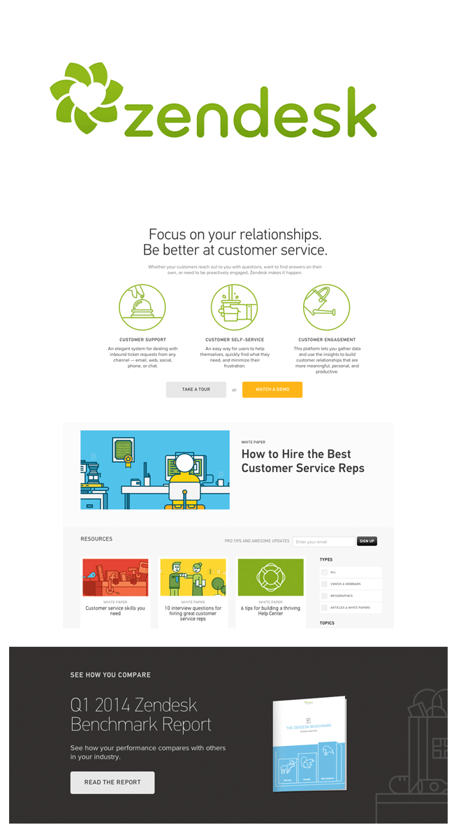
- Customer service is made beautifully simple.
- Their software brings all customer feedback into one place.
- They have a clean and intuitive site design that makes it easy to learn -- and form and content are aligned.
- They offer best practices for their customers, positioning Zendesk as a industry thought leader.
7) Yoh
Why They’re Brilliant
- They look absolutely nothing like any other recruiting site and company.
- They steer away from conservative, stuffy pictures, and copy.
- They make learning about their company fun and engaging -- the brand has a pulse.
How They're Doing It
- They use bold messaging that speaks to “you” and not about “we.”
- They use little-to-no industry jargon.
- They use a consistent and striking brand look and feel.
- They use original website design that is hyper-visual.
- They feature downloadable content and clear CTAs.

8) Four Quadrants Advisory
Why They’re Brilliant
- They cater to a niche market and audience just for dental practices.
- Their customers call them the “Dental Guys.”
- They go beyond numbers and become advocates and consultants for the best interest of dentists.
- They take away the “behind the practice” stress for dentists.
How They're Doing It
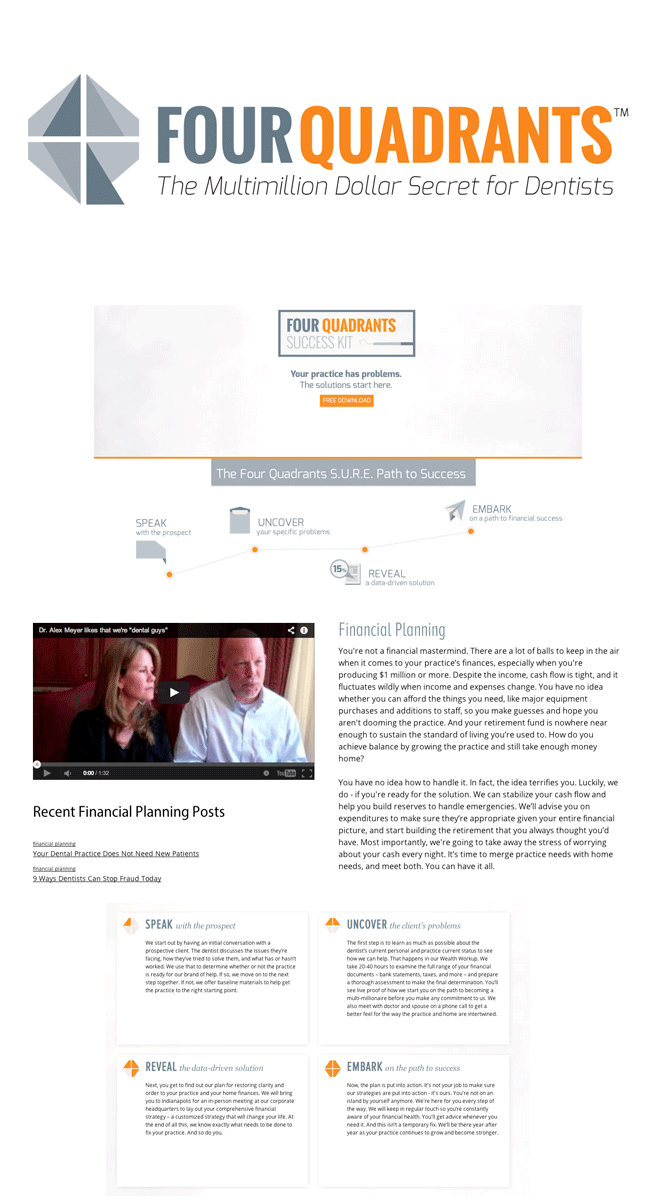
- They're transparent about their process, and it's laid out in a simple way using user-benefit statements.
- They offer more than just financial planning, but practice and capital planning.
- They empower their team to create valuable content for their website.
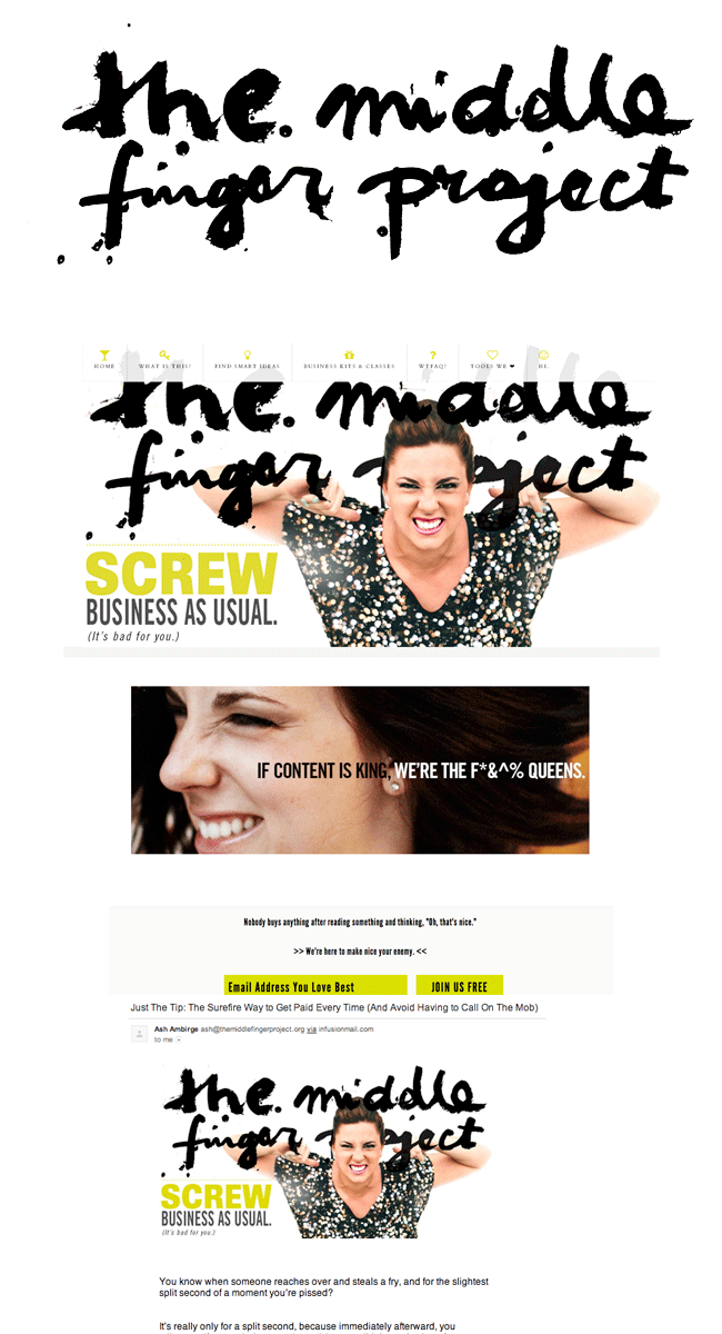
9) The Middle Finger Project
Why They’re Brilliant
- They are reimagining copywriting and messaging consulting.
- They're a confident and sometimes outlandish advocate for being fearless in writing -- especially business writing.
How They're Doing It
- They use frequent email blasts called “Just the Tip” that share a tactical nugget of information.
- They value a bigger cause -- going with your gut in writing.
- They make writing great copy a lifestyle within an organization.
- They offer kits, classes, tools, and smart ideas for any business to use.
