Google Is About To Take Over Your Whole Life, And You Won't Even Notice
“I have a weird question for you,” I stammered, sitting in a hotel room across from Matias Duarte and Jon Wiley, the Google design leads for Android and Search, respectively. As a reporter, you tend to ask a lot of stupid sounding questions, and it’s generally no big deal. But I was about to ask an extremely stupid sounding question--the type of question that, just by breathing it into the air, might out me as actually stupid, tainting every future conversation we’d have to come.
“What is Google?”
Yes, It's A Lot Of Services
The question may have been stupid, yes, but it was apropos. Google had just announced a new initiative called Material Design that promised to unify all Google products (and even third-party Android apps) under a common UX tongue. Google seemed to be morphing into something, but what?
With Material Design, Google has become a second reality inside touch-screen devices--complete with its own rules of logic and physics--and if Google has its way, it will eventually break free of touch screens to quite literally reshape the world around us.
“When you make things, you inherit thousands of years of expertise. But software design is just getting started,” Wiley had explained earlier. “We took a step back. We looked at all of the software and asked, what is this made of?”
A day before, as Google revealed its big plan at its annual I/O conference, it was overwhelming to conceptualize what this blob of digital services had become. Was Google a search bar that lived in a laptop web browser? Was Google a dashboard for your car? Was Google the Android tablet, being used to control an Android TV game? Was Google thesystem of white note cards, being sent from an Android phone to an Android Wear smartwatch? Was Google a magic blue button that lived on these cards, making anything possible with a tap?
In reality, all of these notions of Google are true. It's a series of services that have become our digital infrastructure. And in the very near future, Google will exist, not as something you need to understand as "Chrome" or "Android," but as a conduit of information that's on just the right screen at just the right time. When you check your watch at the train station, you'll see when your next train is arriving. But when you check that same watch at work, you'll see the most important email from your boss. That watch will unlock your computer--no need to use a password--and your email will be waiting. Walk away mid-response, no problem. Your phone has the email waiting on its screen, cursor blinking mid-sentence, as you walk to your meeting.

Luckily it's not all work. After five, on your ride home, every one of these screens will be dedicated to new tasks: picking up your kids, making your dinner, and showing you Game of Thrones reruns.
And Google is grounding all of these infrastructural services through a new approach called Material Design, which will be introduced inside their upcoming mobile OS, Android L. It's an impressive, underlying logic to Google's interface across all devices that I believe will not just unify their services across the digital world, but bring them into our analog world, too.
The Stuff Google Is Made Of
Material Design wants to add the intuitive feeling of physical objects in a purely digital environment. It renders all of the windows and buttons behind your screen as pieces of cardstock. Each piece catches light and casts shadow in a simulated 3-D space that meets your finger at the screen's glass, but this nanometer-thick wonder surface that's more capable than any material known to man. Where real cardstock would rip, Google's ambiguous stuff can balloon to double in size or split into two or three pieces and then recombine. Where real cardstock would appear dead white, Google's stuff can ripple with colors and animations.

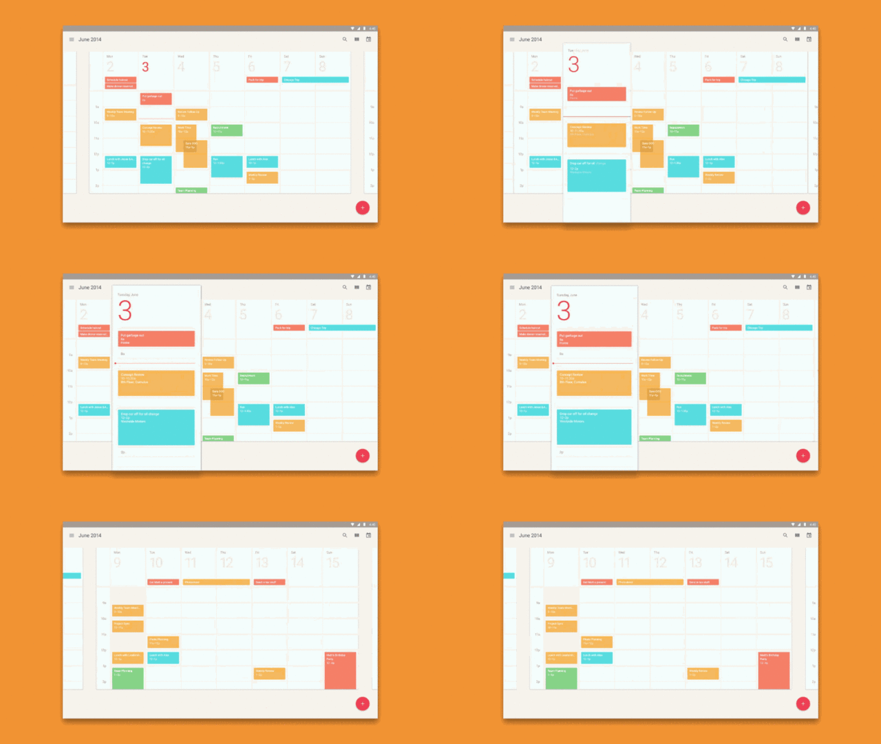
Of course, the most impressive part of it all is that these physical properties feel almost as logical as dominos falling. Unlike interfaces where you tap a button while the rest of the screen sits dead, every action inside Android L seems to have an equal and opposite reaction. Tap a day in your calendar, and it grows while every other day around it is pushed away by its volume and mass. Read through your email as one long sheet of paper, tap on an individual message, and just that relevant thread is sliced out. Tap a circular play button inside the music player, and its colors echo forth into what becomes a fuller, rectangular control pad.
It’s in part the result of Google’s careful study of the way real paper works. The team went so far as to craft their app icons out of paper to see how light and shadow could interact with relatively flat (but real) material, and Wiley told me he became a bit obsessed with folding Post-it notes in the process, too. But it's also sheer wishful thinking of what our physical world could do if its rules could be cheated. Paper can't split itself and recombine, after all.

So to test if their designs pushed the limits of believable too far, the team stripped away all typography, photos, and colors from their interface during development, instead focusing on the way their wonder paper worked. One insight Duarte has is that you don’t need to be a designer to spot when a rule is broken in the physical world. Imagine if you dropped a piece of paper and it thumped on the table like a stone. This led the design team to agree it was easier to offer functional improvement of any Google product with the natural world as a point of reference for its digital concepts. It's what makes Material Design more than just a pretty aesthetic ploy.
Second Nature
With a solid enough universe of rules, Duarte added, it would be possible to bring other materials into the mix. Paper was the natural choice because it's relatively easy to render on a screen--its flat white surface doesn't have the complicated textures of bricks or treebark--but I begin to imagine cloth--from table linens to stains--and liquids that ooze and bubble. Sound cheesy? Quite possibly. But these materials would be a far cry from Apple’s last wave of skeuomorphic interface that included felt green poker tables and wood grain book shelves. They’d be borderline real, just rendered in a world on the other side of the glass.
Apple's skeuomorphism was a shorthand reference to the material world to make the digital world more approachable. Google's wonder paper also makes their interface more approachable. But it's not just an allusion to our physical world. It's more an explanation of what is happening when windows suddenly appear or disappear behind our screens. It's as if Google is reverse engineering magic tricks the industry has used for years to render interface, showing us the strings so that these animations make sense. If they're not attempting to write the language of interface, they're certainly trying to understand it in order to push the discourse forward.
When it comes to digital environments, there aren't natural, physical reasons to dictate the way objects and elements inteact and behave--for example, running an Android app on a Chromebook, or pushing a text message from your smartphone to your smartwatch. We've simply learned that these things are possible. So when we talk about interface, we stumble around words like "intuitive" that we'd never use to describe a chair or a table. Material Design is Google's synthetic explanation of what's going on between their screens and apps. The digital physics might not be real, but it provides a grounding to the virtual interface nonetheless.

Material Design is a way for Google to unify what it is--not just as a collection of similarly designed services for various screens--but as a real secondary world in which everything you see is a snippet of something tangible. So when you receive a push notification on your Android Wear watch, it's not just a dead bit of text unrelated from everything else, it's a bit of cardstock--a bit of itself, actually--passed from your phone to your wrist. Those same pieces of Google will pass between your watch and TV, your TV and your glasses, and who knows where else?
Our windows to that world may not always be the same--sometimes it might be circles on our wrists, other times it might be rectangles in our hands--but Material Design promises that we'll always have access to the same, inherently logical bits information regardless of what we're interacting with. And as content merges more and more between these screens, the feeling will be as natural as gravity.

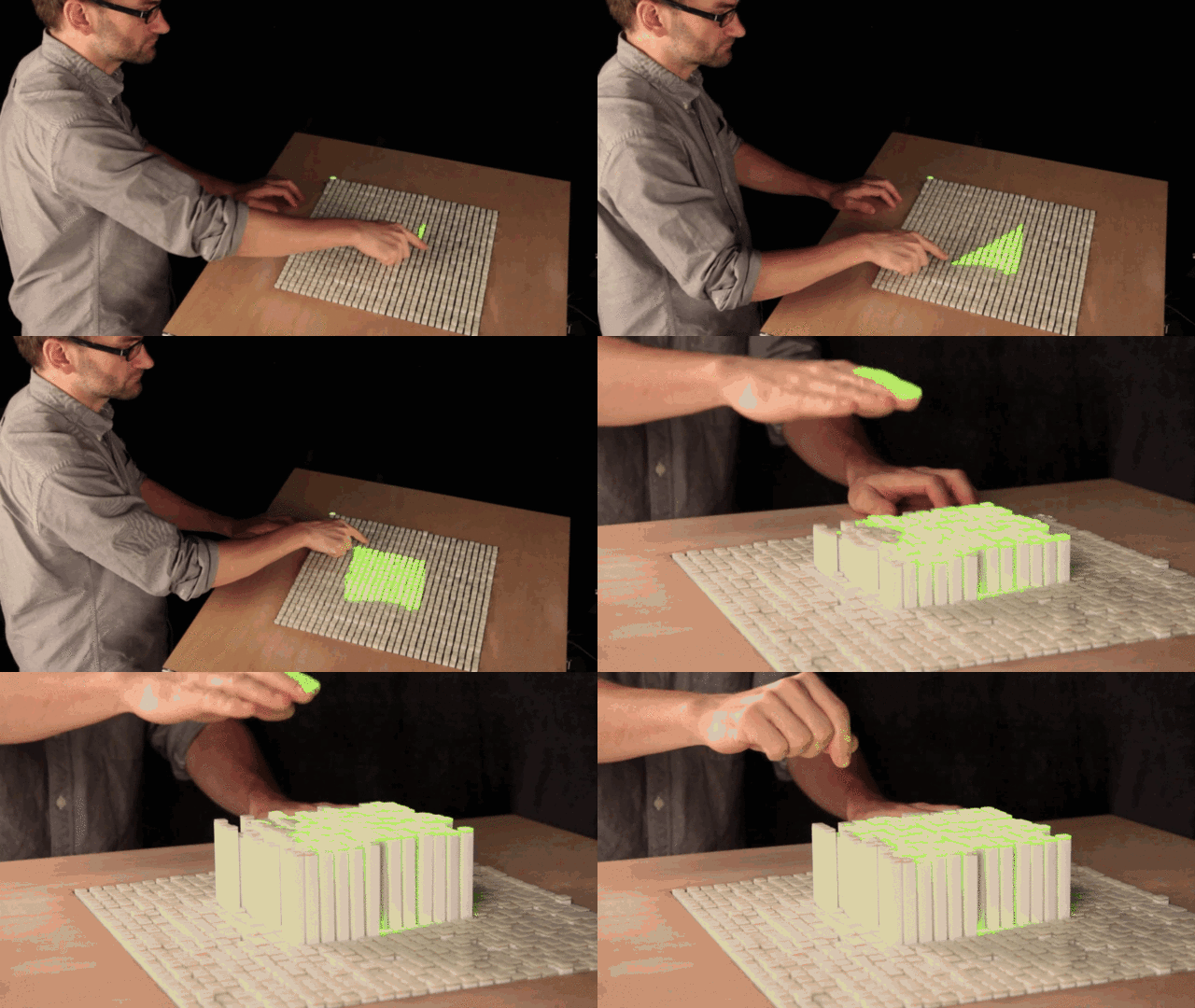
But all of this is not simply a grandiose interpretation of Google's ideas. Google's ideas are actually that grandiose. Duarte points out that soon, our objects will reshape themselves--MIT’s Inform comes to mind--and at this point, Google’s big Material Design play can break through the glass of smartphones, tablets, and watches. Hardware and software will meld together, allowing interaction designers to step in and really work their magic. The object will become the interface, and the interface will become the object. In Duarte's mind, one can see Material Design powering a living infrastructure in a world where every conceivable surface glows, shifts, and ripples, quite literally reshaping the way we communicate, learn, work, and live. Whether we're interacting with a phone, a home, or a watch, Google will fulfill our needs ergonomically.
“What is Google?” I ask.
The team laughs nervously at the question. Duarte mentions company ethos. Interface speed. Simplicity. Wiley uses the extra time to collect his thoughts.
"We look for moments where we can use our technology, innovation, and design to give back time--to give people choice in how they spend their time," Wiley says.
In other words, any point of friction in your day to day life is an opportunity for Google. It's not any one preconceived thing, but a wide, opportunist infrastructure that can constantly conform to your life.
Google wants to be as amorphous as its wonder paper.