- As usual, many of this year's most inspired and delightful advertisements weren't found on TV, in print or online. They were found outside, where marketers played off the real world to bring completely new dimensions to their brands.Below, check out 14 of our favorite out-of-home executions from 2014—all of them a potent reminder that outdoor can make brands instantly relevant and incredibly cool.
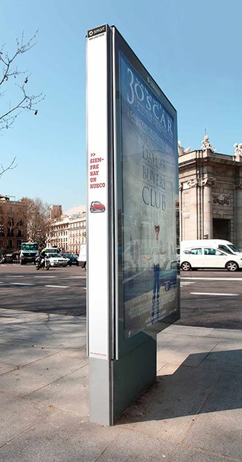 Skinny car, skinny ad. Contrapunto BBDO put this Smart ad on the narrow side of an outdoor display. Text reads, "Siempre hay un hueco," which means, "There's always a space."
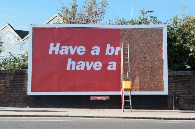 Americans think of "Gimme a break" as KitKat's slogan, but its more famous global tagline, dating to 1958, is "Have a break … have a Kit Kat." JWT London found a fun new way to illustrate that line this year—with a half-finished billboard.
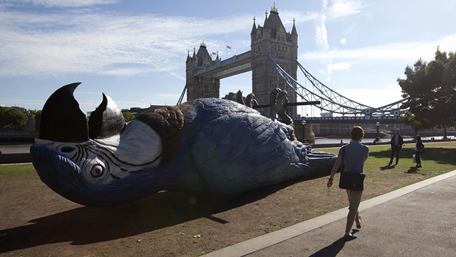 What better way to advertise a Monty Python reunion than with a dead parrot? To promote the live TV broadcast of a July performance by the comedy troupe, British network Gold TV and sculptor Iain Prendergast created a massive fiberglass parrot, which was suspended from a crane and laid talons-up in London's Potters Field.
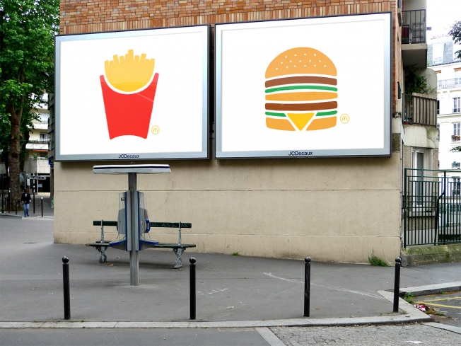 TBWA Paris created some beautifully minimalist outdoor posters for McDonald's this summer, with clean, simple drawings that turned the products into actual icons.
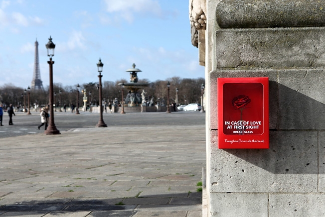 For this lovely Valentine's Day stunt, ad agency Kingsday installed 1,500 cute little red boxesaround Paris, modeled after emergency boxes—but containing single red roses. "In case of love at first sight, break glass," the boxes said.
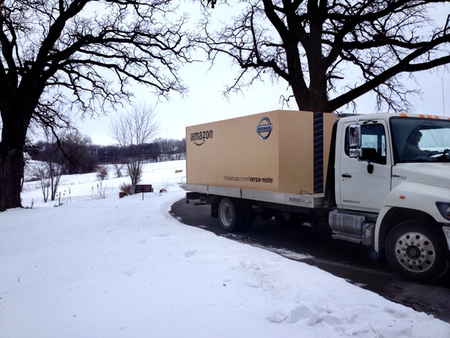 TBWA\Chiat\Day orchestrated this fun stunt for client Nissan, which had offered to sell the Versa Note on Amazon. For three lucky buyers, the vehicles were actually delivered in giant Amazon boxes.
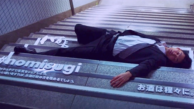 People literally drinking until they drop, and sleeping on the street, is a persistent problem in Japan. Ogilvy & Mather, Geometry Global and bar chain Yaocho addressed it by turning the passed-out patrons into impromptu PSA billboards—framing them within squares of white tape and adding the hashtag #NOMISUGI, which translates to "too drunk."
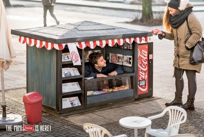 When Coca-Cola introduced mini cans of Coke in Germany, it fittingly opened some adorable mini kiosks in five cities to sell them. They even had a pint-size vending machine. "It's the little things in life that make us happy," said the campaign's tagline.
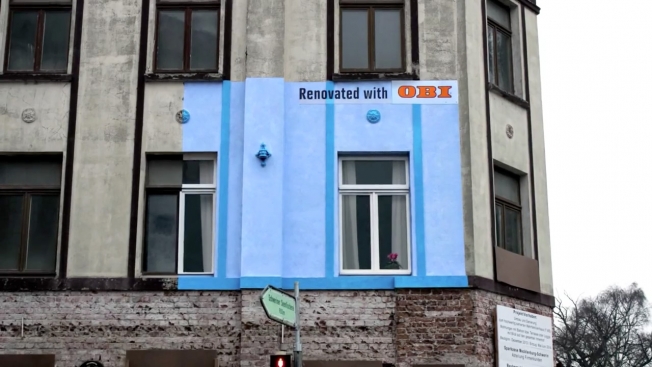 This German home-improvement chain advertised its renovation products by actually renovating homes—well, parts of them. Ad agency Jung von Matt/Elbe measured out billboard-size sections of run-down buildings and fixed them up, delightfully showing the before and after of an improvement project.
German agency Thjnk and production studio I Made This created this brilliant "RGB billboard" for Ikea—and like the client's furniture, it makes the most of limited space. Three different headlines are superimposed on each other in cyan, magenta and yellow. At night, red, green and blue (RGB) lightbulbs shine on the board—revealing the different headlines. (Red illuminates cyan; green lights up magenta; and blue-purple makes yellow visible.) That's how you turn 9 square meters of ad space into 27 square meters.
For the launch of Netflix in France, Ogilvy Paris created 100 different GIFs—some of which "reacted" to current events and even things like the weather—and installed them on outdoor boards. They're undeniably eye-catching in ways other digital video just isn't.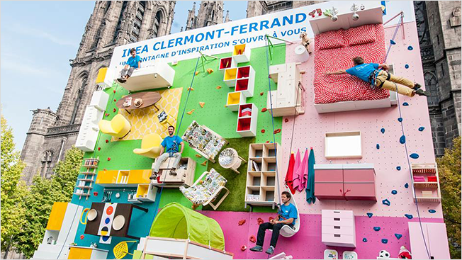 More Ikea. Agency Ubi Bene helped the chain celebrate the opening of its 30th store in France by building an apartment into a vertical rock-climbing wall in the city of Clermont-Ferrand. The wall was 9 meters high by 10 meters wide and fitted with steps and grips, allowing the public to navigate among beds, cabinets, tables, chairs, sofas and accessories.
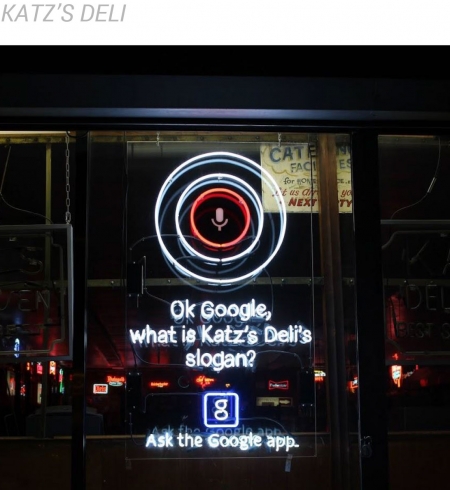
This fantastic digital subway ad in Sweden for a hair-care line of products was rigged up to recognize when trains entered the station—and then showed a woman's hair blowing all around, as though windswept by the train. Simple, playful, responsive and seemingly magical, the execution—by agency Akestam Holst and production company Stopp—blurred the line wonderfully between the real and virtual worlds. (And this homage to it, with a twist, wasn't bad either.) Our favorite outdoor campaign of the year was this series of Google ads playfully and subtly woven into the fabric of New York City. 72andSunny worked with various organizations and proprietors to create a host of wonderful site-specific ads—each one like a mini-installation. The ads, for Google's rebranded mobile app, were all about looking about familiar landmarks in a new way—asking questions about them, which the app can answer. It was truly inspired work, and it was great to see a giant company like Google doing such joyfully detailed advertising work on the ground. See more of the ads below.


14
Smart Car
13
KitKat
12
Gold TV
11
McDonald's
10
Flower Council of Holland
9
Nissan
8
Yaocho
7
Coca-Cola
6
OBI
5
Ikea
4
Netflix
3
Ikea
2
Apolosophy
1Google