What do buying coffee beans, making an investment, and choosing a doctor have in common? They’re all forms of shopping. In each case, customers follow predictable processes for finding, evaluating, and narrowing options. If you understand your customer's shopping journey, you can design your product with the right messages in the right place. And that can guide customers towards selecting your product over competitors, and more importantly, guide you to building a product that’s a perfect fit for your customer.
At Google Ventures, shopping funnels have become a secret weapon in our design work. We’ve used them with startups as varied as Blue Bottle Coffee, One Medical, and CircleUp. Once we know the questions that customers ask and in what order, we design the messaging and functionality to match. Here’s how creating a shopping funnel that syncs with your business can serve as a roadmap for great design.
How People Really Shop
Right after the dotcom bust, I took a job as a researcher at Walmart.com. Over the next several years, it was my responsibility to study how people shopped for everything, from electronics to apparel, from furniture to engagement rings. I began to see what I call "shopping funnels" everywhere. Now at Google Ventures, I often conduct research sprints prior to our design sprints. It turns out that the most efficient and effective way to organize the results is often in the form of a shopping funnel.
Right after the dotcom bust, I took a job as a researcher at Walmart.com. Over the next several years, it was my responsibility to study how people shopped for everything, from electronics to apparel, from furniture to engagement rings. I began to see what I call "shopping funnels" everywhere. Now at Google Ventures, I often conduct research sprints prior to our design sprints. It turns out that the most efficient and effective way to organize the results is often in the form of a shopping funnel.
Purchase funnels, customer journeys, and decision trees aren’t new ideas. But at Google Ventures we apply them to things that people don’t usually think of as "shopping" (such as finding a physician or choosing an API). Any kind of shopping is really about a series of choices. And I’ve found that most shopping funnels are very simple, often no more than five steps.
Depending on the product or service, the details of shopping funnels vary considerably, but I’ve noticed a general pattern in consumer decision-making, and it goes something like this (if you think back to your last big shopping decision, this may sound familiar):
1. Discover: Gather options and establish criteria
Customers first encounter your product when they’re still looking at competitors. They’re asking questions like "What’s available? What are my requirements and criteria? What sites are credible sources for information?" Unless they have a lot of previous experience with products like yours, customers first have to get the lay of the land and learn the lingo. And if you’re targeting newbies rather than experts, you may need to help them get over that hump. Bringing important details to the forefront that help them determine their evaluation criteria. Then understand how customers perceive your product compared to your competitors. You can see how customers look at your and competitor sites by doing quick and dirty user research. For your domain, figure out what kinds of images, tone, messaging, and visual design signal the appropriate level of expertise, reliability, and trust.
.
2. Select: Make a short list
Next, customers choose a set of options that meet their initial screening. With the pool refined, they start looking more closely.
3. Dig in: Drill into each product
Once customers consider your product worthy of consideration, they’ll drill into the details. "Does the product or service meet my criteria?" Make it easy for customers to filter and compare options based on the criteria that matter most to them. Your job is to figure out which details help them narrow their options, and then make those details dead simple to find.
Once customers consider your product worthy of consideration, they’ll drill into the details. "Does the product or service meet my criteria?" Make it easy for customers to filter and compare options based on the criteria that matter most to them. Your job is to figure out which details help them narrow their options, and then make those details dead simple to find.
4. Validate: What are people saying?
When customers are close to a purchase decision, they look for outside confirmation or red flags. "What do the reviewers say? What do my friends say?" Search for reviews of your own product to see what your customers are seeing. Adding customers’ logos or third-party reviews, ratings, and testimonials to your own marketing can be a huge credibility boost. iTunes shows Rotten Tomatoes reviews (good or bad) right on each movie page. For some products, fostering an active community on your site or on related forums (such as Reddit or Stack Overflow) reassures potential customers that they’ll be in good company.
When customers are close to a purchase decision, they look for outside confirmation or red flags. "What do the reviewers say? What do my friends say?" Search for reviews of your own product to see what your customers are seeing. Adding customers’ logos or third-party reviews, ratings, and testimonials to your own marketing can be a huge credibility boost. iTunes shows Rotten Tomatoes reviews (good or bad) right on each movie page. For some products, fostering an active community on your site or on related forums (such as Reddit or Stack Overflow) reassures potential customers that they’ll be in good company.
5. Try: What’s it really like?
In many instances, customers want to try a product or service before they really commit. By kicking the tires, they can decide whether it makes sense for them—"Does it fit my habits, lifestyle, or the way I do my work?"—and whether it’s any good. If it’s not feasible for your customers to try it themselves, explore ways to give them an accurate preview of how it looks and works in real life.
In many instances, customers want to try a product or service before they really commit. By kicking the tires, they can decide whether it makes sense for them—"Does it fit my habits, lifestyle, or the way I do my work?"—and whether it’s any good. If it’s not feasible for your customers to try it themselves, explore ways to give them an accurate preview of how it looks and works in real life.
Design by Shopping Funnel
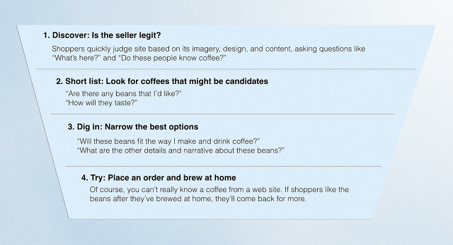
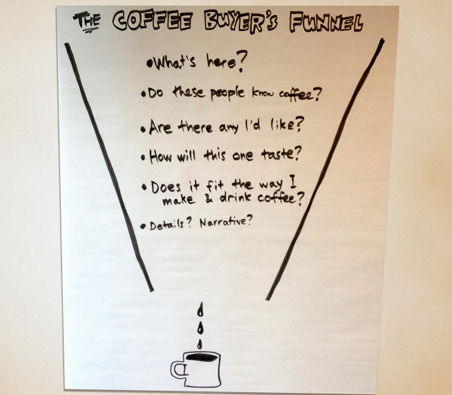
We’ve used shopping funnels to design the websites of all types of companies. For example, Blue Bottle Coffee wanted to improve their online store and make it better match the excellent hospitality of their cafes. Their shopping funnel revealed exactly how a customer makes online coffee bean purchase decisions: taste is more important than origin.
We’ve used shopping funnels to design the websites of all types of companies. For example, Blue Bottle Coffee wanted to improve their online store and make it better match the excellent hospitality of their cafes. Their shopping funnel revealed exactly how a customer makes online coffee bean purchase decisions: taste is more important than origin.

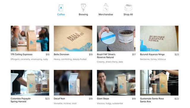
Now on their website, Blue Bottle now describes the coffee’s taste upfront and in language that conveys their nuanced expertise.

We applied the same logic to a very different kind of company. One Medical is a network of primary care doctors’ offices in several cities across the US. They wanted to sign up more patients who came to their web site looking for new doctors. To inform our design sprint, I studied how people find and choose their physicians. The resulting shopping funnel revealed that the first questions related to whether the doctor a) accepted new patients and this shopper’s insurance, b) was in a convenient location, c) and was of the preferred gender. For the website design, One Medical put that detailed criteria front and center, so patients wouldn’t have to dig across multiple pages.
In some cases, seemingly minor shopping decisions can have a big ripple effect. CircleUp is a marketplace where investors can find small, fast-growing consumer goods companies (think vitamin makers who just scored a distribution deal with a national drugstore chain). Faced with a long list of potential investments, those investors want to quickly identify the companies that merit further diligence. By using a shopping funnel, CircleUp was able to match their design to the investors’ shopping process. Because the investors care so much about the product itself, CircleUp decided to make actual product photos the most prominent feature of their browse page rather than just the companies’ logos. And they surfaced three key facts that investors might care most about on each company.
Click through to these websites and in each design, you’ll see the shopping funnel at work, helping prospective customers answer their questions quickly—and in the right order.
Most good shopping funnels start with customer interviews. Running interviews isn’t that hard, and it doesn’t have to take a long time. I recommend using our Google Ventures recipe for afour-day research sprint. Your shopping funnel should evoke a story of how visitors will interact with your product. Where are they coming from? What comparisons are they making? How will they judge whether you have what they want? What info will they look for first? Second? And so on.
After you’ve outlined your shopping funnel, it’s time to put it to work. Structure your design and organize your information to match the questions customers will naturally have. Knowing what people are looking for as they make decisions and designing to match is a recipe for a happy customer.
Have you used shopping funnels for product design? We'd love to hear about it. Tweet us at @GVDesignTeam or @mmargolis.

[Top Photo: N.Sritawat via Shutterstock]