Thursday, April 16, 2015

The Best New Social Network In Ages Is All About Selfies PATH'S THIRD APP, KONG, PLUNGES YOU INTO A CRAZY, COLORFUL UNIVERSE OF ANIMATED GIF SELFIES. IT'S UNREPENTANTLY AWESOME. 0 NOTES 0 PIN 1 PLUS 1 SHARE 1 TWEET 4 LIKE There's just nothing that looks quite like Kong, now available on Google Play and the iOS App Store. So what is Kong? It's a social network for animated selfies. The third app from Path, the company behind the eponymous iPhone-only social network, Kong's color pallette is a rainbow blast of Miami Vice style neons and pastels. The UI design elements seem to reference mid-century California design, the low-fi pixel graphics of '90s online BBSes, an even the opening credits of The Brady Bunch. But before you roll your eyes, actually try it. Because it might be the most legitimately fun and inventive social network to come around for ages. And I say this as a convert, who, within 24 hours, has gone from being a Kong denier to blasting my wife with increasingly crazy selfie GIFs throughout the day. And, in theory, I hate selfies. (If you had my face, you probably would too.) From the moment you load the app, Kong plunges you right into a frenetic kaleidoscope of your friends' animated selfies, with the tile in the top left corner reserved for your own face. You can change the filter on that box by swiping left or right (options include Black & White, Motel Peephole, Rainbow Starburst, and Warhol), and enter text into your frame just by tapping on it. There's only one button, which records a few seconds of selfie, then speeds it up, loops it, and adds it to the pool of whatever channel you're in, or else shares it to other social networks or apps as either a video or animated GIF. It's simple, giddy, and unrepentantly silly fun. "The genesis of Kong was that we wanted to make an app that was all about faces," says Path founder Dave Morin. "The idea was that your face is one of the most powerful methods of communication available to you, even more so than words in the real world, but it's one that goes mostly unused online. So we asked ourselves, what would a social network that used faces as the central unit of currency be like?" Video selfies might seem like a limited form of expression, but Kong really breaks them out into their own colorful online universe. There's no end of different channels you can join in Kong, each one dedicated to their own unique genre of selfie. Go to #uglycry and you'll find nothing but GIF after GIF of people crying like cartoon characters, whereas #emoji might be where you go when you want to take a selfie with a poop emoji balancing on your tongue. #bradybunch is just a bunch of Kong users looking around at the selfies around them, whereas #halfies is like a game, where you try to match up your face to the person next to you. And if you have an idea for a different kind of channel, you can create it at any time. Critically, there's also private channels, so you can also set up a back room just for you and your friends to share zany, embarrassing mugshots with one another, without any strangers wandering in. According to Morin, Kong's development was as idiosyncratic as the app itself. The app has a real digital-first feel to it, which Morin says is due to the fact that it was designed entirely in code, instead of mocked-up in something like Photoshop. Kong's also super fast. The selfies it records are tightly compressed, which Path learned from its previous apps was absolutely critical to helping an app gain traction in regions where bandwidth is more limited. The team also locked in a beta community super early, and made their feedback the single-most driver of the design process. For example, based on feedback, each Kong user's UI has its own unique color, which is generated from their username, so no one's Kong app looks exactly the like. Likewise, after early tests resulted in certain users taking over certain channels in Kong by posting an endless barrage of selfies, Path tweaked the service to only let people post one selfie to each channel. Post another one, and it writes over the last one. But the most important thing about Kong's development, says Morin, is that the app was built from the ground up to adapt to the crazy ways people would be using it. "We've learned with our other apps that if you're going to create a network that is open and porous to the rest of the Internet, you need to design it to evolve in response to how users are hacking is," he tells me. So in a way, now that Kong's been released to the public, Kong's design process is really just starting. I can't wait to see how it evolves from here. (Can you tell I'm a fan? Follow me on Kong @drcrypt!)

The Best New Social Network In Ages Is All About Selfies


PATH'S THIRD APP, KONG, PLUNGES YOU INTO A CRAZY, COLORFUL UNIVERSE OF ANIMATED GIF SELFIES. IT'S UNREPENTANTLY AWESOME.
There's just nothing that looks quite like Kong, now available on Google Play and the iOS App Store. So what is Kong? It's a social network for animated selfies. The third app from Path, the company behind the eponymous iPhone-only social network, Kong's color pallette is a rainbow blast of Miami Vice style neons and pastels. The UI design elements seem to reference mid-century California design, the low-fi pixel graphics of '90s online BBSes, an even the opening credits of The Brady Bunch.
But before you roll your eyes, actually try it. Because it might be the most legitimately fun and inventive social network to come around for ages. And I say this as a convert, who, within 24 hours, has gone from being a Kong denier to blasting my wife with increasingly crazy selfie GIFs throughout the day. And, in theory, I hate selfies. (If you had my face, you probably would too.)
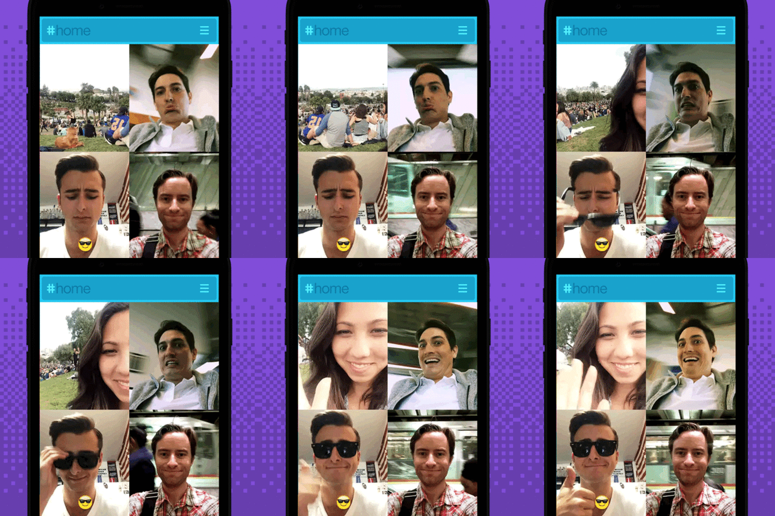
From the moment you load the app, Kong plunges you right into a frenetic kaleidoscope of your friends' animated selfies, with the tile in the top left corner reserved for your own face. You can change the filter on that box by swiping left or right (options include Black & White, Motel Peephole, Rainbow Starburst, and Warhol), and enter text into your frame just by tapping on it. There's only one button, which records a few seconds of selfie, then speeds it up, loops it, and adds it to the pool of whatever channel you're in, or else shares it to othersocial networks or apps as either a video or animated GIF. It's simple, giddy, and unrepentantly silly fun.
"The genesis of Kong was that we wanted to make an app that was all about faces," says Path founder Dave Morin. "The idea was that your face is one of the most powerful methods of communication available to you, even more so than words in the real world, but it's one that goes mostly unused online. So we asked ourselves, what would a social network that used faces as the central unit of currency be like?"
Video selfies might seem like a limited form of expression, but Kong really breaks them out into their own colorful online universe. There's no end of different channels you can join in Kong, each one dedicated to their own unique genre of selfie. Go to #uglycry and you'll find nothing but GIF after GIF of people crying like cartoon characters, whereas #emoji might be where you go when you want to take a selfie with a poop emoji balancing on your tongue. #bradybunch is just a bunch of Kong users looking around at the selfies around them, whereas #halfies is like a game, where you try to match up your face to the person next to you. And if you have an idea for a different kind of channel, you can create it at any time. Critically, there's also private channels, so you can also set up a back room just for you and your friends to share zany, embarrassing mugshots with one another, without any strangers wandering in.
According to Morin, Kong's development was as idiosyncratic as the app itself. The app has a real digital-first feel to it, which Morin says is due to the fact that it was designed entirely in code, instead of mocked-up in something like Photoshop. Kong's also super fast. The selfies it records are tightly compressed, which Path learned from its previous apps was absolutely critical to helping an app gain traction in regions where bandwidth is more limited. The team also locked in a beta community super early, and made their feedback the single-most driver of the design process.
For example, based on feedback, each Kong user's UI has its own unique color, which is generated from their username, so no one's Kong app looks exactly the like. Likewise, after early tests resulted in certain users taking over certain channels in Kong by posting an endless barrage of selfies, Path tweaked the service to only let people post one selfie to each channel. Post another one, and it writes over the last one.
But the most important thing about Kong's development, says Morin, is that the app was built from the ground up to adapt to the crazy ways people would be using it. "We've learned with our other apps that if you're going to create a network that is open and porous to the rest of the Internet, you need to design it to evolve in response to how users are hacking is," he tells me. So in a way, now that Kong's been released to the public, Kong's design process is really just starting. I can't wait to see how it evolves from here. (Can you tell I'm a fan? Follow me on Kong @drcrypt!)