The UX Process is Confusing, Even to Most Designers
In the beginning there was Donald A. Norman, and he created the idea of user experience design.
I invented the term because I thought human interface and usability were too narrow. I wanted to cover all aspects of the person’s experience with the system including industrial design graphics, the interface, the physical interaction and the manual. Since then the term has spread widely, so much so that it is starting to lose its meaning.
— Donald Norman
By 2016, Don Norman was pretty vocal about how badly misunderstood the term had become. He talks about it in this short YouTube video. These days he says he’s a people designer (apologies, I’ve misplaced the interview link), sort of, but he’s non-committal about the title.
I can’t think of a better place to start unraveling the weird and confusing world of modern UX Design than this: Not even the originator of our field knows what to call himself anymore.
De-obfuscating modern UX requires understanding the history of both design and development since the 1990s. They’re intrinsically linked, so it helps to start just a few years after it all began.
Classic User Experience Design
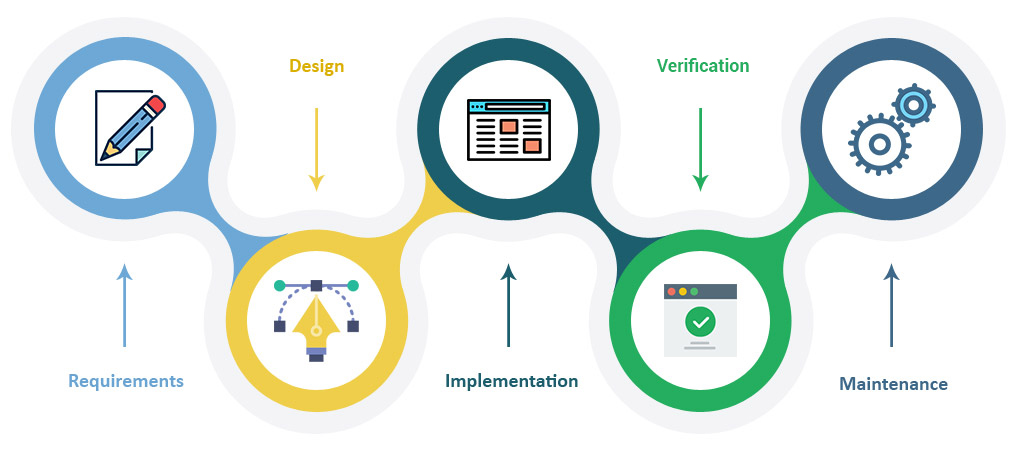
In its purest form, UX Design is waterfall based.
A product team working through the waterfall methodology sets out to learn everything they possibly can before building even the simplest prototype. Research can take months, or even years to complete; and the results dictate a design team’s execution. The requirements lock before design kicks off, and design locks before development kicks off. There’s no going back, not until version 2.0. That’s just how waterfall operates.
A classic UX process is usually taught to college students. It goes like this:
- Do research to discover what the problem is
- Categorize the problems you uncover
- Create personas and journey maps
- Run ideation exercises to generate ideas
- Build and test a prototype
- Send the final prototype out the door to development
- Launch the product
- Return to step 1 based on user feedback
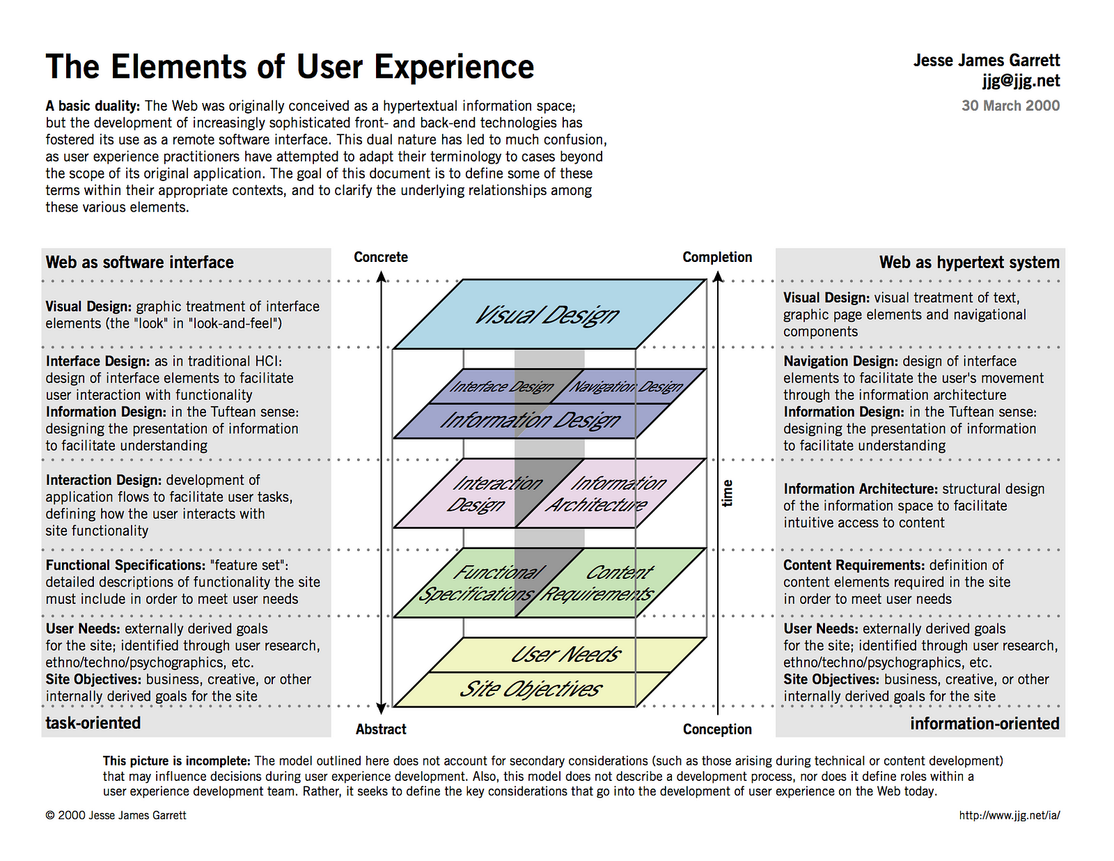
That’s basically a waterfall. The classic elements of UX (Jesse James Garrett) also follow a waterfall schema, building an execution from the bottom up based on well articulated requirements.
The problem is that classic UX is fundamentally incompatible with agile.
Along Came Agile
For a long time innovation in the Silicon Valley was driven by Moore’s Law, which states that the number of transistors in a dense integrated circuit doubles approximately every two years. Superimpose a waterfall process and you’ll notice that it fits nicely into a 24 month cadence. Business, design, and development cycles worked like a Swiss timepiece; perfectly attuned to the release of a new Intel chipset.
Then one day Sony, Toshiba, and IBM (The STI Alliance) decided that Moore’s Law was too slow.
STI created the first cell chip, which stacked 8 microprocessor cores on a single wafer, and the damn thing actually worked (it powered the Playstation 2). Multi-core architecture changed everything.
Moore’s law didn’t break, it got life-hacked. What did break was waterfall.
Almost overnight speed and flexibility replaced precision and predictability as competitive advantages. Companies turned en masse to another well established but underutilized development methodology: Agile.
Agile focuses on rapid iteration. It releases a new set of shippable increments(features) every 2-4 weeks, evolving a product over time instead of all at once. It‘s based on hypothesis, experimentation, rapid release, and real-time measurement. In Agile there is no editing stage, there is no perfection. As Bre Pettis put it in 2009… done is the engine of more.
Waterfall’s painstaking “measure twice, cut once” approach went out of style faster than a StarTAC in a room full of iPhones.
There Was Just This One Small Problem Though
Classic UX operated on a waterfall cadence.
With feature releases happening once or twice a month there wasn’t time to wait for UX Designers to execute their process. In Agile nomenclature, UX became a blocker, and it was a bad one.
Faced with an immovable block most teams simply abandoned UX. In its place they hired young graphic designers who were capable of turning out assets on a two-week cadence. Those designers weren’t real UXers, not in the classic sense, but they knew just enough about user centered design to avoid making the worst types of mistakes.
That was okay with product development teams. The details, they figured, would work themselves out through iteration.
Care to take a guess at what the Agile title for that type of designer was?
If you answered “UI/UX Designer” give yourself a cookie.
UI/UX Designers were at the heart of the storm when Apple proved that a design-lead business could become the most valuable brand in the world. They carried the torch of UX when UX itself couldn’t sharpen a pencil inside of a two-week sprint, let alone design a feature.
It came at a cost though.
The UI/UX bias towards digital and graphic design badly skewed the business world’s perception what an experience designer does. To this day, far too many businesses still think of UX as a visual discipline. As Don Norman has been trying to explain, that’s incorrect.
Things didn’t start to get better until 2013.
Lean UX
Lean UX was Jeff Gothelf’s game changing answer to the problem of practicing UX in an agile environment. In his seminal masterwork, Jeff turned the entire field of UX on its head. The book introduces a series of strategy and alignment activities, which allow UX to operate inside of agile’s cone of uncertainty and rapidly update designs based on user feedback.
Whereas classic UX is requirements based, Lean UX is outcome based. If you need a quick primer on how that works, O’Reilly has a free chapter available online that breaks things down in no-nonsense terms.
Lean UX wasn’t perfect though. While UX was now able to harmonize with an agile cadence, the lean model broke down if a product was vaguely defined (basically anything un-launched).
Designers found themselves under immense pressure to fill a sprint backlog before they really understood what they were building. As a result, a lot of development cycles got burned on features that never made it into the final product. In project management circles, the Lean UX / Agile pairing was known for a high volume of waste and rework when attempted under less than ideal conditions.
In a mature product there is lots of user feedback coming in, which does wonderful job of driving the iterative cycle that powers Lean UX. That’s why Lean UX is the industry standard on almost any established product team. Nobody in their right mind would change a thing.
On establishing teams, however, the user feedback cycle has yet to ignite itself. The waste and rework problem in those circumstances was serious enough that it often crippled the adoption of Lean UX. This presented a real conundrum for startups and skunkworks units that wanted to ensure a strong UX component without reverting back to a waterfall cadence.
Jake Knapp and Google Ventures came out of the sky like a bolt of lightning and solved the problem with the design sprint. Nobody saw it coming. Nobody cared. The long dark night of UX was finally over.
The Google Ventures Design Sprint
If you were to look at a design sprint and say “wait, that’s just really fast classic UX” you wouldn’t be far off the mark. The difference (and genius) is that it’s classic UX at an incredibly low fidelity. It’s the difference between an artistic masterpiece and a napkin sketch — but it works.
The goal of a design sprint is to take all of the existing research about a problem, unpack its essence to a diverse group, then ideate like crazy. The ideations are then funneled through the lenses of human centered design and those that survive are voted on by the team. Designers then build a low-fidelity prototype (often in just one day) that is just barely good enough to test on potential users. The results of the test, if positive, create a target for designers to hit in high-fidelity; thus fueling the Lean UX/Agile cycle.
Magic.
Dual Track Design
IMPORTANT: dual-track agile often refers to the split between research and design in a Lean UX environment. I’ve updated this article to refer to dual-track design in hopes of reducing confusion.
So now we come to the point of modern day UX methodology.
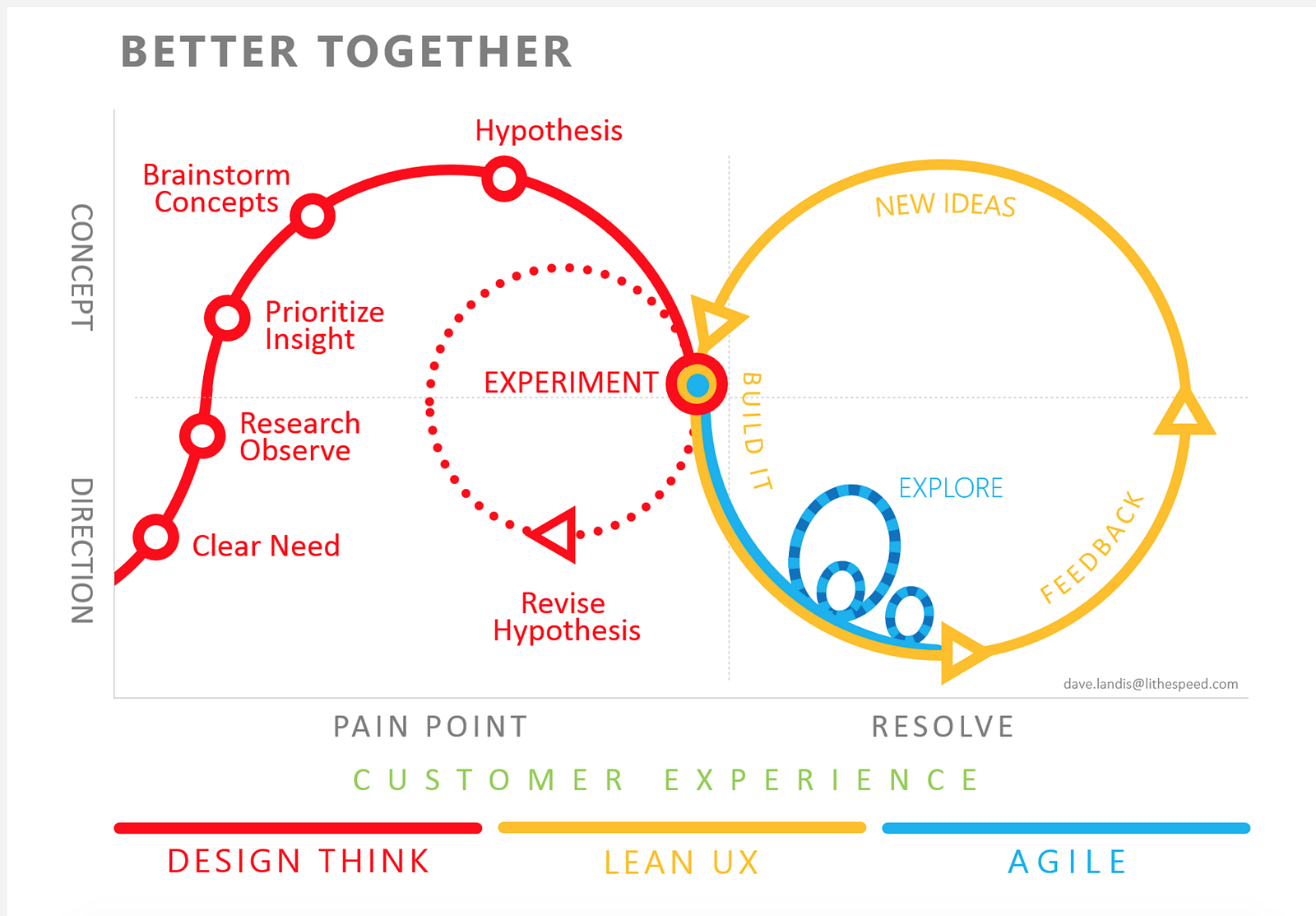
As you might expect, dual track design has two tracks (a Sherlock Holmes level deduction, I know, don’t everybody gasp at once):
- The design thinking/research track powers a design sprint
- The Lean UX/Agile track powers iterative experimentation
A production team is typically running on track two unless the backlog becomes poorly defined. If that happens, the problem is assessed and the team runs a design sprint. Problem solved.
But where does that assessment come from if the production team is busy practicing Lean UX?
The most effective answer is to put a dedicated team on it. While design & development pumps out iterations, a research team investigates the results much more comprehensively in the background. Because that research team isn’t bound to an Agile sprint cadence they still have the luxury of taking 3 months to reach a conclusion.
Every few months a fresh infusion of new insight will hit the production teams, filling their backlog with new ideas for experimentation. At one of the companies I work with, we’ve now got a whole data science team feeding knowledge to multiple creative units. The insight is infrequent, as researchers have much longer delivery cycles, but when it comes down the line it’s wonderful.
Sometimes the insight is big enough to trigger a design sprint, which significantly evolves a product vision. Most of the time, however, it just adds additional kindling to the fire of Lean UX experimentation.
So yes, dual track works best when a dedicated research team is working outside the scope of the active product group. You’ve probably surmised that it’s an expensive undertaking. You’re not wrong.
What I can tell you is that it’s less expensive than the alternatives: operating without UX or dealing with the waste and rework problem of pure lean.
Fund it out of your savings.
Wrapping Up
- In the beginning there was Don Norman, and Don invented UX.
- Other innovators like Jesse James Garrett fleshed out Don Norman’s ideas and the classic UX process was born.
- Classic UX worked well with the standard waterfall development cadence and everybody was happy. UX was still a niche practice though.
- Moore’s Law was bypassed by innovation and Waterfall no longer worked.
- Classic UX was therefore incompatible with modern (Agile) development.
- UI/UX Designers took up the mantle of user-centered design. They were crucial to the growth of UX in the design field but limited in scope. Their bias towards digital and graphic design badly skewed the business world’s perception as to the role of UX. That remains a problem today.
- Lean UX was conceived by Jeff Gothelf in 2013 and brought true user experience design back into harmony with product development. Suddenly researchers, interaction designers, information designers, and all manner of specialized UX professionals were in demand.
- Unfortunately Lean UX was inefficient when a product plan wasn’t well defined, resulting in significant waste and rework.
- Google Ventures conceived the design sprint, which allowed teams to rapidly define and test a low-fidelity prototypes. This jump-started the Lean UX cycle on emerging product teams and effectively eliminated the waste and rework problem.
- Dual Track Design fused the Google Ventures design sprint model with Jeff Gothelf’s Lean UX methodology. It is a presently evolving discipline as of early 2018.
So what is a UX Designer in a dual-track world?
A UX Designer is a leader, a process evangelist, a generator of insight, a purveyor of context, and a creative ideation machine. UX Design, as I’ve said elsewhere, doesn’t really have any deliverables other than value. It has come to encompass dozens of job titles that have hundreds of their own deliverables though.
Most of us aren’t actually UX Designers unless we lead a team, rather, we work in the field of UX Design.
It’s enough to confuse anyone.
It’s enough to exasperate even Donald A. Norman.


