

3 insights from design practice to go beyond touchpoints and look at customer experience more holistically.
Providing great customer experience is crucial for b2c organizations. For this they develop customer journey maps to understand audiences, touchpoints and relevant use cases. Many approaches are well documented and have provided great ideas and tools.
But sometimes practice paints a more colorful picture providing inspiration for a variety of opportunities for great experiences. I want to use 3 insights from practice to talk about how customer journeys can become holistic stories enhanced by delightful moments.
Why is this topic relevant?
No-brainer: We know that many young people value experiences increasingly over possessions: access, not ownership. And while many might not have the big bucks (yet) they want to spend what they have well. For organizations this means they have to deliver against high expectations not only to stay relevant but also to stay in business.
Right-brainer: These experiences have to be well crafted by thoughtful designers. The experiences they design cover many areas and have strong impact, and therefore can’t be looked at as isolated touchpoints. This means designers have to focus on coherent and holistic stories instead of singular design outputs.
Following are 3 customer experience insights that I collected from practice. I will illustrate these insights around one personal use case — car sharing with car2go in Berlin.


1. Story is King
People often create stories of the experiences they have with a brand. Their stories emphasize positive or negative aspects of what they value most. And while the organization behind the brand can only know some of this (e.g. through research and monitoring) and might not have influence on all of the factors, it is paramount for them to take a proactive approach to be the hero in these stories. Here’s an example:


Car2go is a car-sharing service that lets their members use Smart cars in urban areas. They have a really nicely designed app, with which users search, book and un-lock cars. It is functional, gives all the info needed and the look & feel is on-brand for all that I can tell.
Though often times I find myself frustrated when interacting with the app. Simply because in my neighborhood there are no cars around, while the rest of the city is packed. While this is no app-issue per se, it is the app though that I interact with when having this experience.
To get notified when a car gets available close by I can set an alarm within the app. As soon as a car shows up I can book it, check-in and start my travel. After taking off, it might ping me again with another car that got available after I already started driving and have no more desire for another car. Why does it still bother me?
While these are three different things (nice app design, car unavailability, dumb alarm) they manifest in one story of this experience with car2go. Sadly the nicely designed app completely vanishes among the unpleasant stuff.
The story of this experience therefor might not sound like a ringing endorsement of their brand, even though they manage their controlled touchpoints (i.e. app design) really well. Just not beyond. And that is where tons of opportunities lay to become the hero of this story.

A story like this might give hints to potential issues (e.g. no cars available) to which a proactive answer can be formulated. Is there maybe a community feature that holds incentives for people dropping off cars in other neighborhoods? Or do they make someone’s wait worthwhile with a coffee or free minutes? And so forth. Design thinking offers many methodsto respond to these and other challenges. The outcome surly would be a better brand experience.
The key is to be proactive through developing experiences as storylines that heavily consider opportunities beyond controlled touchpoints.
2. Delightful Moments
Delightful moments have tons of potential. They describe turning seemingly mundane moments in a story into great experiences. While expectations might be low in such moments, perceived impact can be huge.
To give an example of what I experienced as a repeated delightful moment, I want us to sit back in our shared car and imagine our trip is about to end. There are two alternate endings to parking the car and checking out:


Alternate ending 1: The car has a simple design to end the trip: I turn off the ignition, take out the key, and put it into a clearly above situated holster (image left). One move and done. This automatically initiates the soft check out process in the car and their app. Just confirm on the display right next to it (“No new Damage”) and leave. Easy and super clear.
To end the trip with an action that fits the affordance of the physical design (the same way we learned to use keys everywhere else) did give me a feeling of having successfully completed the task. And simply exiting the car and walking away until it closed after a 15 seconds countdown felt satisfying (see below).


Alternate ending 2: When turning off the car, I have to flip the key around, reach awkwardly over the wheel to the left side and fiddle the keychain fob into a slot. Not very easy, especially not when wearing gloves. Not even clear why this would make sense when the actual check-out isn’t initiated until the next step.


After this, the check out process is actively done with the complimentary smartphone app (“end rental”). For this I have to exit the car and stand next to it to wait until everything is done. Depending on several factors this might take longer or even fail. In which case I have to call a support line.
Why did car2go take away the easy and fun check-out? I am sure there is a ton of technical reasoning behind it (they are germans after all). And I can see usability people adding up that the number of steps are roughly the same in both cases, but in my experience with car2go a moment of delight became a moment of ouch!


A design-change like this does not only takes the fun out of an interaction, in this particular case it goes even deeper. The whole reason for using a shared car is ultimately to leave the weight of owning a car with the service provider. This means functional weight (fuel, car-insurance, repairs, etc.) but also cognitive load (“did I lock the car?”, “what if network coverage is down?”, etc.). Delightful moments can help to avoid the latter because they make interactions easy and smooth, suggest reliability and build trust.
Disclaimer: As much as it hurts, delightful moments are nothing to easily mass produce or scale across products or service. They have to be derived from a storyline and thoughtfully designed. Since it is not about leaving a candy on a hotel bed or just making something cute. While this is also nice it might not meaningfully enhance a person’s experience. Maybe that is also why designers (i.e. lateral thinking people) are really good at detecting and programming delightful moments.
Service brands promise to carry functional and cognitive weight. While the first can be mass produced, e.g. providing cars and fuel, the second has to be thoughtfully designed in form of delightful moments.
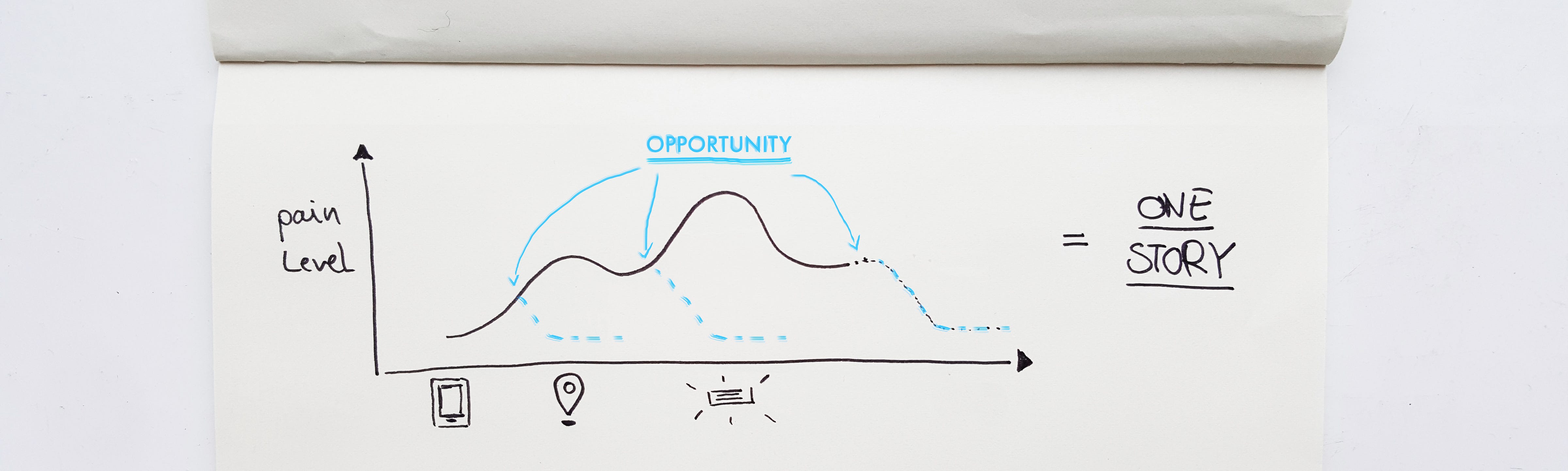
3. Diffusion of Experiences
The third insight is the overall picture that aims to foster inspiration when designing experiences. It starts with the assumption that brand touchpoints are seldom isolated nor necessarily linearly experienced. Yet every interactions leaves an impression that diffuses over time, staying with people in different levels of intensity.
For example, having a delightful check-out experience with a shared car leaves me with a positive feeling for some time longer than the interaction lasted. It also blends into my next interaction with this brand, which then can either obscure or enhance this feeling.


If a customer journey map is the template for a brand experience then diffusion of experiences is what it looks like after taking it for a spin. Anticipating this helps to design better experiences.
While this is a pretty picture, the rightful question is, how to use this approach in practice?
First, dive deep in qualitative research. Understanding the audience’s motivations and values is key. This means to go beyond surveys or interviews. Observations, diaries and cultural probes are much more insightful here since many valuable things might be unspoken or ingrained in culture, rituals and habits.
Second, stay in touch and build relationships to understand how people interact with a service beyond launch. Pretty much like documenting and writing down the actual stories that people are experiencing. With open eyes and ears, and with openness to dynamically respond with design changes. At the core this needs true empathy.
Third, work in interdisciplinary teams that sit at the same table. These teams work with holistic stories in mind, covering all touchpoints to develop coherent and delightful experiences. If people build one story from their experience with a brand why would the design teams write separate ones?


I Hope you enjoyed this. I will publish more ideas illustrating how UX and Branding can learn from each other. I am looking forward to feedback, ideas and inspiration. And: I don’t want to be negative about car2go, I am using their service and I think it’s fine. I am thankful that I can illustrate lessons I learned in other projects around their service. This obviously is only my experience with their service, others have definitely made different experiences.