If you do Facebook Marketing you know it takes a lot of work. You need to get right your objective, targeting and your budget only to then decide which ad formats you’re going to be using. All of that before of even thinking about designing and writing some awesome copys.
We know that too and that’s why we’ve collected la crème de la crème of Facebook Ads to keep you creative and inspired. Doing some research on Facebook Ads examples gives you more tools and ideas to get those leads you’re looking for as well as improve your overall Facebook Marketing strategy.
As we get into the examples we will comment on the things that makes them likely to get good results. So enough of small talk, let’s get into it:
- Nike

This is a great way to use the carousel format for Facebook Ads. They show their customers they can customize the products they want using simple color blocks designs, that contrast is definitely eye-catching. The copy goes straight to the point: you will get our best products delivered to your doorstep.
- Pro tip 1: the use of high contrast color to catch the attention of users.
- Pro tip 2: they have a call to action phrase at the bottom: “customise it your way-learn more”. That takes the user to their online shopping experience.
2. Facebook Blueprint
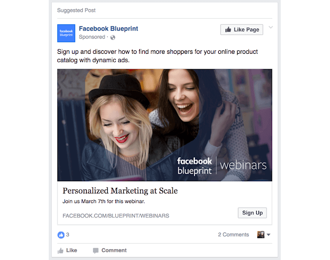

If you’re trying to generate leads take a look at this ad it’s got a simple image and a copy that immediately shows you the benefit you get if you sign up for the webinar keeping the copy short and clear. The form is also very precise, it just asks for necessary information so user doesn’t feel overwhelmed while filling it.
- Pro tip 1: the photo appeals the targeted audience which are young digital marketers looking for new tools to get better at their work.
- Pro tip 2: it makes clear what user will get in exchange for their information. That’s key to make sure that the leads your business generates are relevant.
3. Shopify
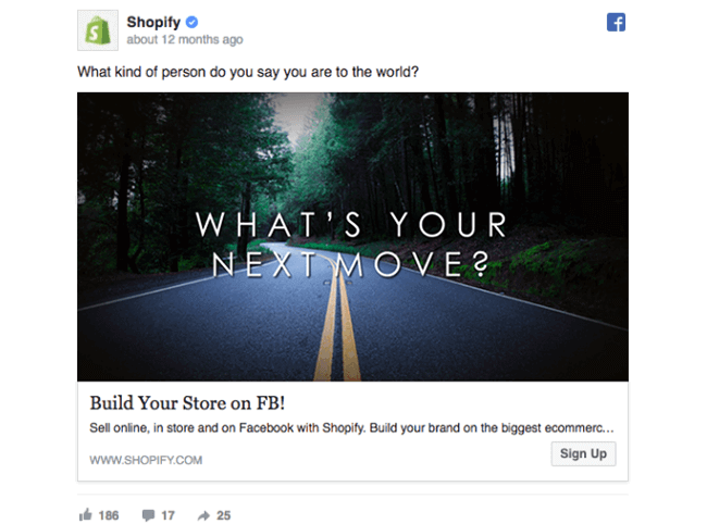
Shopify does very well with a short copy. Notice that there isn’t a call to action within the first part, instead is a personal question that engages with the audience’s dreams and aspirations. Then They use a photo of a road to ask what’s your next move, suggesting they can make your journey better.
- Pro tip 1: They trigger some emotions with the copy and photo, then, once the audience is making those questions to themselves, they put the call to action at the bottom: Build Your Store on FB!
- Pro tip 2: In this case they did an A/B testing and they found that the “sign up” button worked better than “learn more”.
4. CoShedule
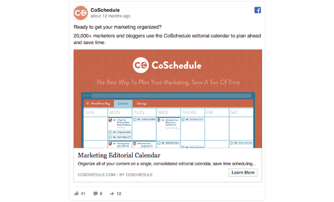
This ad got everything right. The copy is short and is sustained on facts: 20,000+ marketers use our product, period. People trust numbers and facts, so mentioning it is a good idea to catch attention and generate engagement.
- Pro tip 1: the copy’s structure is very precise here. It start with a question that a) suggest they’re going to give you organized marketing, and b) the use or the word “ready” implies that only your doubts are keeping you away of organized marketing.
- Pro tip 2: they show how their solution may look in the image below, letting the audience imagine how they would use it for their work.
5. Airbnb
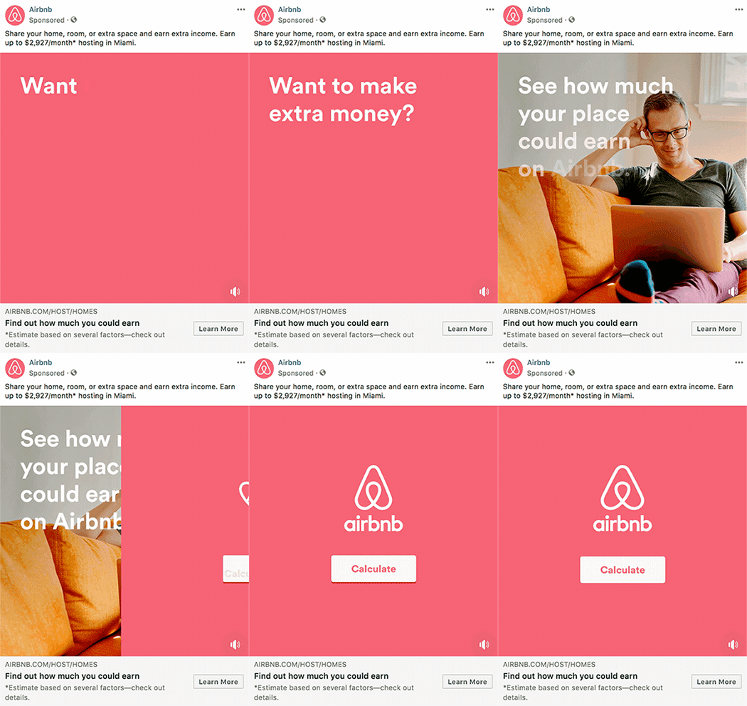
This video ad wins at being short and precise. People’s attention on social media is very hard to get, that’s why short video content get more traction than longer pieces of content. This video makes you wonder and get engaged with the app.
- Pro tip 1: the video duration is something like 7 seconds or less. That’s the sweet spot for video ads on social media.
- Protip 2: at the copy you can see an estimate that gives you an idea of what kind of money you can make with Airbnb.
6. Canva
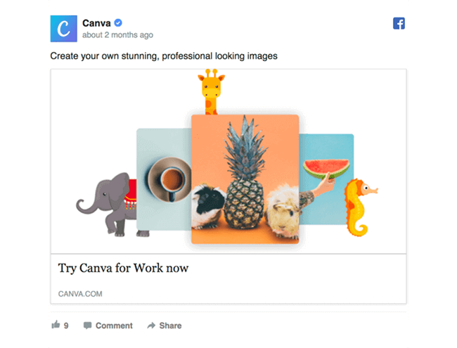
Simplicity is key to deliver a message successfully. The copy commands you to create stunning, professional looking images and what you see after is just a very eye-catching image. The user already knows what’s this all about: composing and editing images.
- Pro tip 1: when your message is so simple and clear the image should match that simplicity in order to create harmony on your ad.
- The copy and call to action starts with verbs: “create” and “try”.
7. Gainful

Personalized is the name of the big game right now. Companies are adverting made-for-you products in everything, but not all of them advertise it well, however Gainful makes their customization abilities the protagonist. They make sure their protein it’s right for you specifically.
- Pro tip 1: To capitalize personalized products, they tell users they’ll be sending them to a quiz (which is very simple, less risk and low-obligation) and that they can get a coupon code if they purchase.
- Pro tip 2: They’ve created a mini-funnel that can be completed quickly while giving customers a personalized product — accurately what everyone wants.
8. Thinx
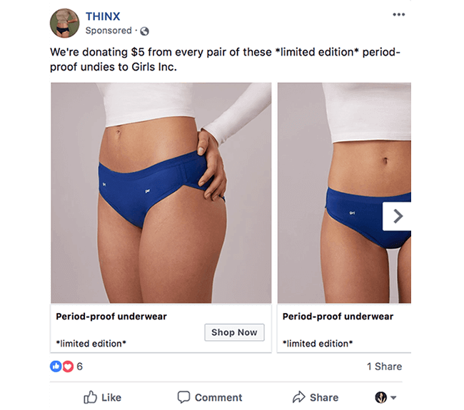
They do something smart with this carousel ad format: they use the text on the carousel image slides to appeal to the logical part of the brain, explaining what the product is. Meanwhile:
- Pro tip 1: their main ad text use an emotional appeal, saying they’ll give $5 for every pair to a charity. A lot of customers are prefer to spend more if it means their money is doing some good, at the same time THINX get more sales while boosting their brand reputation.
- Pro tip 2: they leveraging scarcity in the form of “limited edition” to get people to purchase.
9. Allbirds

The copy in this Allbirds ad is extraordinary because they do many things well:
- Pro tip 1: They start with a testimonial in quotes, to identify. Also, people trust testimonials more than ad copy.
- Pro tip 2: They address a pain point, find comfortable shoes, right off the bat.
- Pro tip 3: Their mention about return eligibility appeals to potential objection of someone who wouldn't want to give a gift that wouldn't go over well.
- Pro tip 4: Seasonal imagery and language is used, create an emotional connection to the thought of “warm wishes and warm feet.”
10. Grammarly
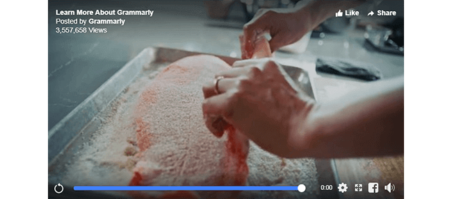
A strategy of native advertising. In this video you can witness native advertising at its best. Grammarly has used a story of their user (a beautiful and fascinating story) and elegantly stitched in a product plug for their product. It’s done in such a natural way, that the product plug even feels complementary to telling the story.
- Pro tip 1: they designed the campaign in a way that it would appeal to a large audience, so they chose to use the storytelling approach.
- Pro tip 2: Creative wise they’ve gone for using a video while keeping it to an optimal 2-minute length.
- Pro tip 3: The video finishes off with an empowering message “write the future”, a very bold message isn’t it? It certainly inspires one to take action.
11. Groupon
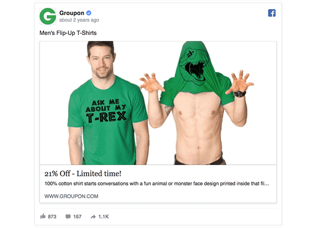
This simple Facebook Ad with a playful hero image that showcases a unique product line is unstoppable.
- Pro tip 1: This ad lets the image do most of the heavy lifting.
- Pro tip 2: Buyers love spoilers. They want to know exactly what they’re getting in the end. They give their audience a chance to see what are they selling.
12. Soylent

In this Facebook ad for a meal replacement product, Soylent delivers its three key messages that combine both benefits and features in an very easy-to-digest list, and with three of their products on the image.
- Pro tip 1: They use a minimal copy. Keeping the copy short and sweet can be a challenge, but it allows you to deliver a message to those drive-by scrollers who plow through their Facebook stream.
- Pro tip 2: Adding special characters such as emojis and symbols (such as ✓➕ ➡ ) is a simple, clever way to get your ad to stand out from the crowd.
- All about YOU: (or…them, rather) Write your ad copy in the second-person point of view (calling out you!). By calling out the reader in a 1:1 statement, they deliver their benefit straight to the doorstep of the audience.
13. Eco Terra Beds

Yes, the copy it’s ok, they use a testimonial and probably there’s no need to try to get someone to read reviews, call, and press a CTA. But this ad is in the list specifically for the image that they’ve chosen.
- Pro tip 1: They’re using the image to show why the mattress works, and how it delivers those promised benefits.
- Pro tip 2: It just looks so comfortable that gives the users an inside-look (literally) at the product can be beneficial.
Wrapping up
When we talk about Facebook Ads there are so many options for you that simply the sky is the limit. You got to do an exercise to determine how to best combine the available features with strong messaging, in order to really connect with the audience you want to get.
We hope these ads gave you ideas and inspiration to adopt some of their strategies to your own campaigns. Which strategy are you most excited to replicate? Which of these Facebook Ads examples were your favorite?
Getting the most of your Facebook Ads is a complex work, but there’s a way to simplify it: Leadza.
Our platform can take off the routine work like budget allocation, automated bidtesting, targeting and much more, so you can get to do the things you love the most about Facebook Ads and your business. You’re thinking about it, don’t you?


