| Fitts’s Law |
There’s an obvious and simple piece of marketing advice that we’ve given at least once a week for the past five years. And marketers still get it wrong so often! We even gave this advice to Mailchimp recently because they’re sponsoring our Stacked Marketer newsletter (by the way, if you want to sponsor Psychology of Marketing or Stacked Marketer, just reply to this email). We decided to take a step back and look at the principle behind that advice, and that’s where Fitts’s Law comes into play. The time to acquire a target is a function of the distance to and the size of the target. That’s the gist of what psychologist Paul Fitts showed in 1954. And it’s something that applies to UX (user experience), UI (user interface), and marketing. Let’s dig into three tactics that use Fitts’s Law, starting with the advice we’ve been giving for the past 5 years… |
| Three Tactics Using Fitts’s Law |
1) CTA and form should go above the fold—on all screens Yes, believe it or not, putting calls to action (CTAs) above the fold on mobile screens is the most common advice we’re still giving years later. Here’s our experience when it comes to forms:
And it makes sense, because it follows Ftts’s Law. An easy-to-see and easy-to-reach form with a call to action makes it easy for users to fill in the info and hit submit. Popular newsletters do this the best. Now if only more lead-generation landing pages should follow Fitts’s Law, too… |
 |
2) Take up more space with your most-desired option In other words, if there’s more than one option that people can take, out of which one of the options is clearly the most desirable, make sure it’s the closest to their point of focus—and make sure it’s bigger than the less desirable options. Amazon does this constantly. Just have a look at this example from their app: |
 |
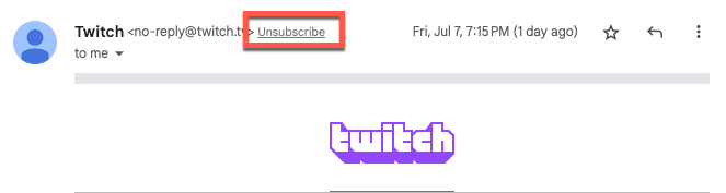
The CTA for subscribing is a full-width yellow button, right in the middle of the screen. Meanwhile, the one-time purchase switch is a small, barely visible radio button. You can also apply this principle to your pricing pages. 3) Decrease the frequency of undesirable actions Based on the same principle, if you have undesirable actions that you must present to users, you can discourage them. When was the last time you were able to close a pop-up ad on your mobile device on the first try? Yep, that small, barely visible, and impossible-to-tap “X” button uses Fitts’s Law, too. Another common example is the email unsubscribe link. You generally find it in the footer and in smaller text, so it’s almost impossible to hit by mistake… and hard to hit on purpose, too. Gmail uses Fitts’s Law too. Even though Gmail pulls the unsubscribe link at the top of an email from known senders, it’s in a small light gray font that’s not easy to read or click. |
 |