Monday, June 27, 2016

7 Reasons Why It’s Time for Marketers to Stop Ignoring Snapchat

“But our audience is B2B.”
“Snapchat is for high schoolers.”
“I don’t get the point of Snapchat.”
“It’s a fad; it doesn’t have the staying power of other channels.”
All these and more are reasons — nay, excuses — I’ve heard marketers give for why they don’t have a Snapchat strategy.
I hear you. Snapchat, with its disappearing content and Vine-like video storytelling, seems like a network designed for youngsters with too much time on their hands. But times have changed, and it’s time to wise up. No Snapchat strategy is no longer a strategy.
Here’s why I think Snapchat is the #1 social channel you need to consider testing this year.

1. Snapchat now has more daily active users than Twitter.

More than 150 million people use Snapchat every day now, compared to around 140 million using Twitter daily. So while many have been brushing Snapchat aside as kids’ stuff, Snapchat has been busy accumulating more users than one of the world’s foremost social networks.
Twitter defined the category of real-time social media. Many marketers, news outlets, customer service teams, and more have had great success with Twitter, and I’m sure they’ll continue to do so. No one is suggesting you abandon Twitter for Snapchat. But if you have a mobile-loving audience and the ability to test a new storytelling format, I highly suggest you give Snapchat a spin.

2. People of all ages use Snapchat.

Believe it or not, Snapchat is actually growing faster with the older crowd than the younger. “Over the last year in the U.S., Snapchat added 25-to-34-year-old users (103%) and older-than-35 users (84%) faster than 18-to-24-year-old users (56%),” reports the LA Times.
Back when Snapchat had 100 million users, the network claimed that of the 100 million:
  • 26 million were 13 to 17 years old
  • 37 million were 18 to 24 years old
  • 23 million were 25 to 34 years old
  • 12 million were 35 to 54 years old
Based on these numbers, the assumption that Snapchat is only for teenage smartphone users is false. The network is growing more popular with older users all the time. I can’t wait to see what these numbers will show when Snapchat releases updated counts of users by age.

3. But millennials, especially, do love their Snapchat.

If you’re targeting millennials, ignoring their love of Snapchat is folly. On a given day, Snapchat reaches 41% of all 18 to 34 year-olds in the United States. And overall, about 60% of America’s 18 to 34-year-old smartphone users are on Snapchat.
Snapchat has incredible marketshare with the millennial buyer. If people in this group are in your target audience, you can bet that the amount of time they spend on Snapchat will only be going up in the months ahead, not down. This will be especially true as we head into the all-important holiday season — which I think will be the first real Snapchat Christmas, from both a customer experience and a marketing standpoint.

3. Snapchat gives you full-screen real estate on the almighty smartphone.

Check out this example from Snapchat’s ads page with an ad promoting the Netflix show Love:
As the example shows, Snapchat gives you what few other platforms can: full-screen smartphone real estate to reach your customers in a big, visual way.
Vertical video may make the cinematographer in you cringe. But that’s how millions of users are viewing videos on Snapchat nowadays. Even National Geographic is now shooting videos for vertical screens, as well as horizontal.

4. Snapchat ads are clever and creative.

Beyond the standard video ads, Snapchat offers sponsored geofilters and lenses. What’s the difference? Here’s your cheat sheet with details from Snapchat:
  • Sponsored Geofilters: “When Snapchatters in the location(s) of your choice take a Snap, they’ll be able to see your Geofilter and use it to explain where, when, and why they took the Snap.” So you’re basically paying for a fun, branded overlay — like a ‘90s photo booth — that users in a special location can access.
  • Sponsored Lenses: “To activate Lenses, Snapchatters simply press and hold on their faces. Some Lenses include prompts like ‘raise your eyebrows’ to trigger an animation, adding a fun twist to the experience. And when you’re finished playing, it’s easy to send Lenses to a friend or post one to your Story. On average, Snapchatters play with a Sponsored Lens for 20 seconds.” With Lenses, your company creates a virtual animation that users have fun interacting with. It’s a far cry from a static banner ad.
Example of a Sponsored Geofilter: Our events team at Salesforce created this geofilter for a Salesforce World Tour event in Boston. Only those in that location could access it. Note the custom hashtag, logo, and city designation that appeared on the snaps of all users who included the geofilter in their World Tour snaps.
Example of a Sponsored Lens: Taco Bell promoted this fun lens that transforms users’ faces into one of their favorite foods: the taco. It animates along with users’ movements, so whenever the user moves, the new taco-face moves along, too, heightening the goofy realism.

5. Users watch as many videos on Snapchat as they do on Facebook.

Snapchat gets more than 8 billion video views a day, which is probably around what Facebook is currently getting. (Facebook hasn’t updated us on total video views since last November, when it confirmed a total of seven million.)
Considering how much newer Snapchat is and its comparatively smaller user base, that’s significant. Snapchat videos are all ten seconds or less. Imagine a five-second video performing well on YouTube. Pretty unlikely, right? But on Snapchat, less is more. That makes it easier to brainstorm ideas for Snapchat content, too; you can keep the message short and sweet.

6. Snapchat users love the personal, window-into-my-world perspective.

Snapchat may be for video, but much like YouTube in its early days and Vine, users are accustomed to low-budget and personal videos. In fact, many Snapchatters actually prefer those kinds of videos over high-production-value clips because they feel more authentic.
So don’t sweat it if you don’t have a Hollywood-size video budget — you can still snap with the best of them. Think visual diary, not blockbuster motion picture.

7. You can experiment without making it permanent.

Check out the full run-down of what types of Snapchat content disappears when. In general, content disappears either after 24 hours or the recipients view it.
While I wouldn’t advocate for publishing content on Snapchat for your brand without any strategic rhyme or reason, you can begin to publish content with the assurance that it won’t last forever. The messages will disappear soon enough and you can create new, better content based on what you’ve learned is most engaging.
If these seven reasons have convinced you that Snapchat should be a social priority for you, here are my recommendations for getting started:
  • Create a low-stakes account for yourself personally. Experiment with storytelling there first before you delve into it for your company.
  • Follow a variety of different Snapchat accounts, from musicians to brands to friends. Pay attention to what kinds of snaps you enjoy and why.
  • Don’t regurgitate the same content on Snapchat that you post on other channels. Snapchat is unique — content should be pithy, personal, immediately grabbing, and often humorous, containing some kind of punchline.
  • Commit to posting every day for a consistent pilot period (i.e., three months). If you only test for a week or two, it’s not a real test. You won’t grow an audience or know if your strategy is working.
  • Don’t knock it before you try it. Snapchat defies explanation unless you’ve played around with it for a while. Snapchat also updates the app frequently. So be sure you really give it a shot before reaching any conclusions about its worthiness.
I’d love to hear what Snapchat accounts you enjoy, plus your plans for the future.

Wednesday, June 22, 2016

The march of the Millennials


Caroline Hayter
Acacia Avenue
Alex Dewdney
qualitative researcher
In the September issue of Market Leader, a group of Millennials explained why they were often described as 'the disruptive generation'. In this article, Caroline Hayter and Alex Dewdney examine what this generation are like as consumers – and how best to market to them.
Millennials are not a new topic to marketers, but their impact is finally making its way far beyond the first question that marketers ask, which is: 'How to market to them?'
There are more than 1.8 billion Millennials in the world – that's the largest generation that has ever existed and latest figures quote that they account for 25% of the population. But it's not just their sheer volume that demands our attention. It's also the scale to which we need to adapt for them. Millennials are no longer simply an audience; they're agents for change.
During our work with Millennials, Acacia Avenue has identified seven key insights that reveal how brands should behave in order to connect with this generation more deeply, and what businesses must learn from them to grow more effectively.

1. Connect, don't sell

A direct link can be drawn between Millennials' influence on brands and business models, and the environment in which they've grown up. Born into a society of financial growth, but coming of age amid the instability of the financial crisis and its aftermath, they have inherited a hefty debt from their predecessors and feel little support from government bodies, reflected in high student fees and house prices. Inevitably, this has consequences – being exposed to an environment where debt is paramount, they are more rational when it comes to money, in contrast to the impulsive spenders of their parents' generation. For them, money is most relevant when couched in terms of moderation, rather than excess. Traditional marketing thinking says that selling to the lowest hanging fruit is to get existing customers to buy more or buy more often. But brands that try to 'sell' rather than 'connect' or offer something useful will instantly lose credibility. This is part of the reason why financial institutions are being shunned by this group – they don't want their bank to sell them a credit card any more than they want their holiday company to sell them insurance. But if you're offering the opportunity to get something free, as Prudential health insurance does with its two-for-one weekly cinema tickets, or to get the latest music, reviews and interviews, as provided by Red Bull's dedicated online music hub, then it's quite another story.

2. Focus on personal values, not badge value

Millennials have entered the workplace at a time of unprecedented connectivity and, more than any generation before them, have an awareness of what the world has to offer. Technology is a key enabler. A US blog, The Blaze, recently quoted a study claiming that 53% of young people would trade their sense of smell for technology. This is the Millennial paradox: they have a hunger for success driven by exposure, but the reality of their situation means they are less likely than ever to achieve it.
The result is that they are taking their future into their own hands – 'back yourself' is their mantra. They have less faith in the world around them and more in themselves. Previous conventional routes through life are dismissed and goals have become more inner-driven. Millennials are more entrepreneurial in their outlook – gone are the five-year plan and the career for life. As Harriot Pleydell-Bouverie, founder of gourmet marshmallow company Mallow and Marsh, recently told us: "I don't even plan five days in advance."
Planning is a constraint and the biggest freedom is the ability to be flexible. This means being open to ideas, new paths and serendipity.
Slashie culture is the result of this, with many people holding multiple jobs in parallel to keep things interesting and to see where opportunity presents itself. As marketers, we inherently know that creativity occurs when there is space – physical and mental – but yet we also subscribe to processes and triedand- tested formulae for new ideas, which don't always get us to where we need to be. Millennials are not weighed down by this convention and the sheer number of new Millennial startups is testament to this. As one Millennial we recently spoke to put it: "A modern-day career person from our kind of generation is a bit more agile. We don't need to put all our eggs in one basket because that basket can get turned over very easily. You should be following different options… be more entrepreneurial with how you work and react to opportunities."
Alongside this perspective on work and money comes a deeper, more fundamental shift in terms of goals and motivations. Having to trust in themselves quickly mutates into getting satisfaction from inner rewards more than outer ones. As one of our research participants reflected: "I think so much of your happiness is derived from your outlook, your perspective, how you see things, and that's so inwards."
As a result, Millennials tend to elevate the role of personal values in the employers they are prepared to work for, and the brands they are prepared to transact with. So brands that act with humanity and a conscience, such as Unilever, which has put sustainability at the heart of its corporate strategy, will flourish in this environment.

3. Product first, brand second

Millennials are highly resistant to traditional marketing. They're not impressed by the mystique of brands and quickly see through the veneer. In a recent project where we asked Millennials and the older generations to talk about their favourite brands, we saw a striking difference in language and tone. Where Gen Xers appreciated brands for characteristics such as 'personality', 'leadership' and 'innovation', Millennials cast their votes for utility. This isn't so much a case of Millennials discarding established brands for newer ones. In some cases, they were talking about the same brands – such as Apple, Virgin and Barclays – but for entirely different reasons. It's clear that for Millennials, utilitarianism is in vogue and traditional brand image building is distinctly out of fashion – in today's world, it's product first, brand second.
It's certainly not a case of functionality trumping an emotional connection with a brand, but a clear shift in emphasis. As Guy Murphy of JWT says: "There is a shift occurring from adding intangible value to adding tangible value. Instead of adding emotion to function, brands are beginning to add function to function. We don't have to play out a brand as a metaphor any more, when we can do it for real. Brands will seem more valuable not just because they feel better but because they work better, or serve you better. This is not a denial of the emotional component of brands; it is just a different way of generating it. It is not about the power of associations; it is about the power of reality."
So emotional context is still relevant – we are all emotional beings, after all. Storytelling has a big role to play, and with this generation's hyper-connectivity a good story can really fly. The emphasis here is on a good story – it needs to be honest and authentic. Anything fake or forced will be sensed a mile off.

4. Make their lives easier

Juggling multiple jobs and being flexible takes its toll. In working with Millennials, we have been surprised to find out how permanently exhausted many of them are, from the moment they wake up in the morning. "We were born busy," as one of our research participants put it.
And busy-ness is a state of mind – it's not necessarily about physical busy-ness but the mental effort required to navigate through their day. They are looking for brands to make their lives and their choices easier and will quickly assess whether their 'effort' in engaging with something is worth the reward. Much of the time, it's not. The now famous Push for Pizza app in the US has recognised this. Founded by "five teenagers and one mature adult", the app enables pizza to arrive at your door within minutes of ordering through a simple, Uber-type process. Once initial sign-up is complete, they store your card details and pizza preference and deliver to you via GPS. The idea was conceived by the teenagers after a night out when they simply couldn't be bothered to pick up the phone for pizza.
The company launched with a homemade re-enactment of this moment, tapping into another keyMillennial trait, which is not taking oneself too seriously. Brands that can add lightness and humour are embraced as an antidote to the heavier issues that this generation has to contend with.
In this environment, it's no wonder that the notion of hacks has become mainstream. MIT hacker Phil Agre defines a hack as "an appropriate application of ingenuity" or a "creative practical joke" – in other words, finding clever shortcuts, mashing up old ideas to make new ones and emerging in a better place.
Millennials are the masters of hacking – from breakfast hacks such as eggs prepared in advance for the week, to tech hacks. Maybe brands should be thinking about hacking strategies. While this might be a risky proposition, the need to find a 'better way' has become a life quest. We can't afford to ignore it.
As Simon Eder, founder of youth agency Voxburner, succinctly puts it: "To be a successful youth brand, you must be able to do at least one of three things – make young people's lives easier, more fun or save them money."

5. Think about micro-targeting

It's rare that one hears a definition of Millennials that goes beyond their age range and it's worth taking a step back to think about this. This is a generation that is currently experiencing seismic life-stage changes – going to university, leaving home, co-habiting, marriage, and kids too. Their lives are in constant transition, which calls into question how we connect and talk to them. It's far more appropriate to be thinking of them in five-year segments than as one, especially as Big Data has now given us the tools with which to identify them more precisely.

6. Harness the power of upward mentoring

Many well-established brands now have inter-generational strategies, but these are usually top-down – for example, mortgage products whereby parents can back their children and help to get them on the property ladder. What is easily overlooked is the bottom-up intergenerational influence. Renowned for their boomerang tendencies, Millennials are often living in the parental home through their twenties and beyond.
Far from simply guiding their parents through technology innovations – which no one would say is a bad thing – they too have a hand in the cooking, cleaning and day-to-day household chores, which means they also have a role to play in household decisions, effectively further eroding established brands from the inside. Not such good news for those brands and another reason to 'think Millennial', even when they're not the core of the brand's user base.

7. Don't forget the business of business

The implications for business are even more broad-reaching. A Yale University study recently revealed that the lifespan of a company in the S&P 500 Index has decreased from 61 years in 1958 to just 18 years today… and the projections are that by 2027, 75% of the S&P 500 will be companies that we haven't even heard of yet.
The test and learn approach advocated by Eric Reis (The Lean Startup) and others has taken time to hit established marketing-driven businesses. We are now seeing the likes of Unilever recognising this, with its startup venture, The Foundry, and many others following suit. Agencies such as The Garage and The Bakery are tackling the challenge head-on. Others, such as SaatchInvest, are recognising the opportunity through funding initiatives. But the big question remains for the brands that define our culture today – can these businesses walk away from their embedded and proven methods and really embrace a more agile approach? Or will new businesses trump them in the race to connect with this cohort of the future?
Learning how to connect with this generation is not enough. We must learn how to be more like them – braver, more agile, more Millennial.

Marketing to Millennials

  • Connect, don't sell
  • Focus on personal values, not badge value
  • Product first, brand second
  • Make their lives easier
  • Think about micro-targeting
  • Harness the power of upward mentoring
  • Don't forget the business of business

Monday, June 20, 2016

18 of the Best Examples of Mobile Website Design

Now more than ever, businesses are focusing on creating delightful mobile website experiences.
After all, Google has been heavily favoring mobile-friendly websites since they updated their algorithm in April 2015 and again in March 2016. And that's crucial, seeing as there have been more Google search queries on smartphones than on desktop computers and tablets for over a year now.
Going forward, Google will only continue to raise the bar for what it considers to be mobile-friendly (including page load time) and reflect that in its algorithm updates. So if you haven't been focusing on improving your mobile experience, you'd better prioritize it now, or your search ranking could really suffer. New Call-to-action
To help inspire any mobile website design changes you'll be making, here's a list of 18 companies who really nailed their mobile web experience.

18 of the Best Mobile Website Design Examples

1) Shutterfly

Shutterfly is an online service that allows users to create photo books, personalized cards and stationary, and more. Because more and more people are taking photos and then accessing them using their smartphones, Shutterfly recognized the need to create a great mobile experience for their customers -- and they delivered.
Shutterfly accomplishes two key goals on their mobile website:
  • It's easy for users to find out information about their offerings.
  • They're selling that information by way of beautiful imagery.
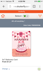
When you arrive on their mobile site, you'll see the menu items have been enhanced into large buttons at the bottom half of the screen. This makes it easy for users to quickly select which option they're interested in learning more about.
shutterfly-mobile-site-1.png
Once users click through to one of those options, they're greeted with large photos showcasing what Shutterfly is capable of for easy browsing.
shutterfly-mobile-site-2.png

2) Google Maps

Everyone has their favorite map or directions application. Mine is Google Maps, which I use whether I'm walking, driving, biking, or taking public transportation. What's special about their mobile website is that it's virtually indistinguishable from their downloadable mobile app.
The screenshots below are taken of their mobile website, but if you're familiar at all with the app, you'll notice they look exactly the same. Not only is the appearance identical, but the mobile website has the speed and functionality of the app.
google-maps-mobile-site-1.png
google-maps-mobile-site-2.png

3) Typeform

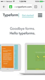
Typeform is a Barcelona-based tech company with one, simple mission: to "make forms awesome." Their desktop website is really beautifully designed, greeting visitors with succinct copy, high-definition videos, relevant animations, and other, more complex design components.
But for mobile users, they recognized that complex design components like video and animations could significantly affect page load time, among other difficulties. That's why they actually removed many of them -- which decluttered the site and simplified the overall mobile experience. The mobile website is a simpler version of their desktop website, and it's still beautifully designed.
typeform-mobile-site-1.png
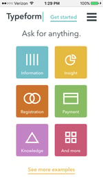
Take note of the large buttons in their menus -- perfect for tapping with your finger on a mobile screen.
typeform-mobile-site-2.png

4) Etsy

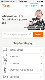
Etsy is an ecommerce website where people can buy and sell vintage or handmade items. Most buyers who visit Etsy's website are there to do one of two things: Either they're searching for a specific item, or they're browsing items in categories that interest them.
The mobile website caters to both types of visitors from the very beginning. When you first go to their mobile website, you're greeted with an option to search for specific items, shops, or categories.
etsy-mobile-site-1.png
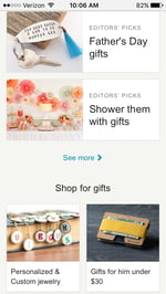
Immediately below the search bar are thumbnail images of trending items that showcase some of the most popular things you can buy on Etsy. Mobile users can view these trending items in a collage format, and the images are big enough for them to easily tap with their finger.
etsy-mobile-site-2.png

5) Adrian Zumbrunnen

This is the personal website of Adrian Zumbrunnen, a UX designer, writer, and speaker. When you visit his website, you'll notice right away there's something very unique about it: It's a conversational website.
It almost looks like a text message conversation you'd normally have on your phone -- including the ellipsis to show he's "typing." Users are given two response options at the end of every exchange, so it's kind of like a "choose-your-own-adventure" experience.
While the mobile and desktop experience are very similar, the desktop website feels like it was made primarily for mobile -- which could be the direction sites will go in the future.
adrian-zumbrunnen.gif
And if you'd prefer not to engage in the conversation-like exchange, you can simply scroll down for details.
zumbrunnen-mobile-site.jpg

6) Elf on the Shelf

Elf on the Shelf is, relatively speaking, a fairly new Christmas tradition based on a children's book. If you're unfamiliar, the basic premise is this: The book tells the story of Santa's scout elves, who are sent by Santa to watch over children in their homes all over the world and report back to Santa.
Along with the book, parents can purchase an elf figurine, which they'll subtly place somewhere in their house where their kids can see it. Every night leading up to Christmas, parents move the elf to a different location around their house to "prove" to their kids that the scout elves are real and always looking over them.
When you first arrive on Elf on the Shelf's website, you'll see that there are actually numerous types of Elf on the Shelf products you can purchase. But instead of forcing users to scroll through a long, text-based list, the web designers made it easy for users to simply swipe from left to right to look through all the different options -- ideal for visitors browsing products on the website.
elf-on-shelf-mobile-site.png

7) BuzzFeed

BuzzFeed is a news company known for it's viral content and popular quizzes. It also happens to be one of my favorite sources of entertainment during my commute to and from work.
And where do you think I'm checking BuzzFeed during my commute? You guessed it: on my phone. BuzzFeed knows that a lot of their visitors are visiting their site on mobile, so they've taken great care to create a smooth experience for their on-the-go readers.
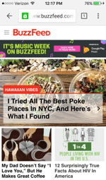
When you arrive at BuzzFeed's mobile website, the first thing you'll see is some of their most popular pieces of content displayed in a simple, collage-like format using large images that are easy to tap with your finger.
buzzfeed-mobile-site-1.png
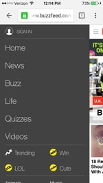
For users interested in specific categories, there's a clickable menu in the top left-hand corner of the screen that lists out all the post categories.
buzzfeed-mobile-site-2.png

8) Evernote

Evernote is an application that allows you to store notes, images, and web articles and then access them across all your devices. Because users tend to download the app or access the website on multiple devices including desktop computer, smartphone, and tablets, it's essential that Evernote get the mobile experience right.
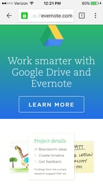
If you look at Evernote's homepage on your desktop computer, you'll notice how clean the design is. The value statements are short and to-the-point, and the images add to the positioning but don't clutter the page. When you look at their mobile website, they've kept this design and style entirely intact. Their mobile website is clean, simple, and doesn't detract at all from the value of the app.
evernote-mobile-site-1.png
Plus, there are those large call-to-action buttons again, which are great for mobile users.
evernote-mobile-site-2.png

9) Huffington Post

The Huffington Post is a well-known news outlet that reports from everything from politics and current events to entertainment and technology. What makes their mobile website unique is that they actually alter their headlines slightly for mobile users so their content is more easily scannable.
If you compare the desktop versus mobile websites, you'll notice that the mobile website has fewer words on the homepage. The headlines are shorter and much more digestible -- perfect for someone skimming or reading on a small screen.
huffington-post-mobile-site-1.png
As with BuzzFeed, you'll find a clickable menu in the top left-hand corner of the screen listing out all the post categories.
huffington-post-mobile-site-2.png

10) Express

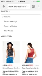
Express is a clothing store that caters to young men and women. Because their audience often comes to their website to browse clothing, it's important for their website to include big, clear images of their clothing -- especially on mobile devices, when users will need to tap items on the screen with their fingers to click through for purchase information.
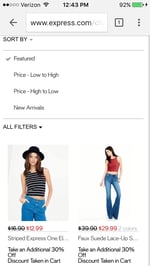
Express takes their mobile experience a step further than most online retail sites. If you slide your finger from left to right across an image showing a piece of clothing, the image will change so you can see the clothing in a different view. In other words, users don't have to load another page to see multiple pictures of the same article of clothing.
Look at the image on the top right in the following two images to see how it changes when you swipe to one side:
express-mobile-site-1.png
express-mobile-site-2.png

11) Nationwide Insurance

Nationwide Insurance provides insurance and financial services. You might think a financial company would have a really complicated website, but on mobile, Nationwide Insurance nails down the simple user experience.
When you arrive on their mobile site, you can get an auto insurance quote right away by entering your zip code -- or, alternatively, you can "Find an Agent" to learn more information about their services. Other than logging in or signing up for an account, that's all the homepage offers.
Although this gives users limited options, it makes for a much easier experience for visitors using small screens. This is a great technique to lead potential customers in the right direction.
nationwide-mobile-site.png

12) Squaredot

Squaredot is a HubSpot partner agency that helps marketers build out their inbound marketing strategies. Their mobile website is colorful, simple, and makes for easy navigating. But what sticks out to me most is how they've adapted their blog for mobile users. Check out the screenshot below, which shows one article in a list of many. Each article takes up the entire width of the screen, making for large, eye-catching images and text that's big enough to skim
squaredot-mobile-site-1.png
We like how they've optimized their online forms for mobile, too. Check out how large the text and the form fields are in the subscription CTA below, making it easier for folks to fill it out on their mobile devices instead of pinching and zooming.
squaredot-mobile-site-2.png

13) Zappos

Zappos is an online vendor for shoes and clothing known for their stellar customer service. Their top priority on mobile is to help users search easily for the items they're looking for on their website, so they've put a large search bar at both the top and bottom of their mobile website to make it super easy for them.
This is what the top of their mobile site looks like:
zappos-mobile-site-1.png
And here's the bottom of the page (equipped with a delightful signoff):
zappos-mobile-site-2-1.png

14) ABC

ABC is a television broadcasting company known for popular shows like "The Bachelorette," "Battle Bots," and "General Hospital." Users visiting ABC's desktop website are greeted with a ton of options: view their television schedule, check out the Oscar winners, watch some of your favorite television shows, or even look at entertainment news relating to those shows.
But ABC knows that the experience on a mobile device should be simplified. When you visit the ABC website on a mobile device, you aren't offered nearly as many choices from the get-go. Instead, you're given one option: to scroll through large, clickable images representing all their television shows. Users can scan through these options and click into any show they want.
abc-mobile-site.jpg

15) Lean Labs

Lean Labs is a HubSpot partner agency that creates engaging, responsive, and high conversion web solutions. (They were also featured on ABC's hit TV series Shark Tank.) The folks over there do a great job of providing a smooth experience for their mobile users, especially with regard to their design techniques and the emphasis they place on their core values, which are apparent to visitors within seconds of landing on their mobile site.
Notice how their mobile website uses scale and color to distinguish certain elements of their page:
lean-labs-mobile-site-1.png
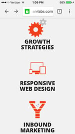
And, like I said before, their core values -- growth strategies, responsive web design, and inbound marketing -- are clearly visible to mobile users scrolling through the homepage, with relevant icons to match.
lean-labs-mobile-site-2.png

16) SAP

SAP is an enterprise software company that manages business operations and customer relations. They enhance the mobile experience by condensing information.
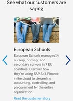
More specifically, they combine some of their calls-to-action into sliders, whereas their desktop website has these CTAs laid out horizontally. This helps keep things simple so mobile users aren't overwhelmed with a lot of information at once, and it also ensures none of the CTAs are too small to read.
SAP-mobile-site.jpg

17) KISSmetrics

KISSmetrics provides analytics software for businesses. On their homepage, there's a lot of information explaining what the software does along with a testimonial.
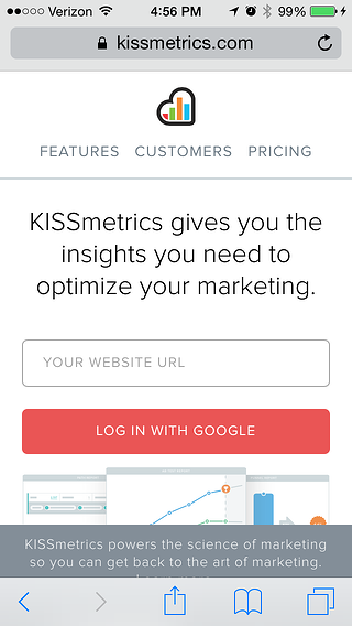
But their mobile site is displayed a little differently: On a mobile device, the information on their site is shown in a list with alternative dark and light modules. This makes it easy for users to skim the page without getting lost in text.
kissmetrics-mobile-site-2.png
They've also made the text and fields on their forms large and easy to read:
kissmetrics

18) idig Marketing

idig Marketing is a development and communications provider. Their mobile website is laid out similarly to their desktop website, but I especially liked how they incorporated the interactive heart icons into their blog posts so users can "Like" their posts.
This mimics the "Like" heart icon in Instagram and Twitter, which is easily recognizable for mobile users familiar with those platforms.
idig-marketing-mobile-site-2.jpg
These were some of our favorites. Which other mobile websites have caught your fancy? Share with us in the comments!