 Do you remember the last time you went to a mobile site and had an unmoving (har har) experience? Maybe the site wasn't responsive. Maybe it was really difficult to find what you were looking for. Or maybe it just loaded very slowly.
Whatever it was, you may have left to go to another site as a result. After all, accordingto Google, 79% of users who don't like what they find on a mobile site will go look for the information they need elsewhere.
Not everyone's neglecting their mobile site optimization, though. So to inspire you to get your website in gear for mobile -- if it isn't already -- here are a few websites that are doing a great job with mobile optimization. Let's take a gander, shall we?
1) HeyKenneth
HeyKenneth is a marketing services company that helps businesses grow their web presence by providing web design and web integration expertise on an individual or ongoing basis. Their mobile site is awesome because it takes into consideration why different people are coming to their mobile site. Take a look:
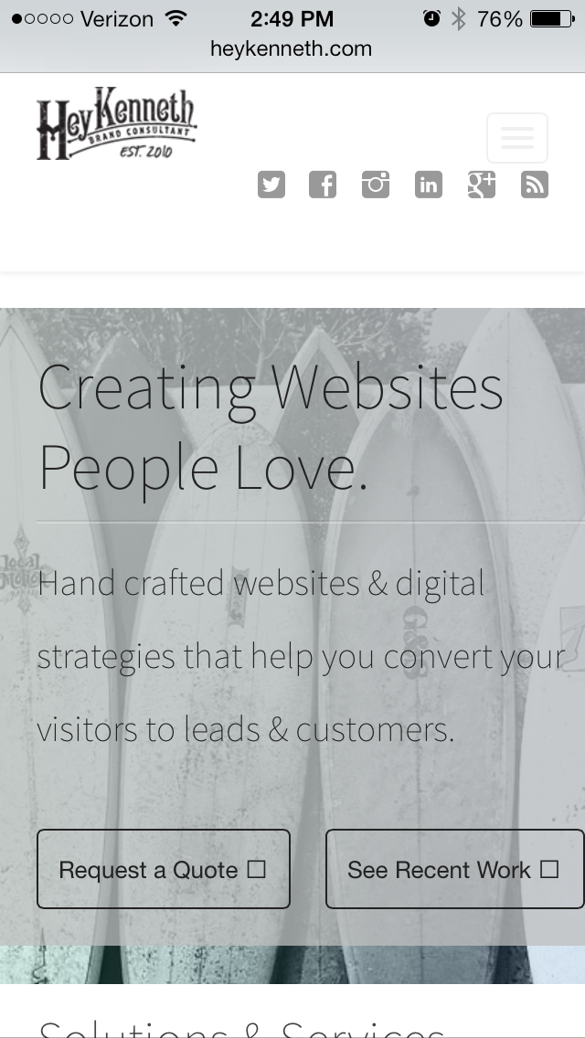
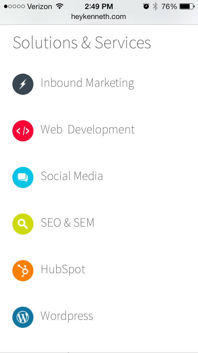
What makes this site really spectacular is that it recognizes what different visitors want from the site, beyond just what device they're using. There are some people who will just stumble upon them while searching on their mobile devices. They don't know anything about the company and need some basic information. Immediately they can click the option to "See Recent Work" (or continue to scroll down to see their other Solutions & Services).
Then there are people who have gone to the website multiple times, know about the company, and just want to quickly find out information about a demo. Lucky for them, there is an option to immediately "Request a Quote."
This site lets both mobile and desktop users at all stages of the funnel easily find what they need, with a limited number of clicks.
2) Orbital Alliance
Orbital Alliance is an internet marketing agency that brings together the worlds of web marketing, web development, and web design. You can see here what their website looks like on desktop:
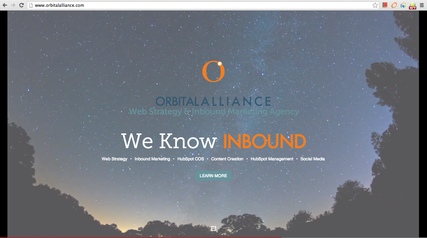
Their beautifully designed website has a captivating video playing in the background that really captures a visitor's attention, as well as some shuffling slogans like "We Aim Long-Term," "We create Partnerships," and (aww!) "We Love HubSpot."
So, why do we love this site so much? Because this is what it looks like on mobile:
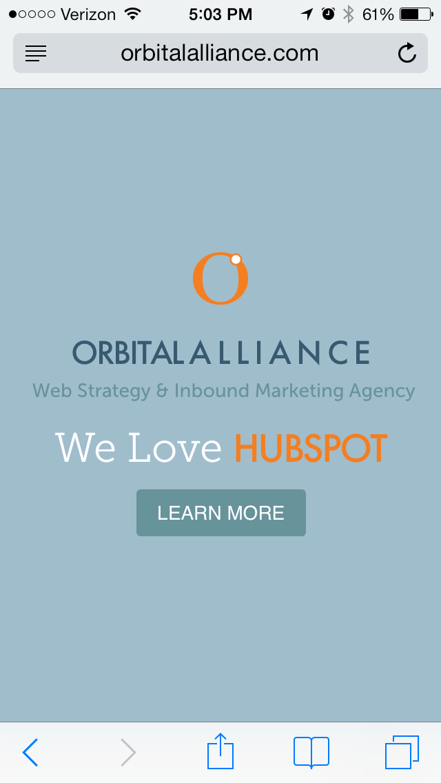
Orbital Alliance adapted their visual content to be appropriate for their mobile site. For instance, if they had kept a video as the background of their website on a mobile device, it would significantly slow down the load time. And according to Econsultancy, 40% of people will abandon a web page if it takes more than three seconds to load. Yikes.
But they didn't abandon all elements of their desktop site, either. They found a way to maintain their messaging by keeping the more mobile-friendly site elements, like their shuffling slogans. Mobile visitors should still get a snapshot of who you are when they visit your homepage -- Orbital Alliance found that happy medium between strong messaging and a good mobile experience.
3) Lean Labs
Lean Labs specializes in responsive web design, inbound marketing, and agile web development. What makes their website stand out from others is their fantastic navigation. On many mobile sites, the navigation is extremely hard to use; and even when the site is responsive, you'll often see websites that have a loooong mobile navigation that takes up at least a full screen.
Lean Labs, however, takes a different approach. Their homepage appears like the image on the left with a condensed navigation. Then, you can click the "Menu" button to show the full navigation, and click it again to close.
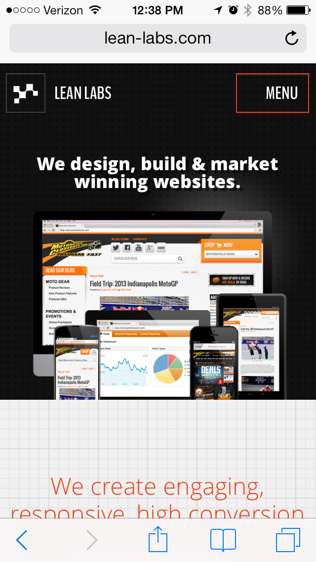
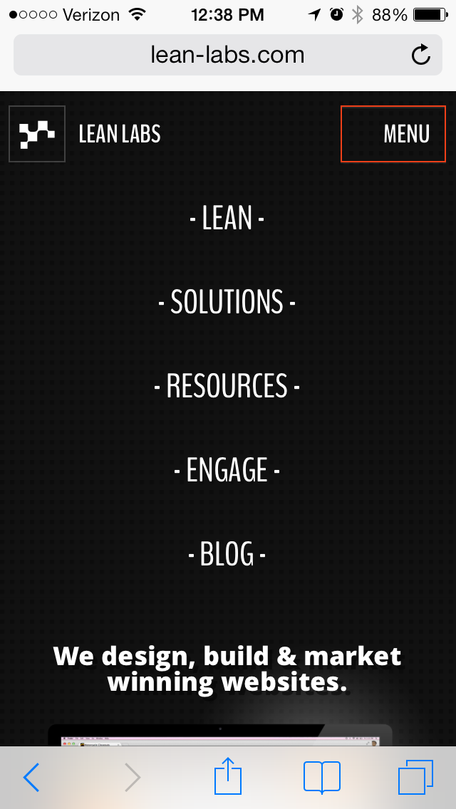
This setup from Lean Labs gives mobile visitors the chance to get to the meat of their website much quicker -- which is critical for preventing bounces. Visitors can pull up the menu quickly to dig into specific pages of the website, or they can just immediately scroll down to see the content of the homepage. The navigation doesn't take up too much room of the site ... unless you need to access it.
4) iOffice
iOffice is a modular integrated workplace management system that works to reduce the daily problems and information roadblocks in facility management. Why did this website catch my eye? Because ... well, who knew that a facility management company could have such a sexy website?

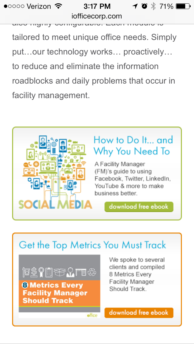
iOffice's website has a few stunning features that stand out. First, the imagery at the top of the homepage really captures your attention. You can immediately get an idea of some of the tools iOffice would provide if hired. As you scroll down the page, you can clearly see the call-to-action buttons -- and they're large enough that they're easy to click from your mobile device. No more fumble fingers, people. No more. The calls-to-action for the ebooks are also visually appealing and really stand out on the page. The whole site has breathtaking visuals that help you navigate not just the site -- but also get to know the company.
5) Outdure
Outdure designs, develops, and manufactures decking products for residential decking applications and commercial decking environments. You may be thinking, based on the images below, that the site is just really well-designed. But what we haven't discussed too much is one of the most important elements of sexy mobile sites -- responsive design.


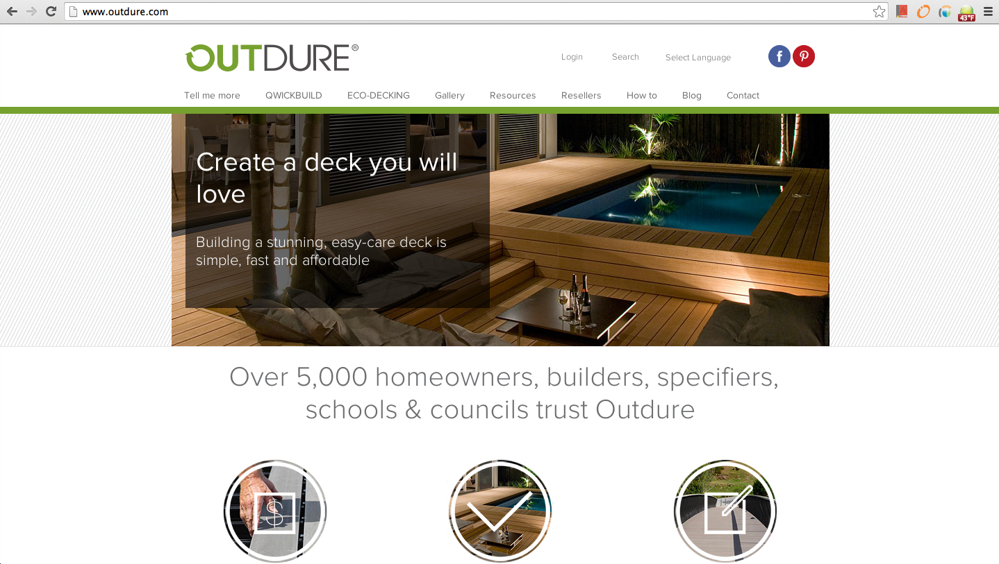
If a website is using responsive design, that means that it adapts to the screen size from which you're viewing it. As you can see from Outdure's website, the menu changes, the images are smaller to fit to the screen of my iPhone, and the buttons of the webpage stack on top of each other instead of side by side. This allows for easier viewing and reading when going from device to device.
According to Google, 90% of people move between devices to accomplish a goal. That means they might start browsing your site on mobile, and then switch to desktop for more in-depth research later, and then shoot themselves an article from their desktop research session to read on mobile while on the train home. In other words, it's critical your content can be read anywhere, with ease. Outdure's responsive site means they don't have to worry about a poor user experience when their visitors engage in this type of content consumption behavior.
