 One of the (true) stereotypes about inbound marketers is that we're an analytical bunch. We like quantifiable data and metrics and benchmarks and statistics. We like concrete evidence to support our conclusions.
Well, we've got a number of stats that inbound marketers simply can't ignore. For instance:
- 48% of emails are opened on mobile devices
- 69% of mobile users delete emails that aren't optimized for mobile
- 89% of email marketers are losing leads and opportunities because they're not optimizing their emails
Lead generation and lead nurturing are two of the top priorities of any email marketer. And the concrete evidence points to a clear conclusion: If you're not optimizing your emails for mobile, you're losing a significant amount of opportunities.
So, wanna get your email marketing efforts optimized for mobile? That's what we thought :) Here are some quick tricks to help you start doing so right away.
1) Reduce image file sizes.
As MDG Advertising relays in this infographic, 94% more total views on average are attracted by content containing compelling images than content without images.
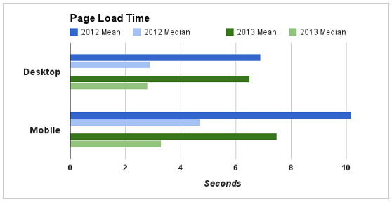
Mobile download speeds have been ramping up each year, but if your images chunky, they're still going to load more slowly on mobile devices than on desktops -- and in mobile, lack of speed kills. Every 1 second delay in loading time results in an average 7% drop in conversions.

Source: Google
You can optimize your emails by using smaller image files. Services such as FastStone Photo Resizer and JPEGmini and can reduce file size by as much as 80% without reducing the quality of your image. That way, you can capture the reader's attention with visual content without worrying about whether they'll bother waiting for the image to actually load.
2) Resize images by proportion of screen.
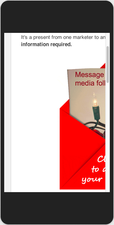
Images are worth a thousand words, so here's a visual example of what happens when images aren't optimized for mobile:

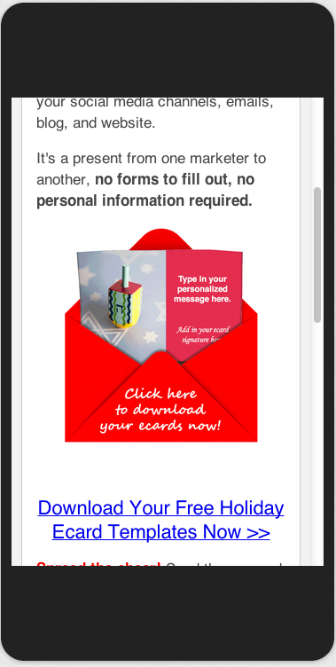
The user experience is terrible, because the image isn't resized to fit on a mobile screen. Here's what happens when the image is mobile-optimized:

Much better, right? Luckily, it's easy to make sure your images fit whatever screen size your device is. In your email's HTML editor, you'll need to alter the style portion of the code so that your image size is defined by a proportion of the screen, not pixels.
Set the width of the image to the proportion of the screen you want it to take up (the example above is set to 80% of the screen width). Then, set the height to "auto" so that it will automatically adjust based on the width. Here's how the code looks (I've highlighted the width property you need to change):
<img style="max-width: XX%; max-height: auto;" class="alignCenter shadow" src="YOUR IMAGE SOURCE.JPG"/>
3) Increase the size of links and CTA buttons.
Fat thumbs or not, it's definitely harder to be precise with your finger than with a cursor. So make sure you don't let mobile device users experience a case of the bad touch.
According to a recent MIT study, the average size of an adult index finger is 1.6-2 cm, which translates to 45-57 pixels on a mobile device. Here's a visual of a 57x57 pixel square:

For the best user experience, make sure any text links and CTA buttons are taller and wider than this range. In addition, space your links far enough from each other that there isn't any accidental clicking.
4) Create a responsive grid system (in other words, your own template).
I'll give you fair warning on this one: This is for marketers with intermediate coding skills. If you don't want to create your own template, just skip to #5 below.
Think you're up to the task? Then you can create your own responsive email template usingCascading Style Sheets (CSS) and HTML.
In your email tool's CSS editor, you will need to create classes for sections in your email template. Each section (up to 12) will correspond to a certain proportion of a device's viewing screen. This means that whatever width your columns are, they'll retain their proportions no matter the size of the device screen.
After you have created the responsive code in CSS, you can go into your email tool, open up the HTML editor, and create your responsive templates.
Confused? Don't be! Here's a comprehensive guide on how to set up a responsive grid system.
5) Invest in responsive email templates.
Creating your own responsive template may be beyond your particular skill set or bandwidth (or both -- I'm not exactly a coding wiz myself). Sometimes, the most economical solution is to just license or buy email templates from the people who do it best.
There are a lot of different email tools that come with responsive templates built into the software. In addition, there are many companies that offer well-designed, affordable templates. Here's a collection of 32 responsive email templates you can use for your business.
Technology moves fast, but only 11% of marketers have responded to one of the biggest trends that's shaping our landscape: the rate of mobile adoption. Don't lose valuable opportunities over something as simple as unresponsive emails.
Get ahead of the pack and optimizing your email marketing for mobile devices with these tips
