5 Steps to Creating a Gorgeous Presentation
 Last week, we discussed how to create a powerful narrative. Now, it’s time to take everything one step further and bring your content to life visually. Assuming you are applying the techniques we unpacked, you should now have an outline of your presentation ready along with all of your on-slide content.
So, what’s next? We start the presentation design process that includes these 5 essential steps:
Step 1: Brainstorm
First you need to decide what you are going to use the presentation for and who your audience is going to be because this affects design. You need to establish what you are using for design inspiration. Do you have a strict brand guide that needs to be followed? Does your brand give you a little more wiggle room for creativity? Once you know where your starting point is then you can start trying to come up with more specificdesign ideas.
Goal: Write down your inspiration and whatever notes you’ll need to keep in mind before starting.
Step 2: Moodboards
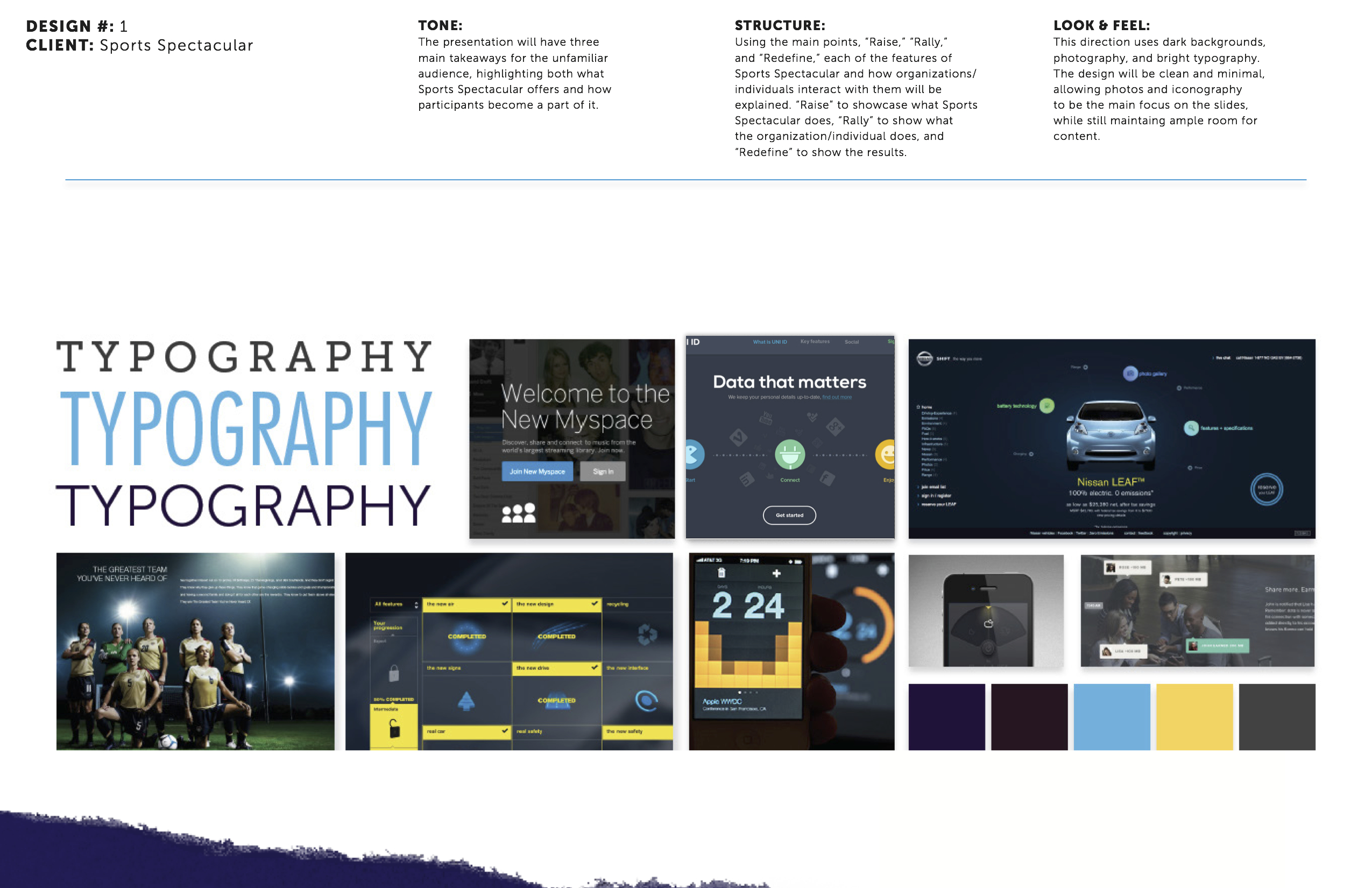
After you know the basics about your presentation, you can begin exploring design ideas. You can do this through moodboards, which are three different styles that correspond with the three content pitches. Presentations look best when the content and the design match in theme and style. Think back to other presentations that you’ve seen and try to take inspiration from them. You can also use sites like Dribbble,Designspiration and Pinterest to help you find colors and elements that you like. Don’t be afraid to go a little out of your comfort zone. These are just ideas and you never know what might inspire you. Find color schemes, typeface choices and theme ideas to help mold your presentation.
Goal: Create three different visual approaches to your presentation design, pulling from anywhere you find inspiration.


Step 3: The Design Comp
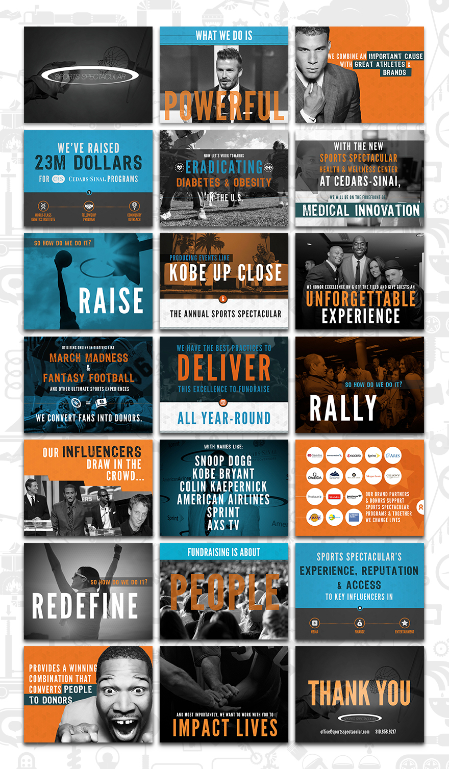
Once you have chosen a design style and you have your content in place, I suggest that you do a few slides first to help you discover the direction you want to go in. Show it off. Take it to your boss, his boss and all your co-workers to get opinions. It is much easier to make those changes on a few slides than to the whole deck. Invite criticism. Use this stage as a learning experience: If it really isn’t working, it’s no big deal. Try something else and keep iterating.
Goal: Design a few slides based on one of your moodboards, and test them out before starting your full draft.

Step 4: Full Draft
Once you know your direction, you can start designing the full presentation. When designing, make sure to keep it consistent. This is the big difference between an amateur and a pro. If you have your logo on every slide, make sure that it is in the same place on each slide. Design consistency throughout is essential, and will make your presentation look professional.
Goal: Create the full draft of your presentation, giving yourself plenty of time to do so.

Step 5: Review
When you are done with the full presentation, make sure that you’ve allowed yourself plenty of time to review it. At this stage you can check for inconsistencies and spelling errors. Also, this is another good time to have your co-workers take a look and give their opinions.
Goal: Carefully review your design for any issues, major or minor.
If you’ve taken your time through each step of the design process, I’m confident that your presentation will look spectacular. But just to be safe, go back and review Step 5 until you feel ready to share the presentation with the world!
Author Bio
Scott Schwertly is the author of How to Be a Presentation God and CEO of Ethos3, a Nashville, TN-based presentation boutique providingprofessional presentation design and training for national and international clients ranging from Fortune 500 companies to branded individuals like Guy Kawasaki. If Scott is not working with his team building presentations, you will find him in the pool, on the bike, or on a long run. Scott lives in Nashville, TN with his wife and three dogs. He has a B.A. and M.B.A. from Harding University.
inShare