Tuesday, October 31, 2023

How social media pros are rewriting brand playbooks for the wave of new social platforms

Within recent years, there has been a string of emerging social media platforms that have created short bursts of hype among marketers before ultimately losing steam. It’s a story that has unfolded among the likes of Clubhouse and BeReal to Lemon8 and Discord.

And while these apps have further fragmented the social media landscape, the people behind brands’ social media accounts have had to retool their playbooks.

Exploring a new platform requires resources — less in terms of ad dollars and more in terms of manpower — to experiment, establish KPIs and measure metrics around community engagement for each platform as it develops. Depending on the nature of the platform, whether it be video or audio-based, resources go beyond the social team, extending to media teams for creative, visual assets or audio teams for sound quality, as was the case with Clubhouse and Twitter Spaces. If the juice turns out to be worth the squeeze, a new platform means learning new user behaviors, building a new audience and sometimes, creating a new brand voice to appear more authentic on said platform.


“It’s a lot even for one channel, let alone 10 — let alone every new thing that pops up every day,” said Holly Stair, group director of social strategy at Giant Spoon advertising agency. The onslaught of social media potentials has increased in recent years. In response, social media professionals are experimenting at a rapid pace with teams internally vetting each newcomer before creating a strategy sometimes within hours of an app launch, updating clients on a rolling basis on user growth, capabilities and content performance, she added.


“It is totally a group effort. Our strategy, creative, media, production teams honestly have to work so closely because we all need each other to make anything happen,” she said.


It’s a trend that’s years in the making.


Back in 2021, brands joined the audio-based app Clubhouse, hoping to cash in on its hotbed of influencers. Some agencies even hired Clubhouse managers while the app was still in beta. Around the same time, brands like Chipotle, Jack in the Box and investment platform Otis made their debut on Discord, looking for niche communities. Not long after, BeReal photo-sharing gained popularity, followed by the Instagram alternative Lemon8. This July, Meta launched an X (formerly Twitter) alternative called Threads, that saw 100 million new users registering within a week and the brands came rushing in. This is all while TikTok was becoming social media’s golden child, courting advertisers at scale and launching new features, like TikTok Shop and a new search ad toggle.


While the hype cycle, and user engagement, has remained steady on TikTok, the same can’t be said for the others. As people left pandemic lockdown and started attending in-person events, Clubhouse’s hype fizzled out, never quite making it to the brand social playbook even in light of its monetization efforts. On the other hand, BeReal lost momentum with waning user interest and no ad infrastructure, causing marketers to put it on the back burner. Meanwhile, even excitement around Meta’s Threads — where brands vowed to be there most unhinged selves — has seemingly petered out.


Through it all, agency social teams are tasked with navigating a saturated landscape, determining what platforms will join a digital graveyard, like Clubhouse, or become a social media staple, like TikTok. “A lot of judgment and a little bit of predicting the future is necessary to do a good job,” said Jordan Fox, head of Laundry Service marketing agency.


Much of an emerging platform’s future for brands hinges on its user base. Brands want to be where culture is happening, willing to invest time and resources into wherever culture and audiences are. Because there are so many emerging platforms at once, agencies say a measured approach is important, tracking user engagement, audience growth numbers and ad opportunities. Especially as each new platform means building a new audience, learning new user behaviors and creating content. When an app falls out of favor with users, it falls out of favor with marketers and advertisers as well, per agency execs.


When chatter around BeReal died down, Fox said his team and clients lost interest. “Eventually, we all started to get bored. Then we started to read that their user growth had stalled out at a very tiny number. That’s it, but no one shed a tear,” he said.


Typically, emerging platforms start out with smaller user bases and minimal engagement. The agency, Fox says, advises clients to avoid over-investing time and resources in early stage platforms until the scale is there. The bar is high when it comes to adopting a new social media platform, especially as brands are tasking their agency partners with getting them in front of massive audiences, like Facebook, Instagram, TikTok and other more established platforms. 


For example, the day Threads came out, the agency was already familiar with the new social media platform and sent an explainer to clients the morning it was released to the public, he said. Some clients jumped right in with confidence given Threads was backed by Meta, leveraging the social media behemoth’s infrastructure and audience. On the other hand, Fox was less convinced about BeReal, not advising clients to get involved right away as the platform’s user base has waned. 


“Our clients are on these platforms because they are major, major mass media channels with unprecedentedly granular targeting capabilities,” he said, referring to social media advertising opportunities. “We started taking TikTok seriously when TikTok began to achieve the scale of user base and user engagement… to compete with other major media platforms.”


Navigating the never-ending string of social media platforms requires a measured approach, per agency execs. With each emerging platform, agencies must determine their client KPIs, including app traffic, user engagement and scale, before investing manpower or convincing clients to launch a presence. 


“It is really imperative that teams, internally and externally, have the infrastructure — and honestly, a cultural opportunity, budget of resources to be able to either take the time to think about these things, or spot these updates and move really quickly,” Stair said.


Should it not be worth it, agencies should consider if money being left on the table within existing platforms. Meaning, as more established platforms like TikTok and Instagram release new features, they’re worth exploring with an already established audience, platform and brand presence before dedicating time and resources to an emerging platform, said Morgan Murray, director of social at Buntin ad agency. 


Time and time again, Meta has notoriously moved to release copycat features to capitalize on the momentum of an emerging platform’s growth. Remember Instagram Stories coming after Snap’s success or Threads launch in light of X (formerly Twitter’s) peril.


For Threads, the agency started tailoring content specifically for the platform, thus spending extra hours to produce Threads-specific content, Murray said. But, the agency is seeing half of the engagement it saw on Twitter and the team is left wondering whether to continue with a Threads strategy or move these resources back to Twitter.


Naturally, there’s pressure to be a first-mover on a social media platform, whether it be to claim a handle or drum up some press coverage. But, per Fox, there’s no intrinsic value — aside from learning and experimenting — in being the first to launch a presence on an emerging platform, especially if audience numbers and user engagement isn’t growing consistently — that’s aside from press coverage and bragging rights. There’s also, per agency execs, no harm in abandoning a platform, leaving an app to join a graveyard of digital apps and technologies.


“It’s, again, making sure we have those other things in place to where we never feel like we’re pivoting all our eggs into this new basket,” said Murray.


The 10 Most Important Customer Experience (CX) Trends In 2024

Good sales and marketing, quality control, pricing, customer service and after-sales all help businesses to generate sales. But good customer experience (CX) creates customers for life.

These are super fans who will buy from you simply because you’re you - even acting as brand advocates and champions among their community and peer groups.

The key to CX is maximizing the effectiveness of all of these factors at every stage of the customer journey. In 2024, CX will continue to take on new meaning as it becomes a strategic priority for all businesses. Here, I highlight the ten key trends that will drive it.

Generative AI In CX
Though massively hyped, generative AI is still relatively new to the business toolbox and over the coming year, more organizations will start to understand exactly where it can bring value. In terms of CX, it has endless potential uses, from generating dynamic marketing campaigns and personalized user guides to streamlining customer service and gaining deeper insights into customers and loyalty by analyzing behavioral data. Maintaining transparency and honesty in the way it’s used will become increasingly critical to winning and retaining customer trust.

Subscriptions Get Smart
The shift towards subscription services enables businesses to nurture ongoing relationships and drive up lifetime value. But businesses are learning that the potential goes far beyond one-size-fits-all offerings. In 2024, more businesses will invest in leveraging AI and advanced analytics in order to create tailor-made offerings at dynamic price points and individualized levels of service. Customers who engage less and consume fewer resources can be offered lower prices, while super-fans can be rewarded with VIP bonuses to help them understand how special they are to the business.


MORE FROMFORBES ADVISOR
Best High-Yield Savings Accounts Of September 2023
ByKevin PayneContributor
Best 5% Interest Savings Accounts of September 2023
ByCassidy HortonContributor
CX-Driven Value
It’s accepted that today and going forward into 2024, customers will willingly pay higher prices for good experiences. Rather than racing to the bottom in terms of price, more companies will compete to offer richer, frictionless, more rewarding experiences. Building CX strategies that increase metrics such as average order value and customer lifetime value will be a priority for CX-focused businesses in 2024.

Omnichannel Evolved
Omnichannel isn’t just about connecting across as many channels as possible in 2024. The concept of meeting customers where they are becomes more dynamic, offering customers a consistent channel of communication without having to repeat themselves or risk disclosing personal information at multiple touchpoints. Customers seeking help will no longer find it acceptable to have to give their story to a chatbot, then to a customer service agent, and then again to technical support. More companies will leverage smart authentication and CRM tools to track interactions across the growing number of channels that are available.

The Rise Of The Synthetic Customer
The trend for creating synthetic customers touches on several key technology trends, including generative AI, data privacy and the concept of the digital twin. This enables companies to model their behavior, predict where pain points will arise on the customer journey, and predict the best path towards an optimal outcome. Customer personas are nothing new, but in 2024 they are informed by real-time data including live transaction data and social media sentiment, meaning they are more useful than ever when it comes to generating insights into real customers.

Sustainable CX
Customers increasingly prefer to do business with companies that can demonstrate their commitment to sustainability, and factoring this into CX will become a priority. In 2024 it will become more common to see companies giving information about their environmental footprint, and what they are doing to offset or mitigate damage, as part of the customer journey. This helps customers to feel reassured that they’re making ethical consumer choices.

Security-Centric CX
Having your customers’ personal data stolen and sold on the dark web doesn’t make for great CX. We know people are happy to hand over information in exchange for a good time and great memories, but that bond of trust breaks down quickly if it isn’t used safely. Accessible and transparent data and privacy policies are an essential element of CX, with 63 percent of customers saying they are happier dealing with businesses that make it easy to see how their data is used.

Chatbots That Enable Rather Than Annoy
We’ve all had annoying experiences with chatbots in the past. Frustratingly, businesses, having made investments in earlier iterations of the technology and possibly already reassigned human staff, have sometimes been slow to rectify these issues. Chatbots powered by generative AI can answer questions more quickly and accurately in a way that's relevant to customer requirements. Hopefully, this means that in 2024, the days of the limited, clumsy and inaccurate customer service chatbot are numbered!

Immersive CX
Creating experiences that capture and engage customer attention in new ways will continue to be key to providing memorable experiences. This could include leveraging cutting-edge technological innovations like virtual and augmented reality (VR/AR) or experiential marketing activations like those used by Warner Bros to lift the 2023 Barbie movie to the status of a cultural phenomenon. Customers want to do business with companies that leave them with great memories, and creative immersive experiences are key to this in 2024.

Sentiment-Driven CX
Sentiment analytics enables businesses to track and react to the emotional state of customers at each stage of their journey. This can be used to drive experiential decisions, such as whether to engage via automated channels or whether a situation requires the human touch. Knowing whether a customer is excited about their new purchase or frustrated due to poor service means you can make a better decision about whether it's the right time to ask them to leave a review or reach out to make amends. A deeper, more dynamic understanding of how sentiment affects loyalty, satisfaction and advocacy scores will be core to CX strategies in 2024, helping to build stronger and longer-lasting relationships.

Thursday, October 19, 2023

AR for everyone: How to build accessible augmented reality UX


Explaining accessibility guidelines for AR apps

Augmented Reality furniture in an empty room, viewed on an tablet

“If you want someone to hear your story, don’t stop them”
-Christopher Patnoe, Head of Accessibility and Disability Inclusion, EMEA at Google

During my first year of college, I was introduced to the TV series Black Mirror thanks to my English teacher, who one day played the episode Saint Junipero to the whole class.

It was the first time I watched Black Mirror, but also the first time I’ve seen a story involving a digital world in a deep and compelling story.

Needless to say, I was hooked.

The more episodes I watched, the more intrigued I became with Virtual and Augmented Reality. It had so much potential and yet, the technology seemed so far into the future.

Until it wasn’t.

Some years later, Facebook rebranded itself to Meta and announced their planning for this new online ecosystem they called “The Metaverse”.

I thought “When the Metaverse is here, there’s going to be a whole lot of worlds and spaces for us to dive into. But… is the Metaverse going to be accessible?”

If I have a motor impairment and can’t move my body freely, logging into the Metaverse seems like the best possible escape.

So I started researching Augmented and Virtual Reality, how to design for those platforms and what documentation there was about making them accessible.

This blog is to summarize some of what I have learned along the way to accessible AR experiences.

AR accessibility guidelines

Today, we have the WCAG (soon to release its version 2.2), a set of accessibility guidelines that are internationally accepted and serves as a valuable source of information to know how to make our products accessible.

Although the information they present is mostly for products in a flat screen, a fair amount of their guidelines can be applied for AR.

There is not one unique list of guidelines when it comes to accessibility for AR; at least, not yet. But big companies like Google, Meta, Playstation, etc… have their own set of guidelines that anyone can access.

According to Google, there are four major impairments that we need to have in mind in our development process:

  1. Mobility and Dexterity impairments
  2. Vision Impairments
  3. Hearing Impairments
  4. Cognitive Impairments

How to approach mobility and dexterity impairments in AR

Mobility and dexterity impairments refers to both permanent and temporary disabilities, considered by some as the largest impact areas.

Mobility and dexterity impairments can be used to describe people who have a hard time using their bodies to its fullest. It goes from not being able to use your hands, your legs, or even your whole body.

Moving freely in an AR environment, as well as interacting with the digital content without trouble, is the main objective of this section.

1.- Show your content in the screen at all times

For users with difficulty turning their head around, showing the content in front of them at all times is crucial.

Imagine having to grab the pieces of a puzzle that are scattered behind you; all you’re while seated in a wheelchair or in a moving bus. Moving around with the device to look for the pieces doesn’t sound that easy to do.

2.- Adjustable size and rotation for objects

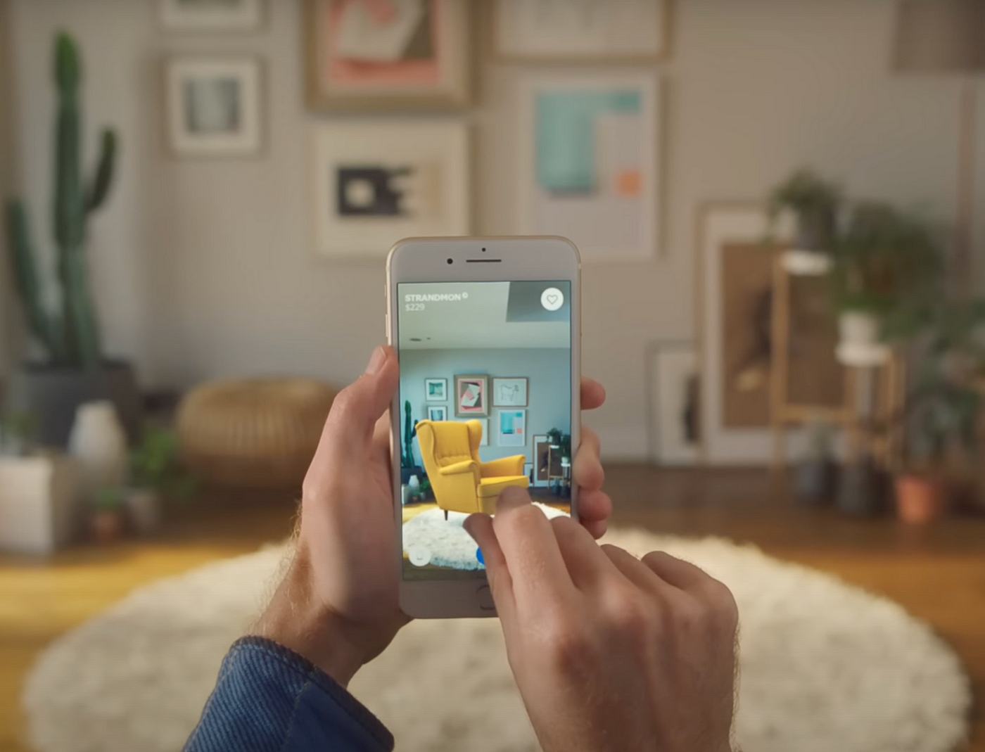
Placing objects around to interact with them is pretty common in AR experiences; from placing a cute character to see how it behaves to placing a digital chair to see how it might look.

Being able to adjust the object to our liking is much needed if you’re in a small space or of short height. This means allowing our users to make our content bigger or smaller, as well as rotating the content so they can view it completely.

AR armchair in a living room with a hand pinching the chair
Object manipulation using hand gestures in IKEA’s Places app. The user resizes the armchair by pinching the screen.

3.- Apply large tap targets to your objects

To manipulate an object (move, resize, rotate), you first need to select it. If you are gifted with fat fingers like me, or have a motor impairment in your hands, selecting an object to manipulate it can be tricky.

Having a large tap target in your objects will make life easier for others. This will make it easier to select them.

4.- Alternative hand gestures as controllers

Having different hand gestures goes hand-in-hand to the previous two points of this list (pun intended).

Going back to the example of not being able to use your hands freely, using simple hand gestures as an alternative to control the digital content is a good approach.

Apple’s Vision Pro does a tremendous job in using hand gestures to navigate around.

Hand gesture command instructions for pinch, spread, press, press and tap actions
Gestures commands, from the “Touch Gesture Reference Guide”

How to approach vision impairments in AR

Vision impairments refers to not being able to see the world as it is. People who experiment some type of colorblindness, who need glasses to see properly or can’t see at all fall into the vision impairment category.

Making our AR experience usable for vision impairment users might sound tricky, but here are some tips and tricks you can follow to overcome this barrier:

1.- Add an option to increase font sizes

Adding an option to increase the font size, or even having large font sizes to begin with, makes the information easier to read for people that have problems in their vision.

2.- Use a colorblind-friendly color palette

One of the most common colorblind types is called Deuteranopia, where users are unable to distinguish between red and green. Other forms of colorblindness include Tritanopia (unable to distinguish blue and yellow) and Tritanopia (unable to perceive the color red).

There are many more. The ideal case scenario would be to have a color mode for each type of colorblindness but, since there are too many, sometimes this is hard to accomplish.

It is recommended that we apply a color palette for the most common ones. To take care of the rest, use different shades, patterns and shapes for key elements so that they’re more distinguishable.

Three groups of objects placed at random. Each group with different shape, pattern and color as others.
Using different shapes and patterns, in addition to color differences, makes them easier to differentiate. Image credits to Meta Quest.

3.- Have good contrast between the elements and the background.

Good contrast in the elements means that the color of the element can be distinguish with the background. If, for example, you have black text on top of a black background, the text wouldn’t be readable.

Different contrast ratio of a sentence, reducing its contrast as you read the text
An example of blue text on top of white background. Notice how the text becomes harder to read the lighter the color becomes. Image source: Google Developers

4.- Support the use of screen readers or voice over text.

Screen readers are a very important tool for blind users. They are meant to read out loud to the user what is written on the screen, describe images and graphic elements as well as help the user navigate.

Having a good structure in our code will allow screen readers to communicate to the user efficiently. Conducting usability testing with screen reader users is the best way to know if you’re applying this guideline correctly.

How to approach hearing impairments in AR.

When we design for people with hearing impairments in consideration, we’re not only helping those who are deaf or hard of hearing, but we’re also helping users in a noisy environment or even a quiet one where they are not allowed to make any noise.

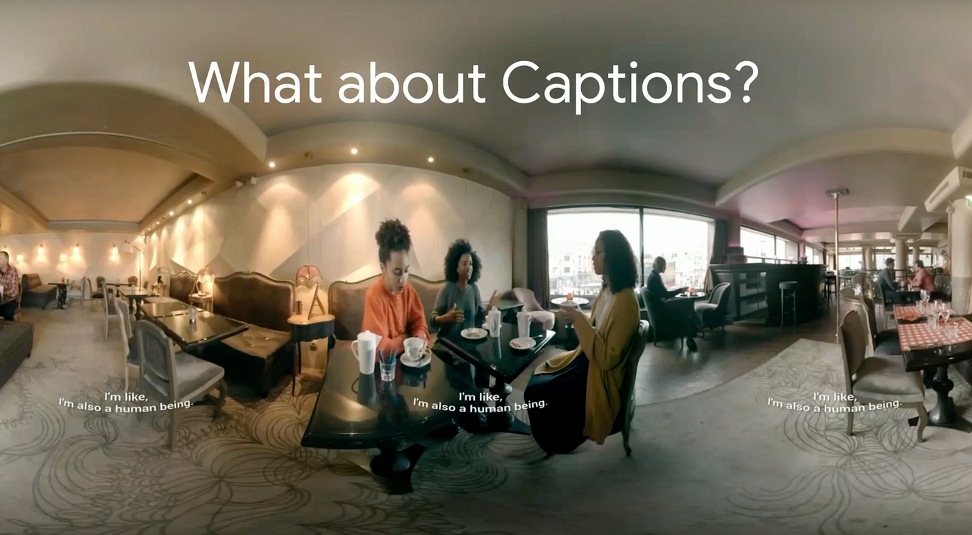
Adding Closed Captions (CC) alongside speech and sound effects that are key for the experience is the best possible solution to address hearing impairments.

CC must always be visible for the user, no matter where they look. To achieve this, you can stick the captions on the bottom of the screen so they follow the user as they turn around. Another possible solution is to place the captions in the front, sides and back so they’re always on display no matter where they look.

If you can play through your AR experience without sound, only CC as your guide, you have successfully achieved the objective.

360 photo of three woman talking in a restaruant. Closed Captions can be read in the center of the screen as well as on the sides
YouTube’s use of CC in their 360 mode, as presented in Google’s I/O ‘18

How to approach cognitive impairments in AR.

Being accessible towards cognitive impairment users means that we’re helping people with short memory, who get easily distracted or people in a foreign country who don’t speak the language.

Simply put, we have to design our experience to be easy to understand, remember and navigate.

1.- Have an indicator pointing to content of interest

If we’re showing a digital content, say a character, that goes out of frame because we looked away, it is helpful to have a visual like an arrow pointing at the character that went out of sight.

This way it is easier for us to know where to turn to see our character again. The same principle goes for special content we want our user to look at but are outside the field of view.

Empty table in a living room with an arrow pointing outside of the frame
An icon on top of the screen pointing to were the content is located, also from Google’s I/O ‘18

2.- Add descriptive of feedback, haptic cues and sound effects

Knowing what is going on is important for every experience. Adding feedback like visual cues or sound effects to communicate either a change or an action that our user needs to make is crucial.

3.- Have an easy onboarding session

For new users, an onboarding session to learn the mechanics and objectives of the experience is really helpful.

Just like in video games, the onboarding is meant to be a safe space to mess around and do tasks with no repercussions. Give them as much time as they need to learn, and always give them the option to revisit the onboarding if something was left unclear.

Summary

We covered four major impairments and different ways in which we can make our AR experience accessible for them.

We learned how having different options to manipulate an object is crucial for motor and dexterity impairments, how to think of a color palette for colorblind users and making our content readable for visual impairments.

We also learned how closed captions in our experience is the best possible solution for hearing impairments, as well as how to make our experience easy to understand and enjoyable for people with cognitive impairments.

In a digital world where possibilities are endless, accessibility becomes twice as important. As designers and developers, we have the power to bring joy to others by experiencing what other ways can’t be experienced in the real world.

For me, that is the reason why I decided to bring accessibility to the digital world.

References

Patnoe, C. Ran, T. Accessibility for AR and VR (2018). Google. California, US. Retrieved from: https://youtu.be/pW2oWy-ePS8?si=F1CUo3WsxePKnMHK

Unpingco, A. Faaborg, A. Best practices to design AR applications. Google. California, US.
Retrieved from: https://youtu.be/bNJJCREZgVM?si=3atRVQ6QOaSKLOkB

Alger, M. XR Design Theory and Practice for Digital Eyewear. California, US.
Retrieved from: https://youtu.be/4o__z7aPlMw?si=8FeGu1qzqNSAkkwk

Villamor, C. Willis, D. Wroblewski, L. Tough Gesture Reference Guide. (2010).
Retrieved from: https://static.lukew.com/TouchGestureGuide.pdf

Argyle, A. Gleason, C. Testing Web Design Color Contrast. (2022). Google Developers. California, US.
Retrieved from: https://web.dev/testing-web-design-color-contrast/