Explaining accessibility guidelines for AR apps
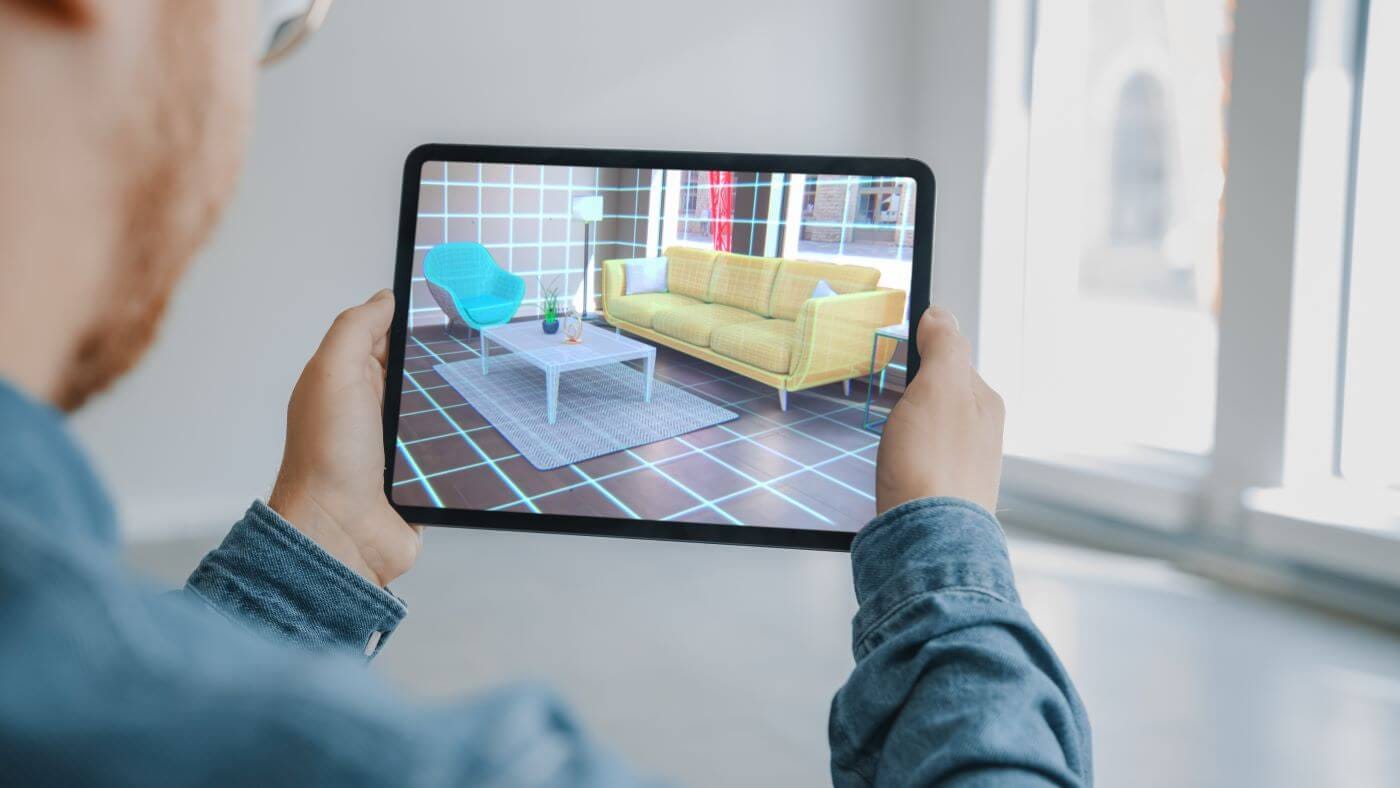
“If you want someone to hear your story, don’t stop them”
-Christopher Patnoe, Head of Accessibility and Disability Inclusion, EMEA at Google
During my first year of college, I was introduced to the TV series Black Mirror thanks to my English teacher, who one day played the episode Saint Junipero to the whole class.
It was the first time I watched Black Mirror, but also the first time I’ve seen a story involving a digital world in a deep and compelling story.
Needless to say, I was hooked.
The more episodes I watched, the more intrigued I became with Virtual and Augmented Reality. It had so much potential and yet, the technology seemed so far into the future.
Until it wasn’t.
Some years later, Facebook rebranded itself to Meta and announced their planning for this new online ecosystem they called “The Metaverse”.
I thought “When the Metaverse is here, there’s going to be a whole lot of worlds and spaces for us to dive into. But… is the Metaverse going to be accessible?”
If I have a motor impairment and can’t move my body freely, logging into the Metaverse seems like the best possible escape.
So I started researching Augmented and Virtual Reality, how to design for those platforms and what documentation there was about making them accessible.
This blog is to summarize some of what I have learned along the way to accessible AR experiences.
AR accessibility guidelines
Today, we have the WCAG (soon to release its version 2.2), a set of accessibility guidelines that are internationally accepted and serves as a valuable source of information to know how to make our products accessible.
Although the information they present is mostly for products in a flat screen, a fair amount of their guidelines can be applied for AR.
There is not one unique list of guidelines when it comes to accessibility for AR; at least, not yet. But big companies like Google, Meta, Playstation, etc… have their own set of guidelines that anyone can access.
According to Google, there are four major impairments that we need to have in mind in our development process:
- Mobility and Dexterity impairments
- Vision Impairments
- Hearing Impairments
- Cognitive Impairments
How to approach mobility and dexterity impairments in AR
Mobility and dexterity impairments refers to both permanent and temporary disabilities, considered by some as the largest impact areas.
Mobility and dexterity impairments can be used to describe people who have a hard time using their bodies to its fullest. It goes from not being able to use your hands, your legs, or even your whole body.
Moving freely in an AR environment, as well as interacting with the digital content without trouble, is the main objective of this section.
1.- Show your content in the screen at all times
For users with difficulty turning their head around, showing the content in front of them at all times is crucial.
Imagine having to grab the pieces of a puzzle that are scattered behind you; all you’re while seated in a wheelchair or in a moving bus. Moving around with the device to look for the pieces doesn’t sound that easy to do.
2.- Adjustable size and rotation for objects
Placing objects around to interact with them is pretty common in AR experiences; from placing a cute character to see how it behaves to placing a digital chair to see how it might look.
Being able to adjust the object to our liking is much needed if you’re in a small space or of short height. This means allowing our users to make our content bigger or smaller, as well as rotating the content so they can view it completely.
3.- Apply large tap targets to your objects
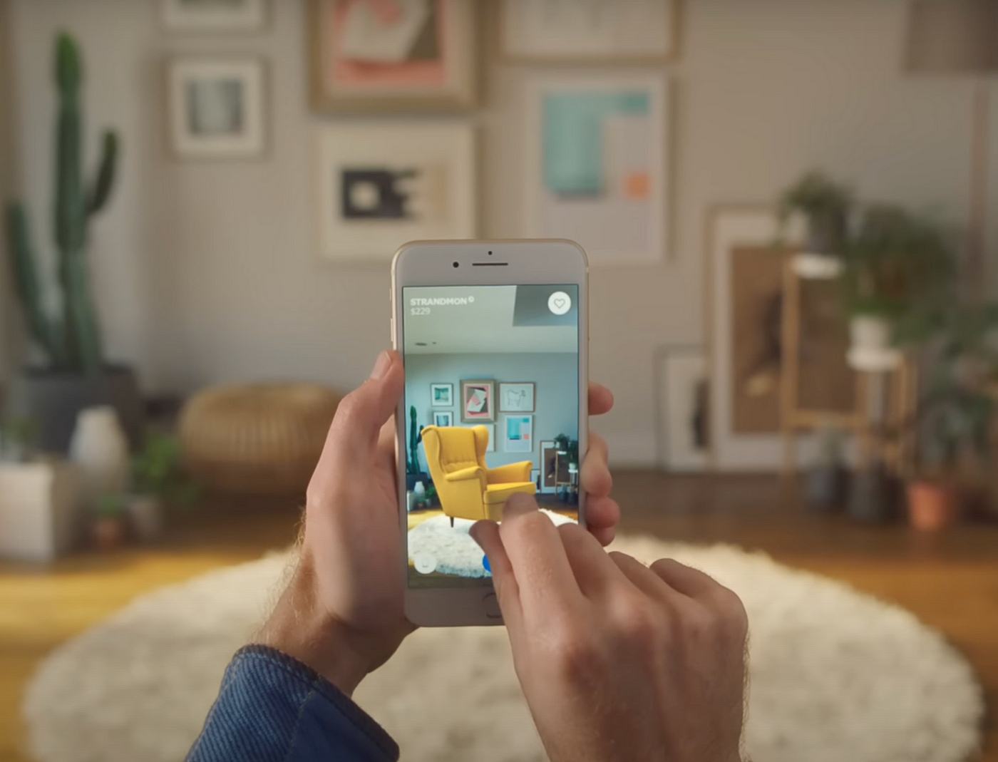
To manipulate an object (move, resize, rotate), you first need to select it. If you are gifted with fat fingers like me, or have a motor impairment in your hands, selecting an object to manipulate it can be tricky.
Having a large tap target in your objects will make life easier for others. This will make it easier to select them.
4.- Alternative hand gestures as controllers
Having different hand gestures goes hand-in-hand to the previous two points of this list (pun intended).
Going back to the example of not being able to use your hands freely, using simple hand gestures as an alternative to control the digital content is a good approach.
Apple’s Vision Pro does a tremendous job in using hand gestures to navigate around.

How to approach vision impairments in AR
Vision impairments refers to not being able to see the world as it is. People who experiment some type of colorblindness, who need glasses to see properly or can’t see at all fall into the vision impairment category.
Making our AR experience usable for vision impairment users might sound tricky, but here are some tips and tricks you can follow to overcome this barrier:
1.- Add an option to increase font sizes
Adding an option to increase the font size, or even having large font sizes to begin with, makes the information easier to read for people that have problems in their vision.
2.- Use a colorblind-friendly color palette
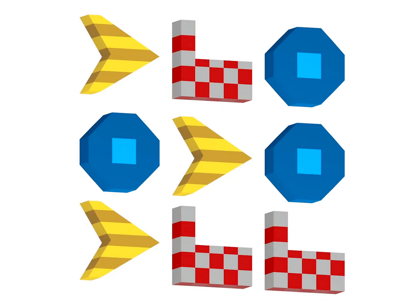
One of the most common colorblind types is called Deuteranopia, where users are unable to distinguish between red and green. Other forms of colorblindness include Tritanopia (unable to distinguish blue and yellow) and Tritanopia (unable to perceive the color red).
There are many more. The ideal case scenario would be to have a color mode for each type of colorblindness but, since there are too many, sometimes this is hard to accomplish.
It is recommended that we apply a color palette for the most common ones. To take care of the rest, use different shades, patterns and shapes for key elements so that they’re more distinguishable.
3.- Have good contrast between the elements and the background.
Good contrast in the elements means that the color of the element can be distinguish with the background. If, for example, you have black text on top of a black background, the text wouldn’t be readable.

4.- Support the use of screen readers or voice over text.
Screen readers are a very important tool for blind users. They are meant to read out loud to the user what is written on the screen, describe images and graphic elements as well as help the user navigate.
Having a good structure in our code will allow screen readers to communicate to the user efficiently. Conducting usability testing with screen reader users is the best way to know if you’re applying this guideline correctly.
How to approach hearing impairments in AR.
When we design for people with hearing impairments in consideration, we’re not only helping those who are deaf or hard of hearing, but we’re also helping users in a noisy environment or even a quiet one where they are not allowed to make any noise.
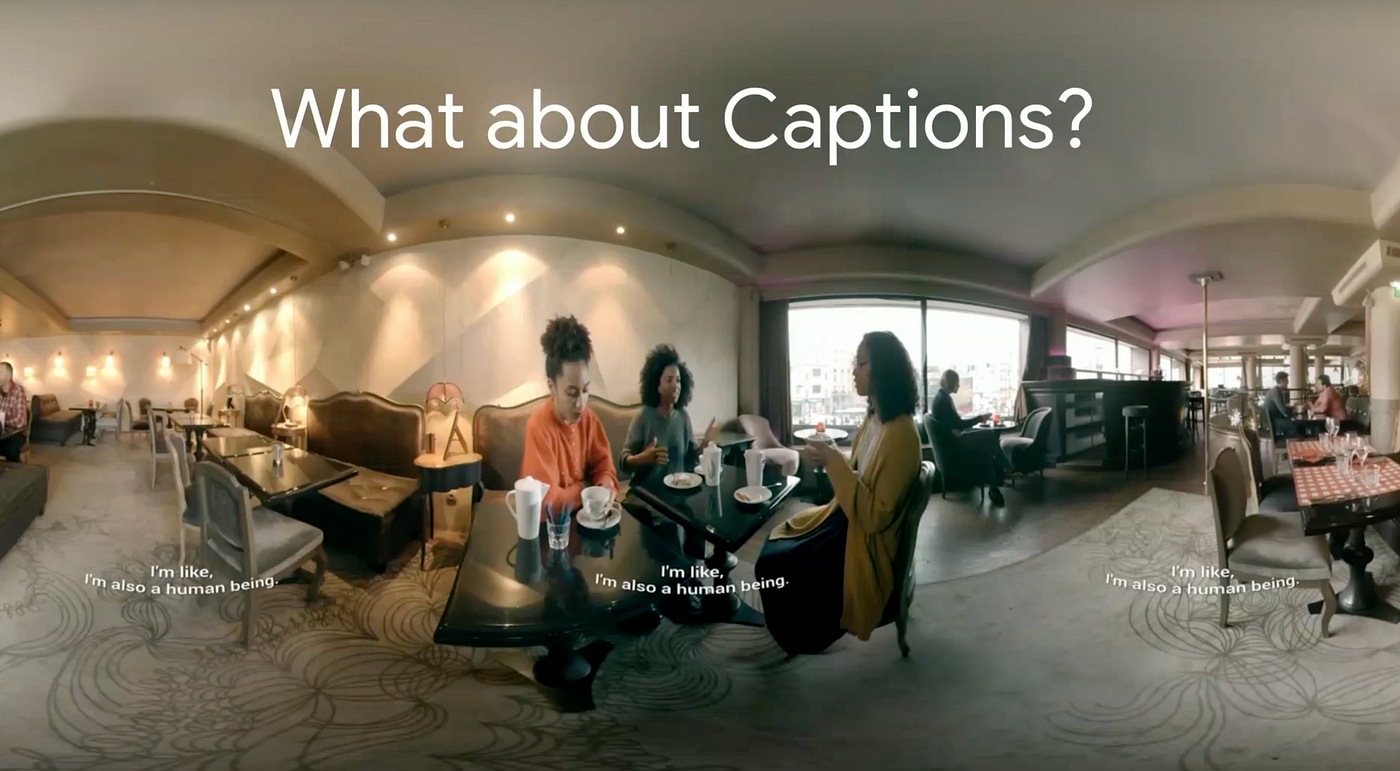
Adding Closed Captions (CC) alongside speech and sound effects that are key for the experience is the best possible solution to address hearing impairments.
CC must always be visible for the user, no matter where they look. To achieve this, you can stick the captions on the bottom of the screen so they follow the user as they turn around. Another possible solution is to place the captions in the front, sides and back so they’re always on display no matter where they look.
If you can play through your AR experience without sound, only CC as your guide, you have successfully achieved the objective.
How to approach cognitive impairments in AR.
Being accessible towards cognitive impairment users means that we’re helping people with short memory, who get easily distracted or people in a foreign country who don’t speak the language.
Simply put, we have to design our experience to be easy to understand, remember and navigate.
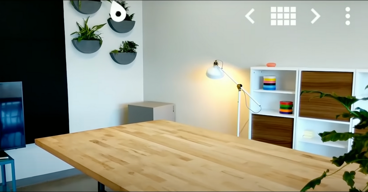
1.- Have an indicator pointing to content of interest
If we’re showing a digital content, say a character, that goes out of frame because we looked away, it is helpful to have a visual like an arrow pointing at the character that went out of sight.
This way it is easier for us to know where to turn to see our character again. The same principle goes for special content we want our user to look at but are outside the field of view.
2.- Add descriptive of feedback, haptic cues and sound effects
Knowing what is going on is important for every experience. Adding feedback like visual cues or sound effects to communicate either a change or an action that our user needs to make is crucial.
3.- Have an easy onboarding session
For new users, an onboarding session to learn the mechanics and objectives of the experience is really helpful.
Just like in video games, the onboarding is meant to be a safe space to mess around and do tasks with no repercussions. Give them as much time as they need to learn, and always give them the option to revisit the onboarding if something was left unclear.
Summary
We covered four major impairments and different ways in which we can make our AR experience accessible for them.
We learned how having different options to manipulate an object is crucial for motor and dexterity impairments, how to think of a color palette for colorblind users and making our content readable for visual impairments.
We also learned how closed captions in our experience is the best possible solution for hearing impairments, as well as how to make our experience easy to understand and enjoyable for people with cognitive impairments.
In a digital world where possibilities are endless, accessibility becomes twice as important. As designers and developers, we have the power to bring joy to others by experiencing what other ways can’t be experienced in the real world.
For me, that is the reason why I decided to bring accessibility to the digital world.
References
Patnoe, C. Ran, T. Accessibility for AR and VR (2018). Google. California, US. Retrieved from: https://youtu.be/pW2oWy-ePS8?si=F1CUo3WsxePKnMHK
Unpingco, A. Faaborg, A. Best practices to design AR applications. Google. California, US.
Retrieved from: https://youtu.be/bNJJCREZgVM?si=3atRVQ6QOaSKLOkB
Alger, M. XR Design Theory and Practice for Digital Eyewear. California, US.
Retrieved from: https://youtu.be/4o__z7aPlMw?si=8FeGu1qzqNSAkkwk
Villamor, C. Willis, D. Wroblewski, L. Tough Gesture Reference Guide. (2010).
Retrieved from: https://static.lukew.com/TouchGestureGuide.pdf
Argyle, A. Gleason, C. Testing Web Design Color Contrast. (2022). Google Developers. California, US.
Retrieved from: https://web.dev/testing-web-design-color-contrast/