
As a marketer, you know by now that most (if not all) of your potential customers are likely a part of Facebook's massive community. There are 890 million people signing into Facebook every single day. So, whether your target audience is college students or CEOs, they're probably using Facebook -- and some of them are using it daily.
The trouble is, posting on Facebook alone isn't enough anymore for most brands, especially for those just starting out. Throwing money at Facebook to drive people to your page and sending them to your website only works if you're smart about it.
One way to be smart about it is to create optimized Facebook ads targeted at the right audience. Optimized ads can help you spend your PPC budget wisely and see a positive return on your investment.
Learn how to create successful Facebook ads by downloading this step-by-step guide to Facebook advertising.
So, what does optimized Facebook advertising actually look like? If you're looking for some great examples, you've come to the right place. In this post, we'll quickly go over the two overarching formats for Facebook ads: right-hand column ads and News Feed ads. Then, we'll show you 8 different types of Facebook ads, each including real-life examples -- along with some insights into why that ad is so successful.
Before we get to these examples, let's chat for a second about the four components of a good Facebook ad (or any ad, really) regardless of its type. Remember, people are on Facebook to stay up to date on their social lives, not necessarily check out your products. This is why keeping these four things in mind is important for any Facebook ad you make.
4 Components of Successful Facebook Ads
1) It's visual.
Visual content is treated more favorably in the Facebook algorithm. What’s more, visual content is more engaging in the ever-changing News Feed, and therefore is more likely to catch the eye of your potential customer. With 90% of information transmitted to the brain is visual. No matter what type of ad you make, your image needs to be visually appealing and attention grabbing.
Check out this blog post for a detailed guide to image sizes for various ad units on Facebook along with some tips on posting visual content.
2) It's relevant.
Relevance is critical for success when using Facebook advertising. Remember, you are spending money when someone views or clicks on your ad (depending on the settings you use). If you're showing ads that aren’t relevant to your target audience, then you're wasting your time and money and will likely not see success with any kind of advertising.
Facebook recently launched a new feature in the Facebook advertising platform that rates your ads and gives you a relevance score, similar to Ad Rank in Google AdWords. The more relevant your ad image, ad copy, and destination page is to your audience, the higher your score is -- and the more favorably Facebook will treat your ads.
3) It includes an enticing value proposition.
A value proposition tells the reader why they should click on your ad to learn more about your product. How is your product or service different from any other? Why should the viewer click on your ad to see your website?
Your value proposition should be believable. Saying you have the greatest sandwiches in the world will not make people come to your business's Page, but maybe offering 20% off will. Or, perhaps adding social proof will help; something like, "Sandwiches loved by over 1 million people every year, come try yours today! Get 20% off your order with this coupon."
4) It has a clear call-to-action.
A beautiful and relevant ad is great, but without a call-to-action (CTA), your viewer might not know what to do next. Add a CTA like “Buy now and save X%,” or “Offer ends soon” and add a sense of urgency to your viewer. Your CTA should encourage people to click on your ad now.
The 2 Overarching Formats for Facebook Ads (With Examples)
Facebook has offered more and more options for Facebook advertising over the years. Each of the 8 examples we'll go over can fit into either of two categories: the right-hand column ad and the News Feed ad.
The main distinction here is the placement of the ad, as well as the amount of writing and size of image that is allowed. Almost all ad types we cover can be used in either type of ad, so let's briefly go over the difference of the two main formats now.
Format 1: The Right-Hand Column Ad
This type of ad is the most traditional on Facebook, it appears on the right side of a user’s Facebook News Feed. This is the first type of advertising Facebook had, and it still exists today.
Although ads in the News Feed are likely to get higher engagement metrics due to their native advertising features, right-hand column ads shouldn’t be forgotten. We often see less expensive clicks and conversions when using these ads. In order for a right-hand column ad to be successful, it needs to be relevant, have a value proposition, a good visual, and have a call to action. Let’s look at an example below from Club W:
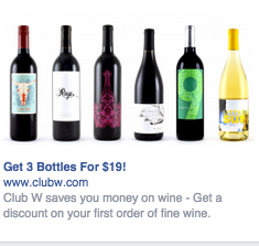
Why is this ad a good ad?
- It's visual. The visual is clear, simple, and appealing to all types of wine-lovers.
- It's relevant. This came up on my own Facebook Page. You may not know this about me (and hey, why would you?), but I do love a good glass of wine, so I would give this two thumbs up on relevance.
- It includes an enticing value prop. Three bottles for $19? Yes please! They also pull me in with an additional value: a discount on my first order of wine.
- It has a strong call-to-action. The word "get" is strong call-to-action language, and they use it twice here. A time limit on this offer would have made it even stronger.
Format 2: The News Feed Ad
A News Feed ad appears directly in a user's News Feed, and looks more like native advertising. In our experience, these ads have a higher engagement rate than right-hand column ads, but they can also be more expensive. They also must follow organic Facebook posts best practices and be engaging and visual.
This is how an ad from Club W would look in the News Feed:
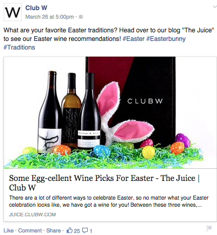
Again, what makes this a good ad?
- It's visual. The image is larger in this ad than the image in the right-hand column ad, making it more visually appealing and catching my eye even more than the previous example.
- It's relevant. Same as with the right-hand column ad, it is relevant to me. (Side note: I actually purchased the wine from Club W, and it's lovely).
- It includes an enticing value prop. They've already done the thinking for me by having Easter wine recommendations. Although there's no discount on this ad, I still find value in their content.
- It has a clear call-to-action. They're telling me to head over to their blog to read their suggestions. This way, I know exactly what to do -- and what to expect when I click.
Now that we've covered the two main ad formats, let's dig into the wide variety of post types you can use.
8 Types of Facebook Advertising & Some of the Best Facebook Ad Examples
1) The Facebook Video Ad
Recently, Facebook said they would treat video ads more favorably in the timeline. Take advantage of this by, well ... creating more video ads!
Video ads appear large in the user’s New Feed and offer more engaging content. Video is becoming more and more popular among brands and individuals alike. In fact, 50% of peoplewho visit Facebook daily watch at least one video a day, and the number of video posts by brands as increased 3.6X in just one year. If you're looking for a highly engaging advertising type, try out video.
Need some inspiration? Check out this example below, as well as our explanation as to why it's great and how your company can create a compelling video ad.
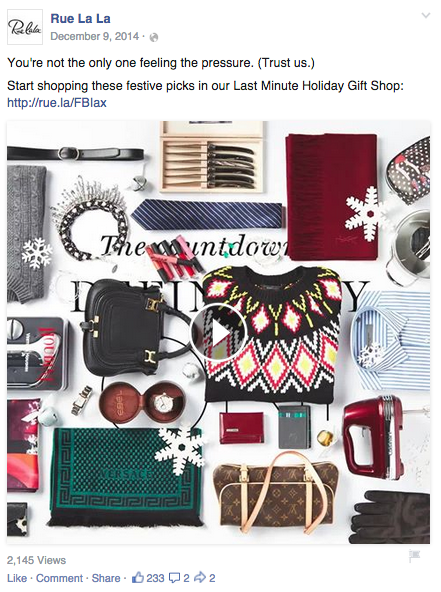
What makes this ad so great?
- It's visual. Even though this is a video, I have a general idea of what I will be watching, thanks to the screen capture they started with.
- It's relevant. It's relevant to me for many reasons. First, I saw this ad three weeks before Christmas -- right when I was realizing I didn't have a single present purchased for my family and friends. Second, they call that out by saying, "You're not the only one feeling the pressure." It’s like they can read my mind. Third, this is a page I've been to in the past and a website I have purchased from, so I trust them and would be likely to purchase from them again.
- It includes an enticing value prop. The company is showing me the countless options I have on their site for holiday presents. From the video, I can tell this is a one-stop shop. I can get everything I need there.
- It has a solid call-to-action. By calling their boutique a “last-minute holiday shop,” I'm encouraged to go shop now.
How can you create your own video ad? First, understand Facebook video ad requirements including length and video size. We suggest keeping your video as short as possible, even though Facebook allows you to upload a much larger video. Create a video that displays your product or service, and upload directly to the Facebook ads manager by following these instructions.
2) The Photo Ad
Another type of rich media advertising on Facebook is a post of an image. This is one of the most popular types of ads ever since Facebook began favoring visual content. The optimal size for News Feed photo ads is 1200x628 pixels, otherwise your image will get cropped. Adjust your image based on the target audience’s needs and by what will appeal to them the most.
Here's an example of a photo ad from NatureBox:
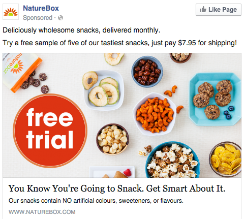
Why does this ad work?
- It's visual. The image shows you exactly what you're getting, and they are calling out the “free sample” CTA well.
- It's relevant. Everyone likes to snack! In all seriousness, the person who saw this is a fan of several lifestyle subscription companies, which is what NatureBox is.
- It includes a good value prop.: This ad is full of value. First, the “free trial” callout is the first thing your eyes go to when looking at the image. Second, they clearly mention the healthy aspects of the goodies in their product.
- It has a clear call-to-action. They are asking you to try their free sample. It couldn’t be easier to know your next step.
Starbucks took another approach at a photo ad by creating a multi-image ad within one posted photo, including the date and time of the special event they are hosting.
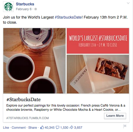
Why's it good?
- It's visual. The visuals are well shot and enhanced, and the topics appeal to caffeine addicts and Starbucks addicts alike. The text is short and sweet and in a playful font with a bold, red background, making it easy to scan.
- It's relevant. I'm a fan both of Starbucks and of drinking coffee in general. (In fact, I'll probably head over to the local Starbucks after finishing this post.)
- It includes an enticing value prop. This ad plays up both the natural human desire to be a part of something big (the world's largest Starbucks date) and the fear of missing out. They also begin to describe some of the coffees and treats attendees will enjoy, making anyone's mouth water!
- It has a clear call-to-action. In the image and in the description they are clear about where and when. I know exactly how to get involved.
Businesses can use this same tactic throughout the year by playing off of a national holiday or large local event.
3) The Multi-Product Ad
Multi-product ads allow advertisers to showcase multiple products within one ad. Viewers can scroll through the images and click on individual links to each product. You can promote multiple of anything, not just products -- like different blog posts, ebooks, or webinars. These ads can be created in the Facebook Power Editor.
Here's an example of a multi-product ad from Shutterfly, along with the additional images that are used in the ad. Each image has a different offer, to appeal to many different demographics in one ad.
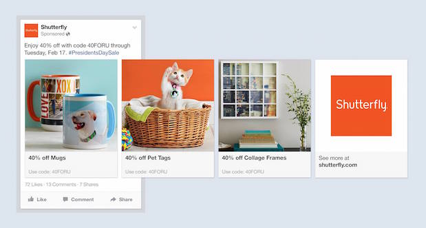
Why does this ad work?
- It's visual. They use color really nicely here, and the images are visually appealing. (Having a cute cat doesn’t hurt either!)
- It's relevant. The person who saw this loves taking photos and creating sentimental gifts.
- It includes an enticing value prop: There is a very clear value for the user, 40% off each of the products being advertised. The code and sale end date are also clear in the ad description. This ad also has an added level of value, it is showing the many different ways people can use Shutterfly, in ways many may not be aware of.
- It has a clear call-to-action. I know I need to use this before 2/17 when this deal expires, so I would be encouraged to take action right away.
4) The Local Ad
Local ads on Facebook only work if your business has a physical location that you are trying to drive real foot traffic to. If you fall into this category, then locally targeted Facebook ads may be a great fit for you, as you can hyper-target on Facebook down to the mile.
If your business has an offer or event going on at your store, set up a few Facebook ads that appear only to people within a short distance of your store. Have these ads appear a few days prior to the event and on mobile devices while the event is happening. You may want to reach some people the day of the event who happen to be in the area and checking their Facebook account on their smartphones.
Take this ad for example from Mizzou Campus Dining:
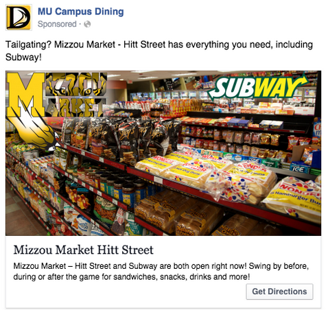
Why is this a good ad?
- It's visual. This image has college pride, a variety of salty and sweet treats, and a well-known logo to attract hungry college students.
- It's relevant. This ad is likely only being shown to students on campus who are in their target audience. It also mentions the sports game that was going on at the time, and plays to the student’s current needs: snacks and Subway sandwiches.
- It includes an enticing value prop. Mizzou market is telling hungry (and lazy) college students that they have everything students need for the big game.
- It has a clear call-to-action. This ad has the option to show directions, making it extremely easy for a college student on the go to follow the walking directions to this market.
5) The Offer Ad
An offer ad is a newer form of Facebook advertising where a business can promote a discount on a product or service that can be redeemed on Facebook. The benefit of this? It eliminates one step in the buyer's journey, which ultimately increases sales.
Facebook allows you to create these types of ads in the Ads Manager or Power Editor. You can choose to have these ads show up in your audience's the News Feeds, right-hand columns, or on their mobile app.
The offer ad has many benefits. First, it drives the user directly to the offer. The user claims it directly on Facebook, removing any added friction of needing to to go to your website for the offer. You also can reach any type of audience that you want, as all the Facebook targeting options are possible. Finally, you can include all the information needed for the user to decide if they want it or not, including the time period it is useable, the number of people who has already claimed it, and the exact amount the offer is. This will eliminate any unqualified clicks, which cost you money.
Here's an example of an offer ad from Jasper's Market:
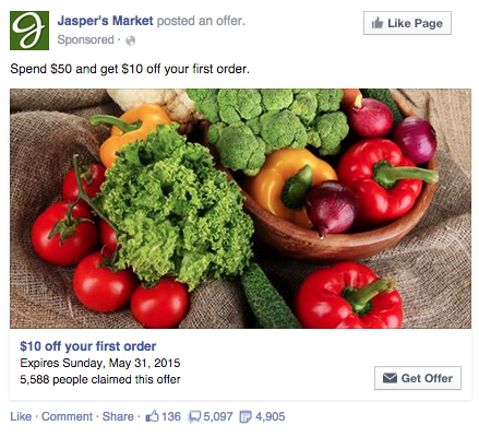
In this example, we know exactly how much the offer is for, when it expires, and how to get it.
Here's why it's good:
- It's visual. The image is very colorful and well set-up.
- It's relevant. This ad is timely, as the offer expires next month. Plus, it promotes a store where I'm likely to shop.
- It includes an enticing value prop. You're getting $10 off your first order -- a value prop that's spelled out not once, but twice. Plus, there's social proof: Over 5,000 people claimed this offer, and I don’t want to be left out.
- It has a clear call-to-action. The “get offer” CTA is clear.
6) The Event Ad
Event ads promote (you guessed it) a specific event. The CTA on these ads usually send users directly to the ticket purchase page, wherever that happens to be hosted.
Using this type of ad will help drive a targeted group of people to attend your event. These will show up in the News Feed of the specific audience you've chosen. Events are a big part of most businesses, but getting people to attend even a small event, can be tricky. Promoting your event to a targeted specific audience on Facebook can help drive the right kind of attendees.
A good ad in this format will clearly show the benefit of attending the event: The price, dates, and a clear CTA to purchase a ticket. The events ad below for the Tortuga Music Festival displays the date and time and the bands playing:
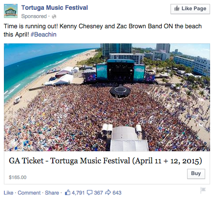
Why is this a good one?
- It's visual. The picture alone is worth a thousand words about how much fun this concert would be. Not only is it on the beach, it was also taken on a gorgeous day and the stage looks amazing. Also, it clearly represents what to expect during the event, and it catches the eye as someone scrolls through their News Feed. (The beautiful ocean water definitely helps.)
- It's relevant. The person who saw this ad is a fan of Kenny Chesney and has been to his concerts before. They're also originally from Florida, which is where this event takes place.
- It provides an enticing value proposition. Since the image was taken on a beautiful day, it looks like an ideal place to be -- especially to those of us viewing it from our office desks. They also clearly tell you the cost of the ticket so you know before you click. (This is also good for the advertiser: By including the price, the advertiser allow users to self-select based on whether they can afford the ticket. If they can’t afford it, they won’t click through, thus saving the advertiser money on unqualified clicks.)
- It has a clear call-to-action. The CTA is clear: "Buy." The advertisers also add urgent wording with the title “Time is running out!”, encouraging you to purchase your ticket now before it's too late.
7) The Retargeting Ad
A retargeting ad promotes an ad to a specific list of previously identified people. Have you ever seen ads follow you across the internet after visiting a certain website? Then you've seen a retargeting ad. For me, Vineyard Vines follows me everywhere -- and usually is successful at getting me to purchase more!
Facebook has the same capability. An advertiser can advertise to a list of leads or customers by uploading a list of email addresses they already have into the Power Editor to make a custom audience. This tactic has been very successful for HubSpot in getting reconversions to our existing database on our free trials and our CRM. A good retargeting ad acknowledges that the brand knows you're already interested in their product. (Because, let’s face it ... retargeting can be a little creepy.)
Last week, I decided to plan a trip to Greece. After searching several sites, I tried Jetsetter to see if I could find a deal on a hotel. A few days later, I signed into Facebook and saw the ad below.

They nailed it. Why?
- It's visual. The image isn't too busy, and gives me a good idea of what to expect when I book.
- It's relevant. Again, they called out that I was already planning a vacation and showed me an ad for a hotel that I had already looked at. They nailed it on relevance for me.
- It includes an enticing value prop. Luxury hotels available for 40% off made me take a second look.
- It has a clear call-to-action. The wording at the bottom of the post is: “Exclusive deals start today!” This triggered me to check them out that day.
So, did I click through to check out this lovely hotel? Of course! Santorini, here I come.
8) The Boosted Post
A boosted post is an organic Facebook post that was originally on the homepage of a company’s Facebook, and that later was boosted with advertising money.
This is different from the above ads because it's not created in the ads manager. You can include more in the description, as there is no limit to word count on boosted posts like there is in ads. You can also have a link in the copy.
The cons? Boosted posts leave you fewer options for bidding, targeting, and pricing. You also cannot run any types of A/B tests because you're promoting a post that's already been creating, not creating one from scratch.
Here's an example of a boosted post from Fabletics:
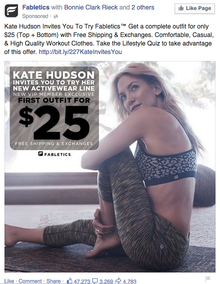
What makes this one successful?
- It's visual. The image of a fit model tends to work wonders when you're selling workout gear. The colors and lighting go well with the text and text box background colors, too.
- It's relevant. As a female who enjoys working out, I would say this is relevant to my demographic.
- It includes an enticing value prop. A workout outfit for $25 plus free shipping is a pretty great value -- which is why they call out the discount not once, but twice. (And in HUGE writing.)
- It has a clear call-to-action. The ad asks me to take a quiz in order to get the $25 outfit, and gives me a link that goes directly to the quiz.
An added bonus? The social proof at the top that tells me three of my friends have already Liked the Fabletics Page. This incentivizes me to Like it myself -- which I can do without even leaving the ad by clicking the "Like" button at the top.
There you have it: A list of all the different types of Facebook posts and a few examples of awesome ones from all different brands. The Facebook ads manager platform will walk you through how to set these up with simple, step-by-step instructions -- so don't feel overwhelmed.
Now, stop reading and start creating!
